The board had questions, and the CEO had to have answers from Sage CRM
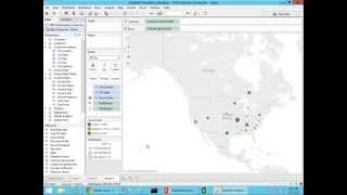
This YouTube webinar (May 7, 2015) is a product presentation and live demo by John Edgar (founder & CEO, DataSelf) showing how DataSelf Analytics provides self-service BI for mid-sized companies using Sage CRM and other ERPs. Edgar contrasts enterprise-grade tools (Tableau, Microsoft BI) with DataSelf’s packaged offering (ETL, connectors, and 5,000+ prebuilt reports/dashboards/KPIs) and demonstrates building reports and a dashboard via drag-and-drop (sales detail, marketing-sales trend, geographic sales map, top/declining customers). He finishes with an ad-hoc profitability root-cause drilldown that identifies a customer group (SH) with low (~9%) to negative profitability (a month at −4%), illustrating how the tool empowers CEOs to answer board questions on the fly and reduce reporting labor and costs.
Questions this video answers
John Edgar, founder and CEO of DataSelf.
May 7, 2015.
More than 5,000.
Over 10 years.
About 80% reduction in reporting labor.
Chapters
Who needs bi? Who needs business intelligence? Well, typically are the people who are managing the business or decision makers, people who understand the opportunities and the threats. And typically these people need information from their systems all the time. However, they require another person, an expert to build reports, to slice nice reports for them. So, so it's not efficient. So here we're going to show you today how we address that issue, that problem. So the webinar today is about. The board had questions and the CEO had to have answers from Sage 5. I'm sorry, it's supposed to be Sage CRM. My name is John Edgar. I'm the founder and CEO of DataSelf. Thanks for joining us. So how do we empower decision makers with a tool that they can actually become more self sufficient? They can become empowered. Let me show you how or why we do it, how we do it. So this slide talks about Gartner. Gartner is one of the most reputable companies doing technology assessment for Fortune 2000 companies. In every year they release an assessment from the analytics and BI platforms. Making a long story short, right now Tableau is considered the leading company providing analytics self service. BI is the most successful because it's the easiest to use for business people and Microsoft is the leader when it comes to BI infrastructure. What about these two companies? What about Data Self? Well actually Data Self is a package that contains nothing but the very best from Fortune 2000 companies. But we add our own secret sauce to make it simpler, to make it better for mid sized companies. So part of the secret sauce is a tool, an ETL tool that simplifies the deployment and maintenance of a solution like that so easier, faster. And over the 15 years that my team has been working with this, we have built more than 5,000, yes, 5,000 reports, dashboards and KPIs out of the box. So not only using the best tool available for Fortune 2000 companies, but there's a lot of connectors and a lot of reports available out of the box. So you can start from that solid starting point. In a nutshell, this will deploy in hours. So super fast to deploy to get benefit out of it. We have been building this technology for Sage CRM for over 10 years. So we know how that works, we know how BI works and how to make it valuable for companies like yours. Finally, this solution costs literally little money, usually with a few thousand dollars you can actually get started with this whole enterprise grade technology. So it's not going to break the bank. And the more you need, the more users you have. You know you pay additional fees but the entry level cost is really low. Alrighty. So that's how we make this technology really enabling for decision makers. It's the easiest to use for Fortune 2000. We make it affordable for you as a mid sized company using Sage CRM and other mid market products. And out of the box you have a lot of things ready to go. So let's take a look at the product and the scenario I'm playing here is I am the CEO of this distribution company on the west coast and I have a board meeting that I have to get prepared. We recently acquired Data Self analytics and until now every month when we go to the board meeting my poor IT team will spend several days crunching reports for me so I could go prepare to the board meeting. So it was very time consuming for them. Not only that, but my board is very, you know, tough. They usually would come with questions about my. About the business in my reports would have not yet I would not have a report ready for those those answers. So quite often I would have a lot of notes out of my meeting and then I would go back to my IT team telling them to build additional reports to show questions that I was not able to answer during the so with Data Self analytics my main goal with this investment was well I want to get a lot of these reports automatic. So my poor IT will no longer have to be crunchy numbers every month. It will be just automatically created and I want to have a tool that will allow me in the board meeting to find answers on the fly if they ask me. And I just want to be able to figure it out without having to have notes for the next meeting. So that's the scenario in a show here I have four reports. These four reports that I'm showing every month we show to my board and my IT was building them. I want to see if I can build them myself during this presentation and make them automatically for moving forward. So I'll show that. And then the last part is a new question. We have been growing our business significantly in sales for years but but our profitability is surprisingly low and we don't know why. My board is asking me why we're not so profitable. I don't know the answer but hopefully I'll be able to find some profitability trends to start a conversation. So we'll do that ad hoc analysis at the end of the presentation. Let's do it. Let's do it. So now I'm switching to my Data Self analytics publishing tool and I have here right Now I'm connected to my opportunity connector from my Sage CRM and then the first analysis that they're asking for is they want to see quarterly sales details. So what I just do is I just drag and drop information into my report. I have my dimensions in my measure so I want to see actual sales. So I drag actual sales to my report. That's my total actual sales. And I want to break down this actual close date so I put actual close date in my columns. So these are the actual close dates for my CRM and I want to break it down by account manager, by account and by opportunity, details and product. Everything is drag and drop. So go to my account manager, just drag the names over here. So background manager, I have my actual sales and let me just focus on the last year which is in my sample database, 2014 I'm going to choose relative date. I could choose any time, bucket, year, quarter months. I'm going to choose relative date and I'm going to choose last year and click ok. And actually let me just put this filter on the right here. So right now I'm showing my previous year and I could easily come here if the board asked me a different period. Quarter, month, weeks. I just changed the bucket and I change, let's say I want to see quarter, the last three quarters, last four quarters, whatever. My sample database is not so rich here. Let's put last year which I know I have database here. So very easy to change the filter. Now I want to see by account everything is drag and drop. So by account I drag account name into my report and I want to see let's say opportunity id. I drag and drop product, it's just drag and drop. So what I'm very excited about is when I with my board and they ask me questions about these detailed sales. If you ask me questions, quantity, shipped, profitability, I just come here and drag and drop and most likely I'll be able to answer several and hopefully all their questions without having to wait for the next meeting. This is so great. And building reports like this is something so straightforward that a lot of our users learn how to do it just by looking at presentation like this. It's so easy and so intuitive. Awesome. So my sales details report has been built. Now the next report that I need to put together is I need to see marketing sales trends. So I want to see how my website visitors are affecting my sales in our marketing team. And it work every month a lot to put this information together. They got to get information from Google Analytics and from CRM and sales and combined I know it's a pain for them. Well here my IT team with data self already put together the connector to analyze that behind the scenes. They already did that, they already validated the data. Now as a decision maker I'm going to see if I can build a report from scratch. So I want to see my sales and this time I want to see as you know, a trend analysis over time. So I want to put my date in my columns when I drill down to actually want to see sales by month. So here I have all my months and I see a sales growing throughout the year which is pretty good. Now I have website visitors here which comes from Google Analytics. I just drag and drop to my report and these are website visitors. Let me make bars. So bars are website visitors, sales is the line. Now I want to combine them together one on top of the other so it's visually probably more informative. So I'm going to put them on a dual axis and look at that. So website visitors are in orange bars, sales is in blue line. And now I mean this is so visual that I'm sure that now when we go to my board, analyzing this data is going to be so much easier than before looking at numbers on a spreadsheet and it was kind of confusing sometimes. Hey, it took me like I don't know, a few minutes to put it together. And the good news is next month I don't need to build it. I just open this report again, it will be ready. And I don't have my poor IT and marketing team working hours and hours every month to put this together. I'm so excited. Alrighty. The next report was original sales by deal size, regional means. I can look at anything that has a location like ship to build to warehouse location, whatever it is. In my example I want to see customer address, I want to take the state, I want to see from invoices, the size of my invoices sales input everything on a map. So there it is. I have bigger bubbles, bigger sales and then the bubbles are sliced by the aggregation of small, medium, large invoices. Very informative. Now right now we're focusing most of our analysis on the continental usa. So let me click here and choose United States Continental. And now I zoomed right into that area. If I was doing an analysis, let's say by zip code, by city, county in a specific state like Florida, I could just type in Florida and click enter and it would zoom in right into my Florida state. So very straightforward. Let me make the Bubbles a little bigger. So awesome. So I just see sales by state and invoice size. Awesome. That was exactly what we do this on an ongoing basis for my board and I know that my IT team suffers so much putting this on a map and quite often they don't get it right but now was very straightforward. Well these three reports I want to put on a dashboard that will be available on my iPad. I go to the meeting with an iPad. So I'm going to put my geography analysis at the top. I'm going to put the trend analysis at the bottom. Then my opportunity management analysis, detail analysis on my right. Look at this. In a few minutes I was able to build this dashboard from scratch. As you could tell I was not. I don't need to be it. I don't need to be highly trained. It was just drag and drop was very fairly straightforward. Now I'm going to have this dashboard ready for all my meetings. I won't need to ask my IT every month to crunch this data will be automatically would be accurate because this data is all automatically refreshed by the data self analytics server. This is awesome. In here when I'm in my board meeting sometimes they ask me what is the sales of a few different states and when they ask that question if I don't have a report I just cannot answer at all. I got to have to come up with a report later on. Ask my it was going to take again hours to put together the information. If they ask me again, you know what is the sales for those three big states here in this dashboard using my finger on my iPad I could do this. I want to say, I want to say take this area and this one here. I just go whatever I want and voila. Now my report is only showing sales for those three states and my dashboards change accordingly. I'm so excited. I'll be able to answer many questions to my board on the fly because now I finally have a tool that empowers me to be self sufficient with reporting at least for a lot of the reporting. Awesome. I'm so excited. The next report that I need to put together is main customers with sales decline. That's another report that I know that my IT team spends a lot of time every month crunching and showing customers with top decline in customers who are no longer buying. Now when they purchased data self analytics I knew that those two reports are available out of the box by year, by quarter, by month. They have so many different ways to look at information. So let me see if I find Those reports right now in my data self analytics portal. So this portal was already deployed out of the box. There are more than 5,000 reports, dashboards and KPIs available out of the box. As I mentioned here, we only have a sample. But how can I find those reports? I come here and say let's say top customers. I just find top customers and right there I would have all reports showing top customers again out of the box. We have lots of those reports. This is only a sample, so I only have a few. In this case only a couple. And here is one of them. Top customers by sales change since last year to date. That's exactly one of the reports that the boards asked me. Which clients are declining the most in sales since last year to date, out of the box, ready to go. I don't need to do anything. It's awesome. And how critical is this? These customers have the biggest sales decline on a year to date basis. Sure enough, now I can spend more time calling my account managers to see what's going on. So when I go to the board meeting I have answers and I can drill down on the fly if it's needed. Awesome. This report is done. The other one is customers with no sales. Well, here I also have this report that's out of the box from Data Self ready to go. It shows me customer with no sales. You know, you can find customers with no sales, products with no sales and a lot of things out of the box. In this case, customers. And I have customers with no sales the last 30 days, last 60 days, last year and 12, 24 months for my business. This is awesome. If I need it differently, it would take me, you know, a few mouse clicks to spin it in different ways and choose different time buckets. But boy, I don't need to build these reports from scratch. I'm very happy. So in a nutshell, these four reports are ready to go. It took me like 15 minutes to build from scratch. Awesome. I did it. And good news is I can easily spin them differently as the board may ask different questions and now on an ongoing basis, they're ready. I don't need to ask it. They don't need to spend more time. They'll be automatically refreshed. And every time that I open these reports, so much better. Now, the last one may be trickier. Why profitability isn't higher, I don't know. I have no clue. And I have to see if I can find some trends. So this is an uncharted ground for us. We have not looked at profitability so far, and I'm going to see if I can start seeing some trends. So let me open my publishing tool here and I'm going to look at profitability. Now let me start with sales because I'm very comfortable with sales first. So let's put my sales and I'm going to look at customer groupings like customer group and territory. Because we do a lot of analysis also centered around our customer groups in our territories. Let me pivot this view here so it's easier to look by customer group, by territory. I have sales. Now. How is profitability affect, you know, is profitability different throughout my customer groups and territories? Let's figure it out. Let me take gross profit and add as a color. So very green, very profitable. Light green is not so profitable. And look at that. I can clearly tell that the SH customer group is very light green, meaning it's low profitability, while all other customer groups are pretty green, high profitability. So territory does not matter. So I'm going to remove territory, just focus on customer group. And SH is 9% profitability, while the other ones are over 50%. Well, there was a trend here. SH is my problem. That's a good finding I didn't know about. So let me actually filter this report and only show sh. So let me remove the other three. So right now I have sh only with 9.1% profitability. Let me pivot it and let me see what happens with this. Is this something by product over time? Let's spin it. Let me put time in my columns here. Drill down to the month level. And let me see the whole thing. And look at this. Let me make this a little bigger size for my lines. Look at that. I can tell that this was unprofitable. We lost money. We lost money in that month. 4% negative. That's unacceptable. How can we be having profitability that is negative? And look at this. It happened again the prior year and if I look in 2012, it was pretty low compared to the other months. So clearly by looking at this, I can tell that, you know, towards the end of the year, somehow our profitability for this customer group goes to negative territory. This is unacceptable. What's going on? Well, let me take last month, which we have a lot of, of decline. And let me actually go to the details and see all the records, all the invoices, customer products that were sold. These are all the records. There's 36,000 records sold to that customer group in that particular month that have a lot of negative profitability. I'm going to take this look at this profitability negative. This is unacceptable. I'm going to email this information to my account manager that handles sh and ask this person to see what the heck is going on with that customer group in that part of the year. Maybe we got source the products from better vendors or renegotiate there is something wrong that I'm going to ask that person to analyze further and so when I go to my board meeting we'll have more answers. But boy it took me like a few minutes to figure out to analyze gross profit and find some trends showing that definitely we're having issues specifically with this customer group and specifically at the end of the year. How about that? Well, definitely sales data self analytics has helped me a lot. I'm very excited and now I'm ready for my board meeting or I'm getting ready and I'm spending less time crunching data and more time analyzing the business opportunities and threats because that's really what my decision makers are meant to be is to analyze data and act on it, not spending time putting it together. Right on. So that was the presentation. I hope you have enjoyed the product presentation. Let's move forward. So main benefits of Data self Analytics first of all, it's empowering decision makers with a tool that will allow them to do their own data analysis anytime, anywhere using desktop, web and mobile devices. That's really empowering. It makes a big difference when your decision makers can make decisions more in a timely fashion. The way we do it is because we use enterprise grade user centric analytics. You know, we use nothing but the very best from Fortune 2000 companies and out of the box. You don't have to start from scratch building everything. We have connectors for Sage CRM. We have connectors for several ERP packages covering sales, purchasing, inventory, financials, payables, receivables. We have a lot of things out of the box in more than 5,000 reports, dashboards and KPIs. So it's a great empowering tool for decision makers. Overall, this tool will automate a lot of your reporting procedures. So if your team has been spending a lot of time crunching and distributing report, crunching data and distribute reports to people, this tool will likely automate 100% of those tasks. We usually see cost reduction of 80% in reporting in labor intensive reporting tasks. So major benefit from a cut costing standpoint as well. And finally as I mentioned, our technology leverages tableau which is the gold standard for analytics in the Fortune 2000 world. So you as a decision maker. You're getting nothing but the very best and easiest to use reporting tools. While your IT will be so glad that now they have this enterprise grade technology that will help them maintain the back end server very easily, very quickly in a very inexpensive fashion. Also our cost as I mentioned before is very low. You can get our solution, our entry level solution for literally a few thousand dollars. So you can get started with very low investment and take benefit of this gold standard technology. We have a few minutes for questions and answers. If you have questions please use the GoToWebinar panel and I'll be addressing right now. Let's see if we have questions. So one question here from Mary is what ERP packages do you connect with out of the box? Mary, thanks for your question. Let me actually go to our website to show that information. So if you come to Data self website go to Solutions and click analytics by ERP and CRM. And then here you're going to find the connectors we have available out of the box. So we cover ERPs for Everest, Microsoft and Sage products as well. If your ERP is a different one, no problem. We can build new connectors from scratch, but these ones out of the box. We have a lot of reports and KPIs. By the way, if you come to Solutions overview here you have this button that shows the architecture of our solution and this button shows a list of the 5,000 reports that's with the KPIs. So if you want to take a look I strongly encourage you to download the list to have an idea. Mary, thanks for your question. More questions here. Question from Susie Let me explain the question here. So Suzy is asking if this webinar will be available. A webinar recording will be available later. Suzy, thanks for your question. Yes, back on our website here you've come to resources and you go to webinars. Then here are the upcoming webinars. But if you click Recorded webinar we're going to be posting this recording in the next probably day. So we'll be available and we're going to be sending an email to all of you with the link to that recording. But you can find all recorded webinars by clicking and finding all the options. By the way, if you want to show data self analytics to someone that have little time, you can come to Resources and click the two minute demo. And in this page you'll find a very informative yet short video that will be a hook to give you an idea of how easy to use it is and how much power you can get out of our solution. Folks, we are about to wrap up. We're running out of time, so let me just show my contact information. If you need to talk with me to learn more about our solutions, learn about other vendors, how we compete with how we stack against other offerings, or any other information regarding data warehousing analytics, you can call my cell phone, you can send me an email or use my Twitter account. I hope you have enjoyed the session. Thank you for joining us. Have a happy Thursday and I look forward to contact you again. Thank you.










