The board had questions, and the CEO had to have answers from Sage 500
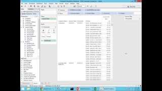
A CEO needs board-ready reports from Sage 500 data. DataSelf Analytics lets non-technical managers build them fast. The demo shows quarterly sales, geographic trends, and a profitability analysis that caught a low-profit customer group the finance team had missed.
Chapters
Who needs bi? Who needs business intelligence? Well, are people that are the decision makers, people managing people, building things, managing processes. And typically these people have to rely on an expert to build reports to change and dislicandize reports and dashboards. And that's what we're going to be talking about here today. How we empower decision makers with a business intelligence solution where they can do most of the things that today they have to rely on someone else on an expert. So today's presentation is about a story. You know, the board had questions and the CEO had to have answers from Sage 500 data. So play a little scenario where I'm sorry, the CEO will go through a series of scenarios to have the answers ready for the board. Before we jump into the story, let me tell you how we empower decision makers with an easy to use tool. So this slide shows Gartner magic quadrant for BI and analytics platforms. Gartner is one of the most reputable companies doing technology assessment for Fortune 2000 companies. Making a long story short, in the Fortune 2000 world right now, Tableau is considered the best tool, you know, the gold standard when it comes to analytics platform dashboarding, self service BI. So it's the easiest tool for Fortune 2000 companies. While Microsoft is considered a leader when it comes to BI infrastructure. What about them? What about data self? Well, our solution actually is using nothing but the very best, you know, the client tool, it is Tableau, which is the leader in Self Service BI. For Fortune 2000 we add SQL Server which is a great foundation for BI purposes. But then we add our own secret sauce which is the ETL which simplifies the deployment and maintenance of these other two tools. Over the years we have built more than 5,000, yes, 5,000 reports, dashboards and KPIs out of the box. So not only we're using the gold standard when we when it comes to the analytics platform from Fortune 2000 and we're bringing to mid sized companies. But out of the box there's a lot of value. You don't need to build things from scratch. There are a lot of things done already. So in a nutshell, this technology is super fast to deploy, usually takes hours of effort. We have been working with mid sized companies and Sage 500 for over 10 years now. So we know how it works. We know how enterprise analytics work and how to make them work for you. And overall the cost to deploy and maintain this is a fraction of the cost if you try to build it yourself or if you try to hire consultants to do it. So that's how we can empower you with the best technology available out there for midsize companies. So let me go through the little scenario. You know I'm the CEO of this distribution company in the west coast and I'm going to have a board meeting in and I recently acquired Data Self analytics to help with my reporting and I've been already trained on it. So I'm going to show how a business person, in this case me, the CEO of this distribution company will find the answers to my board meeting. And what I need to show to the board meeting is this quarter sales details. We usually go over see customers and products sold when they bought it, the invoice usually we, we go through some of those information in our board meetings. Also we need to see how our marketing sales are, you know, if marketing sale is helping our sales initiatives. So we need to put some trends to see how they relate to each other specifically from our website traffic in how our sales are related. Also we need to see regional sales by, by deal size and see how they relate to each other. And finally main customers with sales decline. These four reports we have been doing the old fashioned way in the past where it would spend several hours per month before our board meeting. I mean several hours, a lot of hours crunching this data to put it together so I could go to the meeting and, and show information. And with the old style, you know, I was getting information after all of these hours from the poor IT team. But one of the limitations was quite often we have new questions and people would ask me what about this, what about that? But reports that I got from it, I could not change them on the fly. So usually I would have to come up with the answer in the following meeting or email them later with whatever that they have asked. So now with Data Self Analytics I hope to have these reports ready much more quickly, hopefully automatically. Not only that, but if the board asked me more questions, which is typical during the meeting, hopefully I'll be able to slice and dice reports without waiting for another meeting. So these four reports have been done in the past and I hope I can just build them right now during this presentation. But the last part of my request is something new. The company has been growing significantly for the past few years. The focus was growing sales but now the board has asked me how about profitability? Why aren't we more profitable? What's keeping our profitability low? And we actually don't know where we're not being so profitable. So I'll be a little Bit of discovery. I'm going to go and jump into the data and slice and dice and see if I can find some trends to tell why our profitability isn't so high. So I don't know where I'm going but I'm just going to give it a shot and see what I figure out. So let's do it. So you know, I just been trained in data self analytics and I'm going to try to find out those pieces of information. So this right now I have data self analytics connected to my sales information which, you know, pretty much all of those questions were centered around sales. But you know, with data self I have information from sales, purchasing, payables, receivables, inventory, financial information, everything. This demo is focused around sales. So here I have my sales dimensions and my sales measure. So the first information that I need to find out is detailed sales for the last quarter. So let's start building that information. I want to see sales. I just did drag sales to my report. There it is. Total sales. I want to see by customer. So I want to see by customer invoices, invoice, date and so forth. So let me bring my customers to my report. So by customer I have total sales. Now I can slice this information by, you know, usually by time, year, quarter, so forth, select my invoice date at the top. And then here I have total sales by year by customer. I could drill down to the quarter level, I could drill down to the month level, but I don't want to do that right now. I just want to see sales for the last quarter. So let me filter this and I'm going to drag my invoice date to my filter shelf and I can select different time buckets. In this case I'm going to choose relative date. Click next. And relative dates is periods comparing to today's date. Let's say I can choose this year, previous year, the last three years. I want to see quarter. So I'm going to choose quarter here and just this quarter and I click ok. So now this report is only focusing on the current quarter. So if I drill down here I see that I'm the quarter two. And because I chose relative this quarter, I don't need to change this report anymore. Every time I open this report it will show this quarter's date. And if the board asked me different questions, you know, different periods, I could come here later and just choose a different, you know, bucket and different periods. Very straightforward. Something that most people would be able to do without it assistance. All right, so Beautiful. I have by customer sales this quarter. Well I, you know, typically I need to see invoice number, invoice, date, product and so forth. You just drag and drop. So let's say I go to invoice fields, I find invoice number, drag and drop. There you go. Buy customer, invoice number, invoice date, just drag and drop. Maybe between the two of them. There you go. Buy customer, invoice date, invoice number, let's put product, just drag and drop and you get the information. So building detail oriented reports is very straightforward. Anyone who wants to learn how to do this sometimes just look at this presentation. They'll know and they'll be able to do it by themselves. In my board meeting as a CEO, if they ask something different than this, I will just drag and drop and I'll answer the question. So boy, I'm happy that this time I'll come with this report and and I'll be able to answer not only this but any variations hopefully that they throw at me because it's so drag and drop and pretty visual awesome. And hey, next time I don't need to ask it to go over the whole data crunching. This report will be ready. It's just this quarter, I just open it up, it will have the latest information. How awesome is that? All right, good. So that was my first report. The second report I need to show is marketing sales trends. I need to see how website visitors are influencing my sales and this is something that also takes a lot of effort from my IT team and my marketing team. Let's see how with data selfie works. So again I'm going to see sales. In this case I'm going to see a bar in lines and trends over time. I want to put this on a yearly basis and go to the month level. So I want to see how sales is aggregating throughout my months. So for every month I have you know, a line here showing. Now I also have website visitors that in this case comes from Google Analytics and is already incorporated into my sales analysis. How it's done, I don't know. It did that. I trusted that you went through the process and properly set up the whole thing. Now as a decision maker I just drag and drop. So I'm going to take website visitors and put in my report. So this part here is website visitors that make bars. So you know, website visitors are bars so it's easy to tell them apart from my sales and sales continue to be on the bottom and to see if they're Related to each other. I'm going to put them on a dual axis and look how beautiful this is. Now I have website visitors in orange bars, in sales with the blue line man. Before, when the IT team and marketing were working together to put this report, I know they were spending days crunching and comparing and putting side by side. I know it was a pain. It took me like two, three minutes. It's awesome. Okay, awesome. So I have this part of the information as well. So marketing and sales trends. Now I need to see geography analysis. I need to see sales by customer address state. It could be shipped to whatever. So I'm choosing customer by customer state. I want to see how big the deals are. So I'm going to choose invoice size and sales. And then I want to see this on a map. There it is. So I see bigger bubbles, bigger sales, and the bubbles are sliced by the size of my invoices, Small, medium and large invoices. Now, mostly I'm interested in the US operation at this point. So I'm going to choose here, United States, continental only. And now the map zooms in into that area. If I was looking only, let's say sales by zip code or by city by county, let's say in California. I could just search by California and the map would zoom right into it. Very straightforward. Awesome. Make these bubbles a little bigger. Good. Now I think these three dashboards, they'll go great in a single dashboard when I go to my meeting with the board. So let me build a dashboard here. And I'm going to put my map at the top. I'm going to put my trend analysis at the bottom, and then my detail report at the very right. As you can tell, just drag and drop and you get this dashboard that is fairly sophisticated and it took me literally like 10 minutes to build it from scratch here. I can just tell, let's say that my map is going to be a filter to the whole dashboard. And if my board asks, how am I doing in only in a few of these states, I could come here using even my fingers on my iPad and just select a few states and voila, I'm just looking for those states. And I could do a lot of questions that the board would throw at me. This time I'm confident I'll be able to answer on the spot. We'll make decisions more quickly. And I'm so excited that I believe our business is going to grow a lot more quickly because of the ability to analyze data anytime, any, anywhere, and business people being able to do that. Awesome. So let's plug along with the other questions. The other questions is we need to. We're always looking at the main customers that have sales decline. And Boyd, it works a lot to also crunch that kind of information. Now I know that in data setup analytics, there's more than 5,000 dashboards, reports, dashboard. KPIs out of the box. And I saw that they have some reports showing sales decline. So let me go to the web portal where my out of the box reports are and search by top customers and see what we get. And right here, this is just a sample. We have a lot more, but this is just a sample that we have two reports showing top customers. One is just by sales and when it's top customer by sales change since last year to date. And that's exactly what I need to look for. My board is showing customers with the biggest sales decline since last year to date. So typically we have to build this report every month and refresh it here out of the box from data Self. I do nothing and I just take this report and I show to my board these customers are growing the most in sales, which I don't care for my board meeting, but these are the ones declined the most in sales, which is what I need for my board meeting. So awesome. No work. I'll just show them the report. Also in this report here, we have these tabs and we have this other tab showing no sales, no sales shows my customers that are no longer buying in the last 30 days, in the last 60 days last year, in the last two years. So it shows in a descending order which customers are no longer buying. Boy, it just took. It took me no time to find that information. Outstanding. Well, all of those reports that it was building before and taking several days, you know, these four are all set. It took me like 15 minutes to get them ready. And now on an ongoing basis, it's going to be zero time because they're already refreshed. I just need to spend time analyzing the data, no longer crunching the data to put them together so much better. Now the last part is why profitability isn't higher. I don't know the question, but I'm going to give it a shot if I figure it out. So now I'm going to start a new analysis and want to see profitability where, why it's not so profitable. So let me start building a sales first and slice my sales by customer group and by territory, which is something we do all the time. Let me pivot this so I can See more easily by customer, by territory. I have my sales now I want to see profitability, how I'm doing profitability wise by customer, by territory. Is there any trend among them? I don't know. Let's take profitability and put it as colors. And look, this is interesting. So this SH customer group have low profitability for all territories while all other customer groups, they all have good profitability across the board. So it does not matter. The territory lets me remove territory. It's only SH that has a much lower profitability than everyone else. How about that? Well, let's focus only on this customer group sh. So let me put this as a filter and let's remove the others and only leave sh. So let's only analyze SH which has a low profitability and let's see what else we can find. Is it changing over time? What's going on? I don't know. Let's check it out. So let me add the date to my column. Let me drill down to the quarter into the month level and let me put this here. So now I have, for every month I have sales by month in profitability on a color schema. And actually let me make this a little bigger here. I can see a trend now if I look at the end of the year, the color starts to become a little reddish. This was 4% profitability. This was negative profitability. This was 4% negative. There is clearly a trend that towards the end of the year my profitability for these customers go down. And why is that happening? Well, would be a discussion for further analysis, but boy, I'm into something. SH customers clearly are causing profitability issues. And I could even go over here on this month and say I want to see, view the data, I want to see the detailed information and maybe share with, you know, my sales team so they can see why profitability is so much low in those months. I could email this sheet using Excel or a PDF and send to my SH account manager and see why these customers are so unprofitable. Maybe it's because we're buying something from them to a much higher rate and we have to either buy better, more affordably or maybe we have to increase the price toward the end of the year or somehow increase profitability. Now this is awesome. Just I'm curious now to do some trend analysis with these numbers. Let's say I want to add some trend line to my report. So this show how it grows and it seems that we're going on a ramp up approach which was awesome for my business. We keep on growing. Maybe I want to see some forecast how it's going to be the future compared based on the numbers we've seen in the past. And here the tool gave me in this area here for the next year. And so this green line is what is the most likely sale in this whole gray area is the likely scenario where my sales going to be. I think this report here is going to be awesome for my board meeting because it shows me profitability, show me clearly a trend where sh clients are making our profitability going down and then you know we can address and hopefully increase profitability. It also shows trends over time in what the future is likely to happen. So I'm ready for my board meeting. Boy, it took me like 20 minutes and I think we're going to be a lot more productive moving forward. Thanks to Data Self Analytics. That was a little demo. Let me move forward here. One of the main benefits of Data Self analytics, the most important as you can tell, was empowering decision makers so they can do their own analysis analysis anytime, anywhere using desktop, web and mobile devices. This is thankful for because we have an enterprise grade user centric analytics powered by Tableau, which is the leader in the Fortune 2000 world. And then we have more than 5,000 reports Dashboard KPIs available out of the box. So not only it's an easy to use but it comes with a lot of reports that are critical for most businesses. This tool will automate a lot of your labor intensive reporting. As I showed here, you can build things quickly and next time they'll refresh automatically. Overall we have seen reduction in labor by 80% so it's great also saving the long run because of less labor. And as I mentioned overall this technology uses the gold standard for analytics and it will be so happy to focus their time and energy supporting something that is the best. And you as the decision maker will be so happy because now you can make decisions by yourself anytime, anywhere and you don't have to no longer wait for an expert to give you the answers. Folks, we're supposed to wrap up this webinar at 9:25 so actually I'm going to be skipping the questions and answers this time. Sorry. Before I wrap it up, if you come to our website dataself.com and you can go to Solutions and overview, you can see the architecture of our solution as well as the list of the 5,000 reports, KPIs and dashboards. So I encourage you to navigate to those. We also have this two minute demo that you can show to people who want to have a quick glimpse of what to do, what we do. And you can also find in our webinars page the recorded webinars that this will be available in the next day or so, as well as upcoming webinars on this page. Folks, I really hope you have enjoyed the session. If you want to contact me to discuss any topic that I cover today, or if you want to learn more about analytics and how we stack against the competition, you have my cell phone, my email and my Twitter account. I hope we have a happy Thursday. Thank you for joining us. Have a great day. Thank.










