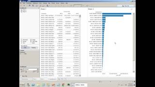
Learn to build a second report in Tableau, create a sales by salesperson bar chart, and combine it with an existing report into an interactive dashboard. The video covers dragging fields to build charts, sorting data, setting up automatic sizing, and publishing the workbook to the DataSelf Analytics web server so team members can view it on any device.
Chapters
This video is about building a new report with data self analytics. Part two. Part one was covered in the video called building a new report. Be sure to watch that first. Now in the part two we will create a second report. We will create a new dashboard. We'll make it interactive, we'll publish it to your web server and then we'll open the dashboard in a web browser or mobile device. So let's check it out. Let's do it. So this is where the video part one stopped. Now I have here sales by customer by year. What I want to do is create a new report showing sales by salesperson and combine both reports together in a dashboard. So let's create a second report. For the second report I come to this button and create a new worksheet. So now I have two sheets and on the new worksheet I want to see sales by salesperson on a chart format. So, so I'm going to see sales. I take sales and I drag it to. If I drag to my rows areas I will see vertical bars. If I drag in my column area, I'll see horizontal bars. So let me do that. So now I see total sales. Now I want to break it down by salesperson. I check salesperson inputting my rows. So now I see buy salesperson, sales represented by bars. Well, let me see this on a descending order. And I can sort this by clicking these buttons. So top salesperson at the top. Okay. And I could keep on creating more sheets if I wanted to, but I want to create a new dashboard in this case. So I click this button instead. And when I create a new dashboard, I'm going to tell the size to be automatic as the starting point. So it will fit whatever the size of my screen. Now I just have to drag and drop when I take sheet one, drag anywhere on my dashboard area. Drag and drop, take the sheet 2 and drag it into quadrants. Left quadrant, top, bottom or right quadrant. There it is. I have both sheets together. Now I'm going to click on this sheet too and select this little icon available in all sheets to make this sheet to be a filter across the whole dashboard. So if I choose let's say a salesperson, it will change the other reports on this dashboard to show only sales related to whatever I chose here. Cool. Now let me rename this dashboard. Going to right click and choose rename and call my first dashboard. Cool. Now I want to share this dashboard with other people. How can I do it? You come to server, you click publish workbook. This workbook is called Book one, I'm going to save into projects. You can have a project for sales, for finances, for purchasing, whatnot. I'm going to choose the sales project and I'm only going to publish my first dashboard, not the other sheets and click publish. There you go. Now it's being published to the web server. Now all users that have access to the data self analytics web server using, let's say a web browser, they can come and enter, go to the URL of the web browser of the web server, enter their credentials and then they'll have to go to the project where I saved. So in this case it's the essay sales. I can search the workbook which was book one or by the name of the view or the dashboard. So I'm going to click views in this case because I called my first. I'm just going to call my first and there it is. It found myfirstdb. I click it and there it is. I can open this on web browser mobile devices. As long as I have the credentials in the URL I can see the information and it's quite interactive, just like it was on the desktop application. All right, now be sure to also watch the video report distribution options. You can find the link below. I hope you found this video informative. Thank you very much.