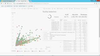
DataSelf shows how Tableau 10.3's tooltip selection feature lets you click items in a tooltip to filter related marks. In a scatter plot of products, customers, and states, you can instantly isolate what drives low profitability and work toward a 40% target.
Questions this video answers
10.3
September 1, 2017
40% (move profitability out of below 40%)
About $50,000 in sales and 5,000 items sold
Chapters
Tooltip Selection with Data Self analytics and Tableau version 10.3. Now there's a new feature that can allow you to easily see how related data is performing. It's very useful. Let's take a look at it. So here's a very simple example of a dashboard showing a scattered chart in a related information. Just to give a little story about this dashboard and how the tooltip selection is valuable. So for every customer, for every product in every territory or shipped territory, there is a dot on this chart. The color of the dart relates to profitability. And then on the right side we have all the details. So every product, every ship to state in every customer we see how much was the sales, the quantity sold and the gross profit. And the idea of this dashboard for this particular client is a real case story. They want to actually move profitability out of the below 40%. So right now let's say this is the largest sales that I have, about $50,000, 5,000 item, that's red. If I put the mouse over, I can see details about this particular data point. That's not new yet. If I click on this particular data point, then I would specifically filter this whole dashboard and on the right I will see the details for this data point. Still nothing new, all regular. Now in 10.3 what I have is if I move the mouse over the tooltip now, I can actually select these different options and filter the whole chart or dashboard for that particular categories. Let's say if I'm looking at this situation and I say, okay, is the profitability low because of this product? Well, if I don't have this new functionality, I have to probably create a different report to see that we have to slice and dice and drill down with the new tooltip selection feature, I just click on the product inside of the tooltip and it will automatically filter the whole chart and dashboard. So right now what I'm seeing is highlighted is all the dots, the data points for that particular product and I can tell the profitability is above 40%. So no, the product is not the culprit of my profitability being low for this data point. Is it because of the state? You click on the state. Now I'm looking at all the data points for this state and the profitability is above 44%. So also it's not a problem with the state per se, is a problem with the customer. I click the customer. Now it shows all data points for this customer. And in this example, yes, the customer is the reason why I'm having a low profitability. And awesome. In a few clicks I was able to figure it out and without this new feature it would take me probably a lot more clicks. Maybe different reports and dashboards and drill down and slice and dice to get to the point. So new tooltip selection. Very powerful to see. How related data is performing. If you want to learn more about it you can use this link which is also available down below on the YouTube recording. Thanks for watching.