Top 10 Business Intelligence Dashboards & Reports for 2021 new
Johnny Giorotti walks through DataSelf's top 10 dashboards for 2021, from Open Sales Orders to Year-over-Year analysis. Each dashboard drills down to invoices, exports to Excel, and responds to plain English queries. The platform deploys in 30 minutes and costs $209 a month.
Chapters
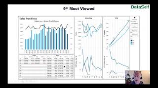
Hello everyone, my name is Johnny Giorotti. I'm Data Sales founder and CEO and I'm a big lizard brain inspired data geek. And today we'll talk about the top 10 business intelligence dashboards and reports for 2021. Where did we find this top 10? Well, we work with hundreds of mid sized organizations and we have looked at the most popular out of the box dashboards from Data Self Advanced Analytics. That's the list of the 10 top most viewed. Let's check them out. Number 10 is an open sales order dashboard. It does have a section showing the details about the open sales orders, but it also shows as a dashboard the total. Here in using a color legend to show how much you have in future future open sales orders, what's supposed to be shipping today and what's late. And then you have the same color legend and the same number representation. But breaking down by customer by product. So very easy to see where opportunities and threats might be. Also this section shows what was supposed to be shipped yesterday, but it didn't. If you haven't shipped something, do something about it, call the client and manage expectations. Number nine, most viewed is a sales dashboard. You pick the period on this drop down and then it shows the bars which are the sales on a monthly basis and how profitability is trending over time. Then you can see monthly if it's growing year over year, the the variances as well as the accumulation on a year to day basis and how it's varying from the prior years. All the information that you see in charts can also be seen on this grid with the numbers in details. Number eight most viewed is AP Aging. This is the first time in my 20 year career that I see the AP Aging making at the top 10 pretty much you can see the top numbers with the total balances and using color legend to show things that are on time or late. You can see by vendor, by the documents, by the due date and all the details. Number seven. Number seven is a sales slicer. It's actually a powerful yet easy to use way to let decision makers to view their data slice and dice it without learning complicated report design. Let me show in practical terms how it works. This is the actual slicer on a web portal and right here I'm seeing by customer sales in four months that I can select. In this filter section let me show how I can create something from scratch. You know I want to see sales by Salesperson in periods 3 and 4. So I unselect periods 1 and 2, press apply and then I change the Slicer from being a customer to be the salesperson. The list of options here can be customized. These are available out of the box, but I chose salesperson and now it's a salesperson report for the past two periods. And what if I want to see to whom the salespeople are selling to? Well, I can drill down by expanding from the salesperson to the next level, which in this case is, is a customer breakdown. So sales by salesperson by customer. What if I want to see the breakdown by product by customer? Well, I drill down to the next level, which right now is showing warehouse. But as you might already know, I just choose a different option and then it changes to show in this case by salesperson, by customer, by product, my sales in that given period. And of course you can change to different metrics. Maybe when a CEO gross profit, you press apply and the report changes. So very powerful and easy ways to slice and dice the data without knowing complicated report design. Number six, a daily flash dashboard. Very important concept. Management wants to be on top of things, important things, you know, treasure opportunities as they happen, not days, weeks or months later. So the daily flash is a way to do that. This is an out of the box dashboard, but it can be customized to show what kind of metrics management cares. And then show widgets focusing on specific areas of the business, showing those metrics in all the details. Of course, popular as well is to use colors to highlight important things. In this example, profitability is fine, shows us black. If profitability is low, highlights in red. So quickly you can see here which dimensions are having issues. And also in all the details. Number five, an AOR aging dashboard. You see the total in AR aging broken down by the aging bucket, where the money is coming from. Using the same color legend, the money distributed by the due date by salesperson by customer in all the details. And quickly you can pinpoint. Here you have two salespeople with quite a bit of, you know, old aging reports, as well as a customer with a lot of these past two invoices. Number four, hot and cold performers. And in this case we're looking customers from a sales standpoint. So you pick the period, last period in this period and then it shows on this section the biggest, in this example, customers by sales. So biggest sales means your hot customers. On this section we have the biggest customers by sales growth since last period. Biggest growth, hot customers. By the same token, you see on the opposite side of things. So these are the customers declining the most since last period. And these customers were buying last period. But not at all this period. And these are the cold performers. Number three, a financials dashboard and very popular. Looking at p and L KPIs usually a highly customized dashboard. In this example here we're looking on the left, revenues as the bars and the gross profit as being the line. And you're looking over time how things are changing. The top section is usually where is more customized. What ratios CFO controllers care out there. You know, revenues, operating expenses, gross profit percentages, ratios of, you know, wages versus revenues and whatnot. And of course looking at P and L and being able to slice and dice it as needed. Number two, the salesperson dashboard. Salesperson dashboard is a way for management as well as salespeople to look at the KPIs of the current period. You select the period, put the goal, you see the total for the company and then a breakdown by salesperson, by customer, by territory, and by products and services. At the same time. You can look at, you know, AR, aging and open source orders because these are the two metrics. Sometimes they can influence your sales. So having a centralized way to look at all the touch points of a customer is critical. And that's usually what the salesperson dashboard is for. And the most popular dashboard is the year over year dashboard. In this case a sales dashboard. You select a period and you select a year in the period and you see the total this year, total last year, the variances and then trend analysis, dark blue this year, light blue last year, and then the total last year this year in variance by customer, the same thing by product or services and by territory. Let's actually look at this dashboard in real life. So here's a dashboard. Very important with these dashboards is the ability to let management interact with their data. For instance, I want to see data in 2021, so I select 2021. And I only want to see sales through the period four because it's where in 21 we are right now. So I'm going to unselect everything and only select the four periods. So this is a year to date comparison. And when I look at these numbers, I might look at this customer and say, oh my God, it's declining so much. What about it? I click on this particular customer and the whole dashboard changes to show only the data related to that particular customer, the totals, the ship to, and what I've been selling to them quite often. When you're doing this kind of analysis, you might want to drill down into the details. I want to see the invoices and why not sure. In this case, you click show details and then at the bottom of the dashboard it will show the transactions all involved with this customer. Very important to allow management to access these reports and dashboards anytime and anywhere using computers, web browsers, mobile devices, and even receive them automatically by email in their inbox. All of these things are important to allow management to be more data driven. The last thing I want to show that is not part of the top 10, but it's very popular as well is natural language query. Natural language query is the ability to build reports from scratch using plain English, just like no search on the Internet where the answer is an actual report from your database. Let's say I want to see sales by salesperson in 2020. You ask a question. The tool uses machine learning and artificial intelligence to give you hits. You select the right one and it will build an instant accurate report right there in front of your eyes. So in this case in 2020, buy salesperson, I see sales in a descending order when I break down by month. Sure. By month. Again, choose the right hit, the tool will give the answer to that question. Maybe I don't want to see line charts. I want to see actually a grid with numbers like Excel. Sure. I choose tax table and now the report looks like an Excel report. And of course with a few clicks I can export this data into Excel if I want to use Excel to do some further manipulation. Very empowering. And that's natural language query. So these are the top 10 most popular reports and dashboards in 2021. I hope you found some inspiration in this presentation and you can build the reporting dashboard from scratch if you want to. But there's some good news. Everything that I showed you today is part of the Data Self Advanced analytics out of the box solution. Pretty much in 30 minutes we can deploy Data Self for your system. We have right now a 21 day free trial so you don't have to invest anything to get started. And if you decide to keep it, if you see value with these reports and dashboards, then starting price is $209 per month. If you're more interested, please contact your SWK account managers to discuss how you can move forward or if you decide to get some inspiration from these reports and dashboards. You can also ask your SWK rep for a copy of this PowerPoint to see what we cover here today. I'm going to be available for the next several minutes for questions and answers. I can also show you how to build new reports and dashboard from scratch in case you want to see how they work in data self. Thanks for your time. I hope you have a wonderful day.










