TPAC / Sage 300 and DataSelf Analytics
Johnny Girardi, founder of DataSelf, presents an analytics platform built for Sage 300 resellers. It offers over 5,000 pre-built reports and dashboards on Tableau, deploys fast, and targets distributors and manufacturers with revenue above $10M. The platform is designed for busy decision-makers who don't have time for technical tools.
Questions this video answers
Johnny Girardi, founder and CEO of DataSelf.
More than 5,000.
Tableau (front-end) and SQL Server BI (infrastructure), plus a proprietary ETL layer.
>$10 million in annual sales, and distribution/manufacturing companies.
Desktop-only perpetual entry: $5,000; web perpetual (five users): $10,000.
Chapters
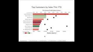
So the main question here is who needs business intelligence and analytics? Well, typically are the people making decisions, the people running the business, managing people, managing processes. Typically these people, they don't have much time to learn complicated reporting tools. And if they're using the traditional tools available in the Sage 300 market, the traditional reporting tools, what they need is someone else to take care of the reporting needs. And sometimes the decision makers, they don't have time, they need information. Now they may be in a meeting, in a call, maybe in a coffee shop meeting, a client. These are the people needing reports. And if you give them a reporting tool that is not designed for them, it doesn't become efficient. They cannot make decisions anytime, anywhere. They're not going to make the most informed decisions and that it's not good. So that's the main problem. People who need BI or the decision makers are not the techies necessarily are not the consultants. And that's what we're going to be talking about here today. This mainly focus around Sage 300 for resellers and hopefully some of you that we've met again at tpac. My name is Johnny Girardi and I'm the Data Cell founder and CEO. So first of all since this is for resellers, I like to set at the very beginning which client. Data self analytics is a must have. And typically there are two main ways to categorize clients that need to have data self analytics. First of all are companies that have more than $10 million in sales overall. These companies are large enough where decision makers, they need to have easy access information anytime, anywhere so they can become more efficient. So all of them, they need better reporting tools, easier reporting tools. Also we have built a very comprehensive out of the box solution with more than 5,000 reports. Dashboards and KPIs in of those out of the box are centered around distribution manufacturing. So any company that is in distribution manufacturing, when they look at the out of the box solution, they feel what's included is way more value than what the cost is. So if you have clients that are fit in any of these two buckets, welcome. I think you're going to like what you're going to see today. If you don't have clients in those two buckets, maybe this is going to be a waste of your time or just informative. But these are the clients where data set analytics is a must have. Overall. The reason that we can be like the Ferrari of analytics in the Sage market is because of this slide here. This is Gartner, Magic Quadrant, Gartner is one of the most reputable companies doing technology assessments for Fortune 2000 companies. And every year they release the assess of BI and analytics platforms. And this is the latest, just about a month old. And make a long story short, what it shows here is that Tableau right now is considered by far the leader when it comes to analytics. And BI is a dashboarding solution that is very successful, the most successful for years in a row. Very easy to use and really designed for business people in their mind. Also Microsoft is one of the leaders mostly when it comes to the BI infrastructure as well as some BI tools. So what about these upper market vendors and what about DataStep Analytics? Well DataStar analytics actually includes Tableau which is the leader. Nothing but the best also includes SQL Server BI as part of the framework. But then if you try to build this solution, you know, an analytics solution using Tableau and Microsoft BI from scratch usually takes several months, even years to come up with something very valuable. What we have done is we have added our own secret sauce, our own ETL tool that eliminates programming from these other tools so it's easier to deploy, easier to maintain and out of the box we have more than 5,000 reports, experts and KPIs like kind of plug and play. So what we deliver is nothing but the best of the breed technology available for Fortune 2000 companies. We make it available for companies who have Sage 300, Sage CRM and so forth. We make it very fast to deploy, usually hours or days. We have been working with upper market BI for our team for over 15 years. So we know Sage 300, we know Sage CRM and other products, we know BI and we know how to work with resellers and end users to make this whole thing very successful. And overall the cost of this solution is really a fraction of the cost if you try to build it yourself. Looking from a total cost of ownership, typically the cost is 4, 5 figures investment. So that's why our solution is so much easier to use and evolve than other options in the mid market. At the end of the day it goes back to who needs bi. And again who needs BI are people who typically don't know or don't have time to learn complicated reporting tools. So the BI must be user centric, not expert centric. If you look at all the tools available in the Sage 300 market, pretty much you need a consultant, someone highly technical that have learned the ACPAC database extensively, have invested ton of hours into learning the reporting tool and this person would be the one always kind of Know slicing and dicing and building new reports for the decision makers. So it's expert centric. Ours actually designed for the business users, on average more than 70% of the custom reporting needs of users. They can do it, they can tweak it, they can slice and dice it anytime, anywhere, using desktop, web and mobile devices. So you are empowering the decision makers with a tool that they can make more informed decisions again, anytime, anywhere. It's user centric, it's not expert centric. Let's see an example of how it works, this user centric functionality. So here I'm showing our main tool for publishers and right now I'm looking at sales information we call the sales connector that will be connected to Sage 300 and any other related sales related data sources. And here you have like, you know, the dimensions which are entities that people want to look at. Data, customer, product invoices, things of that nature. And then at the bottom we have measures, you know, what people want, the numbers that people want to keep track of. This tool, as I mentioned, is designed for business people. So pretty much it's kind of no drag and drop, point and click. People don't need to know complicated stuff. Let me show you an example of how to build three different things. One is I want to build a very detail oriented report showing sales, invoices, customers, products, things of that nature. Very straightforward report. Then I want to build something showing charts, trends over time and also something on a map to see sales by region, let's say. And finally I want to put all this information on a dashboard that could be shared with people using, let's say iPads. I want to show this in the next five, about five minutes and to show how easy it is to build those things from scratch. So suppose I want to see sales so I can drag sales to my report. Right there is my total sales. And then I want to break down by customer. So I go to the customer list and I pick, in this case customer. I just drag and drop. And right there I see for all customers, total sales in my company history. Well, typically I want to see in a time period, you know, years, quarter months, fiscal periods, weeks, days, whatever it is. So let me drag my date to my columns. Right there I see in my columns information broke down by year. I can easily expand from year to the quarter level, or I can expand to the month level. I can go to the day level. Very straightforward, just keep on expanding. I can expand into weeks or fiscal periods. Let me remove here the month level. And in my sample database My last quarter is the third quarter, 2014. Let's assume that I want to see detailed sales information in that quarter. So I want to filter my report by a specific time period. So let me add my date to my filters. And here when you do that, when you're trying to filter by dates, you have a little wizard that is very intuitive, kind of helps decision makers walk through the data discovery journey. I can select years, quarter months, dates, week numbers, so forth. Or use relative date, which is usually very popular. Let me use that option. Relative date is because usually when you're running reports you want to see information comparison to today's date. Let's say this month, this quarter, last quarter or this quarter versus same quarter, last year, this year to date. It's always periods comparing to today's date. Not always, but quite often. So when you use this relative date, you can choose let's say quarters, I want to see this quarter or previous quarter or this year, this month or the last three months. Whatever it is, you just pick and choose and then the report will always remember that you want to see. In this case, let's say the last three quarters which in my sample database actually put the last four quarters. I'm going to get quarter three as 2014. So let me click OK here. So there it is, I got my last four quarters which in my sample database includes the last quarter in my sample database. Okay, and here, you know, I could easily come here later and just pick and choose another time and bucket or different periods. Very easy, very intuitive to change the filters. Now what if in this report I also want to see, let's say more things like invoice number, invoice date and product, you name it, it's all drag and drop. Let's say I go to the invoice dates, I got invoice number, I drag to my report. So now I see for every customer all invoice numbers in that quarter. Well, let's put the invoice date. I can take the date drag to my report and now I have the date. Maybe let's put the date before the invoice number. There it is by date. Some customers with more than one invoice per day, okay, maybe product. Now you name it, you just drag and drop. So building a report like this, as you can tell is a very straightforward procedure. Pretty much any business user that wants to learn how to do this, they can. Maybe some want because they're too busy, they don't want it, whatever they are system to do it. But the point is if they want to do it, they can do this even on a mobile device like a tablet. Very intuitive, very easy, very straightforward. Let me remove product from this report just to make it a little simpler. Okay, now let's make some kind of chart analysis. See sales by month over time. So let's do that. I'm going to drag my sales to my rows. So this is total sales for my whole company history. Let me drag my months to my columns. So now by month I see my sales. We can easily combine any related information. Like right now this would be sales from Sage 300 but we could have number of meetings from let's say Sage CRM or website visitors from let's say Google Analytics. As long as we can relate this information, we can bring it in and combine and it just becomes part of my sales connector. Doesn't matter where it comes from, it's part of my sales information. And now as a business person I drag let's say my website visitors to my rows. So these are website visitors, let's make this like bars. So website visitors and these are sales. Perhaps I put them on a dual axis so I can see let's say if my sales is being affected by my website visitors. And I could come up with some conclusions right there. But again, as you can tell, it's drag and drop. I don't need to be highly technical or specialized to build something like this from scratch and have valuable insights anytime, anywhere. The next report I want to build is showing information by region. I could choose anything that has a region, like ship to bill to region. Here I'm going to use the customer address which is from the bill to I'm choosing the state from the customer address. I'm also going to break down sales by deal size and the sales per se. And now I'm going to click the show me button and choose the mapping capabilities. And when I choose this approach, What it shows is a map where bigger bubbles show bigger sales while stick a little wire here. So bigger bubbles, let's make the bubbles a little bigger. So here bigger bubbles, bigger sales amount. And each bubble is sliced by the the size of my invoices, the accumulation of large invoices, medium and small invoices. And again it just took me a few clicks to build this very informative report that shows me sales by state and by deal size. Now assume that I want to put all of these three reports into a single dashboard, let's say for iPad or tablet users. So now I'm going to create a dashboard and I'm going to tell how big the dashboard is. It could be, let's say for iPad, landscape. And now I just drag and drop my three sheets that I just created. Let's say first the map. That's the map. Then I want to put my trend analysis at the bottom. There it is. And then my detail on this quadrant here. All drag and drop. Very simple, very intuitive. Again, this tool is user centric. It's designed for people that don't have time to learn complicated tools. And they can access this tool anytime, anywhere, access their existing dashboards pre configured, just point and click. Or they can easily take any existing report or dashboard and with a few clicks or touches on their mobile device they can change it, they can slice and dice it, they can export information. So this is really user centric, not expert centric. Yes, we need experts to maintain the server and that's a very sophisticated work. But for clients, for the users, they can actually do a lot of things by themselves. They can make more informed decisions and move on with the business more quickly. So that's the user centric part of our technology. Now as I mentioned, we have more than 5,000 reports, dashboards and KPIs out of the box. And let me show you some of them. First I'm going to show some financial oriented dashboards. Typically most of the people who want financial information from datasoft analytics is not necessarily for the balance sheet in profit losses because typically those things already tackled by sage300 and you cannot be very creative about it. You got to actually be pretty following the rules of balance sheet and profit losses. We can do it. Absolutely we can. But most people want our analytics for financials is to build dashboards around their financials so management can analyze their business more efficiently and with things like this. So here we have a let me make this bigger revenues and projection dashboard. We have revenues by quarter by different cost center revenues in this particular quarter for each one of these cost centers is showing revenues, gross profit and percentage gross profit. Then we go to the month level again for the cost center we have bookings, sales orders, expected revenues. I mean this information may come not only from the financials but also from CRM and other modules. The point is people managing the business, they need to have a pretty comprehensive view of their financials. And this kind of technology goes a long way into giving them this kind of, you know, one place with one version of truth showing financial sales, purchase, whatever they want. Perhaps another way is looking at financial metrics like in this approach, very granular in this Case we're looking weeks, it could be fiscal periods, calendar periods, whatever it is, then looking revenues year over year and customer count, product count, whatever it is, it just becomes part of the financial dashboards. So financial dashboards is typically critical for management, especially for companies with more than $10 million per year. And also distribution, manufacturing in our solution has really a comprehensive out of the box with more than 5,000 reports in KPIs. This one is for sales analysis. Let me make this a little bigger and this I like to know. For distribution, manufacturing or companies who sell to custom customers, recurring customers, we have a lot of reports that are very critical for customer management purposes. This report shows top customers by sales this year to date. We have bars, bigger bars, bigger sales. And we also have the color of the bars showing gross profit and gross profit also using the black dots. So once you understand this dashboard, next time will be easy for people looking at this dashboard. And let's assume that profitability is important for the company to pay attention to the customers who are not doing so well, profitability wise among my top customers and see if there's anything I can do to make them more profitable. So the idea is give the insights quickly so people can go about doing what they're supposed to do, which is make, make more sales or make more efficient their business and so forth. Another kind of report we have out of the box, which typically is also very important, is looking at the tip of the growth curve of your key performance indicators, what's growing in decline the most. And typically those are very important for your business. And this report is a very good example of that. This is showing my top customers by sales change since last year to date. These are growing the most since last year, and this means how much they grew since last year to date. And these are declining the most in sales since last year to date. And maybe there's something wrong with them. And if your company doesn't fix the problem in a timely fashion, they may leap for good. So reports looking at the tip of the growth curve are critical. And we have many out of the box like this. And there are many other dashboards available out of the box for sales commission, or we call also exception reporting or showing transactions that are no longer happening. In this example here we're looking at customers, regular customers who are buying from the company but are no longer buying. And we have four different kind of buckets here, you know, buying the last 60 days, but not in the last 30 days. Other customers were buying the last 180 days, but not in the last 60. Buying the last three years, but not in the last year. Buying the last five years but not in the last two years. Well, I don't know what your business is, but the idea is if you have recurring customers, looking at the ones who are no longer buying is usually critical. And we have many reports tackling that kind of perspective. All right, so this is a little glimpse into the 5000 reports dashboard KPIs. We cover pretty much all main modules from Sage 300. Payables, receivables, financials, inventory order entry, sales, receivables, purchasing, so forth. Project job cost as well. So not only is user centric, but out of the box. There's a ton of reports and KPIs. So what's in it for resellers? Well, first of all, this kind of technology, typically the services around it, you can charge a lot more than what you're charging for your report creation. Now you're no longer creating one report. You're actually maintaining a platform that empowers decision makers with something that they can do the job themselves. So typically the labor associated to this kind of work is usually a lot higher value. We have quite often sold reporting packages and things that would take us a couple of hours and we would charge, let's say 5,000 because otherwise it would cost them 20,000 to build those things. But we can charge only 5. And because we can do efficiently, we can do it only a few hours and make this very profitable from a service standpoint. So it's much more efficient, much more profitable than just selling one report at a time. I'm sorry, they have to fight. Why this report costs so much dollars. It's not about that, it's about the platform. Second is if you start showing, when you're showing new clients how easy they can pull data out of the system, the people who write the check, that's what they want. They want information. They are not going to be doing things in Sage 300. They are managing the business, they are running the business. They need information. And when you show how easily they can get the information, they will be buying more from you. You're going to have a competitive advantage. You need to go back to your existing customers and you upsell data self analytics. What's happened is they're going to become more efficient. Most likely they're going to grow more quickly. They're going to need more sage 300 licenses, more sage CRM licenses and also more analytics license. So you make more license sales because now decision makers can make more Informed decisions, anytime, anywhere, by themselves. And overall, if you give them better information, they're going to be happier. So those are the three main benefits for resellers that engage with data self analytics. From a pricing standpoint, we have perpetual as well as subscription licenses. The entry level pricing for perpetual licenses is $5,000 if you go with a desktop only approach. And if you go to the web, it's $10,000 for five users. So it's not a cheap solution. No, it is not. There is a cost to it. However, there's a big benefit. And it is amazing how easily people lay money. When they see decision makers, the guy who write a check, they'll look at this, they'll look at the benefit of it, they'll see that this cost is usually a drop in the bucket for the value they can get out of it from a turnkey solution standpoint as a reseller. And if you use the subscription pricing, you may be able to sell the whole solution deploying, getting people trained for as low as $5,000 for three users. And depending how many users the system has and all the services, it can go up to $150,000. So the price range ranges typically between those two limits. So what is next? Well, typically, if you find this something that you want to get engaged with, our recommendation is let's get a sale, let's do it together so you can see how quickly how efficiently things work, how happy the client gets, and then if that works well, and you decide, okay, now I want to do it myself, I want to go through training and learning all the steps at that point, once you see the process and we had a success, then you can invest more of your time and your team's time into learning the back end, the front end and everything else. And how can we get a quick sale? Typically, if you have clients in one of those two buckets, clients with revenues over $10 million, or distributors and manufacturers, pick three of them, the ones that you know the most, that are the most active. Let's do a sales process with them, contact them, talk with them, demo them, and most likely in a couple of months, we're going to sell to at least one of them and then we got this one. Usually in a few extra weeks, we'll get it deployed, you'll see how successful it is, and then you can make a decision if you want to make a full investment into learning all the product, the back end, the front end, and start doing it yourself. So if you are interested in moving forward, please contact me. And we'll get the next step going. Alrighty. I hope you have found the session informative. Let's open Questions and Answers. If you have questions and answers, please use the GoToWebinar panel and we'll be addressing questions. So let's see here. All right, question from Janet. How does this solution compare against Sage Intelligence? Janet, thanks for your question. Let me go back here and actually go to my PowerPoint and go to the slide here. So first of all, Sage Intelligence in our perspective is like, you know, is an expert centric technology. It's very good, but still it requires experts to do a lot of the report creation and maintenance. While ours is really user centric. How can we be so user so much easier to use? Well, because we're using nothing but the best available for Fortune 2000. The client tool we use is an OEM with Tableau, which right now in the upper market is considered the leader. The best company doing is easy to use analytics solution, nothing but the best. If you'd be looking how Sage Intelligence compares in this quadrant, it would be probably in the left bottom corner somewhere right here. So it is a good solution. It is mid market. It's better than let's say Crystal or Excel alone. Definitely it is, but it's still expert. Centric is not user centric like Tableau, which is what we have in the front end. Janet, thanks for your question. I hope I have answered more questions. Let's see here from Brian, what ACPAC versions are supported. Brian, thanks for your question. Actually, let me put my website here and if you go to dataself.com and click analytics by product, then we go to sage300 or any of the other products. Then here at the top we tell what products we support and pretty much we support older versions like in this case version 1.0. All to the latest. We're always supporting to the latest, so usually cover 10, 15 years worth of versions from source systems by the way. Also, if you want to see the software architecture data self in our website, you can come to solutions and click Software Architecture. And this is the architecture. So on the far left we have the data sources, you know, Sage 300, CRM, Google Analytics, whatever it is, then the data is copied over to an ultralight data warehouse which is based on SQL Server and we use our ETL to eliminate programming from the data warehouse maintenance. Then the data is optimized for reporting here and then we add the web server which is powered by Tableau. And then at the end of the day people will be able to access information through desktop, web and mobile devices anytime, anywhere, and be able to change things easily and quickly as needed. Brian, thanks for the question. Let's see if we have more questions. Looks like there were the questions, so those are the questions. Let me just go to the final slide here. I really appreciate your time today. If you want to contact me to discuss anything about this, or if you want to learn more about analytics and how we compare with other solutions, I'll be glad to talk with you, exchange emails. You have my cell phone here, my email address, and my Twitter account. I hope you have a happy Thursday. Have a great day and I look forward to talking with you again. Thank you.










