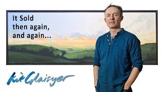
In this video blog, artist Kit Glaisyer walks through his process of painting a wave for his new series. He begins by outlining the composition—foreground surf, the bowl of the wave, and the crown—while emphasizing the goal of achieving transparent water with light shining through. He then demonstrates his iterative color‑mixing workflow, starting with a pale green and adjusting with yellow, white, and blue hints until the hue feels right, noting that he works without reference photographs and relies on intuition. Glaisyer applies the chosen color in a large area, layers lighter washes, and blends to soften transitions between dark and light zones. He critiques the brightness in the middle, adjusts the transparency of upper waves, and fine‑tunes gradations to enhance depth, movement, and the overall sense of light. Throughout, he explains how each decision is guided by feeling, tonal balance, and the interaction of colors across the painting.
Chapters
Okay, I've been working on one of my new wave series. And you can kind of see some of the work that's going into it. So in the foreground is this kind of surf, this movement. Then in the middle, this is sort of the bowl of the wave. And the top, the crown of the wave coming over. I've also got this element of sort of transparency in the water with the light shining through. And that really is what I want to work a bit on now. So I'm just going to be doing a bit of that. and then I'll film where I go. Okay, I'm back. I'm just mixing up some color here. So I've just got this pale green here, and as you can see, I'm just applying it a bit here. Now you can see immediately, it's actually slightly the wrong tone. I think it needs to be a bit more yellow, so I'll mix up a bit more now. Okay, so back to the palette. Now I've mixed up a little bit more white, a little bit more yellow. So again, onto here. Immediately you can see it's a bit paler, a little bit nicer. Trying some of that. And then coming back to see how it fits. And again, it's not quite right. So I basically just keep doing this. Back to here, so then I'll be adding a bit more white, a bit more yellow. And you just gradually basically feel your way into the color that feels right. You'll notice here that I don't actually have any reference photographs of this. I don't really need them. It's far more of a feeling thing. Okay, so I've been mixing a bit more now. I've ended up with this one here. Often when I'm mixing paint, you'll start with the main area. And then you might create another pool of paint which maybe is a bit more different hue. So I've actually gone up here now. I've brought in a bit more blue. And then basically the blue went a little bit paler. So I'm talking about green here, but a blue hint of green. And then I brought in some more white and then a touch of yellow. And now on my painting you can see It's beginning to approach the right feeling. So of course it's how this color relates to the colors below really, that's the thing, to get that feeling of if the water is transparent, what hue and tone would it be. So now that I've found something that I'm quite happy with, I'll do a large area and see how it looks. and then I'll be blending it. Okay, so I've been doing some of that, and now you can see for most of the painting I've added this lighter layer, and then the next thing basically is to blend it in. So that's what I'll do now. OK, so now I've been doing some blending. You can see the transition is now a lot softer between the dark and the light. Obviously it's a little bit too bright here right in the middle, which is where I started it. I'm going to have to tone that down and also work on these upper waves, which should probably be even more transparent. But you can see that the general wave now is looking a lot better. Okay, here we are now. So I've been working on it a little bit more. Obviously there's still more to do, but you can see that basically there's definitely a sense of more light. Coming through the water now. And it's really a matter of working out which bit pleased me the most and extending that. So for instance, to the left here it's a sort of darker element. In the middle it's kind of lighter. And I think I prefer that, so I will probably lighten this end a bit more. And also around here. And then just things like the strength of the gradation. And you are always making these choices basically about how it feels basically, whether it's light enough, dark enough, whether it has a sense of depth and movement or whatever. Of course the other thing is I'm painting all this