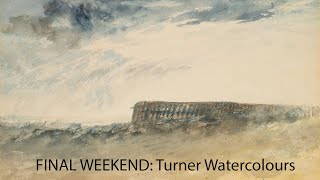
In this on‑site commentary, the speaker walks through the Turner exhibition at the Holburne Museum, offering a vivid, personal reaction to a series of J.M.W. Turner watercolours. The monologue highlights Turner’s expressive mark‑making, the strategic use of white paper and minimalism, atmospheric treatment of sky, sea and horizon, colour gradations and palette choices, and narrative details such as boats, shells, and distant landscapes. The speaker repeatedly notes the emotional impact of each work, comparing pieces, noting size, and observing technical aspects like scratching, washes, and layered tones, while expressing enthusiasm for the evolving experience of revisiting the exhibition.
Chapters
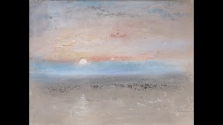
Well, it's the final few days of the, um, Turner exhibition at the Holburne Museum, and, um, I'm back for my third or fourth viewing. Don't know why this isn't focusing. And it just keeps getting better every time. Look at these marks, so expressive. 1845. Look how much white paper is left as well. Some of them like this, just completely, completely minimal. Look at the sea in this one. Look at this mark making here, just spontaneous. Again, look at the empty sky and then just these marks. Boat, quite rudimentary but very expressive. That blue band of sky. Just noticed this one here. The sea is just blank paper and the sky is blue, and then the beach is like a pink Yeah, the beach is plain paper, white paper. And then of course this one here. Crikey, what can you say? Look at these marks. That's fabulous. They called you differently on different days. Let's just admire this triptych here. Actually, I like that one, but I love this one here. This is tiny, it's about 6 inches long. Rainstorms, the dark horizon. And this one below is just fabulous with the— look at these waves on the pier. And then again, that dark horizon, glowing clouds. This one here is great. He's obviously mimicking the clouds. Probably not blue in real life, but doesn't matter, it's a painting. And then this one here, the pier. I love this little touch of the distant horizon over there, having these wonderful Choppy seas, the rain. This is a really sweet little one. Just the sun breaking out from behind this, um, dark cloud. Some people in the foreground. And then this pair of paintings, it's really lovely. Don't know whether it's like a gray paper or a wash. This is the one with this, um, shadow across it. But obviously you can play with the tones here, the light and the dark. And this one here, what a painting! Look at these shells, look at those waves. Chopping and churning. Absolutely wonderful. Then a very minimal one here, just glowing. And then the European paintings is, uh, more worked up. These subtleties, something scratched back into the paper here. Beautiful. This is interesting in terms of these gradations of the layers. It's a dark foreground, then a light middle ground, dark for distance. He used to do these drawings. See the pencil work here. And there's just a very simple wash on it. And again, this— these lovely, lovely loosely painted skies. Degradation of this mountain range, the light behind it, silhouette of the tree in this middle ground, the shapes of these mountains here came down to the water. Look at this again, scratched into the paper here, quite heavily worked. I don't like this one. Wonderful. Okay, look at these gradations of color.