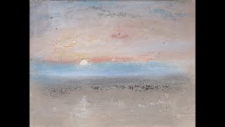
In this segment of the YouTube series, the speaker conducts a close‑up visual commentary on a selection of watercolor works by J. M. W. Turner and his contemporaries (including Henry Edridge, John Crow, and an unnamed Copman). The narration moves through several paintings, highlighting subtle colour juxtapositions (blue‑red interplay, delicate sky tones), the handling of light and its removal or rubbing effects, and the rendering of atmospheric elements such as mist and waves. The speaker repeatedly points out the artists’ control of tonal contrast—dark‑light‑mid‑tone layering—to model form, depth, and shadow, especially in architectural details like brickwork, fences, and urban perspectives. Composition is examined through rhythm (the path echoing tree bark), positive‑negative space balance, and the placement of figures and landscape elements. Throughout, the tone is analytical and appreciative, emphasizing the technical mastery and expressive subtlety of the works.
Chapters
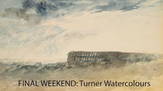
Of course, yes. But it's a very, very subtle piece. Look at this color, blue and reds. 2 more very subtle words. Look at that. He's never moved. His attitude is about expression. There's waves, crazy waves. It looks like it's like a pier here. It's almost like cliffs, but I think— I don't know, are they cliffs? They are incredible. A very subtle piece. So here's kind of a couple of more turns here. Still very, very subtle. A little bit less expressive. This is his earlier work. And back to his late works. Look at this. It's almost like a giant— look at that light. How do you paint that? Looks like it's been removed, rubbed off. This one here, again, this is like a more It would be nice to put out some of these details with some highlights. So she lost her evening. You miss her first. Look at this, these little tiny details. Boat, the weight, or the shim line, uh, what you call it, fishing line. See one right there, the mist blowing. That color tone of blue sky, that hill, and the subtle hills leading up to the mountain. Sky is a nice person. Look at that scratched away there to make the light on that mountain. That turn around there, couple little figures, and then the shadows in this. The light is going down that hill and then that further hill in light, and then the lake lit up. Wonderful, wonderful composition. Another Copman. And this one here, which was obviously accidentally left in the shadow for a while. Henry Edridge. And here's some, uh, little urban pieces I did here. So you get into the details of the brickwork. Very good drawing here. Look at that, extremely good perspective. Maybe the shapes in the foreground Beautiful fence and the whole composition, absolutely perfect. Here's a John Crow. He's probably faded in time, I'd say. Shame. If you could, uh, put it through Photoshop and look at these This beautiful tonal contrast here, purely applied tones, all tonal contrast. Look at that shadow on the front of the fence and then the darker things behind, and then paint it in front. Dark light, dark light, mid-tone, dark light, dark light, mid-tone. And then this very stylized tree, again very character, extremely well drawn. And again, look at this length of space, positive space. All built out of tonal contrast. Wonderful, wonderful control of tone here. And then it continues into the foreground. Look at the rhythm, the rhythm of that path. The rhythm of the path actually echoes the rhythm of the tree in the bark. Wonderful painting.