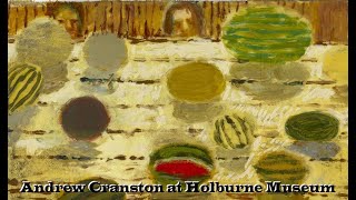
The transcript captures a conversational walkthrough of the "Iconic: Portraiture from Francis Bacon to Andy Warhol" exhibition at the Holborn Museum. Speakers A and B discuss specific artworks—including a Peter Blake piece and a large Andy Warhol canvas—while detailing practical curatorial decisions about placement, lighting, and display materials. They explain the challenges of using museum‑grade acrylic or glass, how reflective surfaces affect visibility, and the compromises made with edge lighting and label positioning. The dialogue also covers installation logistics such as raised barriers, resin supports, and the need to keep visual lines clear for visitors. Throughout, the tone remains informal and descriptive, offering insight into the behind‑the‑scenes considerations that shape the visitor experience.
Over here, the Holborn Museum.
Really interesting exhibition.
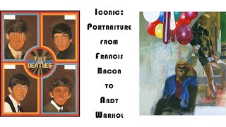
It's a Peter Blake.
Doesn't look very happy. That, because there's no point sticking a pair of case to here if you want to use that, because they're going to go straight down the drain. Um, and it may look really aesthetic if you think it's not going to work. Same thing to say with, um, shampoo and conditioner, the wash and dry. Um, when you put your case in, think about removing all the plastic as well, because you can do really neat things on the plastic as on the boards of the place, no one's going to read it. You want it kind of at eye level, and sometimes you need to talk away from music. Go on this way, I'll show you, um, we've got some, um, electric works. So it's really lovely what we've got in each of our handout pieces of the show. So we have, play your best guessing table, and we have this really lovely picture of, um, May West, James Temple, and, uh, Joseph Fields— sorry, here. Now with these, placement-wise, this works because you don't really need it in the corner. You've got your light on that side, you don't really see it right in the center. I think people probably use it that way around here. So when you've got an object like this, it's going to be as close— placement of it in terms of where it can be seen, really important in the way that the video looks like. This is where I came, but I particularly like these riches. It was a commission.
Maybe that's why. There's a great Warhol here, 6-foot square canvas.
So this is my best guess at the cross. It looks like this, it has to be made of that if it's got a flat deck of purple paint. So the right-hand screen is in galleries, we use museum-grade acrylic or museum-grade glass. That means it's very reflective and through the mirror you can see the image behind it.
So it's cool that it's 1962, but the actual he painted it several years later reminiscing about the Beatles who he knew.
Tear those labels and then these words on the side of it, how would you make it not be blinding for that? So the compromise we came to in the end was just to kind of gently light the edge, and then that way you've not got a bright light on that, that kind of makes itself, and that makes this text a lot clearer and another light source. That's one thing you can think about. Various. So we go for mainly the raised barriers just because of the look of them, but we do think about what colour appropriate these are. So we're growing quite rapidly here, and so we did spend a good hour last Saturday trying to navigate this and see what would look best. And we had to make a decision at the end of the day to be— I don't think you can see it, but they're not really visible —keep up with the public walking towards the end of the trip. One end will have that view, so they can get a bit of work. So you've got this white line, still presumably, you know, the vision line, nice work. Basically, sound doesn't need to be embarrassed. And then coming around the edge of the wall as well, there's some— I don't know if you can see the bottom of the resin support on the metal gate wall. Second. Interesting one, isn't it?
This one. Yeah, it's nice. It's, um, we've got another baking I think it is Warhol.