Matt Ragland walks through making a custom font from your handwriting using Calligraphr and Procreate. Download the template, draw 75 characters, upload to Calligraphr to adjust spacing and baseline, then install the TTF file on your Mac to use in Keynote, Pages, or any text app.
Chapters
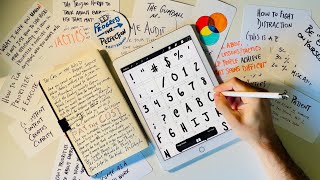
Created my own custom handwriting font, and a lot of people loved it on social media, so I want to show you how I did it. It's way easier than I thought. You can actually just do it with pen and paper, but I used an app called Procreate to make sure that the drawing itself was really dialed in and already digitized. But you can just do it with pen and paper. Let me show you how it's done. I used a tool called Calligraphr, or a website called Calligraphr. It's not spelled exactly like that, it's missing an E right here, as you can see, but super simple, easy, and free to do what I did and what I'm going to show you here. And so all you need to do is create a template and print it out. What I did was I downloaded the image that they give you, and instead of printing it out, I saved it as an image, and then I opened that image in an app called Procreate on my iPad and used an Apple Pencil to draw the characters and symbols directly onto the iPad, onto the image, and then put that back into Calligrapher but you can also print this out. There is a limit of 75 characters per font. So that still gives you every single numeral, all of the upper and lowercase characters. The thing that you'll have to make a couple of decisions on, which I did here, is— and also core punctuation— that leaves you with, I don't know, like maybe a dozen others to play with. And so I added in quotation marks, money sign percentage, you know, of course we want apostrophe, and then the symbol is if you want to add in arbitrary characters. So let's say I wanted to add in brackets, then I could do that, and the bracket would— okay, so this is where it says there are currently 76 characters, free version only supports 75. So I could have like, let's say say gotten rid of semicolon, but let's say instead I wanted to add the plus symbol. Okay, no, it's right there. All right, whatever. So there it is. There's the plus instead of the semicolon. All right, now you're going to download the template and you could just do this either PDF or PNG. If you're using it in a tool like Procreate, if you have an iPad and you have some kind of stylus, recommend the Apple Pencil. This is what I would do, a PNG instead of PDF. And then you just download it. This sheet that again you can print or add to something like Procreate, you can see that all of the characters are up here. So here's uppercase and here's all the lowercase. Your symbols are here, your numbers are here. So again, put it into Procreate or just use— I would definitely recommend using a thicker pen. So a Pilot G2, like 0.7, 1, you know, 1.0. Kind of strength. I don't know if that's the right, the right term. I'm a pen guy, but not that kind of pen guy. Or like a marker, a Sharpie would be too much, a permanent marker would be too fat, but don't use like a 0.5, like make it as thick as you want. That's hard to say. Anyway, so you're going to fill that out. And then whether you take a picture and scan it and then upload it back into Calligraphr, or if you're using Procreate like me, then you end up getting something like this. You see what I'm talking about? Like these are pretty chunky. So maybe it is kinda, kinda, sorta, it's easy to do like a chunkier type of writing for the uppercase, but you end up doing all of this, okay? And there's 2 sheets because there are a lot of characters, but you take this and you then come back into Calligraphr and you're gonna go to My Fonts. Then you're just gonna upload the template. Now again, I've already done this. I'm not gonna do this again. But you're going to take that image or that picture, whatever you did to get it here, and upload. And this is what you'll see. The couple of things that I had to go back and do is that it will give you like secondary characters. I don't— I didn't really like using these. So yeah, here's, here's this. I always like— for some, it'll give you some variants. So I actually would click through and make sure that if there are variants, you, you are sure to set the default to the one that you like. Okay, now you can make some adjustments in here. Like, for example, my E was really small. Okay, it was just like when I looked at it at first, it just wasn't, wasn't what I wanted it to be. So you can come in here and adjust the baseline or the size, and it'll show you. So these are all— yeah, I'd want to get it to where it's compared against other lowercase. And you can like, you know, Drop down the base, drop the base a little bit, the baseline, if you will, and adjust the size a little bit if you want. Okay. So I would click through each of these and just make sure that it's hitting kind of the baseline, the kerning. It's not the proper use of kerning, but it's always fun to throw a good like kerning reference in even if you don't know what it means. Now you're going to go to Build Font, Font Name, Build, and then it will give you— I'm not going to do it again. But it'll give you a TTF file, which is on a Mac what you want to use. All right, we're going full shared screen now, baby. And the last thing you're going to do— so this came into my downloads. Shout out to Sparkle, by the way, by the Everyteam. Amazing for organizing files. I could say more about it, but that's not what this video is about. Let's see. Now we're going to come in and here it is right here. Matt Handwriting Regular TTF. And what I'm going to do is open up the Font Book here on the Mac. And I can, I mean, really, all I need to do here is just take this. Now I've already done it. I could just drop, literally, you can see like the little green plus, I could just drop it in. I'm not going to do that. I may have messed something up. But yes, now it's there. Again, whatever. But now it's in my font right here. Now if I click into it, I can see everything. And if you need to, if you notice that something isn't, isn't off, I had to do this a couple of times, like, ah, that variant, that dang variant is just not what I want it to be. Or that's where I first saw that E is really tiny and like spacing, the line height is off. So it's not uncommon that you might have to come back in here and you just like redo it again. So adjust the line height, adjust the spacing, whatever you need to, and then just repeat this, build the font again. I would go in if you do that and make sure like the old font, I would just drag this into the trash. So there's no risk of like duplication. But then what you can do, super cool. Let's come into Keynote. Let's say I was building, building a presentation. I haven't tried to figure out if I even can like add this to Google Docs or like Canva or anything like that. But this will work on Pages, this will work on Keynote, this will work. It doesn't work in Notes, but it'll work in TextEdit when I I shared like a little screencast of typing before that was just in TextEdit. So basically any, anything where the Font Book is installed. So let's come back here. So this is one that I showed the other day, but now all I have to do, you know, text, there it is. Let's say this is going to be a title style. But if I go all the way up, Matt handwriting shows up right there in little pre, I mean, Super cool, super fun. I could just say, 'By Matt Ragland.' There we go. You can do like everything else in this. If you want a drop shadow, really, there we go. Now, now we're popping. Anything like that, then like all those things now apply. You have this font for yourself. It's super cool. And another thing that I'm excited about, again, using it with is by doing some, like just like those screenshot note posts, you can do this now with your own handwriting. And so it would be, you know, new, add handwriting, there it is. Let's bump up. Let's go. There you go. So you can see all those things. You know, 1, 2, 3, 4, 5, 6, 7, 8, 9, can't even type numbers. Amazing. Okay, that's all you do. If you have any questions, yeah, comment, share, DM me, check out Calligraphr. It's really cool. And let me, let me see what kind of fonts you create.