Climate variability: Understanding the trends and impacts on crop production - David Stephens
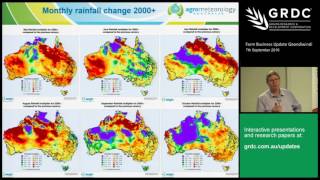
David Stephens shows that Australia's climate shifted around 2000 to drier, warmer winters and wetter summers. Wheat yields fell in the south while sorghum gained in summer regions. He maps the temperature and rainfall changes, then traces how heat stress at flowering and low water efficiency are reshaping what farmers can grow.
Chapters
Well, I'd like to thank the GRDC panel for inviting me up here to speak. This is my first time to Goondiwindi, so it's a good thing for me to see the North Eastern wheat belt. I'd also like to acknowledge a lot of this work was done in the Australian Export Grain Innovation Centre, which is half funded by the state government in Western Australia and half funded by the grdc. Okay, my talk today is going to focus on climate change and climate variability. I want to start with my key message up front, that at the beginning of the century, beginning of the 2000s, we moved to a new climate system and really we need to manage for that new climate that we've experienced since 2000. So I'd like to show what changes have occurred since 2000, why I think that is a shift in the system and then thirdly, what is the impact on crop production and yields for summer and winter crops. So let's move into the talk then. Climate change, we hear about it all the time. It's all been presented in a very sensational way. It's getting hotter, drier. We're getting more bushfires, dust storms, you know, erosion and all those sorts of things. Is that real? Is climate change like that? Then we get the other sort of signal. We get floods and more intense cyclones. Cyclone Yazi, Queensland floods in 2010, recent sea level rise impacting our cities. Is it like that? Is it that dramatic? What is actually happening? Well, I'd like to really focus in on the data in rainfall particular and then look at what has changed. Is there climate change occurring? If we look at first rainfall, and this is just a simple map from the Bureau of Meteorology's website showing the trend in rainfall since the 1960s. You can see that a lot of Australia has actually been getting wetter, particularly in the north west of Australia, it's been increasing rainfall 40 to 50 millimeters per decade. The rainfall's been going up like that. Conversely, in the southwest of Australia, it's been going down southern Victoria and southeastern Queensland. You're getting a steep decrease in rainfall. And so that's showing and really suggesting to us that the winter systems that are coming through here are weakening and moving south. The systems that rely on rain coming off the northwest, the warmer water off to the north of Australia is also occurring. And that's impacting and coming down into this region in south eastern Australia. So let's compare rainfall there at Wyndham in the north, where the extreme wet change is occurring, and compare it with rainfall at Cape Leeuwin in the southwest, a very winter dominant rainfall system. If you compare those two annual rainfall time series in time, what you see, Cape Leeuwin in the southwest used to be consistently wetter than Wyndham. There was about 16 cases where it was the other way around. But at the turning point, what I think is 2000. Every year since 2000 has been wetter at Wyndham. So there's been a change, a sort of a shift that's occurred there at 2000. So what does that mean in terms of rainfall and drivers of that? Well, if you look at the drivers of weather, there are three drivers. If you do meteorology 101, one is energy from the sun, which varies very slowly over a thousand year period in terms of its output. Two, the spin of the earth, which is very consistently spinning. And the third thing that drives the weather pattern is your temperature gradient between the equator and the pole. And that gradient drives the strength of your westerly winds and the upper levels over us through the year. And at the turn of the century, there was a drop of about a degree and a half from about 53, 54 degrees between the equator and the South Pole now to a new mean down here in the 2000s. So for me, I tend to think as a meteorologist, something shifted there which lines up with the shift in rainfall that we've seen. So let's compare now the rainfall for the two different seasons since 2000. And what we see is that the winter rainfall, May to October rainfall, has decreased across most of southern Australia. And in this region here it's decreased 10 to 30% and more inland, where they've just had some heavy rains recently. Conversely, in November to April, you can see the rainfalls increase from 0 to 30% over much of the inland cropping areas. Not so much on the Darling Downs, but still an increase in summer rain. So we've got these two different signals. So how does that look? If we compare it on a longer time series, we've got the longest rainfall data set that we've got and we add up and weight the rainfall across New South Wales to the south of here, you get a similar map for Queensland, but if we do it for New South Wales, the summer rainfall's in light blue. You can see the time series ticking along and what you notice is that there's this long term gradual increase in the summer rainfall and the mean since 2000 is 287 millimetres. The winter rainfall varies quite a bit more. We had a dry period in the 40s, but it was steadily about 240 millimeters. And then at 2000 we had this divergence between the summer and the winter rain. And so the winter rains decreased 39 mils, averaged over New South Wales, a 16% decrease. And you've got an 18 mil increase in summer rain. So there's a divergence between those winter and summer rainfalls. The other thing, of course, is extreme droughts. Are the droughts getting worse? What's driving those droughts? Well, for the winter growing season, the worst droughts are highlighted here with the red dots. And all of those years were El Nino years. So El Nino is still occurring. And every 10 to 20 years or less you get severe El Nino drought. But we haven't had one now since 2006. So this is just a time series, giving you a bit of a feel for the longer term record and this sort of change that we've seen since 2000. So if we look at the rainfall through the year now, spread on a fortnightly basis from January to December, I'm splitting the months in two to look at the fortnight changes. And I show the original average rainfall at Glamorgan, which is north of here. What we can see is that the historical data from 1910 to 1999 shows a classic summer rainfall climate. You've got more rain in summer in blue January, February, March, decreasing down to a minima in winter, moving up again to your wetter rainfall in November, December. Since 2000, the rainfalls increased in that early summer rain particularly. So in the November, early December period, there's been a big jump in rainfall. Similarly, at the end of summer, in late beginning of February and in March, there's been more end of summer rain. But the big decrease has actually been in the winter growing season, particularly between April, June, July and parts of September. So this winter season has decreased its rainfall, the summer has increased and that should have implications because your winter system now is going to rely more on soil moisture coming through from that summer season. Also, you've got to think about summer crops. If you're getting more rain here, then why concentrate on just getting moisture through which evaporates through the summer? Why not consider using that to produce crop production? So this is something I want to get you guys to think about for this region and your rotations. If we go further away to other stations, just to give you a bit of a feel for. Is this just a one off station effect? We see a consistent pattern, Dalby, you've got the same increase in that early summer, late summer rain, big decrease in the April, May seeding period and in these critical crop development periods in July through to September. Similarly in Inverel you've got a big increase in that early summer rain decrease through that early early winter rain, not so much of a change early in the year. So you see this consistent pattern occurring across this northeastern Australian region. So let's have a look at that month by month across Australia. I'm showing here the percentage change in rainfall or a ratio of the rainfall received month by month since 2000 and using Red and brown as a low ratio. So, so the rainfall's been dry if it's red and brown, if it's blue or green, it's been getting wetter for that month. So here I've got the winter growing season. So starting in May we can see the May rainfall's decreased, June's decreased or increased to the north. July's particularly dropped off in the northern part of Queensland cropping area. August the rainfall's patchy but decreased particularly in the south. September's decreased but increased in the north and October's generally decreased. So you can see for most of those winter months you're getting a decrease in rain. But you'll notice inland in the desert country the rain is actually increasing consistently. So the rain that isn't coming down from the northwest in our winter system is actually drifting down into the middle of the country with these cut off flows and summer type systems. If we move now to the summer season, you can see the reverse colour pattern starting to show itself, particularly through the center of the country. But in this region here, much wetter. November, December, January's a bit drier, so there's a bit of variability in that rainfall pattern. February's increased to the south much more. March rains increased. April, which you want to really start planting early with your wheat, unfortunately it's dropped off. So this is this change that we've seen since this 2000 period and it really is a reflection of two different seasons. So why has the summer rain increased and the winter rain decreased? Is there any physical reason why we would expect to see the those changes or is this just a normal decadal variability? I mean, is there reasons for this? Well, the first thing we look at is ocean temperatures. Because ocean temperatures, oceans are the regions where all the moisture comes from. So any rain that you get here is coming off an ocean somewhere. And particularly here it's coming from regions north and northwest of us. So if you correlate rainfall for eastern Australia in May to October with ocean temperatures around the world in Indo Pacific region What you find is that there's a positive correlation with ocean temperatures to this region to the northeast of us. This means if it's warm water there, it's wetter in our growing season in winter. Conversely, if it's colder down here, it's wetter there. So what that's saying is if you want a wet year, you would prefer to see warmer water here and colder water there. You also want to see colder water out here. And who can tell me what that is? What's colder water out in that region? La Nina. La Nina. Okay, you got it. So a La Nina type pattern is related to wetter rainfall. But also you can see this difference in temperature anomaly across the Indian Ocean. That's the Indian Ocean dipole. At the moment we've got a La Nina and we have a negative Indian Ocean dipole. We can see that in the next chart map over here. On the 1st of September, the sea surface temperature anomalies, anomalies where it's warmer or cooler than the long term average shows a beginnings of a La Nina. It's trying to get going in the Pacific. It's sort of faltering at the moment. But the critical thing is that all this region to the north and east of Australia is much warmer than normal. Also we have colder than water normal down here. So this is an enhanced sea surface temperature gradient going from cold to warm. So cloud band after cloud band after cloud band and moving down into this region. So we are in a classic wet pattern. And so that's just a background understanding for what drives our winter rain. So what's actually happened with sea surface temperature trends? What are the ocean temperature Trends doing since 1970? Well, this is a map, two maps from the Bureau of Meteorology's website. Basically the first map is the change in sea surface temperatures since 1970. And what we see with red is warming and blue is cooling. And what we see is the much warmer increase in sea surface temperatures to the west of Perth and less of a warming further north. So that gradient has actually slackened off. It's actually worked in towards a dry pattern where it's warmer there, not as warm there. So this reduced sea surface temperature gradient has contributed to less rain coming down in our winter season. Conversely in summer, we can see that the warming has occurred generally all around the country. And in summer there's generally a positive relationship with ocean temperatures off the coast and rainfall inland. So basically that's favorable for summer rain. More water evaporating off that warm water, more instability in the atmosphere, favorable for Cyclonic development, upper level troughs, thunderstorms. So it's all good for your summer rain. So we see these two different signals occurring in the ocean temperatures. The second driver of weather is whether your barometric pressure is stable, the air is sinking or is it unstable, is it rising, low pressure or high pressure? Rainfall drives on those two things. So what's the pressure doing? So this is the change in pressure across the world from 2000 to 2015 minus the long term average. So is the pressure getting higher then? I show it in yellow, red. If it's getting lower, I'm showing it in blue and purple. And in May to June, July, which is our winter season, we see that the high pressures are strengthening through the mid latitudes, through our region, particularly off to the southwest of Wa where the Indian Ocean trough used to lift up and bring that westerly cold frontal systems. So see the same in the northern hemisphere. You can also see the much lower pressures down here. And what that's suggesting is that the circumpolar vortex, cold rotating mass of air around Antarctica has strengthened and contracted south. And so the cold fronts are stronger, but they're further south and that's a negative pattern for our rainfall. If we move to our summer season, you get the same general pattern, although the high pressure belts in summer move south of the continent in summer, but where they have positioned themselves, they're stronger than normal. But to the north of Australia, where the monsoon low is developing, that low is strengthening just off our coast. So that's very favourable to drawing in moist air off that warm Indian Ocean into our northern rain systems. And those systems feed down into this region as well. So you see a different anomaly pattern in terms of pressure. Pressure is falling here, the rain's increasing here, the pressure's rising and the rain is decreasing. So this to me are the two drivers of this shift that we've seen since that 2000 period. What's that done in terms of yields? Now I'm showing here wheat yields as a variability and what I'm doing is I'm running a crop model, taking out the trend in yields and looking at the real variability in time. I'm running a calculation on a 15 year running running interval. And what it shows is that for different parts of the country the variability shifted at 2000. Now, traditionally the highest variability in wheat yields was in Queensland. So Queensland had a very high variability in time. And then at about 2000 it dropped and move to a lower variability. Whereas further south in southeastern Australia, New South Wales, Victoria and South Australia the variability was lower, but it jumped and moved to a new maxima. Similarly, in Western Australia, where the variability was very low, it jumped two to three fold in its standard deviation. So this to me is another shift that the variability has increased in southern Australia and it's decreased in Queensland in terms of wheat yields. Let's have a look at that spatially. This is the map of wheat yield variability from in the 80s and 90s. And you can see the highest variability in red and orange was across the border here in Queensland. Move across the border, becomes more stable, becomes very stable in southern New South Wales, Victoria and South Australia, and particularly wa. However, if we move forward to the more recent period that we could get yield data, you can see the variability has jumped in this southeastern Australian region. So the orange and red colour is now down in the southeast. Conversely, the blues and greens and purples are actually occurring in Queensland. And what's happened is that the major droughts haven't impacted Queensland as much as they have further south. So the variation has been more average to below average types of yields. But that has been a shift that's actually occurred. What does that mean in terms of yield trends? That is what's our productivity increases? How much are our yields going up in time in terms of kilograms per hectare per year? Well, this is a model output from our STING crop model and what it shows is the very large increase in yields of about 30-70 kg per hectare over much of New South Wales, hot wetter areas of South Australia and much of Western Australia in the 80s and 90s. So wheat yields just steadily rose as we moved to a high yield package early sowing better varieties, more nitrogen. That whole high yield package really worked at that time. You can see that the yield trends are much lower in Queensland with that higher variability. Farmers are more cautious, more conservative, didn't apply as much n and so on. So you can see this marked difference across the border here and much higher trends in this region where they really started to switch to sorghum in rotation with wheat and the benefits of less disease and the carry through of nitrogen into those crops. So there was a real big change across the border there. Now, when we move forward in that time in the yield trends and move to the more recent period, you can see the yield trends have really dropped off in New South Wales, where they used to be much higher, and they've picked up a bit in Queensland. So there's a big change point. But generally the trends aren't as high over much of Australia, particularly southern Australia, since that 2000 sort of breakpoint. So this changing climate is directly impacting crop yields and crop yield variability. So you can see here, this is just another calculation of the yield trends as a running 20 year interval. With a crop model, I'm calculating the real trend in time and updating it year by year. And you can see that the yield trends for Western Australia peaked at the end of 2000. For southeastern Australia, they peaked at 2001. And then we started getting the drought years 2000 20607. And so the yield trends and productivity really dropped off and have only now started to rise with some better years more recently. Conversely, in Queensland, Queensland wheat yields were very much impacted by these severe droughts from 1991-94, 95. So the trends just dropped off completely with those four drought years in a row. But since then, the trends have picked up and gone much better. So you can see this different signal as you go across that Queensland border. So let's have a look at the real yields for the dialing downs. Now, for sorghum and wheat. And this is showing the just the difference, A, in the variability and B, the trends. So in wheat, you can see the wheat yields have had a steady increase only 1 to 2% per annum. Sorghum, on the other hand, has actually been motoring along. And if you take out the climate variability, Andreas Pottgidda did this in a study working with us with his sorghum model. And you looked at the real increase in that sorghum yields, what you're finding is yield increases of 3 to 6% per annum. So farmers have been able to improve their management plan, plant with higher densities, use new varieties, and the yield gains in the C4 crops like sorghum, are much higher than the C3 crops like wheat. So that's suggesting that if this keeps going on in time, the profitability of sorghum must start improving. Thinking as well that the climate's changed to more summer rain, you've got to start joining the dots. So the same, if we look at the area of sorghum and wheat, you can see that sorghum area has steadily increased. Wheat area has also increased, but that trend is very variable. And you can see the effect of the drought that occurred here in 2006. So that's the trend in yields and variability in yields. So what does that mean in terms of our climate, where we classify our climate to different zones? This is the old climate zones map produced by the Bureau of Meteorology showing a summer dominant rainfall system in the north, where most of the rain occurs in January, February, March, rainfall that spread more through the year, but predominantly in summer through here, much of Queensland, northern New South Wales, a uniform zone through central New South Wales, A winter system in Victoria and a winter dominant system where the rainfall typically occurs in June, July, August, in the middle of the year. That was this climate zones for the previous century. If you calculate the ratio of summer to winter rainfall and update that, you get this new climate zones map. So basically the climate zones have moved south two to 400 kilometres, depending on where you are in the country. So this region in here is still summer dominant, of course, but it's starting to experience what the climate would have been further north. Remembering as well that mean temperatures are rising. You're also experiencing the mean temperature environment that you would have experienced further north. So there's a shift that's occurred in that 2000s period that's very clear there. So what have the mean temperatures been doing? Well, they've been rising steadily through time since the 1970s. So in summer, winter, autumn and spring you see a steady increase, particularly in spring. So this has impact on your wheat crop growing and flowering and maturing grain filling in spring. And the temperatures there have been rising 0.6 degrees per decade since that 1970 period. So that's going to put stress on your winter crops, particularly if they're planted late. You can avoid that by moving your crops earlier, but there are limitations on doing that. But that is the change in the temperature environment that we've seen. What does that mean in terms of high temperature stress on crops? Well, this is an experiment done by the guys at the Agriculture Victoria, James Nuttall. He just published this work showing the effect of very high temperatures in the period five days before and after flowering. What the yield increase would decrease would be if you had these high temperatures. And you can see that if you had a 35 degree day, you lose 3% of yield just with your temperature being at that, that maximum. As you go to higher temperatures, you get a much larger increase. If you have Those high temperatures 10 to 20 days after flowering, that yield decrease is less, but it's still quite significant. So basically you can see here, there's a 0.22% loss for every degree and every hour over that 32 degree threshold. So this is something that we need to consider as we go on in time. If those temperatures keep rising, then we're going to start edging up towards temperatures that will negatively impact our grain production in time. So that's something else that Farm businesses need to think when you start thinking of wheat or soil or summer crops, something to keep in mind. Finally, I'd like to just end with a map showing the average water use efficiency of wheat calculated from our crop model across Australia. Basically what it shows is that for much of this region the water use efficiencies are only 40 to 60% of what the potential is. So given the moisture rainfall that you get and you calculate your potential, what's your non limiting yield? Well, we're only getting half according to this sort of analysis. And one of the things that we realize is that for some of these regions farmers are conservative, they actually back off on their inputs. They don't try and get the highest possible yield because you could lose money. And so the question we need to ask ourselves is, are people losing yield potential by not going for the highest yield? Now I want to ask the question, is anyone here in the audience farming who didn't put on enough nitrogen fertiliser this year for the crops that they're looking at now? Are the people who've been cautious and not put the nitrogen on that they should have done, But maybe they lost a bit of potential yield by not having on earlier, is that right? I'll tell you what, it's happening, Right, so yes, so that's right. And they're saying that because they don't want you to lose money by putting out all this nitrogen if there's going to be a dry spring finish. Now one of the things that we are considering and looking at is that New South Wales government have now issued a rebate for multi peril crop insurance. So if you insure your crop for income, you actually put a lot of inputs on there, you don't get the yield that you're expecting, then they'll come in and back you up with this multi peril crop insurance. So maybe this is a way of coping and moving to a higher water use efficiency and increasing our productivity and our profitability. Something to keep in mind as we look at a higher variability. So I'd like to end now with just my conclusions. When we moved to the 21st century, we moved to a new climate. It's been warmer, drier winters, wetter summers, so things aren't as pretty as what they used to be. People really need to take account of that reduced moisture environment in winter. So technological gains and southward shifting climate zones will make summer crops a more viable option if these our trends continue. We need to manage and adapt for this new climate. Thank you.
More from Gerri



GRDC National Variety Trials (NVT) Case Study: Helping Oat growers make informed variety decisions


Managing rhizoctonia in wheat and barley: Impact in low and medium rainfall zones 🌾🌾