Optimising performance of farming systems: Current & potential systems in the North - Lindsay Bell
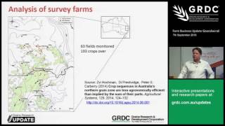
Lindsay Bell analyzed 63 wheat and canola fields across eight years in northern Australia, finding crops achieve only 40-50% of their water-limited yield potential. Nitrogen shortage wasn't the main problem; crop sequencing and fallow time drove performance gaps worth an estimated AU$1.7M annually for wheat alone.
Chapters
Thanks Andrew. It's actually my 10 year anniversary of joining CSIRO today, so that makes me feel old, I think. But anyway, so what I'm going to talk about today is, well, Andrew asked me to come along and talk about a couple of things of some recent analysis that's been done by myself and some colleagues in CSIRO looking at how we're performing in terms of our farming systems. So what I'm going to tell you today is I think the analysis suggests there's large potential to improve the performance of our current farming systems practices here in the northern region. Most analysis of wheat and canola crops, at least their performance suggests we're only achieving 40 to 50% of our water limited yield potential. Most of that analysis suggests that crop sequencing is a key area where we can improve the efficiency of the farming system. So that's related to both how we manage crop frequency in the farming system, how we manage fallows and then the sequence of crops that we put together that manage or influence our risk and biotic constraints in the farming system. And in my opinion, the key levers that we have to play with out there in the farming system to take us forward are managing cropping intensity and also managing the diversity of crops we are employing in those crops that you sequences. So there's three parts to this talk today. So the first part I'm going to talk to you about the yield gap atlas and we're going to go through and do a brief analysis of what the yield gaps are in this particular farming district. Then I'm going to take you through an analysis that was done by Svi Hochman and some colleagues in Brisbane where they analysed the agronomic efficiency using some real farm data and compared that to what our models would have predicted to be the potential performance of those farming systems over time. And then I'm going to talk to you briefly about a more recent analysis that we've done in the GRDC funded Northern Farming Systems Project where we've essentially taken a bunch of the crop sequences that are employed across this northern region and analysed them and to explore how well their relative performance might be in terms of economic efficiency of those sequences. So you first might be wondering what's this term of yield gap? So a yield gap is this. So we have obviously a farmer's actual yield and we have ways of assessing what the environmental yield potential might be. So in that context that's where we've employed best management practice. We've had no nutritional constraints to performance of those crops and no biotic constraints. So that's what we term the water limited yield potential. And usually we derive that from things like simulation models which, which tell us what that potential might have been in a particular season or a range of seasons. So that tells us the difference between these two numbers is what we term to be the yield gap. Others might also use this term the exploitable yield gap. So that recognises the fact that most farmers are not going to try and achieve this level of efficiency because that's probably not an economic optimal thing to do. You're not going to try and manage for known weeds and diseases. And of course, full nutrition of crops may not be the most economic choice. So most analysis suggests that around 80% of that water limited yield potential is what growers might aim to achieve. So that gives us some idea about what our exploitable yield gap might be in the farming system. So those are some terms that if you hear them bandied about now, you have some understanding about what they are. So what I'm going to take you through here is this is, this is a product, the Yield Gap Atlas of Australia that was developed by some CSIRO colleagues in conjunction with grdc. And so this is on, this is a website where you can go on and explore how big the yield gap is across different districts across Australia. And so this is using a combination of statistical data from the ABS that's been boiled down into local area information and matching that against what a crop model might have simulated to be the yield potential across that same set of years. So this is a 17 year average. So it's using the average yield that was measured, that was reported in the ABS statistics, versus what a simulation model would have predicted to be the potential yield across those districts as well. So this, you know, so this is putting that together. So what we're going to do is explore briefly around this Gundiwindi region what the size of those yield gaps are. And so you can see here we've plotted the size of the yield gap by different colours around this area. That the difference between what our simulation model would have predicted to be the yield limited water potential, water limited yield potential versus what the reported ABS statistics is around about 2 tonnes or 1 1/2 to 2 tonnes gap across this region. It's a bit higher as we go further east into the higher rainfall or more higher rainfall environments. So these are what statistical averages reported. It's around 1.6 tonnes in Wagambashire, around 2 tonnes in the whole northern grains region. While APSIM would have suggested our Water limited yield potential is around three and a half to four tonnes across those same set of years. So that leaves us with a yield gap of around nearly up to 2 tonnes. So 1 1/2 to 2 tonnes yield gap for a wheat crop. So we're only achieving about 50% of what our water limited yield potential might be based on those information. So one of the things you can do with this particular website is you can go on and you can do a farm size yield gap. They've simulated the water limited yield potential for a range of different soil types that are prevalent in different districts. And so you've got different soils here and these are the water limited yield potentials. So demonstrating that obviously those things are different or different soil types. And then you can go in and you can describe what your percentage of your farm that are allocated to different soil types. So in this case, 65% Vertisols, 20% to a Sodasol, et cetera, and put in your information about what your average farm yield is on each of those soil types and then it'll give you some indication of what your farm yield gap might be, the difference between what the APPCIM would have simulated to be your yield potential across those same sort of years and what you achieved and tells you what your relative yield is. So, so in this case, this particular farm at these numbers is saying your farm yield gaps you've got about, you're achieving 64% of water limited yield potential in that particular context, while the area average based on ABS Data is only 50%. So you can go in and explore how you might be compared to the ABS information, or how you're comparing to what a crop model might have simulated to be your potential. So there's a little tool that you can go away with and have a look at in terms of your own production system or production system of your clients. So just to put that all into context, so this is a bit of a summary across the northern region versus nationally. And so you can see that yield gap is close to 2 tonnes in this northern region as a whole, and we're only really achieving 46 or so percent of our water limited yield potential across the whole northern region. I mentioned the exploitable yield gap. Well, obviously you're not trying to get that full 3.6 necessarily all the time. So exploitable yield gaps around 1.2 tonnes per hectare per year on average. But if you put that all together, that's in the northern region alone, that's about 1.7 million bucks a year worth of gap. That's exploitable out there in the farming system in wheat yields. So there's plenty of gains to be made. So that's the first part of the talk. The second part of the talk is some people might have some skepticism about how accurate the ABS data is. So I guess this is a different approach to looking at that question. And so what this analysis has is there's got real farm data collected over about eight years from 63 different fields that were monitored across this northern region through southern Queensland and northern New South Wales. So that had about 193 crops over those set of years. So there was information about what crops were grown, the sequence of crops when they were sown and harvested and the inputs that were provided to those particular crops. And so what the authors here did is they analysed how well those crops performed compared to what the potential efficiency might have been. So, so let me explain what this graph is. This is relative yield compared to the amount of input a particular fertiliser in the farming system. So if you're at one, that crop received sufficient fertiliser to optimise its water limited yield potential, it was not nitrogen deficient in any way. So there's a curve here. So if you're 100% efficient, your crop would have been on this curve. So it could converted the nutrients that it had with the water it had at optimal efficiency. We've plotted here an 80% efficiency line. So this is saying, well look, your aspiration might be to get above or close to that line. So analysing the percentage of people who are below here is important. They're not achieving what an exploitable efficiency might be. And, and it tells you sort of across those, the number of proportion of crops that received enough nutrition versus suboptimal nutrition to get their maximum yield in those set of years. So it's telling it how the difference between one of these crop points and this line or this line is how big a gap in efficiency of that crop was. So we look at those 193 crops, there's 193 points on there, right? So 27% of those crops received enough nutrition and achieved above this 80% efficiency threshold. So one third of crops were in there, 8% was still highly efficient even though they were probably under fertilised for what the water available in that particular year was. But they were still highly efficient. But on the converse, 64% were inefficient in terms of they poorly converted the water and the nutrition that they were provided. Into grain yield in those years. So 50% of those received sufficient nutrients to achieve those yields, but didn't convert that into grain yield effectively. So analysis of why that might have been the case. So this is exploring nitrogen nutrition as a driver and you might have got the indication that it wasn't important. So this is the simulated yield. We're using the amount of reported nitrogen versus what would have been the yield if it was unlimited in terms of nitrogen. So a crop that had the yield potential in an unlimited context. So a crop here, for example, this point here, its water limited yield potential with full nutrition was six tonne, but it actually only achieved two and a half, so it was under fertilised. So that crop there, that one. But if you look at most of the crops, they are on that line, which means they were fully fertilised, they had sufficient nutrient to capitalise on their condition. Crops down here were ones that probably would have paid off in those contexts. So essentially that data says nitrogen nutrition was not a major limitation, wasn't a huge dragger across this data set. You might think sowing time was important. So this is the analysis saying this is with reported sowing time. So what the growers said they sowed and this is the outcome with an optimal sowing time for that particular year. And so the points, a point here would say that you could have improved. It only yielded 1 and a half, well bit over 1 tonne, but with an optimal sowing time, it could have yielded 3.2. So that's. That's a point above the line, but the points are all over behind. You know, this, this one is to one line means that there's little gain to be had from improving sowing time across that data set. So that suggests that while sowing time there was variability, but it wasn't a consistent dragger on crop yield across that data set. And it wasn't the main prevalent. It wasn't a prevalent driver of poor performance of those particular crops. So they also analysed how those crop sequences, because they had those set of years and the crops in those sequences, and the same sort of idea. So this is the efficiency frontier. This is now in economic terms, though not in yield and an 80% efficiency threshold. And across those sequences, the level of input that was provided, and those are those 68 different fields. So across those 68 different fields, we now only had 21% of those crop sequences which were highly efficient and received sufficient inputs. About the same number was still highly efficient but were probably under fertilised. In some respect. And now we had over 70% of the crop sequences were below that efficiency threshold. So there's a difference disparity there between the performance of individual crops and the performance of our sequences. So sequences weren't performing as well as the crops that made them up, which suggests that there's some problem or some issues with how our crop sequences are performing or a bigger problem with the crop sequences compared to individual crops. So all of that suggests that while these factors over here are obviously important, that they weren't really the key explainers for why the system was performing inefficiently. Factors over here are probably as much to blame, if not more so. The information suggests these crop sequences and longer term issues are probably underlying factors which drag crop yield down across that data set. So based on that, one of the things out of the farming systems project that we've been doing is looking at, okay, if that's the case, well, let's step back and say, let's analyse across the range of cropping sequences that farmers are typically using in this northern region, how do they perform in terms of an economic efficiency? Now, you all probably heard of crop water use efficiency, which is kilograms of yield per millimetre of crop water use. I'd say, look, if we're going to start thinking about our efficiency of our farming system in a crop sequence context, we need to start thinking about it in a different way. And so the metric that we're using here is dollars of gross margin. The reason we use that is because you can't really compare the efficiency of a chickpea crop to the efficiency of a wheat crop. The value and the they're not the same thing. So it's very hard to compare how they perform in efficiencies of water. And to account for the fallow context of those sequences, we need to do it in terms of millimeters of range rain. So this is the economic efficiency, economic water use efficiency, if you like, that we're using as a context. We're also analysing the risk of those cropping sequences. We're doing that by analysing the percentage of those crops which received a negative gross margin based on our economic assumptions, but also looking at what the gross margin would have been in the worst 20% of years. So in the worst set of seasons, what would have been the economic outcome from those sequences or the set of sequences that we're growing? So here's some information about how we did the economics on this. We obviously were predicting grain yield across those sequences and We've buy a price and these are the set of prices. Now just bear in mind we've used average long term prices here based on the last 10 years. Obviously these things change from time to time quite often and so we're not accounting for those fluctuations, we're just dealing with climatic variability. Only here one of the things you'll note is we're letting those sequences derive the amount of nitrogen that was required to meet the needs of the crops in those sequences and the amount of sprays that would have occurred across those sequences. So those things vary based on this crop sequence. And then we've got a variable cost for each crop. And so those are based on each crop, excluding fertiliser and fallow sprays. They're the assumed amount of background variable inputs for each of those different crops. So that's what we've done economic, the economic analysis we've done. So just a couple of things just to bear in mind that we aren't including in these analysis thus far. One is all of these sequences we've run so far are set rotations. So we haven't done a full tactic, we haven't done tactical variations on these at the moment. They're all locked in set sequences that a crop got sown in every position in that crop sequence. So it probably means that we've set up some of those crops for a failure, then that may not happen. If you were in a real context, you might have decided not to grow that particular crop because it wasn't a sensible thing to do. We aren't accounting for heat and frost events in these sequences. So any reductions due to those are not included. So this is the potential outcome with those, those things. We're not accounting for losses due to other things other than nitrogen or to weeds or pathogens in the farming system. We're still developing this capability and hopefully be able to do that in a year or two's time to be do a better job of that sort of thing. And bear in mind all the soils we've used here have had no constraints that might have dragged down yield. So chickpeas in this context are going to perform pretty well compared to if they were on a sodic subsoils situation. And as I said before, price fluctuations are not accounted for in those relative values of the crops are set in this analysis. So if those things were different, the crop sequences might perform differently. So here's a chart that you can probably use as a bit of a guideline for economic efficiency benchmarks for different crop sequences. So Gundiwindi across a range of different crop sequences here. So let me explain what they mean. S is obviously sorghum, chickpeas, wheat, a fava bean wheat and a cross beans, a fallow. So two crosses together is a long fallow. So there are a set of crop sequences that I'm going to talk about briefly here today. And as you can see at Gundiwindi, really the efficiency differences across those set of sequences, not large, there's only a 10, there's less than 6, you know, the range is only 6.$06 per hectare per millimetre of rain. Amongst them, only a 12% variation from the best to the worst. So there's not a huge variation. While in other locations as you go further south, the variation becomes much larger. So if I put up the data here from Dubbo, for example, or Tranghi, the difference between the best and the worst is quite a bit more terms of crop sequence, but really not a huge difference. In most cases, this wheat, wheat, chickpea system performed the best in terms of its potential. But of course we're not counting for draggers in terms of pest or disease losses in those particular farming systems. So that could be a challenge for some of these rotations. But nonetheless you can see. So gun to Windy, a benchmark might be around $0.50 per hectare per millimetre of rain. Mungundai, as you go further west, might be around 40 odd cents per hectare per millimetre of rain. And as you go a bit further south, say Narrabri, it's a bit higher, maybe just about 50 cents as well, probably just over, maybe. So some benchmarks there to look at how you might go away and compare what you've achieved versus those benchmarks. One of the things David talked about is how those different crop sequences are performed in the last two since 2000. Now, if I did put this up for Tranghi, it would have been vastly different with summer crop performance or sequences with summer crops in them performing much better. At Gunda Windy, all of the sequences have had some. If you looked at the last 15 years, they're performing worse than what they would have over the long term. And I wouldn't say there's any strong push one way or the other to favor across those different sequences. If you look at Mungandai, the story is a bit the same. I would say that some of the systems with, for example here, where was I looking? Sequences with opportunity crops built in probably have copped less of a loss than others, which are more winter dominated in their farming system. So that's one of the messages that might come out if you're moving further west from here, at least that the sequences where we've got opportunity, mung bean crops, for example, built in have less reduction in the last 12 years than others. But really not as big a difference in terms of. Compared to when we went further south in David's context, where summer rain was increasing much more. One of the key drivers I mentioned before was cropping intensity as a driver. So here we are. What we've done here is I've plotted a full range of those crop sequences we just mentioned against the time in Fallow. So 80% time in Fallow. This here is a long fallow system, like a weak long fallow chickpea system, so it spends nearly 80% of its time in fallow, while this one over here is a much higher cropping intensity system. And so this is the average sequence gross margin across those full 100 years of cropping and across those range of different sequences, you can see that if you had less time in fallow, your potential average gross margin is a bit higher. There are outliers like this one up here, which performs pretty well for that amount of fallow. But fallow, period, the amount of time in fallow is a critical driver of potential gross margin across any of the locations we've analysed, except for Mungundai. Actually, you might be considered thinking about, well, what that means in terms of risk. So on this axis here, we've got the downside risk or the gross margin in the worst 20% of years versus time in fallow across those sequences. And at Gundiwindi, there's no strong relationship between fallow in terms of managing risk. So some of those sequences there are not, you know, one over here at a high crop intensity is no more riskier than one in the middle here with a much higher frequency of fallow at Gundiwindi. I'll put up Mungundai as a comparison. So Mungundai here you've got a very flat relationship between time in fallow and returns. So a high crop intensity system versus something much lower in here, there's not really any economic difference. So the system's performing very similar for the amount of time in fallow. If you do a risk analysis, though. So down here is bad outcomes in the worst 20% of years. Up here you're much more resilient in those worst 20% of years. Fallow is a good way at Mungand Dai or in a lower Rainfall, environment of mitigating risk or poor or low economic outcomes in poor years, you probably know that. But thinking about that as a trade off is important to consider. So what I've done here is plotted our average sequence gross margin against the number of crops that had a negative gross margin across the full range of these crop sequences here. So ones these of those sequences up in this top right hand corner, they're the high risk, high return sequences. Ones down here are relatively low risk but higher in return. Ones over here are fairly low risk but have lower returns on average. And ones up here is probably not where you want to be because they're risky and don't give you higher returns. So you can see where some of those sequences that are pretty common around here fall there. They're fairly risk averse in many contexts. And the analysis suggests there's some sequences out there that could improve in terms of their average outcome without greatly improving the greatly increasing the risk of a negative gross margin. Jack, how long is a fallow on those X's? Two X's is the longfellow effectively. So it's from sorghum harvest in that sequence to wheat 14 months time, well whenever the next planting opportunity presented itself in the wheat window. So a system like this one would have sorghum long fallow into wheat, pretty common one around this neck of the woods with three years of winter crop back into a summer long fallow into a sorghum. So this one here for example is just that same sequence, but where you scheduled in a double crop mung beans, you've got a few more negative gross margin crops, but you actually did increase the net, the average gross margin by nearly 50 bucks, well over 50 bucks a hectare potentially. So this is the same outcome for mung and dai. And you can see that the winter based systems are actually performing much better or winter dominated systems. But some of those systems, like this system here, is actually performing pretty well as well. So there are some systems out there that could improve on what people are currently doing based on the simulation analysis. Oh, here's what I want to show you. This is what I'm going to show you. Tom. So these are the frequency of gross, negative, gross margins for each of those different crop sequences. But I'll pull a couple out. The numbers on here are the proportion of those crops that actually had a negative gross margin. So they didn't actually make economic, didn't make money. So any of the sequences here have got a double crop, chickpeas out of sorghum. And so at Gundiwindi. This suggests that 40% of chickpeas out of sorghum double crop, don't make an economic. Positive economic thing return. Does that answer your question? 40% aren't economically making an economic return. Based on our assumptions, these are double crop mung beans. So 30% of double crop mung beans in those sequences weren't giving a positive economic return. And if you have a look at any of the ones with the short fallow, sorghum based systems are around 20 to 30% likelihood of having a crop failure or negative return. But if you had any of the sequences here with the long fallow into sorghum, your risk is much lower. It's only about 15 to 20% of those sorghum crops didn't make money. So if you wanted to reduce risk for sorghum, it has to be on a longfellow. In this environment at Mungundai, the outcomes are the same, but. But the risks are higher. So double crop chickpeas are over here. 50% of those had a failure. The same thing with anything going into longfellow into sorghums. That's the only way you can go at Mungundai if you're going to grow sorghum. These are costs, negative gross margin. Yeah. So just cost like you're basing up the land. Yep, yep. It's all the cost you put in. Yep, exactly. Yep. And obviously $400 chick fees and $800 chick fees, which totally. So totally, of course one suspects halves that. Oh, probably more than halves. It probably more than halves that at 800 bucks. Yes. The outcome will be different. Yeah. Not that we're going to see that. No, that's right. So one of the things we are. The next thing we're doing is actually running the economic risk across this. So using the variance that you get for different crops. So highly fluctuation crops. So let's say mung beans and chickpeas, things that have a high variance in their returns. Well, obviously they're going to be riskier things to have in your system than something like sorghum, which. Well, wheat maybe. Yeah. So that's one of the things we haven't dealt with here that we will be though, of course. So I guess one of the take homes here is that there's no real or rounders in these cropping sequences, there's trade offs. So a sequence that might perform best in terms of gross margin doesn't necessarily perform very well in terms of how efficient it uses its water. Probably has some challenges in terms of how it manages pathogen risk or herbicide resistant risk in the farming system. So there's no around us, so there's always trade offs to be had. I'll quickly pull out a couple of those just in the interest of thinking about these things. So this is the same thing. This is changing carbon of your soil. So how much that changes every year versus time in fallow. So longer fallows you run down carbon faster. Higher cropping intensity systems with more crops in them are more likely maintain carbon or could increase carbon relative to the others. Here's analysis of those crop sequences in terms of their risk of developing root lesion nematode. So these sequences down here are a high risk of developing root lesion nematodes populations, if they're around, all of these sequences here that are high risk have greater than 60% of the crops in those sequences are susceptible. If you wanted to reduce the risk of that happening, you need to have all of these sequences here have got more than two and a half years in a row of a resistant crop or fallow. So those sequences there are likely to maintain or potentially just reduce the populations over time. This is analysis of those in terms of their risk of developing roundup resistance in the weed population. These sequences down here are at high risk of developing roundup resistance in the long term. They're all winter dominated will have more than 80% of the crops are winter crops. These ones up here are sequences which have phases of summer and winter crops. They switch between a phase of two to three years of a summer crop versus two to three years of a winter crop. So they might be things if you're facing or want to manage for those sort of issues, that's a sequence that might help manage those crops issues. So I hope I've painted a picture of that. The analysis suggests there's big potential or significant potential to improve what we're doing in terms of how our crops are performing. Most of our crops are below potential or at least their winter crops are below their yield potential. The analysis suggests the crop sequences are not performing as well as the crops that we are growing individually. And so thinking about crop frequency, how we manage fallows and how we put crop sequences together to manage the risks and biotic constraints in the farming system are important. And in my opinion, increasing the diversity of the farming system and increasing and thinking about how we might capitalise on the intensity of the crop farming system are key areas that might lead us to improving the efficiency of our farming system. So with that I'd like to thank GRDC for their support of most of this work that I presented today, and open questions.
More from Gerri



GRDC National Variety Trials (NVT) Case Study: Helping Oat growers make informed variety decisions


Managing rhizoctonia in wheat and barley: Impact in low and medium rainfall zones 🌾🌾