Adobe Fresco for Beginners
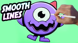
Ryan Maloney draws a character on iPad in Adobe Fresco, showing how its vector engine creates smooth lines that scale without pixelation. He walks through the full workflow: canvas setup, sketching, inking, coloring with the bucket tool, and exporting directly to Illustrator. Practical tips cover layer opacity, brush pressure, and print-ready settings.
Chapters
I'm recording. Anything else going? Got like 30% charge on my iPad. It's a good angle, can't tell. I don't know what I'm going to draw in Fresco yet. I need to make this cord longer so I can turn my iPad like that. It's still charging. I should have set this up before I even started. Sketchboard Pro's a little— there we go. Early morning draw sesh. So I was thinking I was going to draw Well, first of all, Adobe Fresco lets you draw vector drawings, so it's much smoother. Not smoother in the drawing, in like the lines that you can draw, but smoother in that the vector lines are based on math and not pixels, so you can stretch them to unlimited sizes without them getting blurry. So that's why a lot of people like to draw in Fresco, because you can— it's just, it creates much sharper graphics when you go to print them or scale them up or put them in Adobe Illustrator. That's why people like it. People can do some really fancy stuff in it. Uh, I use it maybe not very often at all. I was creating some, um, some characters in it a while ago, but I sort of paused. I did a logo design in it, uh, a few weeks ago. There are some differences between this and Procreate. Well, a lot of differences. I feel like Procreate's a little bit ahead of the curve in terms of like intuitive UI. And this is, this sort of chases, but this, it's starting to catch up and do some cool stuff. And I'm seeing a lot of, a lot of people use Adobe Fresco. And I looked at the analytics in my YouTube and it, it's saying that this is one of the most searched terms. So I'll sell my soul and make a video just for the search algorithm gods. I'm going to set up my canvas at— this is the default, 2732 by 2048. I don't know if that's the default, but that's what it gave me. I created my document. Um, so there's my stage. Um, oh, you can do time lapses of your work now. Okay, cool. We got layers over here. One thing I want to point out is this took me forever to figure out, that the transparency of the layer Come on. Is, is over here in this little guide or in this little toggle here. It's not on the layer like it is in Procreate. Knowing that will change everything because I still do my sketches. And let me get a good brush going here. It's been a while since I've been in here. Two-tap is an undo. That's pretty normal. We got a pencil for sketching. I still like to do really rough sketches, and I'll, I'll get to my character very soon. You know, I was going to draw a Crunchy Cow or a Beastly Baller. I still might. This was under my desk. My kids left it. I found it under my desk just as I was going to make this tutorial, and I thought maybe I'd just recreate this. In Fresco because it's very simple and I can create a variation of this character. So yeah, let's go with this just for ease. And let me show you how I do this. I'd start off with a rough sketch with pencils, with this, this pencil brush up top. See, I don't know if you can see that, if I'm blurring that out. We have a pixel brush, 6-point pixel brush. I'm just going to collapse this layer here and just get just the stage. Sorry, how do I just— there we go. That's what I want. I want some UI over here, but I don't like this whole bar being taken up here. Fuel up on coffee real quick. That may or may not be my second cup of coffee within the first 2 hours of the day. All right. First thing I'm going to do is just get this the circle. I mean, this is a very basic character, so there's not much to it. So we're just going to get a circle here going. I'm just going to put like a cross down the middle. The eye, the pupil is set up a little bit higher. So it's probably we're going to drop our pupil and then the eye is built around that. I just do rough lines until I start to see a final line taking form. And then I sort of invest more and heavier lines into that. That's because we're going to, we're going to build layers over top of this. So it really doesn't matter about being perfect here at this point. All right. So we have squiggly mouth. Looks a little bit happier on this guy here. Um, I'll go with it because I think what I want to show in this video is just, uh, well, first of all, to practice my smooth lines and to show you just how to layer things with, um, a little bit smoother lines like that on top of this. So I'm going to stick with the sketch brush for now. I don't think the feet on this are too inspiring, so I might create my own, put all the weight in this one foot here. Now let's do arms raised because this is like a little too boring for me. But I do draw my characters like that all the time just to get the, like, the base of the character down. Let's use this lasso tool. What's paint selection? I don't even know what that is. Eh, okay. My arrow tool is going to let me grab this, tilt it, and I'm just going to bump it over, put more weight under it, under the character, and just erase the bottom. Let's release that by deselecting. So I'd say I don't use fresco very often because I watch so many great artists that are unbelievably good at it and unbelievably detailed at it. And I like, like, quicker, rougher drawing sometimes. And the intuitive flow of Procreate. It's just so quick and it removes so much guessing and having to learn a UI. This has a little bit more of a UI than, than Procreate. People like Enoch's Art, you can check them out on TikTok or YouTube. I think he's on YouTube or Instagram. Unbelievable detailed line art. I've talked to him a couple of times on my TikTok, but watch his stuff. He's a master at it. So I'm going to create— this is like— this is like spiky. Let me see if you can see it. So spiky horns here. I'm just going to make mine a little bit rounder. And now I'm looking at it and I'm like, no, that didn't look good. So I'm going to make them pointy like that. I don't know if we need a shadow under this guy or not. I actually am not going to go with a shadow just because if I'm drawing it in fresco, I may need like this. This could convert well to a sticker or, I don't know, what else you create with characters like merchandise and stuff. And I don't think I need that shadow underneath it. I am going to drop in the reflection of the eye. This does not have reflections in the eye, but ours will. A really cool thing before I even ink this up a cool thing if you're an Adobe paying subscriber, lifelong addict like I am. This can be sent to Illustrator on your desktop with this button. So if you do an open a copy in Illustrator for iPad on desktop, as soon as I hit this desktop button, it just pops over and opens up on my laptop. It's magical. And then you get— you have all your Illustrator features rolling. This would be great. Like, I don't know, it just really— it just simplifies the process. You don't have to transfer files and save the files as version 1 through 100. All right, now I have my character sketch down. Remember that the transparency or opacity of the layer is up top here. I'm just going— I'm just going to go and turn that down and I'm going to create a new layer on top of this. Just tap this button to make it go away. Here's my new layer. Now I notice that this brush that I had going did not have pressure dynamics on, so I'm going to turn it on and I'm going to alter the tapered edges of it. So it's a little bit— you see how the beginning and the ends are tapered there. They're not the same exact width as this stroke. Some of this character requires just like regular shape, shape building. So you can definitely use— you know what, it's been so long since I used Fresco, I'm like, what do I even— I remember last time I used it, I couldn't even First of all, what is going on here with this thing? Let's delete that. Hope that's not on the same layer as my— okay, okay, no. Do I just delete this? How do I get rid of this thing? All right, we got to get rid of this. Erase it. Okay. No. Erase it. No. Erase. No. Select. Okay. Deselect. Okay. All right. We have our pen going. I am going to draw these circular shapes. They're not going to be absolutely perfect, and it might drive me nuts. So I'm trying to remember. I remember shapes were kind of a problem in this last time. Let me see if I can hold it down. Oh yeah, I can snap. I can snap my shapes. So I'm going to color this in. I drew the circle and then held it down to snap it to try to get a smooth shape going. That's going to drive me nuts. Things don't need to be perfect. 80% is good enough. I'm going to reduce the size of my pen and just get his mouth going. See, it's not smooth. Like, I look at that line and it might look okay, but to me I see total jitteriness. If that's a word. Um, so we have our size, shape and outline, stylus pressure, roundness, angle, length, mode. Looking for like a smoothness, but then I don't like to smooth out my lines too much because then it loses a little bit of its natural quality. Let's see if this can give me a smooth circle here. Snap it into place there. That's okay. Usually when I'm doing vector drawings, I'd want the weight on the bottom of this, this art right here. So I might see if I can just double up this line, see if it snaps. Get a little bit of a snap. There we go. And we have a little bit of weight underneath here versus the top. Even the top here, I'm looking at this and thinking to myself, that's not the smoothest connection. That's okay. This is going to be our, our baselines, and then I'm going to create a layer underneath these to color in. Let's draw the outside of the eye and snap it. So we're not wide enough, so I'm— ooh, that's not good. I should have done that on another layer. I'm going to do that on another layer so I can adjust just the size of the eye. There we go. Got it. I'm gonna put a little bit of detail here. Doing my squint eye viewing. Let's draw the horns. Let's increase the size of this, not as much. I think 18-point was the stroke width for the body. This will be 14. For some reason, that's not Good enough right there. There we go. Now we can duplicate this layer and flip it. How do we flip it? Nope. There we go. This button up here flips it. Probably end up merging all these layers together. Now I'm starting to think, oh man, I copied that character exactly. I gotta make it my own, which we will. Hmm. So I did tapered lines for the hands and for the body. I might go— I might go round for the, um, turn off pressure dynamics and see. Oh. Kind of like that. A little bit of a variation. It's okay. So the arms and the feet will have no end tapers. I feel like there's extremely long pauses when I'm drawing between what I'm saying. I'm going to draw these lines here and fill this in. Usually I'd fill it with a bucket tool, but I'm just going to color it in really quickly. Sometimes I just enjoy the process of coloring it by hand. All right, so pretty close. Let's turn off this bottom sketch layer. Let's make the mouth a little bit more fun. There's not much personality in this mouth. Just going to erase a little bit of the eye in just preparation for a very, like, goofy mouth that extends over the eye. So if you're going to go for it, go for it. Don't just do like that angle was like sort of too straight for me there. So you got to really go for it if If you're going to create an angle, push an angle. I don't know if that makes sense. I just remember my art teachers back in the day used to just tell me, if you're going to do something, like really accentuate what you're doing. If you're going to put an angle, really put an angle. If you're going to put like waves, really put the waves. I don't know what I'm doing with this mouth here. It's not looking amazing to me. I can live with that. That's not bad. And is this mouth open? I can also live with that. Not the smoothest line in the world. Let's, let's fix the curves of the cheeks here. 'Cause I wanna look back at this and look at every single line and say I'm sort of like proud of that line. Take it line by line and make sure you get it right. I just, I mean, not right, it doesn't need to be perfect, but if I just left these little cheek marks, like tiny little cheek marks, it's not, it doesn't add to the personality of the character. You got to push it a little bit. I'm going to create There we go. Now in here, there's definitely going to be a tongue. If you're second-guessing whether to draw something or not, just draw it really quickly. I mean, now I see like that's kind of— that's a little bit amateur hour. Like, what's the point of that? Maybe there's more like a pointed tongue in here. Maybe there's not a tongue at all. Yeah, I can go no tongue at all. Let's see if the paint fill paint bucket. I'm good with that. All right, now let's Select Multiple and select all of these layers here. And this will allow me to— nope. What just happened? I'm going to merge selected, if you can see that. So now we have our full character Drawn. And I'm going to duplicate this layer. And now we have our colored layer on the bottom. So this character is purple with green spots and red horns. I'm not against that. I kind of like— I can go with that. I can do purple. So I'm just going to do quick, quickly colored in. The red horns, I'm going to make a little bit more pink. Eye color, I always like to do like an off-white color, and not by always, I mean sometimes when I think about it. Uh, fill it in. Let's go yellowish. And now for the interior of the lip, you know, we might be able to do like a pink, pinkish purple. Like it's a lip instead of a dark purple. Yeah, I can go with that. Now let's grab our white and add some reflections. Let's do one there, one at the bottom. And go up here. Remember we talked at the beginning of the video, the opacity is up here. But since this is vector, could be printed, I'm not going to turn it down too low. And let's see, it might even be better to not do any opacity at all on it because the printing could be— it could be difficult on a printer to show up. With like a half opacity and over the eye black and half over the white, you may not even see it. So I'm going to make it very like vector-y and simple. And now we can do some shadows, but the shadows I'm going to do by darkening the color. Sometimes I would do this by grabbing a black and turning it to 20% opacity. But knowing this is vector, I don't want to do anything that is going to mess up the transfer to another program. Sometimes you can get weird things going on when you transfer it to Adobe After Effects or Adobe Illustrator or Adobe After Effects with the transparencies. So I'm just gonna Do it. Come on, tap. Just going to use a darker color for the shadows here. Now up top, I'm just going to drop in a highlight, choose the same color, and I just grab it, make it brighter, and I choose like a little bit— you can't really tell here, but there's a little bit of a pink in it rather than a purple. And then let's just make these smoothly intersect. Drop some highlight on top of this hand. Now, people like Enoch's, they do multiple, multiple layers of highlights and shadows. So it is— go watch their videos if you want something with like crazy amounts of detail, you'll get that over there. This is going to be sort of a simplistic version. And they're really amazing vector artists, are— pay attention to every single detail, like where all of these points connect. They're zooming in on these and making sure everything is absolutely perfect. Really impressive stuff. A lot of times because their artwork is going to be scaled up and, you know, printed, put on walls, put on murals and stuff. Not bad, not bad, not bad. All right, um, I'm gonna put a highlight on the top of the lips here to make these stand out a little bit. Now this has green dots, that could be a good— I can't believe I'm just stealing these, uh, I mean, I look, this is not any major toy brand, so I'm sure they're taking this design from somewhere themselves. So if you see this design somewhere else on the internet, let me know. Let's throw some green dots on here. Now even the green dots would have shadows, so may need to take that into account and drop shadows over top, or just avoid where The green dots are dropping, so you don't even have to bother with that. There is a little bit of a lag when you're drawing. It's gotten faster. I mean, it used to be— maybe I just had a slower iPad before, but it used to be much, much slower. I really didn't like drawing in it before, but now The speed is almost 100% with the brush. Little bit of a lag, especially when the, when the ink bleeds out. So really slow strokes will take time for the ink to fully bleed out and you won't know where it's going to drop or bleed out to. This is a little bit of a sloppy dot here. But you can, you can, you know what, let's, let's purposely make some of this stuff sloppy here. I'm going to grab my brush, turn off tapers, turn down this to about 8, just drop some details in here. So this, this will contrast the, the smoother tapered lines. And I love doing little shadows and dots all over the character. I wonder if this needs an eyebrow of some sort. When in doubt, drop it in. Kind of like it does give it a little bit of personality. I can already feel it. That's why whenever I'm like wondering, should I just draw this? Should I just draw this? I'm just like, boop, drop it in. And then you get a sense of whether it's going to work. And then if it— if you feel like it's going to work, it's like a feeling of excitement. Then you invest more time into it. If you get a feeling like a sick feeling in your stomach, like, wow, that's terrible. Don't even, don't even go for it. Like, I'm starting to question this eyebrow standing out too much. Just make it tiny. There we go. Let's see, what can we do with the background? Do we even need a background? Maybe like a dark aqua. And a little bit of a lighter aqua. Color that in. That's what— that's our character. I think that's, that's in pretty good shape. You know what I'll do is I'm going to send it to my computer so you can see how fast this is. So let's— let me get an angle of my computer. All right. So I'm going to tap this button here and I'll show you in real time. So I'm selecting Illustrator for desktop. Let's just watch this. It's already prompted me here. Boom. And now this is all of these. Look, I can shift all these elements around. It's already on my desktop, like in Illustrator, like ready to be edited. I don't need to ungroup any of these. It's just ready to go. That's pretty impressive. All right. That's going to wrap up a little Adobe Fresco tutorial. Let me know what you think of these. Should I do more of these? Should I be following the analytics? And making Adobe Fresco. I don't want to get pigeonholed into making just videos about one software. It's more about the creative business in drawing. So I got a lot of tips and a lot of things to share from being an old guy with like 20 years of experience doing stuff like this, but also building a creative agency for like motion graphics. So we get into After Effects and stuff. So let me know in the comments what you want to go over. Also making books. Let's, let's make some videos on making books. Um, I'm gonna wrap this up. All right, I'll see you next time.
More from Ryan
Drawing Mr. Beast into a Beastly Baller trading card #art #drawing #tradingcards card
The first draft of my graphic novel #art #procreate #originacharacter #graphicnovel #drawing