Character Design Tutorial Procreate - 7 Step Process
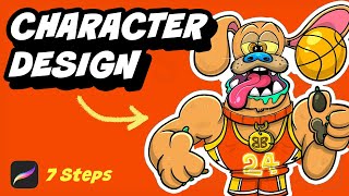
Ryan Maloney breaks down his 7-step character design process in Procreate using a dog-basketball player as an example. He covers sketch, ink, color, and shadow work on a 3500x3500px canvas, emphasizing quick decisions, layer organization, and borrowing shapes from 1990s toys for originality.
Chapters
In this video, I'm going to walk you through my 7-step process for designing characters in Procreate. In the first half of the video, we're going to come up with the idea, sketch it, and add lines. And in the second half of the video, we're going to add color, shadows, and highlights. So let's dive in. Ideas come from inspiration all around you. I'm constantly capturing ideas in the MyMind app, in the Reminders app, and any time I have a thought or something that I think could be a cool character, I'm logging that and saving that. For this character design, I'm filling up on inspiration from characters from the 1990s, some toy and cartoon designs. There's rarely a time in Procreate that I don't work at 300 DPI. So if you look at my canvas information here, I'm working at 3500 by 3500 at 300 DPI. You really want a high resolution. You can always downsize it, but it's hard to increase the resolution. So I'm always starting at between the 300 and 600 DPI. And for my brush, I'm using either the Crunchy Cow pen or a Monoline pen. I have a couple set up here. The first part of the sketching process is just getting the pen moving and getting some shapes and lines on the canvas. At this point, I don't want to overthink things. I just want to move things around and I just want to throw clay on the table until I get to the point where I can start shaping it. I always like to start with the eyes, the nose, and the mouth. I feel like that's where the personality of the character shines through, and that's what gets me excited about the drawing. So I'm always aiming to get something going there. I've trained my brain that every time I see this blue pen on the stage, I will never get into perfectionist mode. I will never overthink things, and I know it's just about throwing lines together until something starts to take form. I'm starting to land on this dog basketball player character. I have this collection of characters called Beastly Ballers, and I think it'll fit in perfectly to the series. Once I have my sketch down, I'm going to create a new layer on top of that and create a cleaned-up sketch. This is where I'm starting to finalize the lines. This is going to give you smoother lines and it's going to give you fewer decisions to make later on down the road. I'm always experimenting a little too much in this phase. I should choose the lines that are working on the sketch layer underneath, but I'm still dabbling and seeing what else I could add to this to add personality. I'm going to add this collar here and then a basketball jersey, basketball shorts, and I'm going to turn his dog paws into basketball sneakers with a few dog toes. At this point, I'm still not sure if I'm going to add the basketball under the arm or above the hand, and I'm starting to think that maybe the ear should be dribbling the ball and he's giving the thumbs up, but maybe it could be interpreted that he's also flicking the ball up or about to spin the ball on his finger. I chose to go with the Crunchy Cow pen or a tapered pen for this part of the drawing because it's so much smoother to draw with. Usually I'll use the mono lines when I'm, I'm going to ink. In this drawing, I'm going to stick with the Crunchy Cow pen throughout, but the mono line is really nice to create a very simple, clean drawing. I decided to shift the feet down to show a little bit of the legs here. All right, now that we have our sketch down, it's time to ink. When I ink, I like to zoom in as close as possible. Get that undo button ready because that is going to be your best friend during the inking process. There are many, many times you're going to hit the undo button. Inking is a lot like taking swings at a baseball. It just— it sometimes it takes many, many swings to get the line right. And you can see I'm using this tapered brush. It's thinner at the top when I apply less weight. And then when I get to the bottom of objects, I'm pushing down a little bit harder to increase the size of that line. And I try to keep the weight of the line on the bottom of objects. I find that this just makes the weight of the character look right all around. So I found that I like the shape of the eye that I first drew. So I'm going to duplicate that and slide it over. I think this is one of the best parts about Procreate is the fact that you can just duplicate anything that you like and then tweak it a little bit so it doesn't look like you created this perfectly symmetrical character. You can move things around and then erase lines and overlap things so it looks like each side of the character design is original. For each drawing, I'm trying to do something a little bit different. Sometimes I'll design eyes the same way for many, many drawings in a row, and when I want to break that rut or learn something new, I just force myself to do something like combining eyes or separating eyes or looking at the pupils of different characters and borrowing that style and adding it to my drawing just to stretch my drawing muscles a little bit and make drawings that look a little bit different. So for this, I'm looking at My Pet Monster and you can see they put their pupils lower. Usually I would do it right in the center of the eye, but I'm I'm gonna move them down lower, and it's kind of a, um, a way to honor your inspirations by pulling these pieces and putting them together in new characters. And it teaches you to design original and new characters by combining shapes. And I just find that borrowing or tracing from characters that you're inspired by and combining those into different shapes is a good way to make original characters. All the Beastly Ballers' teeth are a little bit scary, a little bit jaggedy, and a little bit oversized. All the Beastly Ballers are sort of a monster version of animals or food. So I want to keep that monster theme going. I also looked at, I think it was the Madballs from the '90s and My Pet Monster, and those monsters sort of inspired this drawing. So I'm gonna keep that going and keep those crazy mouths and teeth going. I found that these middle teeth are gonna add the personality of the character, that gap in the tooth right there. And then I'll start to fill in objects that I know are going to be dark or in the, in the background before I even start coloring. This just helps my eye with the contrast and helps me figure out what's going to stand out and what's going to sit in the background before I add that color in. So you can see I'm tapping with two fingers. That'll give you the undo. Later in the video, I start using the control pad on the left-hand side for the undos. I'm trying to build up my muscle memory and condition myself to use that a little bit more because pulling the pen off the screen and tapping for undo, it's quick and it's an amazing feature in Procreate, but that time adds up. So I'm trying to get my left hand to do much of the menu work and then my right hand is always just drawing. So trying to create a more systemized machine for these drawings. For the lines on the basketball, I created a new layer. On top of the ball, and then I can draw the lines through this line to try to get this smooth line here. And then I can go in, and now that I'm on different layers, I can turn down the opacity and grab the eraser and then start erasing the lines on the outside of the ball. And I can do the same thing for the ear. I can just draw through the object knowing that I'm on a different layer. And then erase that part of the ear. And actually, in this drawing, later on you're going to see that I forgot to erase that part and I combined the shapes together. So I have to go in and manually delete and erase that line. I'm going to add in the pupils and the darkness of the pupils here, just as a little reward to myself for starting to get these lines down. I find those details I usually force myself to hold to the end because I love doing them so much, and I know if I start working on the details, that's all I'll focus on. I try to fly through the foundation of the character, which is the sketch, the inks, and the colors, and then try to hold those details to the end. But sometimes you have to reward yourself when you've cracked a character design or you're happy with how it's going and you can kind of see the fine— the finish line in sight. It's okay to add some details before you get the full foundation down. This collar is going to be somewhat of a metal collar, almost like you'd need to put a metal collar on a monster. And then on the dangling chain, this is going to be a place where I can add the BB, the Beastly Baller. Logo. Still tapping with two fingers on the screen. I'm trying to break that habit, so I have my hand rested on the left-hand keypad. Zooming in and out to constantly see what is working, what's not working, and where I need to allocate time to get the drawing done as quickly as possible and keep it balanced and, uh, keep the lines flowing so the eye moves all around the character. For the dog paw, I had to look at my monitor off screen here to see what a dog paw looked like. I couldn't remember if the the claw of the dog is attached to the pad. So I spent 5 seconds looking it up, and then I connect that pad to the, to the claw right there. I'm going to make these big strong shoulders, add the basketball jersey in here. I'm going to add these little ridges for the basketball jersey where they bunch up above the shorts. And then on the other hand, I'm was going to do like a finger point at the camera, but I think it could just be like an in-action pose. There's not really any crazy definition or, or, um, purpose to this arm pose here. I just think it's the way the arm would be resting if the dog was flicking up the ball or spinning the ball or getting ready to bounce it with its ear. Every time I make a drawing, at the end of the drawing session, if it's 45 minutes to an hour, I'm happy I put in the time and I'm always pleased with the result. But then 6 months will go by and I'll look at the drawing and I'll say, "Eek, wow, I can do so much better than that." And I think that's a normal feeling that you can get when you draw and you're constantly developing your skill. I think every 6 weeks or maybe 12 weeks when you look back, you should sort of be embarrassed with your work. That lets you know that you're getting better. I look back at some of my videos and music videos and art that I made in the past, and sometimes there's, there's flashes of really good stuff that I, I'm surprised that I made at a much younger age. But most of the time I'm horrified by what I create. And I'll even look back at this drawing in a few months or a year. And it's going to be— I can definitely do better because I've improved and put so much more time in than I have at this point. So if you're ever drawing this and when you put the line to the iPad and you're thinking to yourself, wow, this is just not good, that's, that's normal. I mean, just keep doing it. And after 6 weeks, you're going to be so much better than you are today. But you got to put in the reps and put in the work in order to build this skill up. And it's not going to feel good. Growing and learning never really feels good. I mean, pull-ups do not feel good. And that's— this is very similar to that. You got to push things around and to create things in the real world. It's going to take a lot of effort and elbow grease to make things that people understand and push yourself to develop those, those skills and build that muscle memory to be able to draw better. Inking, I think, is my favorite part of the process. When I can just get in the zone and put on a podcast or music and I have all the lines underneath and all the thinking is done, this part of the process is just like creating the packaging or the final character design of like a toy or something. And it's just super satisfying to get these smooth lines going. I always just want to get to this point, and sometimes I'll make the mistake of just drawing with smooth lines and not building up the foundation of the sketch underneath. And you rarely get to the point where you're satisfied with that drawing because it's like bringing out paint cans and starting to paint a house before you lay the foundation. You just need to take the time and be patient and get the sketch layer down so these lines have something to rest on and make much more sense. I try to keep my Procreate file to as few layers as possible, although these add up over the process. Ideally, I'd keep them to about 7 to 10 layers, but when it comes to speed, you don't have time to be naming all the layers and creating a new layer for every single line or color, so don't worry too much about the layers or keeping your file totally clean. You can always go back and organize that later. Personally, I know I'll overthink things if I don't get things done quickly, so I need to move quickly and build this as quickly as possible so my brain doesn't start to tell me that it's not that good or I have to go empty the dishwasher or something. Now I'm going to go in and finalize these lines. I'm going to add an upper arm here because I realize this arm needs something supporting it. And you'll see that that ear and that basketball are in the same layer. So got to go in and fix that eventually. I'm going to go in and add some weight on the bottom of these lines. I'll eventually go through that and do that with the entire head. That's going to add some more contrast and make the eye bounce around the character. I don't have a set style of do I like tapered lines all over all of my characters and my— all of my artwork or monoline. I find some of my monoline work to be the best, and by monoline I just mean a thin line that doesn't taper at all regardless of the amount of pressure that you put on the pen. This, this pen, this Crunchy Cow pen tapers quite a bit, a little bit more than the Studio Pen. So anytime you push down, you're gonna get this thicker line. And that's, that's a mistake I see in a lot of people's artwork, and mine included. I used to study the Ren and Stimpy cartoons and to see how they would draw cartoons and follow that, that weird guy's blog. And I got really hung up on having perfect lines, and it derailed me for a few years to the point where I wouldn't even draw because I didn't think my lines were perfect enough. So I always like to have a couple styles now. I have this style, which is a little bit tighter with the tapered lines, and then that monoline style, which any— like, anything goes. You can't mess up a monoline style. I love it for simple characters, for kids or adult cartoons. This line style is probably for a middle age range, either like a graphic novel reader, or let's see, like a, like a 7 to 10 year old, this line style works with this tapered line where the eye bounces around. I think that mono line is great for younger kids or adult cartoons. But at this point, I've got my lines and my inks done, so I am going to move on to the coloring. So this character is going to start to come to life. So let's get started with the colors. Here we are so far. We have a couple of sketch layers and then we have our ink line. And before we ink this character, I want to show you a couple of ways to color in shapes in Procreate. This first way is creating a reference layer. I'm going to create a shape and then I'm going to add a layer underneath it and then hit reference, turn that ink line into a reference. And then underneath that layer, you can fill in with color and it's going to stay within that shape. Another thing I like to do is duplicate my ink line and then fill it with color, and I'm zooming in here to show you there's no white edges or pixelation around the edge of the line there. This is my preferred method. It really doesn't matter which way you go with. I, I'm— my muscle memory and habits are just duplicating my ink line and filling in colors on a bottom layer underneath that ink. That way those inks stay above your colors at all times. So with those principles in mind, we are going to start coloring in this character. So I'm going to duplicate this layer, and this is very rare that I name my layers. This is a very special treat for you to see me, maybe because the camera's rolling. I'm trying to stay organized. Let's get the color layer going here. And for this, I like to move as fast as possible, or I will absolutely overthink every single color. First, going to choose the dog's fur, and I'm working on this orange color, and I don't know if I'm going to stick with this. Sometimes, uh, accidents will happen where you will drop a color into one shape and it will recolor the entire character and give you a brand new color set for the character. I'm always looking for that happy accident because I find I get stuck in my colorways and I like to create things new and different every single time. So at least 1% every single time. So anytime happy accidents happen, I'm always thrilled. I'm going to put a blue nose. I know that my pet monster has a blue nose. Let's make the basketball a typical orange, a little bit muted. I'm also recording a video for the TikTok here, so you might see my phone pop into the frame. There's that happy accident. I accidentally dropped a color into the shape and it recolored my entire character and made it a little bit brighter, more bright than I would have made it. So I'm going to stick with this. I'm just winging this basketball jersey as I go. There's no real rhyme or reason or reference that I'm using for this, just whatever feels right. Now we've got the colors down, it's time for the shadows. I'm going to add a new layer on top of the colors, and I'm going to set the opacity to 20% and the blend mode to multiply. So this will give me a darker color on top of my shadows, and I don't need to go through and select different darker colors for each object. I can just draw this multiply layer over top and we're going to get the same shadow density over top of everything. Imagine there's spotlights overhead and you can choose an angle of light that, that is laying on top of your character, and then anything underneath that is going to get a shadow. I'm not too particular about making this absolutely perfect. It's more a gut feel here as I go, trying to add some depth and shape to as many objects as I can. A little shadow and a little highlight goes a long way. You don't need to drop shadows over the whole thing. Especially for artwork like this that could be used for a card line or a toy line. I want it to be more bright and pop and have almost like simple layers stacked on top of each other to make it, it feel like it's, it's popping off the card. I'm going to go through and add shadows to this entire character, and then I'm going to show you a couple of different ways to add highlights. I do curve my shadows with the shape of the body parts. So you can see I'm curving around the toes here, and then I'll curve around the shoelaces. I'm going to go in and add a double shadow. This isn't necessary on your drawings, but it adds a little bit of extra depth. So I'm just going to add this really quickly. And you do this by adding another layer on top, setting it to multiply, and then I turn down the opacity to around 10%. So it doesn't conflict with the— or make the original shadow too much darker, but it just adds another level or layer of depth. Time for the highlights. There's a couple of ways to do highlights. I like to create a layer on top of my character and set the blend mode to overlay and then turn down the opacity similar to the way that you did with shadows. But there's also a way to do it where you just delete or erase parts of your shadows that you drew in there. So you'll see around some of the edges of my shadows, I'm going to go in and create a sliver of light just by using the eraser tool here. I'm still drawing in the highlights and you can see the overlay blend mode just changes the colors of the colors just enough. You can experiment with the blend modes too. I don't always use Overlay. I don't, I don't really have a set blend mode for highlights that I use. Sometimes I'll just keep it regular and turn down the opacity and choose a white color to make the edges of the character pop. All right, that wraps up highlights. I think it's time for the details. Let's drop in a shadow on the ground. I'm gonna leave my shadow as is, but sometimes you can add a Gaussian blur or motion blur to the shadow to blend it with the ground and make it look a little bit more realistic. I don't think that's necessary for this character style. Let's go in and give him some texture on his snout, and then we'll throw some whiskers on top of this. We'll start with the holes of the whiskers. And I'm going to angle these towards the angle of the snout and add a darker spot for the interior of the hole. And then the whiskers are just going to be popping out of it. I'm going to make sure that they stay on top of the ink lines. And then I'm going to throw in a few more whiskers on the chin. Some on the arm and hand and the knees. The details is the best part. This is the icing on the cake and the reward, and you get to just experiment and have fun with this. There's no rhyme or reason to the details. These are the extra little layers of love that you put on these to let people know you care about the character and you care about them. Being entertained by your character and feeding their eyes, so to speak. That's kind of a weird way to say it, but it's sort of what these lines and these colors are doing. Let's drop in the Beastly Ballers logo on the tag. I'm going to fill that in with a darker gold color. Now we're doing the highlights with the shadow removal. This is what I mentioned before. Set the alpha lock on the character and just grab a textured brush and just throw in some of these squiggly rough lines to add a little bit of grit to the character. Back to the Crunchy Cow pen, let's add some stripes on these socks. And I think we're just about done. That wraps up this drawing. Thank you very much for watching, and I'll see you in the next one.
More from Ryan
Drawing Mr. Beast into a Beastly Baller trading card #art #drawing #tradingcards card
The first draft of my graphic novel #art #procreate #originacharacter #graphicnovel #drawing