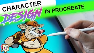
Ryan Maloney draws a cow baseball character in Procreate, starting with loose sketches and confident inks. He shares his setup (tripod, ring light, light box), key techniques like duplicating line layers to prevent bleed and using the Studio Pen for line weight, and his mental approach of avoiding perfectionism and trusting the flow.
Chapters
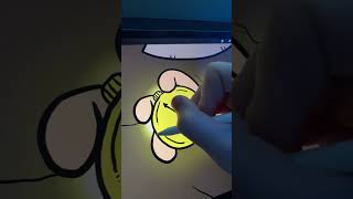
Today I'm going to be designing a cow playing baseball character in Procreate on the iPad. You can look at it as a cow or a bull. I don't know. I just— I was thinking of it as a cow and I made this rough sketch of the cow being ready to swing. I'm going to turn down the opacity, grab my black color and my studio pen, and I'm going to start inking this drawing. Turn on some music and go for the most confident lines or the lines you feel like you could nail first to start the drawing with a little bit of confidence. I chose the ear and then I moved on to the face. I just like the angles of the ear and it felt like I could do a good job doing them quickly and getting a little win at the beginning of this drawing. Sometimes you'll get into drawings and you just feel like you can never get the perfect line. So I always like to lay a line down and just keep undoing it until it feels good and perfect, and then you can move on to the next part. But also don't get too perfectionistic, if that's a word, about it, because you need to, you know, create to put this out in the world, and you don't want to get hung up on it. Most likely the details you're getting hung up on are more so based out of fear of what other people will say or not say about it, and it's more important to get it done than to be perfect. Cheesy cliché. If you look at the top of my desk, I'm always keeping other people's artwork, like a stack of papers of other people's artwork near my drawings, not to copy their style, but it's, it's a set, a standard that I aim for. I'm constantly comparing my drawing, thinking, is my drawing professional like theirs? This artist is Kaufman or Kaufman from— he's on Instagram. He's an amazing comic illustrator. So right now I'm holding the camera with my left hand in a tall tripod above my desk. And then you'll see on my desk I have a 3-prong camera grip that I will put the same camera in to get different close-up angles. As I'm creating everything, I'm documenting everything, constantly checking the cameras. It's an art form all by itself, creating and documenting at the same time. I have my coffee nearby, a light box on my desk that I'll turn on to shoot the YouTube thumbnail for this video. I usually only turn on the ring light on the left-hand side of the drawing. During the drawing process because I find it reflects easily off the iPad. And you'll even see in some of the final reveal shots at the end that that ring light becomes a problem. I want to light the iPad nicely, but I haven't found a way to avoid that reflection. I think I just need to experiment more. So right now I'm bouncing around the drawing using the Studio Pen, inking the drawing. There's really no rhyme or reason. I'm usually just picking the parts that are either lacking the most or I'm most excited about. Usually it's a thing that, that feels like it's lacking the most that you need to focus on. So each one of these characters is going to have cleats on, but they're going to be in the shape of their— the animal's feet. So the cow or the bull will have hooves hoof-shaped— I don't know how to say that— hoof-shaped cleats. And some of the other characters, like the puma, will have 3-toed cleats. There's a rabbit with 3 toes and spikes on the bottom of them. I'm doing— I'm aiming for 38 characters for this line of— for this clothing line that they were launching. I like to go in and add shadows in black with these little stripes, striations, and these tiny little details. I just feel like they set my drawings apart a little bit, and a lot of people won't focus on those details. So it's, it's something that makes my drawings look a little bit different. I'm also going around the drawing and making the line thicker on bottom sections or parts of the character that have more weight. I feel like this gives the character a little bit more energy, variation in line weight, in line thickness. I'll drop some shadows under the arms, some muscle striations, some wood grain in the bat. See, I'm dropping some of the weight on the lower part of the body. I'm doing more so on the bottom part of the body rather than the top, just to give it more weight and more strength. I'll make adjustments, like I'm throwing in this ear last second, and, uh, I don't know if I designed that in my sketch, but I felt like it needed to be there. This is the detailed section of the drawing. I'm going around asking myself questions. Can this be better? What details can I add? Does it need to have details? Do I need to simplify it? I often find that it's the little details that make people the happiest, that, you know, sort of makes a drawing more rich or more attractive. When I set out to do these drawings, I really don't have much of a plan. I find that, you know, what the level that you draw at today is the combination of the years that you've— of work that you've put in to build up to that point. And there's almost very little that you can do in this this drawing session to make it that much better. You can push yourself all you want, but it's really the repetitiveness, you know, if that's a word, the repetition of drawing every day for years that bring you to, you know, how good you are now. So a lot of times during these drawing sessions, I sort of— I want to take control. I want the drawing to be perfect, but I find I always end up with something I'm not happy with. Or I'm focusing too much on what other people will think about it during these sessions. Really, when you put on music and let go and let the drawing become what it's going to become and just do it day in and day out, and the level and your, your skill level, your skill level will increase as you go day by day rather than trying to create the perfect drawing in this session. I'd rather let go and just let it flow. I'd rather let go, let it flow, and let the drawing just come to life and I'm often, you know, the surprise of what the drawing ends up becoming just makes me extremely happy throughout the day. So, you know, there's a lot of letting go in this process, much more so than trying to create something. Right now I'm dropping in colors, all my base colors. I create a new layer with— by duplicating the line layer, and then I drop all my colors underneath. I do this in Procreate because if you drop the colors on on the regular line layer, so you fill in each one of those shapes with a color, you're going to get this white line on the inside of your black strokes that's going to show up. So what I do is duplicate that line layer and fill it in on a bottom layer, so there's a top layer above it with just black and white lines that covers up any, any of that white line that shows up. So for color decisions, I'm thinking about Major League Baseball teams that, that I was a fan of when I was a kid. I was sort of thinking of the San Diego Padres here, but I wanted to make it original, so I didn't reference any baseball uniforms. I'm sure I'm combining two teams or leaving something off or not being accurate with it, but that inaccuracy sort of makes it original. Dragging and dropping colors from the color palette to your closed shape in Procreate is by far the fastest way to fill in a character's color. You'll often need to go in and fill in tiny details like this just in case. Sometimes you'll drag and drop a color and it'll miss and it'll fill in the line layer instead. Leaving this weird fuzzy edge. If you tap down on the canvas with one finger and hold it down, you'll be able to sample any color on the canvas. So I'm often doing that to, you know, get the same orange or the same color and drop it into another shape. It's the fastest way to do it. Now I'm adding highlights. I don't go crazy with highlights. In this, I'm doing a little bit more than I usually do. I always like to add shadows in for sure, so I'll go in and add a new layer, grab a black color, turn down the opacity to about 20%. And that becomes my shadow. You don't need to go crazy on the shadows and the highlights, but just pick one side where the light where you think the light is coming from, one side where you think the shadow is, or the shadow will be on the opposite side of that, um, and then drop them in. I use just a sliver on all the body parts, usually does the trick. Enjoy the reveal. Thanks for watching. You can cut me up in pieces.
More from Ryan
Drawing Mr. Beast into a Beastly Baller trading card #art #drawing #tradingcards card
The first draft of my graphic novel #art #procreate #originacharacter #graphicnovel #drawing