Draw NFT's in Procreate - CHARACTER DESIGNING
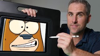
Ryan Maloney creates an NFT character called the Loco Bear in Procreate, starting with research on Magic Eden and OpenSea, then walking through canvas setup, brush choices, and design decisions like eye placement and snout proportions. He emphasizes layer organization for interchangeable features, shows how to add shadows and highlights with blend modes, and stresses staying unique in the NFT market.
Chapters
Camera's rolling. Let's draw some NFT characters. Even if you're not into NFTs, this is still gonna be a good character design course in Procreate using my Apple Pencil on a 2018 iPad with 256 gigabytes. You probably don't care about that, but I see it in the comments so often that I had to say it in the intro. So, let's get drawing. I'm starting this drawing session with no idea of what I'm going to draw. I have the name Loco in my head. I used it in a book title one time and I'm thinking I'm gonna start off with Loco Loco Birds or Loco Bears. You can get your ideas by researching. Go on MagicEden.io, OpenSea, any of these platforms, and they're going to give you a ton of ideas and what styles will work. And I'm going to actually just start off with Googling crazy birds. And I don't want cartoon birds. I don't want some— there's already something called Crazy Birds. I don't want Angry Birds. I don't want other people's styles. It's good to know what styles are out there, but what I'm looking for are birds in nature. Photos, crazy birds in nature. Ooh, like look at that one. And it's also at this point I'm starting to think about other animals. Could I do loco bears or bears loco? I feel like I'm better at drawing bears. So, I might do— let's check out bears. Like what— do I get any inspiration just from photos of bears? So, I have Procreate open. It's at 3000 by 3000 at 300 DPI. I usually do a blue color for my sketches and I use the Crunchy Cow pen. I got to think at this point, what is the style I want to go with? And I don't have any set process like research and go to Procreate. Sometimes it's I'm Googling and then I'll sketch something in Procreate and then I'll go to Magic Eden, I'll sketch something up in Procreate. You know, scroll through here and you can kind of blur your vision and see what's missing. Like I can look at this and see there's only one bright red color. There's a pink, a dark red color. So, I'm starting to think that, all right, backgrounds could be bright red or dark red or maybe textured because I'm seeing a lot of flat colors here. I like this character design style. The line work is a smooth line with a textured paint color and a flat background and some gradients. EGEN Apes, check out. This is probably a 3D style. Do I want to go 3D? Do I want to invest that amount of time? To me, loco birds or loco bears could be very primitive. There's also this really simple style that I always dream about being able to do, but then I overdo it and I can never pull it off. I don't think I could ever live with just doing eyes like this. I admire this artist so much because they can pull it off and feel like that was enough, but I like to overcomplicate things and make my life extremely difficult, so I can't do that. I have to do crazy wacky eyes. And as I say that, I'm starting to get ideas that maybe the base could be a 3D— Spoiler alert: Ryan will not be creating a 3D base. What you're witnessing right now is the creative struggle. Tons of different ideas, milling them over, processing them over, testing them, revising, abandoning, figuring out which ideas stick. You know, bears have like big, big eyes like that. Sometimes their eyes are sort of tiny compared to their head. Now, is there anything we can do here where the bottom jaw is bigger than the top jaw? You can decide you want your character facing straight on, 3/4 right, 3/4 left, you do a spinning— I mean, that's probably too much, don't listen to me there. A lot of 3/4 turns here, 3/4 to the right. Let's check out OK Bears so we don't accidentally knock their style. Yeah, there's personality. There's personality in the snout. Snout? Is that a word? I don't know. Really good nose design on these. Also noticing that the placement of the nose is different. So, this snout must be all drawn together. Good clothing, good consistent shadows. I wonder if my characters should even be bears at all. Could they just be loco animals? Loco— end up going with bears. So, during this part of the video, it's all creative struggle. Fast forward if you want to see Ryan draw the bear. I don't want to get thrown off or copy too much. So many bears going around that maybe this is not bears, aren't it? Loco birds? I really did want to make a 3D base out of this bear. Loco— I have this line called Beastly Ballers that's sport playing Monsters. Love drawing monsters. It can stand out and differentiate from everything else, the birds, the bears, the bird, the moon birds, the, you know, everything out there. I'm still going to experiment and just sketch, get my hand moving because you may lock on to something that you never thought of that would work. This is really just experimenting, failing, abandoning what doesn't work. We have cats, we have skulls, we have mega things, we have gods. This fits as a cool style. Catalina Wine, all about Catalina Wine Mixer. Or Catalina Whale. Looks like this style may have been drawn in probably Procreate. You don't want to be influenced too much by what characters are out there. You want them to come from sort of inside of you and experiences you've gone through. Do mock-ups, put that into the marketplace and see if that is going to work. Does it feel right? Is it different? A lot of times being different is all you need to do. You don't need things to be perfect. It doesn't need to be the perfect artwork, the perfect drawing, the perfect line work. It can just be a different idea and challenges everything that's out there. I always think of bell-bottoms. In the disco era, bell-bottoms were all the craze. They were everything. Everybody was wearing them. 2 to 5 years later, everybody's wearing skinny jeans. So, in any marketplace, especially the NFT marketplace, or anywhere you're going to be putting art, maybe you're designing characters for toy lines or characters in movies, bring your original different unique approach and spin to your character design so it'll stand out. It'll be like dropping oil into water or dropping something that breaks up oil into, you know, it's a terrible analogy. Always strive to be different and stay on the on the outskirts of everything that's popular. That way, eventually your different thing could become the popular thing, and then other people will come in to disrupt you and put their different spin on it. Different character designs are what will stand out. I'm a huge fan of this character design style. Major nostalgia, and you can tell there's just experience behind these designs. I saw that the producer produced Boondocks and Black Dynamite. Obviously totally experienced. Really different designs. Like, look at these eyes versus these eyes versus these eyes. Keep the character base the same, different hair there, different hats. I mean, There's no shortage of detail in these. There's— this is really good artwork here. I love the different textures. They just went flat color in the background, that's cool. I like that they're doing full body. Full body is very interesting to me. So, let's see, is there something we can do full body? I was drawing these rollerblading characters the other day or characters with wheels on their feet or skateboards, so, you know, could Loco Bears athletic or extreme? Is there like a trend going around that's, you know, really extreme or fitness brand or like jacked bears or something funny about this doing jacked birds like super muscular birds with tiny little bird legs? The problem with ideas is you always think at that moment you have the best idea ever but then you go into the valley of despair and you question your idea. You're wondering why you're not playing golf instead of creating ideas and drawing. You sort of want to abandon it and you have to make the decision of are you going to push through and figure out what this thing really is. A lot of the times in this Valley of Despair here, you're just holding on to an idea of what you thought it should be, and in order to get here, you need to completely let go of your idea and let it become what it will become. Here's an example. I made a 430-page graphic novel. I didn't question if it was good. I just questioned whether or not I was going to get it done, and once I convinced myself that I could do it, I just stuck through it. Whether it's good or not, I don't care, but I'm extremely proud that it's finished. All right, let's get some character designs going. I'm stuck in a rut. Maybe it's lunchtime. Let's go eat some lunch and come back. All right, That was a good lunch. I had a salad and an apple with cinnamon. And I also had an idea that I'm not going to make these too realistic. These bears are not going to be bears. They're not going to be birds. Underneath, they're going to be robots. All of them are going to be the same. Loco Bears, Loco Bots, Loco Bears. Let me tell you, Ryan here in the past has not given up on this robot idea, and he won't figure out what this drawing needs to be until he lets go of that idea that just isn't working. And my ears are going to be up here. Let's make the eyes extra large and the snout. I find that overlapping mouth shapes cause a problem here. You also want the eyes to be separate and give a little space between the ears and the eyes here in case you do earrings and you don't want them to overlap the eyes in any way, but you could also just keep them to the edge of the ears. Eyebrows and hair can conflict, so you can almost think about putting horizontal lines across your character and just tell yourself that the clothing isn't going to interfere with the necklace. We'll keep the necklace above this line and the clothing below this line. Or you just do a pure overlap and make sure this necklace is at the edge of the neck so that this, the clothing and the necklace don't overlap and all of your items don't overlap. I spent weeks and weeks fixing CrunchyCow's NFTs because of the overlapping issue. I'm starting to see a cool character here. There's sort of this grin on his face. Sometimes when I just throw lines around, it'll start to create a character that I wasn't expecting could be created. Starting to see the snout here. So, I know the snout is going to layer over top of the head and the eyes, make this more robot-like. All right, the head is getting too close to the necklace. We're going to keep this as the neck, maybe some like shock absorbers in the neck. The eyelids are where a lot of expression comes from. Down low, sleepy, dazed and confused, up high, super excited. Don't worry about making the perfect combination of character features work with each other. Worry about making character features with personality. The eyebrows have personality, the eyelids have personality, the pupils, the nose, the snout, the mouth, the teeth. Infuse personality into each one of those items so when the character is generated, it's going to have a ton of personality all the way around. Sort of looks like a dog. Please don't make it a dog. I may, you know, I'm not opposed to abandoning the robot. In fact, it may happen. I think this is a cool looking bear that is Loco, but there's got to— what's Loco about him? We got to think, you know, how does the name connect to the characters? Just like a product or a brand on a shelf, He looks a little loco. Let's, uh, maybe we could put some stars around his head. Let's make these oddly shaped stars. Once I have my sketch done, I turn down the opacity on that layer, create a new layer on top, grab the black Crunchy Cow pen. I like to work in certain percentages of the size of my brush or my pen, just so I don't have to think. Anytime this slider is in the middle, that's usually a good outline style. If I want to go heavy, I'm sliding it near the top, and at the bottom, I very rarely work in this. If I'm going to do this, I'm probably going to switch pen to a calligraphy pen. So, let's just say 30%. That's a good width, 30% at 300 DPI, and you can go in the Crunchy Cow pen and experiment with the properties and the dynamics and tweak these things to make sure it feels good to you. Get the nose done. I'm actually— let's scale it down to 20%. See, do I like that? Sometimes you gotta just go with the flow when you draw because you'll overthink things. Put some shade lines. I'm gonna draw the snout underneath it. The more you can draw on layers, the better. It's going to be one snout. Experiment with the teeth and the way the teeth lay. Do they have an overbite, an underbite, open? They've something stuck in the teeth? Are there gaps in the teeth? What can you do to add personality to each one of these items, especially the teeth? So, I know that there'd be a big, I don't know if we call them canines on bears, but There'd be those big teeth in there, so I'm going to drop those in and add a lip underneath. The mouth is going to be baked into the snout because sometimes the snout is going to be open and I want the mouth to be open. I don't want to have to redraw the mouth. Now let's get the eyes going. So these are going to be the base of the eyes. I'm going to duplicate these. Crunchy Cow eraser. A little bit of color. You can do multiple colors on the eyes. Put them under this line layer. And then you can add a little bit of shadow on them too. Usually I do the shadows at the end, but just in case you are not hanging around for the full video, let me throw some shadows in here. Add some highlights. Let's get the pupils going. Pupils are personality. Let's see, we'll start off testing out small pupils looking directly at us because small pupils crossed in, it's going to give you a little bit of a loco look. So I like this wide open eye look. I'm going to go ahead and throw some like scrunchy eyelids over top. I don't know what color these are going to be. Probably don't— I probably don't need to double up the layer. Maybe all the bears have gray eyelids, something like that. In order to keep my interest in this drawing, I got to move fast and get a lot of— and cover a lot of real estate because you can begin to doubt your drawing very quickly and your body will want to run away and go eat something sugary. Get the body in here. Something local about these bears. I'm cool with it. Throw some eyebrows in here. I'm always experimenting with different ways to draw eyebrows or features on a character. There are no rules. So, you can put these little flags at the end of eyebrows, put them at the beginning of eyebrows, see how they change the vibe of your character. Now, let's throw some stars up top instead of the black outline, I'm going to a dark yellow outline. I'll duplicate this, add a bright yellow inside of it, and then we'll add shadows and highlights onto these. Pick a brighter yellow, duplicate that layer so this line layer stays preserved. Throw in some bright, grab some orange. These are going to be my shadows. My shadows are going to be on the bottom side of these stars. Maybe make it a little bit lighter. Don't overthink this. People aren't worried about the details in your drawings as much as you think they are. Let's find a brown color for this bear. Go a little bit brighter. Let's color in the snout. Let's try a bluish gray for the nose. And you can see I'm duplicating all of my layers before I add color in. I like to preserve my line layers on top and that also means that I can't draw over them. So, you can see the line layers are over top of anything I draw here. So, in case I go over the edge or I fall short here, I can just clean it up like that. If you have another way of drawing these, leave it in the comments. Highlights. I bounce around from flat colors to shadows to highlights. I know a lot of people, and I've also professed to have an order of what I draw, but I find that in order to keep my interest in a drawing, I need to work on the part that interests me right now, and sometimes I'm drawing the teeth and I say, "Oh, that needs a shadow over it right now before I move on to another part." The trap there is you get a dopamine release from these tiny little details and you forget to focus on the big picture. Constantly zoom in and out is much as you can, try to work on the big picture and work into the details, into the shadows and the highlights, rather than working on the shadows and the highlights and the details right at the beginning. But do whatever it takes to keep you interested in the work so you continue to do more work. See if we need highlights on the eyes. I'm gonna throw some gums in the bear's mouth. You, you won't see many of them, but it's just gonna add a little bit of interest. When I'm drawing teeth or facial features, I'm feeling them on my face. I'm feeling what the gums feel like, what the canines feel like, what the— like the lines and the wrinkles and the shape of my eyebrows and my eyes, and sometimes I'll make that expression that I'm drawing. You want that feeling to come from inside of you, inside of your body, out through your hand and into Procreate or onto paper so other people feel that. If you're just drawing it and you don't actually feel it, it's going to fall a little bit flat. Let's go ahead, throw some shadow on this. I'm just going to pick a dark brown, create a layer above my flat color layer. And I'm gonna do the shadows on the bottom, bottom right. This is a tip I learned from Enoch. He always does the shadows on the bottom right and he does his highlights on the top left as if a light is coming from the top left. And I did a live drawing with him and that is a way that he reduces the time, his thinking time. I use it now and I love the idea. I find sometimes a character doesn't come to life until you add shadows and highlights on them. For highlights, I like to choose an overlay or a soft light. Overlay gives it a warmer feel. Shadows, I set to darken. Once you're once you're on that layer and you have it set up, you can go around your entire drawing, maybe move it to the top. So, I wouldn't throw shadows over top of the mouth or any items that are going to be interchangeable. Say you do shadow over this teeth and then you go to draw a different mouth, you're going to have a problem. That shadow is still going to be here and your teeth are going to be going a different way and it's going to look like a weird line. So, bake your shadows into the items as much as possible. Let's go ahead and throw a few more shadows. We can do Global shadows under the eyes because the eyes aren't going to change here. The eyelids will, so I'm going to show you how I bake shadows into the eyelids. I'm going to create a layer underneath the eyelids. I'm going to turn down the opacity, usually aim for 20%, set it to Darken, draw your shadows. You can even move this up above your item so the shadow hits the bottom of the eyelids there. Let me zoom in so you can see that. Let's go ahead, add some highlights, see if highlights won't show up as a dark mode. I'm actually going to create one highlight layer above. Nothing fancy here. Set that to overlay, turn on the opacity. Now we're going to merge down. Doesn't work if you merge down directly, but pinch these 3 and that also doesn't work. What the heck is going on here? So it doesn't like the combination of these blend modes here. All right, let's just make it normal. Now pinch them together. Now you have interchangeable eyelids with shadows and highlights. Let's go ahead, add some background. Let's find where that stray shadow is hanging out right here. Let's throw some snout shadow. Actually, let's test Bonobo chalk on our shadows. Ooh, little mistake can go a long way. I love the Bonobo chalk for shadow. I haven't done something like that in a while. I'm going to stick with that. It's kind of cool. Adds a little texture to our character, a little bit of dimension. Test and experiment in your drawings. Now, we can pinch these 3 together. We have an interchangeable snout. Notice we do have some shadows overlapping the mouth. So, if I were to change that, you'd still have that shadow. So, we got to fix that which is just erase it, make the shadows into the mouth, not into the global character. Let's add some clothing. We're going to go tank top. I want to make sure this is above the arm line. I think I moved the line layer way to the top. So, I'm going to move the clothing way to the top. I'm going to experiment with a different line color for the clothing. And I'm just going to feel like what the shape of the tank top should be, wrapping around the character. And there'd be a little bend and a little arch, lower arch as it goes back up. I'm going to duplicate that, throw some— I'm going to set this to alpha locks. I'm just going to throw some Novo Chalk shadow on the tank top. I could also add some color here. Maybe it's an American tank top. I never go for just purely blue or purely red. I'm always selecting like a muted version or an oversaturated version. In art school, I just remember teachers always saying to never use pure black out of the tube. Always use black and mix it with something else so it's your original color. And when I'm drawing in Procreate, I sort of think the same way. Am I going to pick that standard red, white, or blue that Procreate recommends, or am I going to take it and just shift it a little bit? The more you do that with each and every single color, the more original your color palette's going to look. All right, so this is a Loco Bear. It's looking pretty good. Now I'm wondering like what other details can we add here? Is there going to be fur on top? Fur on the arm? So that can be baked into the line layer, which is right here. Could also add sunglasses. We could add a necklace. To add a necklace, I would add that layer all the way on top and I'm not really feeling the tank top with a gray line. So I'm going to test that out. Hmm, black line. I think I'm going to double up the line. I'm just going to go a little bit of a thinner line here. Procreate is so smooth. The feeling of like the smooth screen with the smooth pencil. And I clean my screen with this stuff. No sponsor. This is like the best stuff to clean your iPad with. It gets like an inch of my kid's snot and food grease off my iPad in 2 seconds. It makes it super smooth to draw on. So we got a double line there. It's a little bit rougher than the other lines. I'm pretty good about this character. There's something kooky about the eyes. They're a little bit different. The nose is different. The mouth is different. The ears are a little bit different. Something Loco about it. Let's go with it. That's a wrap on drawing a Loco Bear. Whether I push this NFT line forward or not, it was to help you learn how I draw characters in Procreate. If you haven't yet, you can download the free Crunchy Cow pen. Let me know what you think of it, and let's connect on the socials. Thanks for watching.
More from Ryan
Drawing Mr. Beast into a Beastly Baller trading card #art #drawing #tradingcards card
The first draft of my graphic novel #art #procreate #originacharacter #graphicnovel #drawing