How I Design Characters in Procreate - Smooth Lines & Color
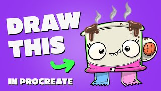
Ryan Maloney shows his Procreate character-design process on a 3500×3500 px canvas, splitting sketching and inking into separate mindsets. He demonstrates line-smoothing tricks like zooming in, rotating the canvas, and varying line weight, then layers colors with multiply for shadows and overlay for highlights to finish a coffee-mug character.
Chapters
Let me first show you the canvas size that I'm working on before we ink this character. So my canvas size is 3500 by 3500 at 300 DPI. I just always work in this size because I can scale that size down, and that size is great for printing, and it's great for setting up a square size on Instagram, 1080 by 1080. But I always like to have a much larger file size than I actually need, and it makes me feel like I draw smoother lines at a higher resolution and a higher DPI. I think that stands for dots per inch. Somebody correct me in the comments if it doesn't. So when I go to sketch this character, I want to have my blue layer on the bottom. I always pick blue. I've trained my brain to think blue means not perfect. It means drawing and sketching and getting the ideas out and flowing. And then when I choose a black ink, then that sets me into inking mode, into perfection mode where we're trying to get things smooth and perfect. It never actually happens. It will never actually feel like that, but they're two different ways of thinking. And sometimes I will actually do my sketches in the morning, and then either the next morning I'll do my inks, or later that day or later that night I'll do my inks, just because they're such different modes of thinking, where one is idea generation, brain dumping, really getting ideas out, and the other is almost like a, like a manufacturing the perfect leather part for a, for a product or something like that. They're just two different ways of thinking. And you don't want— I don't like to overlap my thinking because if I try to be too perfect in my sketch generations, I'm going to delay. I'm going to think to myself, this isn't good enough. I'm not getting my ideas out. I don't have any good ideas. And they're just two different ways of thinking. So I try to separate either by time of day that I'm doing it or just in the way my files are set up. Let me show you. You can see this top layer here, or all these— not layers, this top row here in Procreate. This is where all my sketches are set up for the morning, so, or for the next day or for later that night. This is all my blue sketches. All of my ideas are ready to go so I can go into inking mode, into perfection mode, and not have to worry about coming up with the ideas. It's coming up with the ideas to me is a very fun part. And then getting the inks right is the fun part, but it's a little frustrating. So I like to separate the times and I mean, this is probably a weird connection, but it's almost like cardio and strength at the gym. Like sometimes you separate them, sometimes you blend them, but I typically like to keep them separated just so I'm in different modes, different mental modes. So I don't get too frustrated and I can just focus on the work and not the thinking. So I'll do all my rough sketches, usually plan out 3 to 5 for the next session. Get them at the top row. And I go as far as to set up my files to have this extra layer on top and turn on the opacity. So I don't have to open up this file, add a layer, and turn down the opacity because that creates a level of resistance. That's like walking into the gym and knowing you have to, I don't know, do extra stretches or extra warmups, or there's some form of resistance that's stopping you from getting to that point. So I want to reduce and remove as much resistance as possible. And that's knowing that I have my files set up in the right way. It pretty much eliminates any excuse I have to get to my file and say, oh, I just don't feel like doing this today. This is like putting your sneakers next to your bed before you go to the run. And I'm going to make so many cheesy analogies and comparisons using drawing and creating and art or, and sport or physical fitness. So bear with me, but it's the only way I can think about this stuff because I don't see them as different things. It's all skill development and pushing yourself to do it and figuring out ways to make it enjoyable and easy for you to do rather than, you know, some military drill where somebody's shouting and yelling at you or your thoughts are, you know, telling you to be motivated and to get it done, get it done. It should be enjoyable. So there's ways to do that to make it enjoyable. So if I were waking up in the morning, this file would already be set up like this with a 20% opacity. And a new layer on top. And then I choose my Crunchy Cow pen because that's my smooth pen and just import it into Procreate by hitting this plus and going to import. Hit that import button and then you can import the file directly and it'll just show up in your Procreate, usually under the inking tab or wherever. I like to put it under the inking tab or put it under whatever tab. Actually, maybe it just shows up under imported down here. So if it gets lost, just check that imported tab. So we have our character here. This is a coffee mug that says Mom on it, and this is for Beastly Ballers trading card line. I don't know what else I'm gonna turn these into. So as I'm inking this, I do wanna keep the character in mind, like the feel and the energy of the character and what I want other people to feel. But I'm also just trying to get somewhat smooth lines going here. Let me show you 3 tips to get those lines a little bit smoother. One is draw through your line. See this handle here? Actually, the first step: zoom in to draw your lines. Make sure you're not zoomed out like this trying to draw really smooth lines because you don't know what they look like up close. So you want to zoom into like a medium to up close range so when you draw it's a little bit smoother like that. Now when I say draw through your lines, you see we have this line here and then we have this line here. You could have chosen to do this. You could have said, well, I have this outline, I'm going to draw this line and then switch to this line and then come down here and switch to this line and switch to this line. There's not much variation in these lines and these are a little bit scared and you see some hesitation here. So what I do is you can draw through the line like that. And even that line doesn't look perfect to me. It doesn't look perfect. I'll take that one. And then you can add another layer on top of it and draw that one and then go back down to your bottom layer and just erase that. That part of the line. So now there's less hesitation in your lines and they draw. And I think I learned this from a tutorial, an Illustrator tutorial, where you draw through your lines and then you, I don't know if you outline them and release the, release the lines in Illustrator, and then you can just tap them and delete the overlapping lines. But I brought that over to Procreate because I know that that process of drawing through your lines is just going to reduce hesitation and reduce reduce jitteriness. I think I just made that word up, in your lines. So, for circles, you can use the snap effect. I know I said I'm going to give 3 tips, but I'll just distribute those tips throughout this video because it's early morning here. I think I actually still have coffee going. No, I'm empty. So, I just use the snap tool. When you draw, you can hold down the circle and then it snaps in place. You do get this little extra, like, bleed here from holding it down. So, you need to go in and smooth that out if you really want super smooth line. I've sort of relaxed a little bit in my old age, try to work with imperfect lines. So if I have that, if I have like a little blip like there, can I extend that? Can I create some sort of additional line that just becomes a detail? And I got that from, I don't know what type of Japanese art, some sort of pottery where it's the, they take the cracks in the pottery and they fill it with gold paint or gold material and then that makes the whole piece. But that's what I like to think. If I'm going for perfection and I fall short of that perfection, what is it in that falling short that I can turn into sort of gold. So, I like to take those little blips that happen when you lock in your lines like that, and I say, you know, can that be something? Can I blend that in? Can I make that something cool? So, that's another way I— another way of thinking that I— it's what's going through my mind when I'm trying to make these perfect lines. And I by no means am a perfect line artist. There's people like Enoch's Art, they take it to another level. So, let's get moving with this. I'm gonna draw a few more lines and then I'll come back and we'll chat about them. Okay, so a couple things I did there. When I drew, I know the angle that I like to draw at in order to get smooth lines. So I know I like to— this down line here is a pull versus drawing it as a push. See, this push is going to be a mess. The pull, I have a little bit more control. I feel like I use like the muscles in my— I just lock out my arm and sort of use the muscles almost in my back or my shoulder to pull the line rather than drawing like that. Like if you draw like that and you bend your wrist and all the movement comes from your wrist, this is going to be a lot more jittery than sort of locking out your arm and pulling through. Another thing I did here, I ended up push— I think I pushed this line. So I did a pull and a push, but notice that I twisted the Procreate canvas to do that. So I got for this line up top, I can already tell that I'm not going to push it like that. I'm going to push the top and then pull most of it. I find that there's like much more grace in a pull like that. Than if I try to push it. And I don't know if it's because the movement comes from more of the rotator cuff than the back here. That's just something I find that helps is a little bit more pulling than pushing and twisting your canvas so it makes it easier to pull. You know, if it was like this and then I'm going sideways like this and I'm using all of my shoulder, if I twist the Procreate canvas and then pull, I'm using like a, I don't know if it's using a larger muscle, but it's a little bit smoother than than using these tiny muscles that sort of are jittery. So, let's twist this. With interior lines, I'm putting a little bit less weight than the exterior lines. So, I want these interior lines to be a little bit thinner and I want bottom lines to be a little bit thicker and I can go back and increase the size of these lines. I don't do it too much these days. I used to get hung up on the perfection and the weight of each lines, like looking at Ren and Stimpy and following artists in the '90s. What was the— Rocko's Modern Life and other cartoon series and I thought I needed to make my lines weighted on the bottom perfectly like that, but I just try to do it a little bit and a little bit better every time, and I don't just— I don't spend too much time or worry if it's not perfect. So, I'm going to draw the base of this character first, and then we're going to go through and add the details on top. So, at the bottom, we have some sugar packets. I do want to make these different colors, but I'm going to draw them black lines for now, and we're going to test out different color stroke on them. I'm going to throw in some details. I loved Shel Silverstein drawings as a kid and these little dots that I put, these little messes are sort of an ode to Shel's drawings. I always bring them into my drawings and they also remind me to not keep, you know, it means my drawing is not perfect, does not need to be perfect. And I always found the simplicity of his drawings to be amazing because he created hits with the, like, the most basic drawings. I envision him in his studio, drawing like 100 of those drawings a day. And here I am drawing 5 per morning. So I'm going to switch up colors here. I normally don't do this. I would normally keep it in brown, but I want to show you that you can change the color of your stroke and it really changes the mood of your drawing too. So for the coffee drips, I'm just going to go ahead and make a dark brown outline here. And I'm going to duplicate this layer and find a coffee color. So it needs to be either, either lighter or darker than that stroke. That's about right. I, I sort of want this, the interior to be darker than the stroke because in coffee, the, like the reflection of it around the outside is what's gonna make it show up a little bit more versus like a dark stroke with a lighter coffee interior. These steam lines are gonna be kind of interesting. I'm just gonna fill them in with a gray for now cuz I haven't figured them out. So let's fly through this. Now let's move on to the eyes, which are to me the most fun part. Get your undo button ready, because I'm gonna attempt to do a nice perfect circle here, but it doesn't always work. And I could start from this level there, because I have this extra line here, but I'm gonna start up top and I'm gonna pull through, see if I can snap it. Not bad. I have a little bit of mess up here. I can never quite clean these up just right, so I need to just be satisfied with imperfection there. But if you have a style that you know, is not perfect, it's gonna be fine because like I like— I put little messes and drips to remind myself to try to not be perfect. I'm aiming for perfection but I always throw it out the window because that's— you're never gonna be satisfied if you're going for the perfect, perfect, perfect lines. Let's get some pupils going in here. Once you get the pupils in, to me the character really comes to life and I want one— actually it's once you add the reflections to the eyes and I like experimenting with different reflections, maybe putting some dots up top. To me, that reflection, that like twinkle in the eye, that is what gives your characters life. Like sometimes you can do just a basic black dot, which is cool for like, I think that works for like animations with bigger budgets that don't have time to drop all those reflections in or adult humor cartoons and comics. I think that works awesome. But for these, which are just trading card, they're just gonna go on cards that go in these packs here. With this pupil, let's make it like I have a star in here. I don't know if— is it a star? Why would it be a star? Maybe it's not a star. Maybe we're— maybe we just have another pupil. I'm going to duplicate it. Yeah, I'm cool with that. All right, let's add in a mouth. These are called Beastly Ballers, so all of these characters have a little bit of beast— ooh, that was a very shaky line. My hand just shook, so I'm going to pull it. Movement from— I'm just talking to myself here because I just felt why I did it. I was drawing like this with my fingers, which these small— like, I feel like there's, there's more twitch and more less control from your fingers, less in your wrist, a little bit more in your wrist, more in your elbow, and then in this part right here where you lock everything out and you just draw through. I just felt it because I got lazy and I just went like that, which gets jittery. Cool, so we almost have our character inked. I'm gonna throw some eyelashes on the character. For smaller details, I anchor my palm on the screen and Procreate doesn't pick up any of your palm movement. So, I anchor here and I will do some drawing from my fingers for the smaller details just because it's harder to, harder to make your arm move for those smaller details. I think we're looking pretty good. I do want to add a jersey on this. I'm really thin on my lines here because they're the edges of the basketball jersey. The number, probably number 1. I'm gonna sneeze. Oh, all right, I'll remove that. I'm gonna add in a few more details before I get to the coloring. Just gonna go in, maybe there's some drips, maybe there's drips on the handle too. Okay, I'm gonna choose a beige color for the mug. I'm gonna blend these. I already duplicated my inked layer here, and then I add the colors beneath it. I drag and drop for colors, but you can also hold continue filling or tap continue filling and just tap your colors in. And of course, this is going to be a pink jersey. And then I want, I want one sugar pack to be pink, and I want one to be light blue, water break. Then all the numbers and the striping on the jersey is white. I'm just going to create a layer underneath this and create a white stroke here that you can't actually see and just drag and drop. So now these lines in this color are filled in, or the number are filled in. See where the mouth is? Let's duplicate the mouth. Inks and choose like an off-white color, continue filling, tap, tap. Let's do it with the eyes, duplicate the lines and you can create a reference layer underneath this instead of— like I could turn this into a reference layer instead of duplicating the lines. But for some reason, this is just muscle memory and how I like to work. So, I'm going to alpha lock this eye color here and just add in— it's probably hard to see on camera, add in some white shade to the top of the eyes. I can even try a little pink off-white layer, off-white coloring to the bottom of the eyes. And this mug is not really popping to me. So, nope. Just make it a little bit brighter. Usually I do my shadows first, but I just want to get this, the color of this mug right first. So, the base color of this mug is already pretty much already set. Now, let's go in and do the shadows and then we'll work on the smoke at the top or the, whatever that's called. Steam. So, for shadows, I create a new layer, I drop the opacity to about 20% and after you draw the layer, you can sort of mess around with the opacity and then I set the layer to multiply and you can alpha lock or let's see, can I create— no, let's just— could select here and this selects all the artwork on the layer and then I could draw over it. So, when I draw through here, it doesn't cross over the boundaries of the artwork. So, Let's throw in some shadows here. And the way I'm choosing shadows is just thinking that the light source is coming from above here. My hand's a little bit shaky this morning, see it? So I'm just thinking to myself, if that light from above were hitting these objects, where would the shadows fall? I'm actually gonna move the shadow above the coffee because the coffee would probably drip around the edges a little bit here. And I can use that as the bottom shadow of the coffee. I'm just gonna go through, drop some on the teeth. Shadow underneath the teeth. And that's about it for shadows. Maybe it would hook over the rim of the glass there. That's it for shadows. I'm gonna experiment with some— so we have a pink color here. I'm just gonna experiment with some green for highlights. This is Beastly Ballers and this could make it pop a little bit. So normally I would use like a white and set it to overlay or a white and just turn down the opacity and have that be my highlight layers. There's this dog. All right, I might have to go save this dog. Hang on a sec. All right, sorry about that. There was a dog in the creek outside my window and I had to go direct it to its owner. It's still barking. All right, so we're just tapping in these green highlights here. I am gonna switch over to white because this green is not my favorite color here. I'm gonna unselect because I'm not able to select this coffee here, which I wanna do some, a little bit more work on. And get some highlights in here. May need to go save this dog. I'm hearing the owner not able to get it across the finish line. We are approaching the finish line on this drawing. I'm going to add a shadow in here at the bottom. And what I do with shadows is I drop in the, like a black blob, and then I go motion blur, I stretch it out, and then I turn down the opacity. And a lot of times I'll duplicate this layer and shrink down another one and make the center a little bit more concentrated. I find that just creates a little bit more of a realistic shadow. Let's see if there are any other details. At this point, I'm going to turn off my sketch layer underneath. And I see that my steam is on the same layer as that white spot, so I'm just going to paste it again. Let's see if we can Gaussian blur this. Gaussian, Gaussian, I don't know. Okay, and now I'm going to alpha lock it, and I'm just making this up completely. Grab a soft airbrush and see if we can just select one side of it. Just add some thinner stripes. I want this to be blurry. Shaky my line is there. That gets an undo. Losing it. Zoom in. Take my own advice. I am losing it today. So there we go. Not terrible. Let's see what that looks like on a dark background. It's okay. I'm okay with the— with that steam. I think it maybe needs to be reduced and centered a little bit. I kind of want to put a basketball in this hole right here because these are basketball-themed characters. Select the Crunchy Cow. Let's fill it in with orange before we draw the lines on it. I'll even put a reflection on it and a shadow, which I just grabbed a darker color. Doesn't need to be perfect here. I'm going to draw a shadow underneath here, fill it in, turn down the opacity. I'm going to drag it above the ball, see if that will work. There we go. And then in the background, I'm just going to grab a brighter color and stamp in. Done. That wraps up our Procreate drawing. Hopefully you learned a little bit more about prepping your drawing and drawing smoother lines. I'm going to get back to work and work on mine because I still have some room for improvement. See you in the next video.
More from Ryan
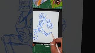
Drawing Mr. Beast into a Beastly Baller trading card #art #drawing #tradingcards card
The first draft of my graphic novel #art #procreate #originacharacter #graphicnovel #drawing