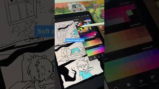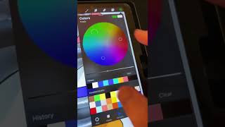
Ryan Maloney walks through Procreate's color picker tabs: Disc, Classic, Harmony, Value, and Palettes. He shows how to use droppers and sliders, shares his workflow favoring Classic mode and palette creation for character colors, and demonstrates practical tips like building palettes from photos.
Chapters
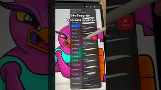
Everything you need to know about the color picker in Procreate. Don't mind the edge of this ghost paper, it's driving me nuts in this video. Tap that color. The bottom, we have your tabs. With Disc, you can drag two droppers to set your color, change things up. I usually work in Classic, it's just one dropper you slide around. Actually, you gotta slide this too, so sliders all over the place. Harmony, this is too confusing for me, I don't use it. Value, this is the first time I've ever opened up this tab, I don't use it. Palettes, I do use this, I use it on my book. These are the colors of my main characters I used over and over. Cards. I sort of don't know what these do at this moment, so I'm not going to try to explain it. You can definitely get pretty wild with these palettes. Just hit this plus, create stuff from photos, stuff like that. You can break this palette off, just close it. 90% of my time I'm just color dragging and dropping or picking a new color, tapping out of it, which will sometimes leave a dot on your canvas. It's sort of annoying. And then drawing.