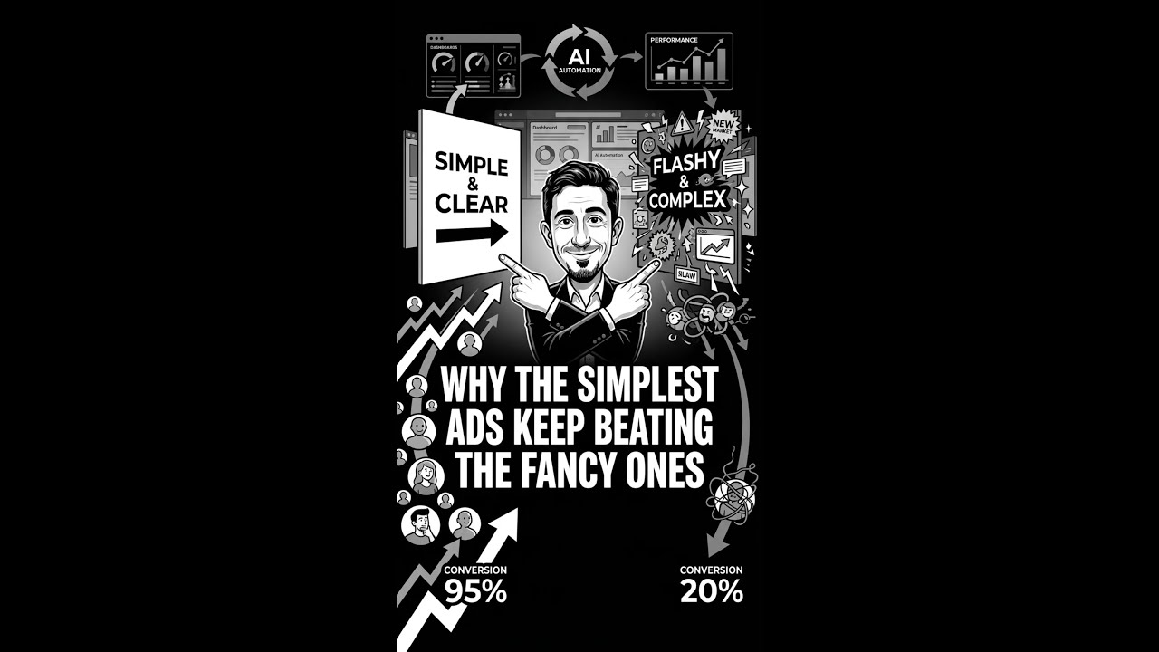
Plain static ads with white text on black backgrounds beat polished videos for low-ticket products because scrollers need instant, digestible messages. Use square format, high contrast, one clear benefit, and the price. Make more simple ads faster instead of perfecting fewer fancy ones.
Chapters
I know this sounds almost too simple, but we keep seeing the same thing. A plain image ad with a black background, white text, and the price right on the image just keeps beating polished video, and not once in a while, over and over. We've seen it across a bunch of accounts, especially with low-ticket offers, even when the person is good on camera, even when there's real production behind the videos. I think it comes down to this: people are scrolling fast. A simple image with one clear benefit and a price can make sense instantly. A video, ask for more attention, and most people just aren't giving you that yet. So the ad that gets the point across faster usually wins. The best ones for us have been super simple: square format, high contrast, big text, clear benefit, price visible. That's really it. No stock photos, no fancy graphics, no trying to make it look overly polished. Honestly, a lot of the winners look like they were made in 5 minutes. And that's kind of the point. Don't spend more time trying to make ads look better. Spend that time making more of them.