2 Image Instagram Ads... (Same Costly Funnel Mistake) – Ad Roulette E19
Vince Reed reviews two Instagram image ads and their landing pages using a three-part framework. Trive Co gets a perfect score for clear messaging and smooth funnel, while Sentra AI stumbles with confusing mobile experience and unclear value proposition.
Chapters
I think it could have been a little bit clearer of what you're getting because again, if a person just skims on this image and they don't actually physically start reading, they might not clearly understand what this is all about.
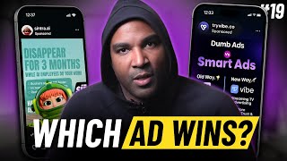
Hey, what's going on? Vint Reed here. And welcome to another episode of adgrouplamps where we critique ads and funnels, making them better, following this three part framework that you see here on the screen. Here's how it works. My team, we just get to scrolling on Instagram because every third or fourth post is an ad. We critique two ads, we critique two funnels, and we try to make them better. And then we pick a winner. And it's your job to let me know if I pick a winner in the comments. And with that being said, let's get started. Drum roll, please. So what do we got here? All right, Trive Co. Okay, this is cool. I actually contacted this company to get more information about it, so I'm actually excited to do this ad. All right, so the first thing we want to look at when we look at an ad is we want to look at the messaging. Now this happens to be an image ad, so the message should be pretty clear what it's all about. And the messaging, essentially what you're looking for with messaging is the person should be able to look at the ad and get a general idea of what it's about. And you can see it says dumb ad versus smart ads. And then it kind of gives you this breakdown of the old way versus the new way. You can see on the old way, there's Facebook ads and the Google Ads and social media ads. And on the right side, you obviously have the new way with, with Vibe and then obviously streaming on TV 10x more brand and trust engagement start at just $50 per day. And that's where we're diving into the creative. All right, so with an image ad, the messaging kind of overlaps into the creative. And again, the creative is really clear because it's giving you this option of, hey, this is what everyone's doing the old way and here's the new way. So I think they're doing a. From the messaging standpoint and the creative standpoint. Now there's something really interesting that I want you guys to see, which is really new. And it happened on the newest update of Instagram. And I have to actually check. I don't know if it's updated all the way on Facebook yet, but notice the sign up button on the left. There used to be basically a horizontal bar where it would say sign up or learn more. And then you could actually add some details to that call to action. It looks like that's gone right now. It's just a button. So what that's telling me just as I'm going through this is that means that your imaging, your messaging, I should say, and your creative has to be extremely clear because there's no more CTA call to action with the button. And that means that your copy is going to have to be important. Which leads me to the copy, which is the third part of this framework. So as you can see here, with the copy, they're going with something that we're seeing a lot more of, which is less copy underneath the image. Just trying to get the person obviously just click on the button and here it says TV ads. So simple, your grandma could launch a campaign in just five minutes. Alright, so really cool. I like this because, you know, for a lot of people TV seems to be something that's out of reach, too expensive, and they're making it sound really simple. They're putting the old way, kind of, you know, as the old way. And this is something new. I like what they got going on here. This is a really good ad. But the moment of truth is the funnel. So let's go ahead and click sign up and see what we have here.
All right, so what we want to do with the funnel is we want to always capture what's going on inside the prospect's mind. So what does that mean? That means that the funnel should be a continuation of the ad. Right? So we want to look at the page headline. So we got to see the branding up top with vibes. And then in the headline right on the top, it's actually moving. Drive sales of TV ads, set goals, run TV ads, grow your brand. And then in terms of the creative and the copy, you've got the B roll going in the back. It looks like there's some people using the tool. And then obviously you've got the imaging kind of, kind of rotating obviously drive sales and TV ads. So really, really clear. Now underneath what you want to look at is the CTA button to get the person in the next step. And that's where you want to make sure that your funnel is mobile friendly. And they're doing a great job of this. This is honestly one of the better funnels that I've seen with really clear messaging continuation from the ad. You got the image, the video going in the background, the person looks like using the tool and you know, obviously something that's really subtle here, but rated 4.8 out of 5. So. Which is really cool for credibility. And then you got two simple. Book a demo and get started above the fold. This is so crucial because clicks are so expensive today. When a person clicks, you want them to be able to see what it's all about, not get confused. Okay. Again, you don't want to, like, confuse them by having it say one thing on the ad and something different on the funnel. This is matching completely with the two easy options below. This is gonna be a tough ad and funnel to beat, but you know, there's always great competition on this popping up in your newsfeed. I'm excited to see the next one. All right, so let's go. Drum roll, please.
All right. Awesome. Another image ad. I think this is the first time we've had two images. Let's call this episode the battle of the images. We have Sentra AI. All right, so just like the other ad, the first thing we want to look at is the messaging, right? And that means when my eyes look at this image on this ad. Okay, what is that image sharing with me in terms of, like, from the person that is looking at this from a perspective of having no idea what this is all about. What is this ad all about? So it says, disappear for three months while AI employees do your work. All right, so that's what the messaging is giving out in terms of the creator. That's all of the other information below. So it looks like there's a laptop as the branding behind the guy peeking out. Then there's some bullet points here. Businesses scale 10 times faster. Increase followers by 35%. Expanded market reach, no more freelancers. Reduce expenses by 3x. Okay, so I get the creative. Hurry up and gain the advantage first. So it looks like this is some type of AI tool that's going to help us, you know, have AI do some of the work for us. All right, so pretty good job from a messaging perspective and a creator perspective, although there's a lot bunched in. All right, and I'll talk about this a lot on other funnels. Sometimes when you look at an image, you want to try to make it where you don't have to physically read through a lot of the copy on the image or the page, meaning you want to try to create the copy to where your eyes can just kind of skim through what's being said and understand what's happening. So, for example, where it says, hurry up and gain the advantage first, I can just look at that and clearly see that immediately. But when you look at the bullet points, there's a lot going on. Still a pretty good job of the messaging of the creative. Alright, so obviously you can see the Learn More button there. No more CTA button. So that's really important for you advertisers to know when it comes to creating your ads, when it comes to the CTA button. So let's take a look at the copy. So again, this is another one with just literally one sentence and it says the future of work is here. And then it's obviously a finger telling you the point. And this is an example when things change. Obviously they were. That was. I'm assuming that used to be this. That probably is what they used as the cta. That only makes sense. But now that the button is above okay, they're like pointing at nothing. But it doesn't look like there's any copy here outside of that. I think it could have been a little bit clearer of what you're getting because again, if a person just skims on this image and they don't actually physically start reading, they might not clearly understand what this is all about. Let's face it, disappear for three months while AI employees do your work. Okay, that. What work? What kind of work? I'm having to assume a lot of things. Obviously I can go through the bullet points. I think that the copy could have supported this a little bit more. But let's go ahead and look at the funnel. We're looking at the funnel and again the first thing we look at is the page headline. We want it to be a continuation from the ad. You can see send your X and then you have the Buy now button obviously way above the fold. So clearly they're trying to get buyers and they are, you know, this is mobile friendly because I'm not having to scroll around in terms of to find where I can actually purchase this product or service. However, when I look at a page headline again, I'm seeing central at the top and then I'm seeing it right again. Centra. Again, your helpers on AI watch video. Now. I'm assuming there's a video somewhere. Can you scroll down or is that the video? Okay, okay, it's a vertical video. Got it. All right, so if you scroll back up a little bit, this is actually pretty interesting. Okay, so it's a vertical video and then you get the Buy now button above the video. So there's not really a page headline outside of the main title or I should say the name of the branding Sintra. On the top and on the top left. And then you have Watch video. So the creative, there's nothing really going on. I think if they used a video thumbnail here, that would have been a little bit better because to be honest, I could have missed this video. I didn't even know this was a vertical video until you scroll down a little bit. But let's go ahead and just press play. I'm just kind of curious, if you press watch video, what happens? Okay, so it's not a vertical video, it's a horizontal video. And then again it looks like I gotta press play again. So press play on this and then I'm assuming the video starts. Okay. There's a lot of steps here to get to the video. Okay. So I'm assuming this video is gonna explain what this product service is all about. You can stop playing and go from there. Okay. So yeah, so remember mobile, 99% of traffic is gonna come from mobile. Right. So even me having. And I'm on a big screen here and that was hard for me to figure it out. Imagine a small phone. So scroll down a little bit, let me see what's below if it's explaining without me having to watch the video. So go back up. The world's first AI powered assistants. Powered by your AI brain that can complete tasks for you even while you sleep. All to save your most valuable asset, your time. Okay. All right, keep going down. All right, so there's another video button to watch video here. There's a lot going on. Go back up to Buy Now. I'm just curious what happens when you click Buy now at the top. All right, so you click Buy now and it takes you to another page. It's like the checkout page. $97 a month. All 12 Central AI helpers. Alright, so I'm assuming the video is going to explain what these helpers can do for you. A lot going on. Let's go back to the funnel. Okay. A lot of clicks. A lot going on. Obviously in this particular case we have to assume that the person is going to watch the video to better understand that.
A lot could potentially have been missed. All right, you know what time it is. It's time to pick a winner. Hey now before we get to the winner of this episode of Ad Roulette, I know it's good. If you are running ads to a webinar or a VSL funnel, check out my members area inside my EBOOP account. I want to show you how we're getting 50 to 79% conversions on our funnels driving traffic to regular webinar and VSL funnels and how we're using EBOOV to do it. So if you click on the link in the description of this video, click, you can check out our quick vsl. It'll explain more about ibu. It'll take your funnel game to a whole new level. All right, with that being said, let's get back to the episode.
All right, so the first one we're going to take a look at is Tribibe Co. I was really excited to do this because again, I actually spoke with this company and it's definitely something that we are actually going to be testing as a company. I think it's a really good strategy to use. I like how they play the dumb ads versus smart ads. Obviously, anybody that followed Robert Kiyosaki you can kind of get out that kind of triggers those brainwaves of that book. So it gets your attention. It's definitely going to stop the scroll from an image ad perspective. And then I like how they really position the TV streaming as kind of like this blue ocean, whereas everything else is like, you know, the old, old school. Right. So from a messaging perspective, dumb ads versus smart ads, I thought they did a great job. I definitely got to give them a point there. And from a creative perspective, I thought they did a great job. However, I think that just being critical, if you notice on the right side vibe, it's a lot more bold. It's a little bit easier on the eyes, whereas the left side, the old way, is a little bit smaller. I'm not going to penalize them for that, but I think they could have made that pop a little bit more. So the creative I thought was great. So I definitely give them a point for messaging and a point for creative and then the copy. I mean, TV ads, so simple. Your grandma could launch a campaign in just five minutes. I think it's great. It's hitting all of the elements that you want to see in an ad because people get so freaked out when it comes to advertising. They just get scared. They think of a member's area or a dashboard inside some ad account and they don't want to do it. So just kind of playing on the fact this is going to be simple. So definitely going to give you a point for copy. So with that being said, I'm giving you a point for messaging, a point for creative, and a point for copy. Giving you a three out of three when it comes to ads. All right, so when we look at the funnel again, a Great job of capturing what's going on inside the prospect's mind. They got the branding, they got the generate leads with TV ads that was rotating. They had the video B roll going on the back end and then set goals, run TV ads, grow your brand. And then they had to rate it 4.8 out of 5 again for that trust and credibility. And then really easy mobile friendly option, book a demo or just get started immediately. I mean this has every element. So from the page headline perspective for the generate leads, TV ads and the branding up top, perfect. Okay? The creative in the copy, you have the set goals, run TV ads, grow your brand and have the outcome, which is what people want. The rated 4.8 credibility and again the mobile friendly above the fold. I don't give it often, but this is a simple ad, as you can see. And even the bottom part, 5,000 plus marketing teams have generated millions in revenue with Vibe. It has everything you want to see in a simple ad. And then obviously I forget where we saw it, but you could get started for only 50 bucks. I believe it said somewhere easy to get started. I think a lot of people are going to test this out. So for those reasons, I'm definitely going to give you a three out of three when it comes to a funnel for a grand total of six. Six out of six. And we don't give a lot of perfect scores. But you can see it doesn't have to be a lot. It could be really simple and you can make really effective ads and funnels. All right, so coming over to central AI, okay, so you know, looking at the messaging, disappear for three months while AI employees do your work. Okay. I think that it was really clear from a messaging perspective. You know, obviously I can be critical here or there and say, what do you mean? What type of work? And then, you know, have my brain start to go into what can this actually do? But they then with the creative get into the bullet points and they start by saying businesses scale 10x faster, increase followers by 35%, expanded market reach, you know, no more freelancers, reduce expenses by 3x. The only thing, the problem I have with the creative here is you want, you really want your ads obviously address a problem, but you want the ad to have extreme clarity, right? Because if people are clicking onto the funnel and they're still not 100% certain of what this is, because you're gonna get a lot of clicks that click and click off, right? And then obviously you have to hurry up and gain the advantage first and then you've got the little guy looking out of that little laptop. So right now, as just a person that is looking at this from a perspective of never seeing this ad, having no idea what this is all about, I'm still kind of not sure what this is gonna do, although I haven't. I can assume that there's some type of AI tool that's gonna help me, you know, eliminate people and allow AI to do it for me. And then with the copy, you know, the future of work is here. I get where they were going for. But with something so new, for example, if you look at the other ad with the dumb ads or smart ads, it really did a good job of letting you know it was clearly TV ads and why it was the new way and why this was the old way. I think that in the copy, we need to really give them an example or something that they're going to do or what they're going to replace and how there's a huge benefit for me. So right now I feel like there is a lot of assumptions that I'd have to make about this ad. So I'm going to go ahead and give it a point for messaging. But when it comes to creative, because I'm not extremely clear of what this is all about in the copy, it's kind of like the future of work is here. Like, what does that actually mean? And again, I can assume what it is, but you've got to also, when you're looking at these ads, imagine this is a person that's saying this for the first time in the newsfeed. They have no idea about workers. And that's how you always have to create your ad, like a complete stranger seeing it. So for those reason, I can't give you a point for copy, so I'm going to give you a 1 out of 3 when it comes to the ad. All right, now looking at the funnel. Okay, now just kind of looking at it right here, you can see you've got the company name sensor on the top left. And obviously right in the middle, your helpers on AI watch the video and everything is just black right there. Right? And then you've got the Buy now button, you know, up top. I personally like the Buy now button below. Only reason I personally like to Buy now button below is because, one, if you think about the ad, right, there was a lot of curiosity. I didn't know what really this was all about. I had an idea. So when they come to the page, you have to support.
Those thoughts that are potentially going on inside of your Customer's mind. So right now, one, I'm not even sure where the video is. It just says watch video. But remember, on a mobile phone, I don't know if I'm supposed to click a button. I don't see a play button. I don't see anything. It's just a black screen. And to me, that could be an image. That could be anything. We just happen to click it. You can never assume that the person is going to be like, okay, that's a play button. I want to click. We obviously we scrolled down, we saw that there was some B roll there and there was a video. And hopefully that the video supports what this is all about. But remember, sometimes you don't have that kind of time. The person is just clicking. They're like, what is this all about? I don't know. And they're clicking off. All they happen to see is a few lines, you know, pieces of copy on this page, and a Buy now button. They click on that Buy now button and they're like, I don't even know what this is, and they click off. So if you're not going to have extreme clarity on the ad, you have to be able to be extremely clear on the funnel. All right, so from a page headline perspective, I mean, to me, it just like, it's the same thing. You have the logo on the top left, and then you got right in the middle. In the middle. I don't really feel like there's a balance, and it's like a continuation from the ad to support what I was expecting to see. So from a page headline perspective, I cannot give it a point. Now from a creative perspective, as I scrolled down and, you know, the images kind of started to play, it gave me an hope to press play on the video. Right? But if I'm just looking from a mobile perspective, when I first click, you don't even know that there's a video there. Right. Unless you scroll down. And again, remember, people aren't going to always do that, especially on their phone. They don't have a lot. Their attention span. They're all over the place. So for those reasons, I can't give you a point on the copier and the creative. However, I will give you a point for the mobile friendliness because the button is above the fold. So for those reasons, I'm gonna give you a 1 out of 3 on the funnel, giving you a grand total of 2 out of 6 for your ad in funnel, which means the winner of this episode of Adroulette is Tryvibe co. Congratulations, Tribe Co. With a perfect score. Perfect score. Awesome job, guys. These are two really interesting funnels, I think, with actually two really cool products. I think if they take some of the tips that we shared specifically on TheCentral AI, I think this can definitely work. And obviously, I think, honestly, they could take a lot from this ad over here and implement some of the exact same things to make this work. Because there's definitely a need for individuals to learn AI and use it to essentially cut costs and get better results. Hope you got a ton of value from this episode of Ad Roulette. With that being said, I'll see you on the next one later. It.