Will This Meta Ad Beat The Competition? – Ad Roulette E22
Vince Reed compares two ads: Austin Schneider's $27 masterclass promising "results for clients in under 30 minutes" scores 5/6 for clear messaging and mobile design, while Typeform's Spider-Man ebook ad scores 3/6 for weak landing page creative. Cold traffic needs clarity over cleverness, with video or previews visible above the fold.
Chapters
You've got the headline and then you've got the sub headline. But in my opinion, there's actually no creative.
Hey, what's going on? Vince Reed here. And welcome to another episode of Ad Roulette where we critique ads and funnels, making them better following this simple three part framework that you see here on the screen. So here's how the games work. My team, we just get to scrolling on Instagram because every third or fourth post is an ad. We pick two ads, we pick two funnels, we critique them, we make them better, and we pick a winner. It's your job to let me know if I pick the right one. And with that being said, let the games begin. Drum roll, please.
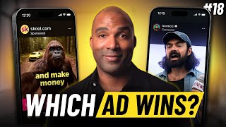
All right. The Austin Schneider. All right, so this is an image ad. We don't get a lot of image ads. This is cool. Which means it should hit on all cylinders when it comes to messaging. What messaging has to do is essentially let me know what this ad is all about simply by looking at it. Obviously if it was a video ad, it'd be playing, it'd be muted and we'd be having a whole different discussion when it comes to messaging. But let's see what it says here. How to launch profitable ad campaigns that get an RI for your clients in 30 minutes or less. Only $27. It's clear the messaging ties right into the creative, pretty straightforward here of what this is all about. Let's go ahead and take a look at the copy. The copy perspective, it says here is calling out video agencies. Sick and tired of getting nervous when your clients bring up ROI. You know what I'm talking about. Delivering 30 plus videos a month hoping that your clients will go viral. I created the simplest way to run ads for your clients and get them actual ROI every single week. This ugly B roll ad system for just $27 is too simple. And then it goes into what it's all about. It's a step by step blueprint that teaches how to make ugly B roll ads. It obviously instantly make the algo want to push the ads to reach at least 200% more people. The exact words. Okay, so this is a simple just. This is how you run ads that are ugly to get results. Scroll down. Is that it? Let's see what this up. The call to action says click click the link below to get access to the client's results. Masterclass for just $27. So you're buying a masterclass, it looks like, not just a course. Okay, these are. These things are clear. I think that that would go back up the top. Let me see the image one more time to make sure it didn't say that. Okay. It doesn't say anything about a masterclass. So I'm not sure if I'm getting a master class or a course. I thought it was a course at first. But looking at. That's why I always like to go to the CTA to see what I'm actually getting. But let's see. Let's take a look at the funnel.
All right. First thing we do is we look at the page headline. So at the top, instant access. Get results for your clients in under 30 minutes. Now, because I kind of went back and I looked at the CTA right before I clicked over to the funnel. Where I'm thinking right now is I'm trying to think to myself is this a course or is this some kind of training? Like masterclass? Right. And those are things you don't want happening from a. From cold traffic. Essentially a person who has no idea who you are for clicking here and landing for the first time. Right. And that's how you always have to assume even on your retargeting ads. These ad platforms are not always perfect. Your ads are going to show up to a lot of people. So I always want to assume that they absolutely have no idea who I am. And I want to always go on more of the side of clarity. All right, so what I'm looking at the page headline here still. The three simple ads that get my clients an ROI fast. The exact ads I've used for my clients of my seven figure agency. Yes, I want immediate access for just $27. Could get the system set up within 30 minutes. So what this is telling me is that I'm going to get these ads. Right. But the other side made me feel like I was going to get a course. Right. So I guess I'm getting the three simple ads that my clients use to get an ROI fast. However, if you scroll down, you can see it says what you get and that's below the fold. I almost feel like this should have been above right in the middle because it's telling me more information about what I'm going to get for $27. So you can see a behind the scenes training that shows you how to set up one simple ad that will help get your clients an ROI and get it done in under 30 minutes. Learn how to create super simple ads that generate sales for your clients. And then there's a bonus. I'll personally hand you our best performing ads of all Time. Yeah. So in my opinion, if you scroll up to the top right, you've got the headline and then you've got the sub headline. But in my opinion, there's actually no creative. Right. Because it's just the button and almost the creative is under the button. I might flip those. Right. And also I love that the copy is big and blocky, but I think it should be three lines and moved up a little bit. And then what you get if it's not a video, you can just put that box above the button. Yes, I want immediate access because at that point, once I read what you get, I'm clear of what I'm getting. But if I don't know what you get, if I cut this part off, I think I'm getting a course. I think I'm getting something set up and that could make me not do anything. Remember on mobile, it's just showing up on their phone, they're going to click that cost you two, three, four or five bucks, whatever that was, to click. They're going to look for a split second and then they're out. You want there to be extreme clarity. However, I think this is really clear. They definitely tried to optimize it. I can tell by the font size they tried to optimize this for mobile, but I think that the creative is missing from a perspective of strangers landing on this funnel. All right, let's go and take a look at the next ad. Drum roll please.
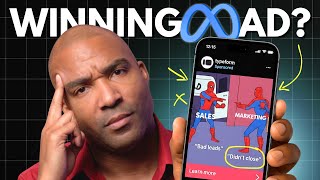
All right, type form. You can see Spider man there. One Spider man is pointing out the other. It looks like sales is, you know, bad leads, marketing and they're saying, oh, you didn't close. All right, two people blaming each other. Alright, so pretty clear that you know something going on with marketing and sales. Not quite sure what they're offering yet again. Always looking at this, I got no have in the assumption. I don't know what Typeform is, although I do. We gotta assume that I don't. This is just popping up in someone's news feed. But let's go ahead and take a look at the copy because the image obviously serves as the creative and is doing a good job of obviously saying there's some kind of battle there. Sales is blaming marketing, Marketing is blaming sales. Alright, so from the copy perspective, it says recently we surveyed 150 sales and marketing leaders to find out why those teams are so often misaligned and what you can do about it. Okay, cool. So they did a good job of kind of pitting each part of the company against each other and These are real arguments that happen each and every day and they figure out a way to fix it. Really problem heavy. I love it. Let's go ahead and take a look at the funnel. The first thing we want to do is we're going to look at the page headline. All right. So there's a lot of space there and again this is what I see a lot because again most people are optimizing for desktop. Can't tell you 99% of that traffic now it's coming from mobile. There's a huge gap up top. Right. Again people are clicking now you're forcing their eyes to scroll down. It says free ebook sales and marketing misalignment. Learn how it impacts your growth goals and how to fix it based on insights from Our survey of 150 sales and marketing professionals. And then as the button to download, which again is above the fold making this mobile friendly. However, you know, sales and marketing misalignment, it's an ebook that's basically going to show you 150 sales get to give you the insights of our sales survey. Right. I think that if this was moved up and there was a video that gave you a sneak peek of like kind of seeing what you're going to get, it could actually improve because again this is another one of those ads. It has the page headline but there's really no creative. Scroll down a little bit. It looks like they put some of the creative stuff below and then I'm not sure what this image means right there from, from silo to.
Yeah, so there's a lot going on here in terms of confusion of what I'm going to get. Although it's clear if you read the headline, learn how it impacts your growth goals and how to fix it. Based on insights from our survey of over 150 sales and marketing professionals. Yeah, this to me definitely needs creative. So what has to happen is this needs to be slide everything up, throw a video on there, give some behind the scenes type of information. I love show and tell. Like be logged in, show the survey, show the ebook a little bit. Maybe you could blur it out so you can say this is what you're going to get which will I think help more people download. People are weirded out right now when it comes to downloading anything on their computer. Even show them what's going to happen. So you click a button, you know, you're showing this in your video, you click this button, you're going to be able to download it. It's going to show up on your computer, then you'll be able to open it up and watch it. Just give a visual so the person can actually see what's going to happen when they click that Download now button. All right, a lot to think about, but it's that time. It's time to pick a winner. Hey now, before we get to the winner of this episode of Ad Roulette, I know it's good. If you are running ads to a webinar or a VSL funnel, check out my members area inside my EBOO account. I want to show you how we're getting 50 to 79% conversions on our funnels, driving traffic to regular webinar and VSL funnels and how we're using eboove to do it. So if you click on the link in the description of this video, you can, you can check out our quick vsl. It'll explain more about ibu. It'll take your funnel game to a whole new level. All right, with that being said, let's get back to the episode.
All right, so we got the Austin Schneider. All right, so really cool. Calling out who his target market is from the messaging perspective, Video agencies, the creative how to launch profitable ad campaigns that get an ROI for your clients in 30 minutes or less. Only $27 clear. With the prices, there's not going to be any confusion in terms of what the cost is and what he's offering is going to essentially do for the client. The copy was clear again, called out video agencies and then kind of went into detail about what was going to happen and what they were going to get. At the very bottom, it did say that it was a masterclass, which kind of got me thinking a little bit and made me look a lot closer at the ad. Right. Again, I'm always assuming that it's a complete stranger. They have no idea who you are, they're seeing you for the first time. And. And that's kind of how I'm grading these. Alright, so with that being said, I thought you hit correctly from a messaging perspective, the creative was as clear as it can be. And usually you should be able to hit everything with an image ad. When it comes to the framework, the messaging was good, the creative was good, and the copy was good for this ad. So for those reasons, I'm going to give you a perfect score of 3 out of 3. Again, just keeping it simple, following this framework, if you do those things, you should be able to have an ad that does its job, which is essentially create clarity and get the person to the next Step with clear understanding of what it is that they're going to see on the next page. Alright, so now when we get to the funnel, we want it to be a continuation of what we saw from the ad on the top. You can see instant access. Get results for your clients in under 30 minutes. Okay. That's essentially the end goal of what you're promising here. And then obviously you've got a lot of copy in terms of not, not a lot of words, but you've got four lines of big copy. But the cool thing is that you can clearly see it. I would have liked to see that three lines instead of four, but that's my own personal bias. Not going to penalize you for that, but it's clear still the three simple ads that get my clients an ROI fast, the exact ads I've used for clients of my seven figure agency. Then you've got the mobile friendly, the button above the fold. However, I felt like that it was missing the creative part. Okay. There was no video there. You almost put it below the. You didn't almost. You did. You put it below the button. You can see what you get and then it was everything that you get. I would have moved that above the fold. Right, so that's below. So there's no creative. So anyone that clicks and they still have questions about what they're gonna get, okay. And they don't scroll down on their mobile phone, they're gonna miss everything that you're offering for only $27. So for those reasons, I definitely will give you a point for their headline. Can't give you a point for the creative copy, but I will give you a point for being mobile friendly because the button is above the fold, giving you a two out of three when it comes to the funnel for a grand total of five out of six. All right, which leads me to the type format. All right, so I thought it was, was a fun ad, right? You got Spider man pointed at each other, sales and marketing blaming each other, one saying it's bad leads, the other one saying you can't close. Okay, so pretty clear. However, you know, someone's still going to look at this and they're not going to be sure of what it is that you're offering. Right. It's clear of the argument, but with the whole point of the ad is to give them a reason to click and to essentially want what's on the next step, what it is that you're offering. Now when we got into the copy, it did a decent job and obviously saying they surveyed 150 sales and marketing leaders to find out why these teams are essentially misaligned. Right? So again, you're having to get to the copy to understand what the image is giving because the messaging on this is really just saying sales is four words. Well, six words. Sales, marketing, bad leads didn't close. User on the other end has to make assumptions of what this is all about. Therefore they go to copy for support. Right? And now you're saying you've surveyed 150 sales and marketing leaders and for whatever reason people are missing all this information and you need to click to find out. All right, so when it comes to the ad, obviously the messaging is, in my opinion, not really clear because you just got specific Spider man pointing at each other and there's six words on it. So I'm having to make a lot of assumptions. And what we want from an ad perspective is we want clarity, right? And then from a creative perspective, again, I'm not really sure of what this is. I have to make an assumption. So I can't give you a point for messaging and I can't give you a point for creator. However, I can't give you a point for copy because it's really clear what you were going to provide. So for those reasons, I give you one out of three when it comes to the ad, right? So I click, I go over to the next step, right? I see some space there. I see it's a free ebook. So sales and marketing misalignment. Learn how it impacts your growth goals and how to fix it based on insights from Our survey of 150 sales and marketing professionals. Download now. So really clear. However, I feel like again, show and tell people today, they want clarity, they want to be assured. They may even be nervous to click that download now button even though it may just pop up an opt in form. They're thinking, I don't want to download. I don't want anything downloaded to my computer. Right? They're not sure. We don't want to leave it by any chance. These clicks are too expensive. Right? So I would have had a video there. So in my opinion, there's no real creative here. It has the page headline sales and marketing misalignment. Okay? And obviously the subhead explaining what you get, but there's no creative. It really explains what I'm going to get. So for those reasons, I can't give you a point for creative. However, I will give you a point for it being mobile friendly. And obviously the headline is there. So for those reasons, I'm going to give you a two out of three when it comes to the funnel for a grand total of three out of six. Which means the winner of this episode of Ad Roulette is the Austin Schneider. Congratulations. You are the winner of this episode of Ad Roulette. All right, so these are interesting. We don't get a lot of image ads. A lot, right. And you can see, I mean they're, they're. This one was actually really clear. Okay. It wasn't. You don't have to say anything. That's really groundbreaking. Sometimes people just need straightforward. Right. Because at the end of the day, you just need to follow the three part framework. Now however, this ad was trying to be extremely clever and creative. It may stop the scroll, but you're going to get a lot of curiosity clicks. Right? People are clicking, not sure what it's all about landing here and it's costing you money for every one of those clicks. All right, so if you're going to use an image ad, in my opinion, really stick to the three part framework when it comes to ads and make sure that that sticks and hit that hard. Alright? So that being said, I hope you got a ton of value and I'll see you on the next one later. Sam.