Multi-Timeframe Analysis Strategy in Forex (Step-by-Step cTrader Tutorial) 📊
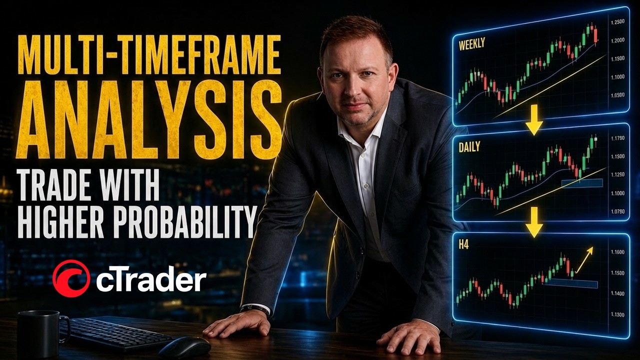
Vladimir Ribakov shows how to trade oil using three timeframes in cTrader. Weekly overbought conditions, daily bearish divergence, and a 4-hour trendline break align to confirm a sell setup. Entry comes when price re-enters a trigger zone with lower highs and MACD confirmation.
Chapters
One of the most powerful approaches towards technical analysis is multi-timeframe analysis, and the reason for that is very, very, very simple. When you analyze multi-timeframes, basically you analyze different money flows. When you analyze weekly chart, it's different trend, broader market view rather than the 4-hour chart or the 1-hour chart. So when you do multi-timeframe analysis, ideally by following timeframes like weekly, daily, 4-hour chart, for example, uh, and they are aligned to the same conclusion, you as a trader have an edge. You have better chances To make a right trading decision and to join the right market forces that currently exist. So hello to everyone. I'm Vladimir from Home Trader Club, and if you don't know who I am, I'm internationally certified financial technician with over two decades of experience in trading and full-time. Trader for over a decade. In this video, I will present my approach to multi-timeframe work. Okay, multi-timeframe, uh, work frame. How do I love to do— to go step by step when I choose— when I analyze the market and choose my trading opportunities? And to present, I would take an example of a trade that we did in Home Trader Club, and I will explain that. I will break it down step by step. But before that, this video, this lesson, uh, and this trading example will be presented on cTrader platform. Why cTrader platform? Here, all the reasons why this one is superior platform and why do you want to trade with this platform. And if you are new to the channel, and even if not, even if you just forgot, some time ago I created a dedicated playlist to cTrader platform where I explain about the platform, its features, and different trading strategies that you can do using the cTrader. So here is the playlist. Make sure you find the time to watch that, all the lessons or some of them, whatever is relevant to you and whatever could be helpful to you. So let's take a look on the trade. So I am on a cTrader platform. This is a demo account just for the presentation, of course, and the trade I want to explain is oil sell. So disclosure, we are now, as I record this video, I don't know when you will watch this video, but as I record this video, we are in a very sensitive period in the Middle East. Ongoing war between Iran, US, and Israel. And of course, the oil prices are going bananas in some of the periods and also crash down very, very fast every single time Trump tweets and says Now we have peace. Now we have ceasefire. Now it's gonna stop. Every single time he tweets something, the market responds and reacts. So the the conditions for trading were not optimized and ideal. However, I myself am a technical trader, which means I rely mostly on chart. Of course, common sense and logic of fundamental understanding, uh, where the wind is blowing and where is the momentum, what is the sentiment on the market at the moment, helps to understand how to find your trading opportunities. Um, but generally speaking, I rely on charts. So when I find something good on the chart, and, and also when the numbers are aligned in my favor, meaning when there is a positive risk-reward ratio, I love to find my opportunities. So I will explain the oil trade and I'll show you how beautifully it is done when you are analyzing multi-timeframe on cTrader platform. So right now I am in Home Trader Club members area just to explain you the to show you the trade I refer to. This was our trading plan. We spot this opportunity and we wanted oil to enter the trigger zone and from there execute our sell. So oil enters this zone, this very zone, to deliver a wonderful drop to the downside and reach pretty quick the target, the first target. So, um, what and why did it happen and how all that is done so efficiently, user-friendly, uh, on this, on this platform. So this is the cTrader platform, um, and this is a multi-timeframe chart layout. You can control everything on this bar here, sidebar, and choose your style. This is a multi-timeframe chart. Of course, if you choose the one single chart method, this is what you will get. Now, in order to connect all the open charts— and I have 3 or 4, in that case 4, uh, so because I'll show you how I make my trading decisions— and to connect them all, simply every time you change instrument, what you need to do, you see this symbol here on the left side Just click on and choose any of them, but make sure that all the charts you want to be together synchronized have the same symbol. Okay, so I picked the blue A and this is what I get. All of them are oil. Why it's important? Because if I want to analyze the euro dollar, for example, I just change one time one chart and all of them would be changed accordingly. So let's make the oil trade once again. And here we are. So of course I can work with one layout, one single chart layout, but when you do that with a multi-chart mode, it is much easier to analyze. Then when you want to make your execution, of course you can go back to a single chart, but for me it's very useful to do it this way. So what do we have and why did I consider that as an interesting opportunity? So first of all, on the weekly chart, we are, as you can see, flirting at the hardest moments of this war. We saw that the price kind of attempts to top around $110 up to $120 per barrel. It happens once, it happens twice, it happens thrice. And that was the worst. It did not manage, at least as for now, and I really hope it would not escalate as I record this video. I am not attempting to predict the future, of course, I just share my hopes. So at that moment, this was a given fact. It did not manage to go above the 110, 120. Therefore when the price created the first peak and came for the second time to the same area and was blocked. Look at the spike. Okay, I don't need to tell you stories. Look at the spike that happens during the week. Uh, that's a very good sign. Consider to that that MACD starts to round to the bottom as it happens, and that is the first aha moment to start looking for possible sell. On the daily chart, the oil attempted to create some sort of a peak around the same zone pretty much. And while it was doing so close to the 120 level, look what happens on the MACD. This MACD peaks are going down. This is a bearish divergence condition. So my decision was the following: if at the worst days of the war that's the maximum the market managed to create, and now it is blocked around round number, psychological number, creates slowdown conditions, there is a good chance we're going to see some easing, some tweets from Trump and the oil prices to go down. So as I analyze the weekly overbought conditions and spikes around the psychological level, the daily chart presented to me a classical bearish divergence. While the market was making the top, attempting to create a similar top— please note, this is not a double top pattern I am trading here, I just present the bearish divergence forming. And the MACD was creating the lower highs. That's the aha moment for me. Besides that, what do we have on a daily chart? We have a beautiful candle formation. It's kind of an evening star—a big green candle followed by doji reversed with inverted hammer evening star. I like it. I like it. So that means to me, let's go down to the next time frame. Which one? It's that 4-hour chart. From daily, we move to the 4-hour chart. So when I take a look on the 4-hour chart to what happens, here is the answer. Okay, so I missed the first drop. It was right after the tweet. But the interesting part here is that the most recent rising trend line, as you can see on the 4-hour chart, was broken to the downside. And not just that, it is gaining momentum with MACD moving average crossover and the histogram goes down. Both of them enter the negative zone. Both the MACD, uh, moving average below the zero line— the zero line is this horizontal line— and histogram and moving average are below that. And that happens as the trend line is broken. To me, this is a sign that if a pullback happens, and I don't know to say if a pullback will happen, but I do know to say if it will, I would want to participate there. So for me, this was exactly the sign, and the idea was simple. I want the price to go back inside specific zone and from there look for the sell. So what is this very zone I refer to? As I showed you before, this was the one. Why did I pick it this way? So the answer is very simple. We have this high, and I didn't go only with the spike high. I went with the average high of all these zones. And the reason is because the market is not perfect, especially in that time with oil. So I take the average between all these zones attempted to create the highs. This was the average. It was also the middle, approximately the middle of the big red candle. And the maximum zone to me is the broken support that now acts as the resistance. This was the chosen zone I had in order to go for the sell. So when the market is entering this zone, that's to me the sign that I want to get in. How do I do that? On the same 4-hour chart, or maybe even one lower time frame. And here we are, look at that. That's the advantage once again of the multi-time frame, multi-screens in front of you. And just, just try to understand and try to imagine how easy it is to see all that in front of you in one layout, and no need to jump from chart to chart. What did they do there? What did they do there? And forget stuff. So this, from my point of view, is a great advantage. So when we are in that zone, now we are looking for the trigger. And the trigger could be any of the technical things you are using, including to shoot market price from the zone, uh, because you already pre-analyzed all the higher time frames. But the minimal thing you want to see is from rising candles to candles that actually make lower highs, lower lows. That's the first indication that sellers could attempt and take the control from there. Okay, of course you can add here false breakout and trendline breakouts and candle patterns and Fibonacci, you name it. All of the tools you have is acceptable and used and relevant to these kind of conditions. So in this video, it's not about showing you the exact secret. There is no secret. Once you are in a zone, you would want to execute a trade. So the minimal way to do that is once again from rising candles to dropping candles, because this is the very first indication the sellers are trying to take the control. And as soon as that starts to build up and the candles actually make the lower highs, lower lows, pay attention to what happens here also with the MACD. When the moving average cross each other to the downside, that's a strong sign. And as it goes, my decision was that first of all, I would like to see these lows. Let's make it as a rectangle. These lows is what I want to see retested. Why? Because this was the last low where the buyers managed to take control. And that's if and when is reached. This is a good place to consider the management. So this, this was an example for the oil trade, but the most important thing for me is to show you how useful it is for those of you who like the idea of multi-timeframe analysis. And from, from my point of view, it's super, super, super important. I personally love the multi-timeframe analysis because I love the different money flows. Weekly, daily, 4-hour chart, they all give you a story. They all give you some view of some observation of a bigger flow of money involved in their trends, the broader trends. So for me, this is my style and I love it when it is synchronized. Imagine the situation you are looking to buy a house. So you don't buy just because, oh, it's a nice house. That's it. No, you buy because you did your research, multi-research, right? The neighborhood, the market conditions, the town, the transportation, how close you are to the highways, schools, etc., etc. You have your reasons. That's the same idea for the multi-timeframe. As it happens, it gives you an edge. And when you have an edge, you have increased probability to be right. So that's pretty much it for this video, and I hope you understand how useful it is to do that, especially with this beautiful layout and conditions you have on the cTrader platform. And also when you can connect all the 4-hour charts together with the button as I showed you before. You just type the instrument you want, all the charts are there for you aligned. I love it and I'm sure you would love it too. So thank you very much for watching. Once again, make sure you watch this playlist we have on the channel about cTrader. And if you are new to this channel, make sure to subscribe to enjoy more trading education, ideas, insights, and useful tips. Thanks for your time once again and I'll see you soon with more. Good trading and bye for now.
More from Vladimir





Stop Buying USDJPY: The Critical Resistance You Need To See #forex #tradingstrategy #shorts