How to Run a Complete Content Audit on Your Topical Map (Rankings + AI Search)
A walkthrough of auditing your content across Google rankings and AI search citations using a topical map. The Authority Planner shows which topics rank, which get cited in AI Overviews and ChatGPT, and which need work. Organize topics by strength, spot ranking trends, and find high-traffic queries you're missing.
Chapters
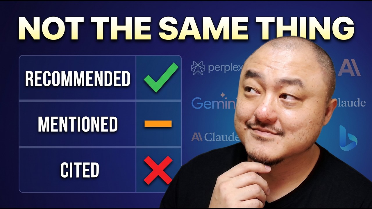
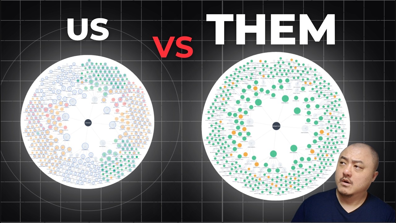
2 systems decide your traffic now, Google rankings and AI search responses. Most SEO tools show you one. Some show you both. But none of them show you both on every topic in your content strategy at once. In this video, I'll show you how to see Google rankings and AI search results side by side on your topical map. Then overlay your Google Search Console data so you know exactly what to work on next. Let me show you what this looks like in the Authority Planner first, and then we'll connect the Search Console data. This is the planner. Every topic from your topical map. For each one, you can see your SERP ranking, and you can see whether AI Overviews, AI Mode, Gemini, and ChatGPT mention or cite you. Right now, even without any Google Search Console data, you already know more than most SEOs know about their own site. Topics where you rank, but AI doesn't cite you. Topics where AI cites you, but Google doesn't rank you. Topics where neither system finds you. You can filter for, let's say, top 20 not found in AI overviews, but found in ChatGPT. That's your strategy layer. Now let's overlay what Google Search Console actually says in the audit tab. Once you're in audit, you are in the priority view because you don't have time to scan thousands of keywords. So there are 3 signal groups, each with action items built in. First, we have the performance signals. We have the winners and losers group that compares the current period against the previous period. So you could see your search impression wins, your click wins. And then your position ranking wins. And you could take action with viewing drafts and creating briefs for accidental ranking keywords. With the query, multiple comparisons correction for A/B tests, that's something you may want to take a look at and create a brief for. And for these losses, you might want to see what's going on with our draft for A/B testing tools for email. Why did we go down 18 spots in rankings all of a sudden? And then in the next section, we have the below average CTR where we are finding high ranking topics, but your click-through rate is below the industry average for that position. Let's take a look at one example with preheader optimization for templates, where we have 2.1% CTR versus the average of 5.1% for the position. Here's where you may look at the data and say, okay, this isn't a content problem. So we don't need to rewrite the content. It's most likely a title and meta description problem because it's showing on the results page, but we're just not getting the clicks. So we'll want to rewrite the title. And then we have the not in AI search section. And this connects back to what we saw in the planner where we saw topics with organic visibility. But zero presence across AI overviews, AI mode, ChatGPT, and Gemini. Then we have the quick wins section where we have topics ranking on page 1 or 2. And with some small effort, we can have a big impact. And then we also have optimized performance where we have topics that are getting impressions and through better targeting or internal linking or even publishing pages. We can create content for those queries to serve the users searching for those queries. The priority section is a list of action items. Now, if you want to think more strategically across the whole topical map, switch to the by topic view. The by topic view is the same data as priority view, but organized by your topical map and hierarchy. So you have the 4 levels of topics. Each topic shows your clicks, the changes from the previous period, your impressions, a coverage bar, your position ranking, and a classification badge for published content and cannibalization if you have it. So Flowy classifies every topic with Search Console data into one of 4 buckets. Based on 2 dimensions, confidence and volume. Confidence is how well the queries match the topic, and volume is how much traffic they generate. We have 4 labels to classify each of the topics. Strong is high confidence and high volume. These are proven winners. You want to maintain and build supporting content around them. Emerging is high confidence, low volume. These are the right queries with growing momentum. We'll want to check internal link, content optimization, maybe even backlinks for improvements. Broad reach is for high volume, lower confidence. So these are ones where Google sends traffic for the loosely related queries, The fix is more focused content, not just more content. Then we have the weak signal, which is low on both confidence and volume. They're ones that are not worth any dedicated effort, but you should be monitoring for changes. And each of these topics has trend lines that show impression trends across the time period. You can spot momentum before it surfaces in the rankings. For the top 2 level topics, you can see larger, more detailed charts for each of these. If we take a look at email deliverability, you can see the week over week numbers here. We can see the attributed queries for that topic. For email deliverability, these are the queries where this topic and content are showing up in Google Search. And you could see the various pages that are ranking. If you have cannibalization for this query, you'll see multiple pages showing up here. And then we can see the coverage for how much of these supporting topics are already covered with content. And we can see each of our individual hubs here. We can see all the topics, their clicks, their impressions. Their rankings. We can see all the queries that are attributed to this top N this page. There's a lot of information here in the topic view. This is perfect for strategy. And if you want to do page-level work, let's head over to the by-page view for faster analysis. The by-page view allows you to see every URL on your site with Search Console data. So it's sorted by impressions. You can sort it by clicks or position. It has a search bar if you only want to see specific ones. And clicking on any specific URL row, it gives you all the queries that are driving that page. It gives you the per query clicks, impressions, and ranking positions. This is the detailed layer when you want to debug one specific page in your topical map. So there's a lot going on here and everything we've seen so far with priority topic and by page, it's all been in tables, but some of us work best with visuals. So if you want to see your whole topical map and audit visually, let's switch over to the map tab. Now this is your entire topical map as a radial map. Brand at the center, pillar nodes radiating outward to its subtopics. And each of these topic nodes are sized by importance. The ones with blue rings are ones that you've already published. So you can see the execution progress at a quick glance. And the color shows the metric that you choose in the menu where you can choose by position, impressions, clicks, and then you can see the AI search version. Let's take a look at position first. We can single out and filter for only the green topics, which are top 10. Then we can filter for yellow, which is positions 11 through 30. And red is position 30+. Gray means that there's no data. There's no ranking, no impressions yet. And you can also filter by published pages. Now let's switch the metric over to impressions. And then these are the ones where you are getting the most impressions. And same thing, you still have your various filters down here by color, by publishing. Then we can switch over to clicks and we could see where we're getting the most clicks from, where we're getting low numbers of clicks. And then we can switch over to AI search. So this is the one I love. AI search, you can filter by AI Overviews, AI Mode, ChatGPT, and Gemini, or you can filter by all of them. These are the ones where you can say, I just want to see what topics we are being mentioned and cited in, where we're just getting cited, where we're just getting mentioned. And the topics where we're not even showing up yet. And the navigation is really simple here. So let's take a look at, let's say ChatGPT. This is where we are getting mentioned and cited, which is none. This is where we're getting cited. This is where we're getting mentioned. And these are the ones where we're just not showing up in any of the ChatGPT responses. So this is a visual map and navigation at the same time. And if you ever want to jump straight to the topic in the planner, you can always double-click any of these topic nodes. And one more thing, there's a compare dropdown here. Let me show you the gap overlay first. Let me change it back to ranking position. So with the ranking position, you can see all the different colors here. Green is where you outrank the competitor. Red is where they outrank you. Blue is contested territory. And gray is where neither of you ranks. This is the entire competitive picture in one screen, in one image. You could choose your different competitors here. I want to compare against HubSpot, let's say. So with all of these pillar topics, they're pretty much outranking us. Then the other view is side by side. So now we can see our map and the competitor's map side by side. We can choose, say, MailChimp. Now, last thing, everything we've seen here is all about the past results. Let's take a look at, go back to by topic. And down here, there's an opportunity section. These are queries where you're getting impressions. And so you have a big opportunity to add it to your topical map because it's missing. So we could see cold outreach best practices, cold email deliverability tips. So it's a lot of cold email and We're just not ranking for it. And these are queries that are showing up. We're getting lots of impressions and we're even getting clicks and we're ranking on page 2. If we add it, we create content for it. We can drive traffic back to our site with these topic opportunities. What you could do is just click on add as new topic and place it in your topical map by choosing. Its parent topic. So that is the whole audit. The 3 layers, your topical map gives you the strategy. The planner gives you the Google rankings and AI search side by side. And then the organic audit overlays real Google search data on top of both. Improve your content by using the Google Search Console queries and data. And use the AI search responses to those queries. And that's all going to help you get ranking in Google search and get cited and mentioned in AI search. Subscribe for weekly content strategy and topical authority workflows. See you in the next one.