Alan Solarsh (YouTube market commentator) reviews the COT report dated 2 Sept 2025 and analyzes XAU/USD (gold) and related FX charts. Key points: managed-money long positions in gold printed 315,796 (≈77% of an all-time high of 408,439), short positions have been increasing (a recent ~17% weekly rise), and price action on multiple timeframes shows demand and supply zones with a Dragonfly doji (~14 pips / $1.45) at the top of the move. He compares gold structure to EUR/USD and the DXY and suggests a likely reversal (gold weakening) in the coming week(s), referencing several moving averages (21, 32, 50, 100, 200) as potential targets.
Questions this video answers
2 September 2025.
315,796 long positions.
77% of the all-time high of 408,439 positions.
About 17% week-over-week.
14 pips, equivalent to $1.45.
Chapters
Hello traders. I just wanted to discuss with you the COT report that came out on 2nd September 2025. So let's get started. So let's look at Gold the XAU USD chart. So we can see here that the long positions came out as a print of 315,796 long positions we which is 77% of their all time high holdings of 408, 439 positions. Now that doesn't mean that we're set for a retrace or for a flip to the south side. It just, it's just something that we have to acknowledge and understand. What we can also note is that the long positions now have gone above the 13 week average by, by quite a bit. And normally what we see is that when the positions of more than the 13 week average we can expect a retrace or a flip. So another thing that we need to consider for the next week or going into the next week if we look at the short positions we can see that they've been adding short positions for the last couple of weeks and last week or the week before from Tuesday to Tuesday last week, ending Tuesday last week the the positions increased quite substantially by 17% which is quite a lot.
So another thing to note as well. So let's have a look at the.
Let'S look at the gold chart. So I'm just going to take a screenshot of the four hour time frame and enlarge it for you. And you can see here that there was demand over here and that this demand was mitigated with a slight drop and then new demand was created. So in actual fact there was a lot of pending orders in this area and we can see that the price has sparked up from here in this area. So this is also a point of interest. So there may be orders at that wick otherwise why would the price have stopped at this point and retraced back into this demand zone? Then we have a supply, the supply zone was mitigated and a new supply zone has been created in this area over here. So if I go through to my phone.
What I'm expecting on Monday, this could very well be an evening star formation that has formed and there may be a retrace to where we don't know but maybe the price will come up a little bit to this area and then it could possibly reverse down to the 8 or to the 32 moving average or even further to the 100 or the, rather the 50, the 100 or the 200 moving averages. We don't know. What we do know is that we're currently north but we're very far north. And you can see here that the price actually stopped at this level over here which is very interesting. So let's put a line over there and you can see there that we basically stopped at the 3600 an absolute wall. So it's very interesting to note that, that when we get to a 00 number and 2.
So 3650-355360-03500 etc. There seems to be a lot of support and resistance at that level. So either the banks took profits or they have loaded some short positions at this area. So significant I would not sure that the size of this. So let's just try and enlarge it. I'll just open my phone and enlarge it on my phone. Very difficult to do, do it on the computer. So I'll just do it like that and then we'll just measure the size of that DOE or spinning top. Right. So let's have a look here and measure.
Okay so it is 14.
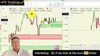
Pips. So it's $1.45 is the value from there to there which is quite amazing. So I would say that that is a doji, not a spinning top. In fact this is a Dragonfly doji indicative of a reversal especially when you're at the top of a trend. So again the price may definitely come down to the the other moving averages. Let's now look at the other charts on Trading view and let's analyze further. So again on the daily chart we've got another demand zone that was created on the week. On the monthly chart another demand zone was created. But I think what we need to do is we need to look at the Euro US dollar and the Dixie which are very interesting. So if we look at the Euro US dollar you can see here that prices also come into demand zones. Here a supply zone has been created very similar to that of the XAU USD chart. And if we look at the Dixie we're on demand so on all the charts. So if we look at the four hour chart we can see here that we've come, we came into demand over here and then we can, we're now in another demand zone over here which seems to be a point of interest on multiple occasions which is an indicator that the price of gold is going to drop next week, that or the week after which is very, very interesting. So we need to take that into consideration when when trading. So let's have a look at the day chart again. The day chart. If we enlarge it again, we're on demand over here. So possibly the, the dollar could strengthen causing gold to weaken. Maybe there'll be a further rally where the dollar weakens a little bit next week or in the coming weeks after we've, after gold drops, it may come back into this zone on the monthly chart.
And then the dollar may rally all the way up to its next supply which, which is up at the top. So very interesting to note all these things. I see that I haven't drawn in a supply zone. So we'll just do that. Now there is a supply zone that is formed. So let us just do a monthly.
Supply on the fib. There we go. So there's a monthly supply on the fib and it's just very, very interesting to note. I see, see that there is slight supply over here as well. So I'm just going to enlarge it so I can draw it nicely for you guys. So there is a supply zone that is formed over here.
There as well. So possibly the price will come in, come down to the demand, go into the supply. I think it's a very weak supply zone and I think that the price, price could rally all the way to the top.
To the supply zone over here. So it's very interesting to understand what is happening with the, with the clock data relative to the charts and what's going to happen next week. So in my opinion, I think that there's going to be a reversal this week and the price could, could drop substantially back into these demand, these moving average demand zones over here. So let me take a screenshot for everybody so you can better understand it. So we, we don't know where the price is going to reverse to maybe to the 200, I'm sorry to the ATMA, maybe to the 32, maybe to the 34. Sorry. The green is the 21 moving average, yellow is the 32, 50 is the, this line of your purple and white is the 50 which is also the 200 moving average on the H, H1 chart. I don't think that will go down all the way to the 100, not next week, possibly the week after and then possibly the 200. Now what we found in the past is that coming into December, January, the price starts to drop significantly and then we wait until February, March and then the price then goes up, up again. So very possible that we could be entering into a bearish phase because it's coming to the end of the year, as we've seen in the past, so we'll see what happens. I'm excited about that because then I get to turn my robot on and really start placing some decent trades right at the bottom of the chart and really take advantage of this dip that's about to happen, which is exciting. So stay tuned for further information and I'll see you in my next video. Cheers.