Alan Solarsh shows how to read moving averages on forex charts. A moving average is the mean of the last X candles, plotted and updated as new candles form. His chart uses color coding: red for 200, light-blue for 100, purple for 50, yellow for 34, gold for 10, light-blue for 5, and red/white dotted for 8 EMA.
Alan Solosh here, the passive income guru in this video tutorial explains to you how to read a forex chart.
Right? So as you can see on my, on my forex chart I've got lots of lines in different colors. So these lines are moving averages. And that is what all professional forex traders and stock traders use to anticipate what is going to happen with a specific currency over the near and long term future. So.
A moving average is basically a dot on a graph that is created by taking the last x amount of candles and dividing it by itself. So over here, the red line, this is the moving average 200, which means that we've taken the close out of the last 200 candles. Each one of these.
Lines on the, on the chart is a candle. So it's the last, the closeout of the last 200 candles and then a dot is put onto the chart and then those dots are, are basically lined up with a line, okay. Joined rather with a line. So when the next candle forms.
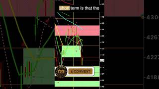
A new dot will form and then this red line will join the next dot, okay? So it'll take the closeout of the last 200 candles and a new dot will form. Now each, there's different time frames on the forex chart. So, so we're currently looking at a one minute chart. So on MT4 you would just put on an iPhone and on an Android you would just put your finger onto the screen like that. And as you can see I've got the time frames on the left hand side of the screen and we're looking at an M1 chart which is a one minute chart, okay? So there's various different time frames which is a 1 minute, 5 minute, 15 minute, 30 minute, 1 hour, 5, 4 hour and 1 day, 1 week and a 1 month. Okay? And so obviously if you're looking at a one minute chart, the moving average 200 is the closeout of the last 200 candles. And each candle represents one minute, okay? Right. So each moving average has a color. And over here at the bottom of the screen you have put here the moving averages and what each moving average is. So the rate is the 200, okay. And the light blue is the hundred and the purple is the 50. And let's just zoom in here so you can the yellow is the 34, that's the yellow. And the gold is the 10. And the light blue over here is the 5. And the red and white dotted line is the 8 exponential moving average. And the, the professional traders throughout the world are using the yellow line. The red line and the purple line. That's how they basically make their decisions. And this is called technical analysis. I use both. I use technical analysis as well as candlestick analysis. So as for me to understand what the direction is of.
A currency. Okay, the white lines, these three white lines. Let me just zoom out a bit. There's three white lines. These white lines are called Bollinger bands. And I've put the deviations and the periods over here on my website. I've left all the documentation on my website. If you're watching this on YouTube, I'll leave the chart set up below the video so you can check that as well. And I highly recommend that you set up your phone according to these parameters as well as start learning what. What these moving averages mean, how they operate, and how they are best going to benefit you in the long run. So on my next video, I'm going to show you exactly why we use these moving averages and how they actually work.