Transcript excerpt of a speaker (Andy Hnilo) describing the personal creation of the Alitura logo: rejecting multiple designers, experimenting with hand-drawn signatures on white paper, choosing a signature-style logo based on the speaker's own signature and revisions, and referencing influences like Phil Knight/Nike. The piece explains symbolic meaning (signing off on the product) and aesthetic choices.
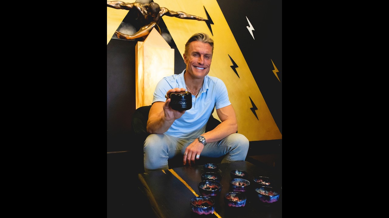
A lot of companies do rebrands. I don't think I want to. I love. I mean, the logo, everything. I went to three different graphic designers, a tattoo artist. I was trying to get my guys know. It's Alatura. They're giving me block letters, like, who do you want to look like? Like, I think they gave me a couple other big brands. I'm like, no, no, no. So finally, I got a stack of white papers. We had a deadline to hit a Sharpie. And I love, like, I've always, like, you know, I thought I was gonna be a baseball player, so I've been obsessed with my signature. A little kid, but so calligraphy is important, but I nailed that alotura. It's, like, symbolic of me signing off on the product. And I. I love how it looks too. Like, so I didn't know that part. I didn't know. I didn't know that you signed it. Oh, yeah, that's my signature. And the A2, I. I. I even have, like, revisions. All that. Like, it took forever. That one. No, no, no. That one wasn't it. That has, like, the swoosh with the tribute to Phil Knight from Nike.