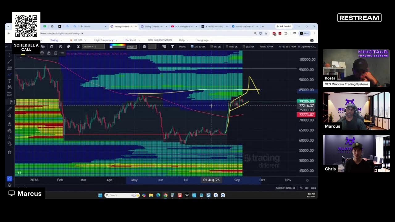
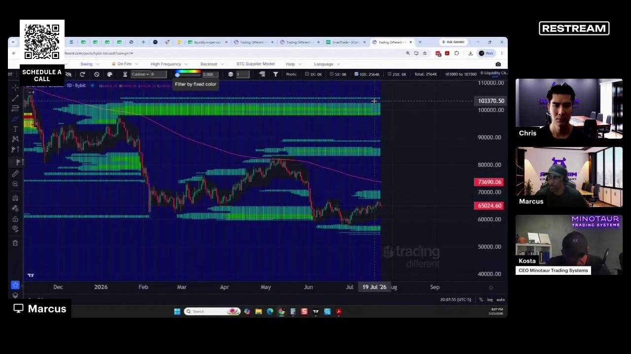
A Bitcoin analyst explains a price chart with three zones: a bottom tied to production costs, a middle band, and an upper region. The model marked major bottoms including the COVID crash, with the lower bound typically sitting around 60% below the midline.
Chapters
There are. The main feature of this chart is that there are two regions, right? By the way, there is also this bottom. This bottom. We believe strongly it has to do with the cost of production of Bitcoin. And look how amazing it is, right? You can catch all the main bottoms. Like even during COVID we didn't cross that line. It's something that you can calculate in different way, but usually it's about 60% from the middle line. Probably this is the real power law, or all the data between the blue line and the white line is what we call the core power law.