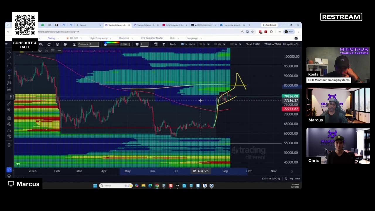
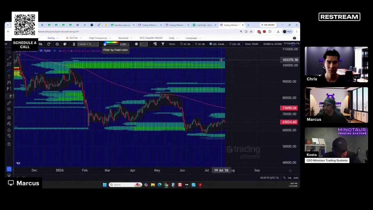
The speaker (Kosta Ouzas) explains a chart linking a global liquidity indicator (the purple line, largely M2) to a price model. He emphasizes that rather than plotting liquidity alone, the chart shows a modelled price based on liquidity and that the liquidity series is extended forward in time to produce the price projection.
Chapters
This chart is more about global liquidity. So it shows, basically, this indicator is one of the main indicators that I have in this case, what I'm doing. The purple line here is the global liquidity, mostly M2. You can try to find more sophisticated form of liquidity, but M2 works good enough. And the trick here, this is why you see this, you see how is extended to the future, right? So many of you probably are familiar with this idea. The main difference between this chart and others that you may have seen is that I don't plot liquidity by itself. So this is where the price ends, right? You see here. But this is a model of a price based on the liquidity.