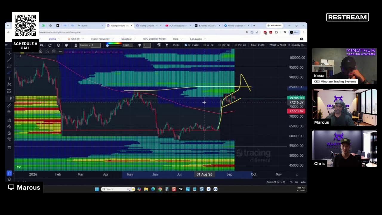
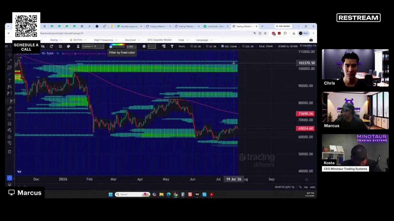
A brief conversational excerpt from a YouTube video where two speakers discuss how a log-linear chart can appear to 'bend' downward, clarifying that this visual effect is an illusion and does not indicate a ceiling in the underlying data or trend.
It's actually an illusion that we have this bending downwards in the log linear chart. What do we call the log linear chart? Right. So if you take your log, like here, you see, it looks bent like this. It's important to understand this, that it doesn't mean that we are having some kind of a ceiling, because some people are confused about these. So even higher eye level.
People being confused by this idea.
There is not a ceiling.
Remember, a real graph is something that goes like this.