We Don't Have A Way Of Calculating The Logarithm
30 Oct 2025 · 1 min

0:34
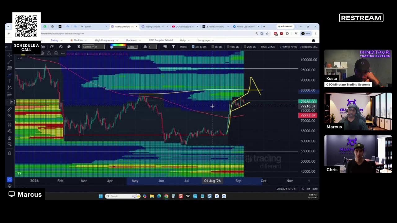
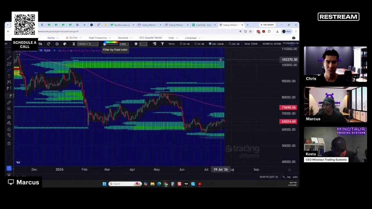
Short excerpt from a YouTube video by Kosta Ouzas explaining parts of a data visualization. The speaker describes a green area slightly above a blue area (the blue representing the 50th percentile), a green line representing the average, and contrasts two regression methods mentioned by name: least squares regression and quantal regression. The focus is interpretive: mapping visual elements to statistical summaries and methods.