The Facebook Ads Formula That Got Me 836 Sales at $11 Each (Copy It)

Four image ads that sold 836 units at $11 each on a $10K budget, hitting 5× return. The presenter breaks down each one: problem-solution list, Apple Notes format with stats, hero shot with benefits, testimonial versus format. Mix and match the hooks, bodies, and angles to generate infinite variations.
Chapters
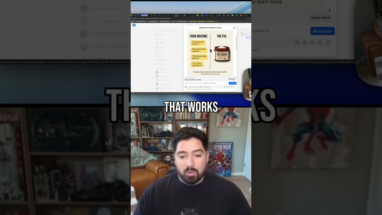
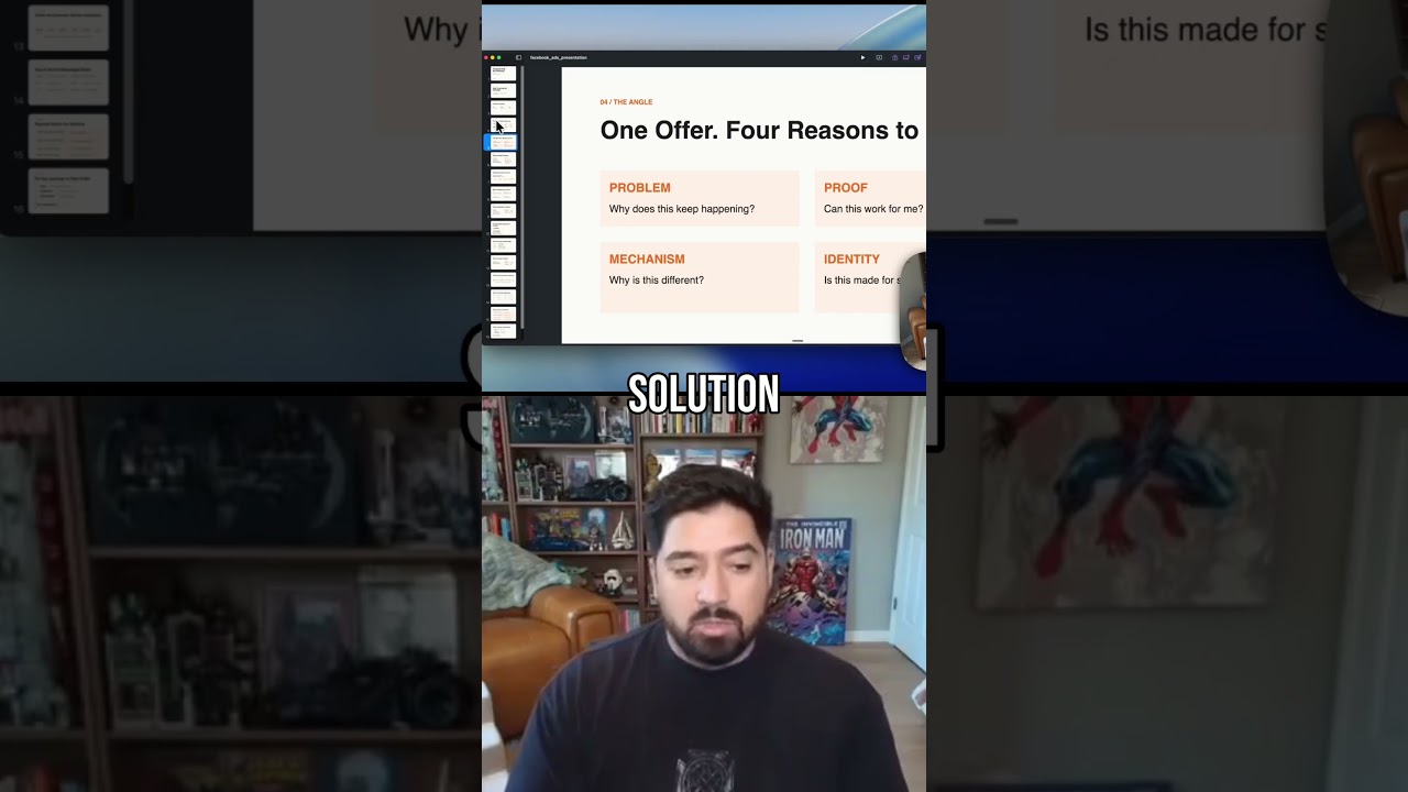
If you're marketing your business or running any kind of ads on Meta advertising, Facebook and Instagram, you know that creative is going to be the biggest thing that determines your success outside of your offer. But a lot of people talk about why creative is so important, but I don't think people do a good enough job at actually breaking down the different elements of an ad creative and then how to actually make good creative so you can get better results. So I'm gonna walk you through 4 different creatives that have totally crushed it for our client. Um, in this past month for this offer. This is an e-com offer, but these same exact things can be applied to info, home service businesses, really anything. The results I'm gonna show you are all backed up. Uh, this is from just the month of July so far. And from these, we've generated 836 purchases at $11 a purchase. We've spent almost $10K on ads to generate $52,000 in return. Even with cost of goods sold and everything else, with a 5x return on ad spend. These ads are absolutely crushing, and I wanna break down exactly what made them work so well. So let's get right into it. Now, before I actually talk about the creatives themselves, I wanna break down the core elements to a creative and what actually makes them work. And most of the time, people will really focus on these 3 things: the hook, the body, and the CTA. And at a high level, these are definitely true. With these, they'll kind of apply them into 2 primary ad categories, a static ad— excuse my handwriting— but a static ad and a video ad. And although most people are gonna push you towards video, you'll see momentarily that all 4 of these ads are actually image ads that are crushing. These same concepts can be applied to both images, static ads, so carousels, memes, whatever it is, and video ads as well. However, I think the one big thing that people do miss in this core structure of a creative, if we're really simplifying it down, which is what I wanna do in this video, is a big overarching element, which is the angle itself. That was not the right pen to use, which is the angle itself. And why this is so important is it allows you to take your one creative and deploy it in a ton of different ways, even if you're not changing too much of the hook, body, or CTA. These things here are really what make up the core of the ad. And if you change, you know, one of these elements, that's fine, but you could have it going after the same angle. I think what's a really interesting way to go about this is especially with Meta Andromeda, going after it with, okay, how can we actually keep the same hook, body, CTA, but change the overarching angle to hit a totally different segment of the market? That's kind of what we did here. Different reasons why people buy. Now let's just get into it and actually break down the creatives. So I've got 4 of them here. We'll go through each one at a time. And these are the winners. We actually had some previous ads that we were running that weren't doing nearly as well, but it was for the exact same offer. And I'll show you 2 of them quickly so you can just kind of see what exactly they look like and you can see how we change things essentially. And it was these 2. So this one, not too bad. This one as well was okay, but it's just so generic and there wasn't enough really deeper angle behind why these were actually working or why people wanted to buy them. So if we look at these creatives here, first off, the before and after, great angle as a whole, great structure for a creative. And the angle here was basically, hey, you're having all these potential problems, right? We just listed basically 5 issues that people could potentially be having. And counteract it with saying, okay, well, all these problems, if you're having one of them, if you're having many of them, here's the single solution and this is our product, right? That's it. Super simple. One big thing as well with these 3 elements of hook, body, and CTA, you'll notice that all the CTAs in these are very simple. We actually don't reveal the price here because we're just getting curiosity to click. That's not a must, but they're all simple. They don't really talk about the price too much, and they're all pretty much low barrier. Learn more, click to learn more. It's not buy now. A lot of people don't wanna make that commitment just yet. So just clicking the learn more can get them to the next step where the landing page does a lot of that heavy lifting. So keep that in mind. One angle for creative that worked very well and one style. The next style that worked well is this like Apple Notes look. Look, plus some image in the background with like a kind of product hero showcase. I think the background really doesn't matter too much. Like if we did the same background or the same ad with just a black background and then a picture of this main product here in the middle, it probably would have worked just as well. And there's 2 reasons why. This is a really strong hook and it's really hitting people's pain points. Your barrier is starved. You maybe feel like a complete mess if you're not, you know, using the right skin cream, and it's gonna hit people that are really interested in that kind of stuff, right? Then it gives a really interesting stat. I think not a lot of people do this in their ads, but they should be. Interesting stat here is that beef tallow shares 92% of your skin's own fatty acids, so it absorbs completely and repairs from within. This is a super interesting fact, and I think having a shocking statistic or an interesting fact that's backed up is a really great way to take any kind of normal product and almost build its own unique mechanism out of it. I think a lot of people, when they think of like the unique value proposition or the unique mechanism, they're kind of one or two in the same, that they think of, I need to create something, I need to invent my unique mechanism, I need to invent my unique value proposition. You can, and you can kind of put a story and a spin on it, But a lot of the times, if you're selling something that's solid, the research is out there and you can use the data to your advantage to actually make some really cool claims that are totally backed up by science and proof, and people enjoy them as well. So that's the next creative. 2 more, and I hope you guys are enjoying this. If you're liking this breakdown and you want more breakdowns just like this, join our school community below. We do breakdowns like this super, super in-depth, and both on ads, landing pages, everything. So if you're liking this so far, check out the school group. I'd love to have you in there because there's much more of this as well. So next creative, this one as well is kind of similar to this Your Problems one, but it's more on the other side of it. So the hook here is you can read every ingredient. Style is kind of similar to this last one that we'll get into a bit, but it's more hero product shot and then all these benefit-driven statements essentially. All the way throughout. Pretty simple product image. That's basically it. But you can see here how one product being presented in a few different ways can make some really, really big results. It's really, really cool. And you don't have to overthink it either. As long as you have a strong hook, different angles, different styles, you're gonna be good. How I really like to break it out is once I have my hook, once I have my CTA— whoops— once I have my CTA, once I have maybe like the body, like stuff I wanna put in there, you can basically take these plus the angle, plus the style of the creative that you wanna go with. So meme, carousel, Apple Notes, us versus them, problem solution. Some of those will be an angle like this versus one, this like hero card one. Apple Notes with a background, Apple Notes without a background. And you could basically come up with infinite different angles and infinite different creatives just by looking at rotating. Okay, well, I've done angle 1 with style 2. How about I do angle 1 with style 3, hook 2, and CTA 1 and body 2? And you can just rotate those around and you'll have infinite creatives. And it'll be different for everyone, but come up with your set of angles, your set of styles that you enjoy doing, and the ones that work well, and try different ones. And you'll see really great results. Okay. Last one. These are more a mix between testimonial style, but also these kinds of benefit-driven statements and problems that they can help solve. So you can see here, this is a great example of how we basically took this ad here. Let me actually get rid of some of these other ones real quick, 'cause I think this will be really, really good. So if we just compare these 2 ads next to each other for a second, Both of these ads are actually the exact same angle. They share the exact same angle between the two. The biggest difference here is really just the style. I'd say is the biggest differentiator between them because all these problems here, dry flaky patches, calmed redness, etc., etc. We probably could have done even more of these as well. I'd say the hook on these ones could be this, but it's also just gonna be all these are the hook. And I'm sure most people, their eyes are gonna go right here. So dry patches are actually gone. That's a really great hook. That's something that we could actually go back to and make a brand new ad creative talking about that stuff as well. So super simple and really cool way how we basically took this one with all the problems listed out this way and presented in more of like a versus style. Versus this one, which we did more as like a testimonial style. Same thing, all the problems are presented here, and there's really only 2 problems. This probably could have been even better if we did like even more problems. So I hope this gives you some ideas for how you can take your ad creatives, how you can really just break them down simply by hook, CTA, body, angle, and style. Mix and match them as much as you can, and you could definitely get some results like this. You need a good offer But if you have that and things just aren't working how they want to, we basically almost more than half this cost per sale before this was around $30 to $40. Um, so we dropped it by $20 to $30 easily to get it down to $11 just this month and get over a 5x return on ad spend, which is amazing. So take this, apply it to your same ad creatives. I hope you enjoyed. Once again, if you want more of this kind of stuff, Click below and join our brand new school group. Really proud of it. I think you'll get a ton of value out of it, and I will see you in the next video.