Roasting Emma Hernan’s Empanada Website #emmahernan #sellingsunset #sellingsunsetnetflix #realitytv
18 Sept 2024 · 1 min

0:59
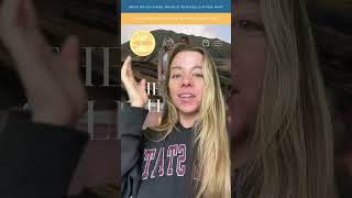
A short video segment by Christina Hall critiquing Emma Hernan’s website design and user experience. Hall argues the site shows inconsistent branding (red theme vs product green/orange packaging), uses a generic logo/font, outdated holiday graphics, spinning decorative elements, and an intrusive image slider that disrupts reading.
Chapters
More from Christina


youtube.com
I created a four-week accelerated brand and website experience that builds your complete BRAND
1y ago

youtube.com
. #businessownertips #businesssolution #businesslogodesign #entrepenuer #startingabusiness
1y ago
youtube.com
And if you tell me you “bought a logo” and never saw an increase thats cause you didn’t hire a real
1y ago

youtube.com
love club #greenscreen roasting a logo for an etsy store that would totally slay on #booktok
1y ago