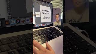
A short video by Christina Hall critiquing an overused Canva logo template and demonstrating quick design changes—typeface swaps, icon tweaks (memory card), and layout adjustments—to make logos look more unique and professional rather than homemade. The speaker emphasizes avoiding common templates and visual clichés (e.g., peach background) and shows dragging assets into Illustrator for refinement.
Chapters
More from Christina




I created a four-week accelerated brand and website experience that builds your complete BRAND



. #businessownertips #businesssolution #businesslogodesign #entrepenuer #startingabusiness


And if you tell me you “bought a logo” and never saw an increase thats cause you didn’t hire a real


love club #greenscreen roasting a logo for an etsy store that would totally slay on #booktok