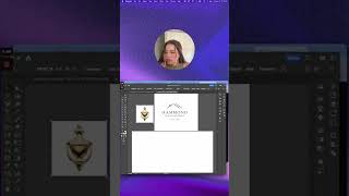
Who would you hire?? — Redesigning another wayyy poorly designed logo on Canva #canvalogodesign
14 Aug 2024 · 1 min
0:59
Christina Hall critiques a generic real-estate logo and walks through redesigning it in Canva to make it distinctive. She avoids overused motifs (houses/keys), imports and traces an alternative house-like image, adds stylized highlights for dimension, and experiments with typefaces that feel approachable but original.
Chapters
More from Christina



youtube.com
I created a four-week accelerated brand and website experience that builds your complete BRAND
1y ago


youtube.com
. #businessownertips #businesssolution #businesslogodesign #entrepenuer #startingabusiness
1y ago


youtube.com
And if you tell me you “bought a logo” and never saw an increase thats cause you didn’t hire a real
1y ago


youtube.com
love club #greenscreen roasting a logo for an etsy store that would totally slay on #booktok
1y ago