Adding Color to Barn Sketch
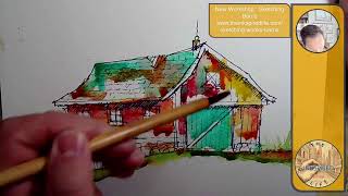
Jason Nicholas of The Inkspired Life adds watercolor to a Sharpie barn sketch, tilting the paper to let pigment run and create wonky, organic effects. He layers turquoise, orange, and sap-green to convey emotion over realism, embracing crooked lines and weathered textures.
Chapters
Hey, hello, hope you're having a great day. This is Jason Nicholas Nicholas with The Inkspired Life, popping on for just a few minutes. Um, I want to add some color to this barn sketch I did earlier this week. So the sketch you're looking at here was done with a Sharpie, and, uh, yeah, let's just throw some color down and have some fun for a few minutes. If you're watching live, let me know where you're watching from. It would be so cool to, uh, say hello to you. So I started with a Sharpie, and typically I will start with a Sharpie, um, that way if I come back later on and want to add some watercolor or ink to it, I don't have to worry about the black lines bleeding, right? Once the Sharpie is down, it's going to stay down there. I'll zoom out. You can see I have, um, let's see, I'm gonna kind of prop this up. I like to prop my work area up at a little bit of an angle, and I also have my watercolor palette here. All right, let's just add some color. Let's see, maybe I'll keep it zoomed out. Actually, let's zoom in. Let's see, I think we'll zoom in on it. This is turquoise watercolor I'm just throwing down on there. I'm gonna leave a lot of white space here. I don't want to fill every single part of this sketch with color. I like to keep it kind of loose and open. Um, leave some of it to the viewer's imagination so they can kind of fill in the spaces. And it also helps to keep the kind of wonky, loose style that I like to do. Now I'm just grabbing some orange watercolor. You can see how the water is kind of running down a little bit, the color is running down, and that's just— I like that style, like to tilt my paper so everything kind of runs down, blends together, and does funky kind of things like this you see here. It's fall here in New Jersey, so I'm just thinking fall colors right now. So I have this orange kind of happening, and I'm going to grab some— going to grab some yellow. So this is a sketch from the imagination, colors from the imagination. I'm not trying to copy anything that's existing. And it's okay if you do, but if I do, say I take a picture of a building, maybe a building in New York City, um, I'll often, or most of the time, just add my own colors. I'll do a quick outline sketch, put the photo away, and just add whatever colors I'm kind of feeling. I'm not trying to recreate a realistic scene. I like to color— I like to use colors based on kind of emotion. What colors are making me feel happy? What kind of vibe am I feeling at the time? And it's just another way of adding a level of fun to what I'm doing. I'm not stressing out trying to recreate something exactly as it is. For me, that's why I love taking photographs, especially of architecture. The photographs are where I can really, you know, get the details and capture a building exactly as it is, or capture at different times of the day, capture details of buildings. So that's kind of one of the reasons I love doing photography. As well as sketching. I'm going to throw in some red watercolor. Typically I like to use a Pilot Precise pen here to use the red. For my reds, for my red inks. Let's just kind of be fun and dip into some red watercolor paint on this. So we got a pop of red happening there. I'm gonna grab some more red and let's throw some maybe on this side. So what makes this wonky for me? A couple of things that make it wonky, and I could even wonkify it more, if that's a verb. Um, It's kind of lines that are not straight. We have lines— you can especially see here kind of crookedy, crooked-ish lines here. Even the roof is kind of bent, um, over in here. This wall is not perfectly straight, kind of leaning in a little bit. I could exaggerate these and really make them wonkier if I wanted to. Another thing for me about wonky are the whimsical, fun colors that I'm using. So that's another way to add a little bit of wonkiness to your sketches. So what do we have? We have kind of crooked, bent, curvy, not straight lines, um, fun colors, add that touch of wonkiness to it. In here on this roof, I actually have— notice the roof comes across and drops, so I kind of shown like a broken roof. So wonky also is showing the age and characters— characteristics of buildings. How are these things weathering? I love the way the colors are melding together. Deborah's in the house. Deborah says looks great. Hey Deborah, it's so awesome to see you. Thank you so much, Deborah. Deborah is an amazing, amazing artist. Thank you so much for coming on and commenting. I love that. So I'm gonna zoom in a little bit. You can see how these colors are drying, and I'm leaving— I'm gonna leave this white. I'm gonna leave this white here. You could see— I'll show you some other ones I've done in the past week or so. Here's, here's an example. Right, I really love this one. I love this so much. Um, I'm loving how it's the unfinished parts of it and how these colors are kind of bleeding down a little bit. And that was done in stages. I think I did it over two different sessions. You know, like for example, what I'm doing now, probably let dry and I'll come back to it later or tomorrow, who knows when, and just add another layer on top. All right, so let's throw some landscape on here. Um, another thing I did on this is I brought the ground— instead of making this ground straight across, I dropped it, and I thought that would just kind of add a little bit more character as well. It's a little off-center, asymmetrical. So another way to help wonkify your sketches, make them wonky, is asymmetry, right? We don't want a lot of perfectly balanced things. Balance— if you have symmetry, symmetry for me equals static things, kind of in place, not moving, very classical. Which can be beautiful as well. But for when I'm trying to wonk— make things wonky, I want that asymmetry, things to be kind of, kind of askew from each other. So I'm just throwing down some— I think this is a Sap Green, and we're gonna— I'll show you what I'm gonna do over here to make some growies happen. Let me move this up. There we go. I am going to dip my brush, load it with a lot of water, dipping it in the Sap Green so it's very watery. And here's what I'm gonna do. I could use a straw, but I'm just gonna do it this way. Pardon my head if it's in the camera. So I got some kind of growies wonkiness happening here. If I just draw, I can control a little bit better. Let's try this side. Let me see, I hold it up and do it this way. There we go, that's better. That's kind of what I was going for, right? So you can kind of see these, uh, grasses, maybe some kind of weeds growing up here, some kind of— I don't know, yeah, some grasses or weeds or plants growing up here. It just adds a little bit of interest rather than me trying— I could draw them or sketch them. Um, it could also just take a thin paintbrush if you haven't do them, or take the end of your paintbrush and do this as well. There's a bunch of different ways to get the same idea, so that's kind of fun. Deborah says thank you. You are welcome. You are so welcome. I'm gonna zoom in so you can see how this is drying. It's looking really cool. I love the colors happening here. Let me add some brown on the roof. Let's see, I'm going to grab some brown. Brown is a color I don't really use too much of in watercolor, uh, not for any reason, I just don't use it, that's all. But let's throw some on here, kind of. Here we go. So by adding these different kinds of color layers, it's adding a bit of, um, aging to me, a little bit of distressing. I love— and I love stressed-looking vibes or aging industrial buildings. I love the textures, the colors, the weathering of the materials, the metal. So some brown on here. So I'm trying to take that look I love from doing industrial sketching to the barns. There we go. So I'm just throwing some brown on here. Let me zoom out. All right, all right, I'm going to— I'm only going to be on for like 2 more minutes. Again, I'm just popping on at a very random time. I— you know what, I want this door I want this to be turquoise. We're gonna make this sliding barn door turquoise here. Threw it on pretty heavy, and we'll see how that dries. I don't care that the color dripped down here into the brown. I like that look. So we'll let it dry that way and see what happens. Maybe we'll borrow some of that color, just kind of bring it down a little bit, pull some of that off and add it to the stones just to tie it together a little bit this way. Cool. And I'm going to throw on a little bit more yellow before I wrap up here. I just want to— I don't know, I call it Taxi Cab Yellow. I'm not sure what color the actual color name is. I'll show you my palette here. So I'm grabbing this. I actually need to put more in there soon. I just call this Taxi Cab Yellow. That's what it reminds me of. Almost dark yellow. Yeah, I would agree, it's like a dark yellow. It reminds me of— what's that mustard? Oh my gosh, there's a mustard brand out there. It looks like that mustard color. I'm drawing a blank on that. Cool. You know, maybe we'll throw some blue here. I'll just kind of tie— this is another door— we'll kind of tie together a little bit of the blue there. All right, I think this one's a wrap for now. I would probably come back after it dries and add a little bit more. to it. But yeah, if you're enjoying this, I have a workshop on October 26th. It is virtual via Zoom. We'll be sketching wonky barns together. So if you're interested, there is a link here at the top of my screen. Feel free to check that out. I'd love to have, have you in the workshop. I think we have 10 spots left out of 20, so that is pretty dang awesome. And I appreciate, um, everybody who signed up. I think we're gonna have a fun couple of hours together, just being fun, creative, throwing down some ink, maybe adding some splashes of color also. Thank you guys so much for watching. Have an amazing rest of your Saturday. Keep using your creativity for positivity. I'll see you guys soon. Peace and live creatively. Have an awesome day.