Tuesday Night Sketching

Jason Nicholas, an architecture professor, leads a 90-minute watercolor sketching session with mixed media tools. He shows how to layer colors like Sage & Amber and Coastal Blue, emphasizing a playful approach where you throw down color without a fixed outcome and embrace mistakes. The core idea: sketch boldly, let intuition guide you, and know when to stop.
Chapters
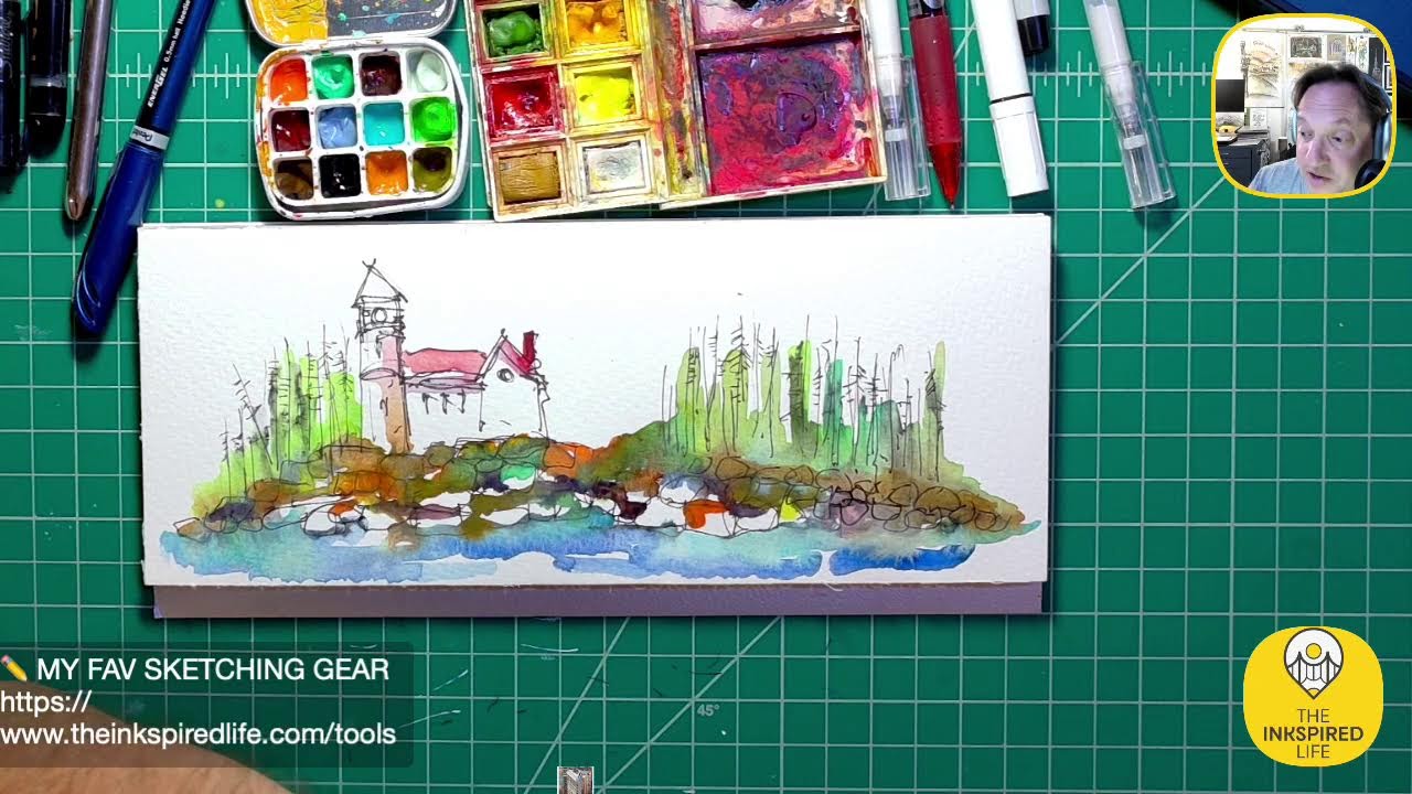
Hey, Jason here from The Inspired Life. It is, um, Tuesday, September 29th. I'm looking at the wrong camera. Tuesday, September 29th, 2026. I'm a little out of practice. It's been a long time since I've livestreamed, but it's awesome to be here. I hope you're having a great day today. Boom! Let's just go live on the Insta page. Yeah, so it's it's been a it's been a hot sec since I I've been on. Things have been just crazy crazy start of school, end of summer, start of fall. Teaching architecture—it's all good stuff, no complaints. Just been busy with life. So I was reminded kind of today that I need to take some time out. Um, kind of like wellness time, right? Sometimes we get caught up in every day and, uh, we just lose track of keeping and taking care of ourselves. So I am here and I want to just do a little bit of sketching tonight. This is one of my things I love, love doing, and I haven't made enough time to, to sketch. So I hope you're having a great, great day today. Feel free to tune in I have— I don't even know what I'm gonna sketch, and that's kind of the point. The point is, um, just to come on live tonight, do something. It's 7:55, so I'll probably be on, uh, 8:30 the latest. Got some stuff here. We'll do some sketching. Maybe we'll try out some colors. I have no idea, but join me on this creative journey as we do some fun stuff. Hope you're having a great day today. I know I said that 20 times. All right, I'm just gonna do some artwork. Feel free to say hello in the comments, and, um, yeah, let's take it from there. I'm using a different camera, so we'll see how that goes. So, um, last time— actually, I don't even think I did this on a live stream, did I? I think the last thing I did on a live stream is I had worked on I had worked on this really cool, um, lighthouse in this accordion sketchbook. So this came out really awesome. I love it. Love the colors. So maybe, you know, maybe we'll play around in this. Maybe we'll do another scene somewhere. You know what? Yeah, we'll do that. We'll just— we're gonna work in this book tonight. We'll just do another scene. I don't want to— let's see, maybe we'll start it, uh, we'll start like here on this page and we'll do a little something cool. I also have some new colors that I, I tested out I think last week or the week before, and I'll show you those colors. I think I did it in this book, so maybe we'll break those out tonight as well. I think I did it in here. I was messing around one day. Oh, that's cool. Yeah, so I have some new colors. I've been playing around with them. I really, I really like them. This looks— these look like fish, kind of, don't they? Maybe a whale or something. And these are the colors. Uh, so I have— this is cool. I love the name of this color. It's called Coffee and Cream. Can you see that? Coffee with Cream, American Journey. So tonight we'll just throw down some of these new colors. Why don't we do that? This is— I love this color, Sage and Amber. Probably my new favorite watercolor right here, Sage and Amber. And I'll show you what these colors look like. This one is called Pat's Coastal Blue. And we have this one here. This is Coastal fog. We can do that coastal fog. Pretty cool. All right, so before we go into the accordion journal, let's just mess around in this little sketchbook here. I'll zoom in. Let's throw some colors down and just play, be playful for a few minutes. I'm not trying to create anything specific. I don't care if it doesn't look like anything in the end. We're just going to throw down these colors and have fun tonight. So I have some water here. Boom. Really cool little mini travel tin. Um, shout out to my friend Rue for that. And shout out to my friend Linda, she sent this, and I'm, I'm gonna break this thing out soon. I've been wanting to do that. So this is a cool little watercolor. Check that out. So I'm gonna break that out. I probably— maybe if I go to the city Saturday, I'll take it with me. All right, cool. All right, let's throw on some colors. I'm gonna try to zoom in a little bit more if I can. I don't know if I— I don't know if I can get any closer. That's me. You don't want to see me zoomed in. Let's, uh, let's switch to Here, we should be able to zoom in with that. There we go. Perfect. And we'll just mess around. Actually, you know what? We're going to break out Our little palette here. Let's throw some of the colors in here. All right, I'm going to put in— this is Coastal Fog. I'm not going to fill the pan, we're just going to put a little, little bit in there. So Coastal Fog. This is Coastal Blue. So I was looking for kind of a Maine-inspired color palette. Coffee with Cream. I just love the name of that color. Sometimes I think it would be really cool to have a job where you just get to name colors. How fun would that be, right? Although now, um, in the world of AI— I did say AI— um, we can generate ideas for names pretty easily. But you know what? I like using my brain first before I go to AI, so I would see what my brain can come up with. All right, let's throw down some color. All right, this is the coastal fog. All right, Coastal Fog. We're gonna now dip into the Coastal Blue, and we're just kind of swatching a little bit. So dipping in clean water, that's the Coastal Blue, and then we're gonna kind of do a little mix here. And we'll see how these dry. All right, next up is my favorite new color. No, I lied, that's going to be last. This is the— oh, I don't need to open it. See, um, my brain is tired. This is Coffee with Cream. I could— if I could drink it right now, I would, because I could use the caffeine, but I am not going to do that. All right, Coffee with Cream, got a little swatch, and let's just kind of Try something fun. We'll just kind of blend these together, and maybe we'll do a little cross-blending this way.
All right, cool.
All right, now is my new favorite color, Sage and Amber. Let's see, where are we going to throw Sage and Amber? We'll throw it, um, We'll put some right here. All right, the Sage and Amber, let's kind of throw a little bit in there and mix it. I'll pull a little down here, we'll mix it, and we'll grab some of that Um, Coastal Blue. So there we go. So we swatched some of the colors. We'll see how they dry. Pretty cool. Let's throw— you know what, we're just going to spend time throwing down color tonight, and then maybe after it dries, we'll come back with a Sharpie and we'll just kind of sketch on top of the The background. So we're randomizing right now. I'm gonna dip into this little palette, and I don't remember the names of all these colors. So yeah, I don't remember these names. I have a cheat sheet somewhere, but this is a cool green. Cool as in C-O-O-L. Not— well, how else would you spell cool? I don't know. Um, Cool, hasn't it? It looks awesome. Not temperature-wise. All right, we'll dip into— fall has started here, leaves are changing color. I have some really awesome kind of fall oranges in here. Let's grab some of this awesome orangey color. Oh, that's interesting. I thought it was gonna be more vibrant. I think I have some another color mixed in there. There we go. I'm gonna throw it on kind of thick. So we've got some of this orange happening. Let's dip into— I like this color. I think this is periwinkle. Load up some of that on the brush here. So we just have some random colors going down. I'm going to grab one of these. Is this a red? I think this is a red. I don't We'll just throw some here.
Okay.
I could already see the— a color combination that I really love as it's drying here. Let's grab, um, some of this Coastal Blue, and then I'll show you that color combo I'm really digging. Oh, I like that. I like the contrast here of this coastal blue on that green. It's pretty interesting. Yeah, I love the color combination. So we're just playing with colors tonight. Hello, David Sachs on Instagram, good to see you. All right, so we're just throwing in random colors. Let's kind of zoom in. I'll show you what I really like that's happening, um, right here. I don't think I have one of my mini frames here, do I? Let's see. I do, I do. All right, let's see this. See if I can focus in. I really like the color that's happening in this frame. So I have to actually go back and watch the video to see what I mixed in here because I don't remember. Part of it I know was the, um, sage and amber color, but I think it looks really cool, you know, especially since I love doing Um, industrial kind of sketches, rust, weathered materials, right? This really lends itself really nicely to a rusty kind of palette, so I like that a lot. So really cool. And that's one of the fun things sometimes, just, uh, go grab your paints, grab a sheet of paper, throw color down. It's a great way just to play around, have fun. See things that happen. Um, you might find color combinations you really are surprised by. You will see some you don't really care for, but you don't know until you throw that color down, right? So, um, really cool. So I definitely want to sketch on top of this with a Sharpie. I'm actually seeing a— I'm seeing some kind of old, uh, Maybe a stone ruin, or not Stonehenge, but like an old kind of stone temple or something happening here. So I could pull that out definitely with a Sharpie. But yeah, let's, um— I am that dude that likes to watch paint dry, just saying. But here, if I hold this closer, look at the colors up here. Pretty amazing, right? You see like the orangey yellows and reds happening. And then here's that, that coastal blue on the green. Um, I like— I kind of like that contrast of colors. So this is a lot of fun. Feel free to say hello if you have any questions. I am here for you guys. If you're watching this on YouTube, I'd love for you to hit that like button, subscribe button. No matter where you're watching, if you could like this somehow or share it, that would be amazing. Um, I just want to spread positivity through creativity. So tonight's big lesson really is just throw down colors, have fun, have no expectations. Sometimes we set ourselves up for failure by expecting a specific result. And of course there's a time and a place to do that, um, but I think we need to make that playtime, that, that time of freedom, you know, go into that creative sandbox, let your imagination fly, let the inks fly, materials, um, don't hold back. It's simply, it's just paper and paint, right? In this case. And I, I'm not going to be crushed if nothing, you know, if I can't turn this into anything. That's fine because that's the point, is to really be playful. Um, I love how this is drying as well. Hey, Lori Jean 64, good to see you on, uh, the YouTube. Hope you're doing well. Check out this color. So I am— what I'm finding tonight is my rusty color palette. Love this. This is— I love how this is drying. So I love aged, um, copper when it patinas and you get that kind of greenish-blue color. So that's, that's not quite obviously that color, but I'd love to get— find a color palette that works. In that way, but this is looking really, really cool. Yeah, I am getting excited by watching these things kind of do their magic. So fun.
Yeah, yeah, yeah.
So fun. I'm just gonna keep dipping into the colors here. You know what? Let's break out some of this bright orange here. This is almost like a. Halloween orange or something. And I'm going to actually put a drop in here. I want to see what happens. I like adding orange when I'm trying to do a rusty kind of look. Orange and turquoise is great for that kind of effect. Pretty cool. Nice fall colors. Yeah, I totally agree. Fall is my favorite, favorite time of the year. The leaves changing, the weather getting a little crisp out. Um, who doesn't love, you know, the whole apple Cider donut thing. OMG, if you're a fan of apple cider donuts, let me know in that chat. Um, and I haven't had any yet this fall, come to think of it. Um, yeah, this is drying really, really amazingly. I can't wait to— I'll show you guys. I'll zoom in on it. We're going hog. We're going hog wild here with colors. Is that an expression? Hog wild? I feel like it is some kind of saying. It's definitely not opossum wild. Or maybe that is an expression too. I don't know. That's why I teach architecture design and not language arts because. I like to make up random words. My favorite word that drives people crazy is, um, oh man, what is the word? What am I using in school? Presentating. Presentating. I know it's presenting, but I for some reason always say presentating, and I'm constantly reminded that it's not a real word, and that's fair. But you know what, I like the word, I'm gonna use it. Oh, all right, I gotta show you this. I'm intensifying this really awesome blue. Um, I'll show you what that's doing. So check that color palette out. I love the colors that are really happening there. Pretty fun, right? Be even closer. Let's see how close I can get. Lighting might not be awesome, but we'll check it out. So you can see those colors really melding together. That's a fun word. Let's all say it together. One, two, three. Melding. Um, I like the melding happening here. Yeah. Heck yeah. If you're just joining me, welcome to the Inkspired Life. We are just throwing down colors, having fun, creating a little color chaos casually and, um, cordially. I was trying to do alliterations. Casually creating color chaos. How's that? We're casually creating color chaos.
Like that.
I'm going to change the name of the stream, the title of this one, to, to exactly that. All right, my camera can't get any closer, so I have to keep lifting it up. So sorry if it's a little shaky. I— this is drying really, really awesomely. Um, I'm gonna dip into some of that Coffee with Cream color, which is right here. Just maybe— just might be my favorite color name right now. And that's this color up here. So I'm seeing some kind of— well, I'll sketch it. I'm going to do some paint sketching here. We'll see what happens. So I'm trying to bring a little structure to this chaos with some line work on here. Maybe I can pull some architectural elements out of this. Again, I'm seeing some kind of ancient temple, maybe. Maybe because my architecture students are sketching the Parthenon this week, so that might be in my brain, you know, having these kind of columns here, right? So you can kind of see a structure kind of popping out of here a little bit. Hello over on the Insta, hope you're doing well. Hmm, I'm thinking too much. I don't want to really think. I just want to keep in the flow. If I start thinking, it is going to paralyze me and freeze me up, and I won't create anything. I'll be thinking too much about what I want to do. So the name of the game today is Throw down the color. Let's see, let's do, um, grab some of that periwinkle color, and I think I'm going to pull in— I think I have a violet in here, so I want something really dark, so I'll grab a violet next. So I am, I am thinking a little ahead. But not too far ahead.
Okay, cool.
And why I was thinking of grabbing— I think it's Violet. Violet, you're turning violet. Violet, what movie is that from? Trivia question. If you know it, you could put the answer in the chat. What movie is that from? Violet, you're turning violet. Violet, something like that. I might be paraphrasing, but I wanted to throw this dark color, this violet here. Maybe create a little bit of depth happening there. Violet, you're turning violet. I can't get that out of my head, probably because I'm watching the, um, this new show on Netflix that is based on that. Based on that line, uh, well, based on the movie and book that's from.
Let's punch—
let's, let's drop a little bit of that violet here and see how these colors mix together. I really want it. Uh, let's see, do I have a— so the, so the color red popped into my head and— oh man, I don't have what I want right here. So I was gonna grab my favorite red pens to use. My Pilot Precise Pens. I think I can grab one if I just spin around. I think I have one here in my bag for school. Heck yeah, we're good. So, all right, so this isn't watercolor and that's okay. My brain said grab this red pen because I love this color red more than red watercolor. So let's throw some of this on here. Hello, Art by Terry Nye. Hopefully I said that right. Good to see you. Hope you're doing well. We're just having fun. We're just throwing random colors down, no rhyme, reason, not trying to create anything specific tonight. It's all in the name of just being playful. So my, my PSA, my public service— my PSAA, public service art announcement tonight: don't forget To be playful. We don't always need to have a specific outcome. All right, it's not— it needs to dry a little bit more before I can actually sketch on top of it. But yeah, whenever I need red, um, the Pilot Precise Red— I don't know what it is about About it, but it is my favorite color red to use on things. Yeah, I definitely have to wait for it to dry. That's okay. It's looking cool. I want to— I want a dark outline or something on there. Maybe I'll do that with that violet, kind of throw it on there pretty heavy. I could have put some tape in here just to get an edge, but that's okay. So I just really want to put a frame around it with that violet color, kind of lock it in a little bit.
Thank you.
This is such a pretty color. All right, I'm being a little, uh, geometric there. I'm gonna really, really darken this up here. I'll hold this up closer so you guys can see, but I think throwing this color really thick on here, it's going to make it pop a little more. Trying to create maybe some shadows, or the idea of shadows. Yeah, so it's really coming out now. So there you go. So I'm starting to see it, you know, I'm starting to see this kind of temple structure thing popping out, emanating from the colors a little bit. Um, I love how this is drying here. So I threw that purple or violet here, boom. So we're getting a really cool rusty color palette. So I'll take this information, you know, we're being playful, but I'm also learning color combos I like. So I'll definitely take this color combo here, um, and here and up here as well, and I'll use those colors when I'm— especially when I'm doing like industrial, um, architectural sketches when I want grungy, kind of a grungy vibe. This is really a cool way to get those grungy rusty kind of colors happening here. Hello, Dad Dario 2390 on Instagram, good to see you. So, right, so you can kind of see just those colors and the way they're working. Um, we'll spend another couple minutes on this. I'm just— again, we're just having fun throwing down colors. I want to see if I can zoom closer, and I can't because Yeah, if I open the app for the camera, it'll slow everything down. I'll just keep holding it up. I want a punch of yellow, so I don't have any yellow watercolor paint here, but what I have right next to me, we're just going to grab and go, and I'm going to use a basic highlighter. I really want— I want a pop of brightness up here, so let's just kind of maybe throw some up in here. I love using highlighters, right? So now we have a kind of cool orangey thing happening up here. There we go. So you can kind of see how that the highlighter is popping things out. Hey, thank you for following me. I hope I'm saying your name right on Instagram. Didario, didario2390. I hope I'm saying your name right. Let me know. But look at— there you go. Cool, right? This will be fun to come back, uh, with a Sharpie and add some line work and pull some things out. Um, this will be a fun one to go back and watch and kind of see where it started and where it's ending up. I want to do some. I know what I want to do. All right, let's do. I have my color pencils here too, but you know what? Let's see. Maybe it might be wet, too wet to use the pencils, but we can try. All right, my favorite color pencil colors are right here: neon yellow, chartreuse, light aqua, fluorescent orange. Neon pink. That's what's in here now. I feel like I'm missing some. I have this cool— oh, I forgot I have this cool pencil. This is a cool pencil except the lead is too— I need a darker lead. This is a really cool pencil. I forget, I think— is it Stillform? Let's see. Yeah, Stillform. I got it at the stationery show in Brooklyn this summer, and they— sorry, I can't read it. Dang nabbit. Anyway, it's pretty cool. This this is the tip. It comes in different leads. This is I think I forget what weight this lead is. It's really hard though, and the lines lines come out super light. Not for me. I'll show you on here. I like a lead that's darker. But I didn't know that when I bought it. Then I tried to exchange it, the lead, and anyway, so I can't— this, this lead weight is not really useful for me. It's not doing anything. So I really— I have to spend $20 or whatever and get the softer leads. Um, so hopefully I'll do that sometime soon. Anyway, I forgot that was in there. Yeah, so let's throw down some chartreuse. Pro tip, I like to sharpen both ends of my colored pencils, so if I'm out urban sketching and I don't have a pencil sharpener, at least I have at least 2 sides to work from. Yeah, that looks cool. And now we're getting to mixed media, guys. We went from watercolor to colored pencil to— we had highlighters, and now we're going to break out the white gel pen. Um, let's see if this one has stuff in it.
Nope.
Let's check. Let me try it in here, see if it works. Nope.
All right.
No es bueno. Let's grab a different one. That one's shot. Let's see this. There we go. This one works. Here's kind of what I'm doing. Feel free to ask any questions if you have any comments. I'd love to chat with you before I wrap up tonight. It's fun to be back on. I haven't livestreamed in a while. Again, I've just been so busy with school and then, um, architecture as well. And not complaining, I love teaching, I love architecting.
It's just so—
it's just my brain's tired sometimes at night and I don't livestream. There we go. So I'm just throwing down some lines with this white gel pen. It'd be cool to pop out some of these columns as well. All right, a couple more minutes, we'll wrap up. Let's see. I'm thinking, I'm thinking too much, thinking too much. Just grab and go, grab and go. I'm actually trying to keep it a little bit tidy over here. I didn't break out any creative markers, so we actually— we're not going to use any creative markers on this one. I lied, I lied. Let's use, um, let's use the turquoise. No, I'll hold this up close so you can see what I'm doing in a sec. Yeah, it's looking cool. So I just want to put a little bit of texture on there. I'm going to add some actually more All right, so I'm just adding a little bit of texture to it. Pretty cool. All right, I'm going to throw on a little more color up here and then we'll wrap it. I'm going to dip back into some of the colors we started with in this little cool palette here. So let's grab some— let's grab some of the, um, Coastal Blue, throw that kind of up in here. We need to grab some Coastal Fog right here. These are great names, aren't they? All right, listen to this song, then I'll wrap up. I need— you know what, I need a punch of green over here. So we're going to grab some of this.
Maybe it's—
maybe this is Spring Green. I can't remember the name of it. I want to— I just really want to pop it out here. There we go. Yeah, that's what I'm talking about. And there you go. You can kind of see, uh, some of the colors coming together there, right? Pretty fun.
What about strippers? What about strippers? Strippers.
This is that periwinkle color. I'm throwing it down pretty heavy here. There we go. I just wanted to throw some more periwinkle down here. Sorry, it was off screen. Sorry about that. Pretty cool, right? So again, we're just being playful. I'm just throwing down these, these colors of randomness. I didn't really want to create anything specific. I just had these colors and I hadn't livestreamed, and I said to you, um, like in my brain, hey, let's go online, let's be playful, throw down colors, see what happens. And, uh, this is what's going on. Sometimes I, like I said before, I think we set ourselves up for creative failure if we're trying to create something really specific and we're just upset and we, we are, don't know where to start. We get paralyzed because we, we're afraid to make a mistake. And that white page, making mistakes is, can set us up for failure, right? So sometimes just embrace a mindset where you just want to be playful. Experiment, not expect any results. Hey, Alas, it's Alice. I see you on Instagram. Great to see you. Hope you're doing well. Always great to see you. So yeah, so just be playful, right? That's what tonight's about. You know, when I did this, when I did this last week, or maybe two weeks ago, actually, this was pretty intimidating because I have this accordion journal, a lot of pages, right? Look at it stretching out. And all I knew, I set a creative intention. I knew I wanted to make a lighthouse in Maine, um, on a rocky landscape. I didn't have anything specific. I wasn't trying to be very detailed with anything. It was just a vibe I was going for. So when you set yourself up with a vibe, it gives you a direction to head into. Now, if I was trying to do something detailed, I could do it. It would take hours and hours, but this was just kind of an exploration. So maybe think of your artwork as a creative journey and exploration to learn about how materials work, how different colors go together, different lines. You'll learn things you like, things you don't like. So this is kind of like a playground. And, you know, when I do my architectural drawings, they have to be very technical, um, and precise. This is kind of a, a way for me to be more loose and brainstorm and keep the creativity flowing in a different, different way. So yeah, pretty cool. I do like the way it looks like a little temple or something is emerging from the page. So it's looking kind of cool. A couple more minutes, we'll wrap up. If you guys have any questions or comments, feel free to put them in the chat. Um, I always appreciate everybody watching, whether you're on Facebook, Instagram, or YouTube. We're streaming to all 3 at the same time. Don't you love tech? Technology is amazing. I'm, I'm throwing down this— I love this blue color here. I feel like I need a little more blue to balance things out, and I want to throw a little bit up here. I don't want to get cheesy, like I don't want to start drawing in fluffy white clouds. This is, this is not a fluffy white cloud kind of scenario. Um, I honestly, I'm not digging that red. I, I mean, red watercolor, I don't know what it is, but I don't like, I don't like red watercolor. I, I always love just using a Pilot Precise Pen whenever I need red. So I threw that red on there and it's meh. It's meh. We'll call it meh. So we're gonna un-meh it. The cool thing about watercolor is you can add layers on top of layers, right? I'm gonna grab some of this. This is Coastal Fog. I'm gonna load it up. And I'm gonna actually just go over that red. I mean, I have it really thick on here. I have way too much paint on there. But I wanna get rid of that red. It's kinda driving me bonkers. I just said bonkers. I don't even know. I don't think I've used that word in years. Does anybody still say bonkers? Let me know in the chat. Do you still say bonkers? All right, there you go. Uh, Alice has a question on Instagram. It says, do you ever feel like you overdid it? Because to me, your work looks great. How do you know when to stop? Oh man, I love, love that question. That is amazing. Um, yeah, I— so a lot of it I think is, is honestly it's kind of, um, instinct and a gut feeling. For example, this is way like too much what I did tonight. Um, I like to leave a lot of space a lot of white space. And when I start wanting to fill in everything, I've gone above and beyond where I should have. Although I'm going to contradict myself. So it is a gut feeling. But if you look at these sketches I did here, this is my NYC-inspired— I'm hoping to turn this into a calendar actually for 2027. So maybe this will be calendar. Um, but these are really opposite. These have a lot on them, right? So this is Grand Central. Here, but there is a lot of white space. So for me, leaving white space or even adding some white, um, I need that clarity. I can't have the entire page filled with color, then I know I've gone too far. Hopefully that helps, uh, helps you. A lot of it is really just a kind of a gut feeling. Love the question. Awesome, awesome. If you guys have any more questions, let me know. I'd love to help you, um, give some— I say they're pro tips. I'm not a pro, I just do this for fun. I've self-taught, but I'm more than happy to share my experiences with you guys. It's a really great question about knowing when to stop. Here, and here's another thing, like, I, I will sketch with Sharpies all the time, um, because if I use a pencil, if I just throw a pencil line down, I know I can erase it. And for me, I want to just be bold, throw that Sharpie down, and go with what's on the paper. Um, if I sit there and start drawing with a pencil and starting erasing every line, I won't make progress and I'll be striving for perfection. So maybe, um, don't always strive for perfection if you want your art to be loose and sketchy. It's kind of my style. I have to be honest with you, I'm not striving for perfection with these or any of my loosey-goosey sketches. So a lot of, um, I think a lot of creativity is a mindset and how we're thinking about what we're doing. I mean, this is a fun little piece. Is it anything special? No, but it was fun. You know, I have other lighthouses in here, uh, some Maine-inspired scenes. If you look at these A lot of white space. Do I have big— I have like random colors and that's okay, right? This actually goes that way. This is Pemaquid. Uh, my heart is always in Maine. Maine is where I— my dream retirement house will be in Maine. So just give me another 95 years, I'll get there. But, um, yeah, I love mean. Pretty cool. Uh, do you ever come back to a finished piece and work on it, or are you a do-it-all-once-and-done type of person? These are awesome questions. Um, hey Linda, I see you on Facebook. I hope you're doing well. Linda, I hope you're doing well. My thoughts and prayers out to you for your— I think, was it rotator cuff surgery? I hope you're doing well. Alice, I love the question. So yeah, I will come back. I will come back. I believe artwork is never finished. So I definitely will come back and add some things. It could be a week later. It could be a month later. It could be years later. Um, so I do that all the time, you know, if I get a gut feeling. Or sometimes I'll even— I have a drawer here. I'll do this one night live if you guys want. Um, I'll go in my drawer. I have tons of scrap, or, you know, scrap sketches in there. I'll just grab one out and do stuff on it. So yeah, that's a great question. I always, always do that. Um, I don't believe it's ever done until— unless I give it away to somebody, of course. Um, same thing is true with, um, you know, some of you guys can relate to this, to like design, the design process. Um, whether you're designing a product or I'm designing, you know, an architecture project, um, you could keep designing and changing designs forever. Um, for example, I'm working on— I have a New York City skyline back there that's like a desk organizer. I've been working on it for like 3 years, something I'm designing. I'm 3D printing it. Um, I have to at some point just stop that design process, 3D print some, and then, you know, put them out there for sale. So it depends on the purpose of your outcome. So some things you really need to have a stopping point for, but yeah, I think you could always come back to your artwork. Artwork. I feel like I'm rambling. If I'm rambling, put in the comments, "You're rambling. You're a rambling man." Good questions. Um, I just want to pop some bright orange on here again. This is just me having fun tonight. I haven't live streamed in a while. I've been tired with the start of school and not complaining. I love teaching. I love what I do. I love— I'm very blessed. I love, um, you know, teaching, designing, but sometimes just tired at night for live streaming. But it's fun to be here tonight, guys. I'm just having fun throwing layers on top of layers here. All right, so I just kind of threw that in the foreground. If you guys are watching this on YouTube, hit that thumbs up. If you haven't subscribed, man, follow, follow me, subscribe. I did a very random walking livestream earlier today. Um, I hadn't done one of those in a while. It was Me walking my pup and we were looking for bunnies. It was fun. So sometimes you'll get those on my live streams. You'll definitely get sketching. You'll get me, um, in NYC sometimes doing some artwork. I'm hoping to get there this— maybe this Saturday, do some urban sketching. That would be fun. And go to my favorite, favorite donut shop. Dough Donuts. Shout out to Rocky and Rekhim and the guys that work there. I've got to make friends over there at Dough Donuts by, um— they don't sponsor the show, they're not a sponsor, but I got to make friends with the guys there just by bringing them a sketch one day. And, um, now I stop in, say hello, and chat for a few minutes, and it's so cool. So artwork's great, guys, you know, just for making friends and spreading positive vibes to people. All right, I'm gonna dig into my— the favorite color of mine of the night, guys, is this color right here, Sage and Amber. Highly recommend it if you want— well, if you want something sage and amber colored. Um, I'm not trying to be a wise guy. It's just a really cool color. I'm getting the urge to do an industrial building soon, so stay tuned. We'll do some kind of grungy, rusty building sketches. That'd be so fun. I think we have a good color palette for it. Right, so there's that sage and amber, just Trying to anchor that corner a little bit, so I'm getting heavier with the color. I like this temple, or a suggestion of a temple. I don't— I started sketching this on the side. Maybe I was getting like, I don't know. Ancient Greek vibes or something. It's looking cool. All right, I think this one— I think we might don't be done with this one. So back to Alice's question, this one's overdone, but that's okay, it's so much fun. And then yes, I will come back to this one because I do— after it dries, I want to throw down some Sharpie. Sharpie is my friend. Love, love my Sharpies. Um, and a Sharpie really will really help me to pull out some of the shapes I'm seeing, especially I do want to pull this temple idea out of the page a little bit, and I think a Sharpie is going to help to do that. But Sharpies don't like to write on wet pages, at least the permanent markers don't. Sharpie gel pens will work on the wet page. I don't have any here though.
Nope.
All right, cool. All right guys, let's see, let's, let's do our final note. I don't know if there's any show and tell to catch you up with things I've done. Uh, I am still using these UglyBooks. I, I can't say enough about the UglyBooks. Let me show you. And no, they're not a sponsor. I, I do get it. If you guys are first-time buyers with UglyBooks, I have a discount code. First-time buyers can get 10% off. Linda, I know you were interested in ugly books. They didn't have the colors you wanted, but I just got an email they restocked a lot of colors, so you might want to check again. But anyway, I didn't say that to be a commercial, but I, I love these ugly books. These red pages are so cool. I love the way the white gel pen works on it. So this, in contrast to what we were just doing, I threw a lot of color down. This is not a lot of color. But still it can be really effective. So that's, uh, the Domino Sugar Factory. Had to do a fashion sketch for a thing I was doing. Um, some other buildings, really cool. And then I think the chartreuse— I think this is my favorite color paper they have. Um, these are some sketches I did of statues at a Where is it? On Route 15 here in Lafayette, there's a really small art museum. Pretty cool. I did some sketches there, but I love the chartreuse background. So don't be afraid to— I mean, we don't, we don't have to always use white paper. Don't be afraid to use color. Color can inspire you to try different things. Here's— this is Gapstow Bridge in Central Park. Um, So this is an urban sketch I did on location. So the color pages made me kind of think about things differently. This is the JP Morgan Chase, just a small, small piece of that building here. Really small piece. Um, so don't be afraid to try different colors. And then here's kind of a lighthouse in Maine.
Awesome.
All right guys, I think we're gonna wrap because I have school tomorrow. It's always great being on here. Until we meet again, sketch boldly. Oh my gosh, it's been so long. How do I end these? Sketch boldly, live creatively, and embrace imperfection.