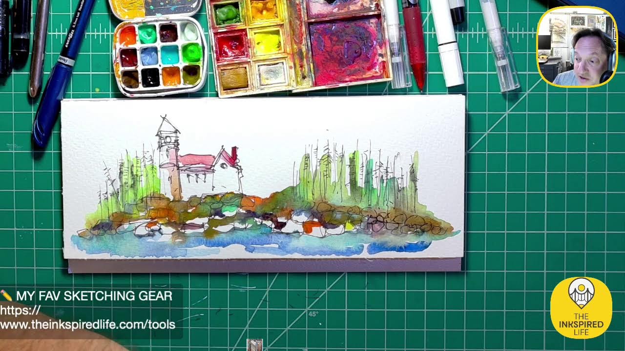
Architectural Sketching inspired by Domino Park in Brooklyn.
In this live YouTube stream, artist and educator Jason Nicholas sketches architectural scenes inspired by Domino Park in Brooklyn, the Copper Building, and other New York City landmarks while interacting with his audience. He demonstrates his workflow—choosing pens, inks, watercolors, and paper (e.g., Fabriano 4x8, Lockbeef Field Journal), applying techniques such as ink bleeding, watercolor washes, and gravity‑assisted drying. Jason discusses his teaching philosophy, emphasizing process over grades, encouraging students to experiment with hand‑drafting versus digital tools, and sharing classroom anecdotes. He explains his personal color palette (neon pink, neon yellow, turquoise, rust tones) and the artistic decision‑making behind adding or omitting color. The stream includes Q&A moments about modern tool‑and‑die practices and color use, as well as community building remarks, future plans to sketch NYC locations in the summer, and intentions to sell original artwork as part of a cohesive series of New York architectural vignettes tied together by subject and palette.
Questions this video answers
Most tool‑and‑die work is now done with CAD software and CNC/milling operations; traditional hand‑crafted die making is now rare.
He adds color when he wants to define shapes, pull elements forward, or give a whimsical feel; he keeps sketches monochrome when the line work itself is the focus or when he wants a more technical, shadow‑rich look.
Chapters
Hey guys, good evening, happy Friday! Hopefully you can hear me now. Mr. Technical Director Man forgot to turn the switch on for my microphone volume. OMG. It's all good, I wasn't saying anything important. Well, actually I was. I was saying hello to you guys and how much I appreciate you all, so Thank you for tuning in. Hopefully you can hear me now. And, um, some people actually prefer not to hear me, so if you want to not hear me, you can turn off your volume. But I think mine is going— so what happens when I come on at 10:40 at night? My brain is like kaputsky. You guys are awesome. So I'm working on a sketch. This Scene is inspired by, um, Domino Park in Brooklyn. This back here, this white area with the windows I'm sketching, is actually the Domino Sugar Factory, currently undergoing adaptive reuse. I think it's being converted into retail, and I'm not sure if it's living or offices. I think it's living. I think it's retail and living spaces. I'll be visiting here in the summer. I'll take pictures and maybe do a little livestream from this location. Really, really cool place. Your voice is melodious as always. Ooh, melodious. I like that. Would you like me to sing? I don't think so. Love all the Fourth sketches. Love all— oh, from— yeah, Becky, Becky, may the fourth be with you. Had all these awesome Star Wars sketches going, so cool. I love that you, um, you had those. Yeah, good call, Linda. Yeah, Becky, they're awesome. I liked your, um, uh, was it the Snow Walker? The Snow Walker. Really cool stuff, guys. I'm gonna bleed some of this. I was using the Classic Flair pen. I'm gonna bleed some of that a little bit, and I'm gonna sketch something else as well. I just wanted to work on this for a few minutes. I started it last night. Hope you guys are having a great day. Linda, I loved, I loved your, your photos of all the old drafting equipment. So cool. And I'm allowed to say old because I, uh, use that stuff as well. And it's really cool just to break some of that stuff out in my classroom this week and next week and let the kids just kind of play around and experience what it— you know, what it's like to hand draft. We're just nowadays so used to doing everything on the computer. I want to just give them the experience And it's interesting, today I had one student, she told me she really loved hand drafting more than using the computer. And then her friend next to her, she told me she likes using the computer more than drawing by hand. Go figure. What's cool is that there are always options. So as a teacher, that's what I want to do, just let these guys try different things and see what they like and don't like. So it's really fun. So I'm just grunging this up a little bit, adding some more detail, and I'll move on. I'm not sure what else I'm going to sketch tonight. I haven't— honestly, I haven't pre-planned anything. This is looking kind of cool. I don't know how much more I want to do to this one. I was thinking about adding just some kind of color where the white areas for the building, but I like how the windows are just popping, so I don't think I'm going to add any color. These are steel beams here, steel columns that they repurposed in along the edge of the walkway. And then back here we actually have, um, what bridge is this? Not the Brooklyn Bridge. Manhattan. This might be the Manhattan Bridge. I think it is. I think this is the Manhattan Bridge in the background. I'm going to ink in some more details a little bit. To pull some things out a little bit more, kind of rough it up a little bit. I was almost a little too clean with my edges here. I'm just gonna rough them up a little bit just because I like that look. So I'm gonna bleed some of that Flair Pen just to kind of soften this here. There we go. Just add a little more drama. There we go. I like the colors happening. Pretty cool. Um, Becky says thanks. Hey Becky, you are welcome. Thank you for sharing your artwork, all of you guys. Linda says I love, love that you are teaching them to use their minds. Computer and old school are important, go hand in hand. Yeah, you know I have to say this, teaching for me, and if anybody's listening out there, if any of my students are listening, which they're not, and they actually know how I feel. For me, teaching is not about an A, B, C, D, or F. It's not about the number or the grade. It's about the thought process, you know, especially since we're designing things in my classes. I want to know the thought process, you know, how are they getting from point A to point Z, right? Are they researching? Are they brainstorming with sketching? Are they, um, you know, looking up inspiration images? So that's really what I love about teaching, is seeing how these guys, how they're thinking and approaching and what their mindsets are, what their creative problem-solving techniques are. So it's really cool that, uh, you mentioned that. Cool. I kind of like this. I'm just popping on some bits of color in here and there. I might overwork it a smidge. This is where I'm just letting my gut take over. I do want to cap this because I don't want this— this is priceless, so I'm going to cap it, make sure it doesn't dry out. Well, it's not priceless. I think you can get these maybe on eBay for— I've seen them anywhere from, um, like $20 for one of these things. All right. Cool. So like, I like the way this is popping tonight. I added some pink. I'm adding some neon yellow. If you guys— if we go back to my sketch series here from the SteelStacks in Bethlehem, Pennsylvania, you know, I'm just kind of— this is kind of a color palette I'm loving for these industrial kind of buildings and these grungy colors, rusty colors. And I just love popping little accents like the pink. You can see here, you know, very similar color palette. So I'm kind of finding a vibe that I like with this style, this subject matter. So I'm just trying to incorporate that a little bit in here as well. You'll see the same elements popping out. Linda QQQ. QQQ, are there any tool and die people today, or is it all computer? Great question. I think it's very, um, few and in between. Is that the expression of actual, um, die makers? I think most of it is done now on the computers using CAD software and um, you know, I'm trying to think of the word— computer milling operations, CNC operations on the computers. So I think a lot of it is all CAD-based now as far as the design goes. Um, so that's something I don't really get into my classes or in our school. We don't really do like machine shop and metalworking type of applications. It's a great, great question. I love what happened here. Check this out, guys, this is so cool. Look at this edge right here. I'm not gonna— I love this line. Really, really cool. I think this one's done. I'm gonna leave it. I know my gut's saying step away. Domino Park. And what I'm doing is I'm putting together a collection so you guys can get inside my brain. I know it's scary, but I'm putting together a collection of kind of New York City vignettes that I'm planning on, um, in the summer going to Central Park and seeing if I could just sell some original artwork, right? The Empire State Building spire. Obviously we all know what this one is. This one's probably one of my faves. Statue of Liberty. I love this sketch of the— just a small section of the Brooklyn Bridge. Really, I think this is a really cool ink sketch. And I have other ones I won't pull out now, but I'm just working on these little original art pieces. So it'll be fun to see what happens, see if I can get out there. And I may be doing it with a special guest over the summer. We'll see how that all pans out. That's where I'm headed. Cool. All right, we'll do another sketch. I'm loving this format paper. This is Fabriano. It's a 4x8. I love the proportions of this, really cool. So I'm going to do another sketch on here. I'm going to move this here so it dries. And what, what do I want to sketch? Let me think about that for a sec. Hmm, I'm actually going to look through— I have a lot of— I'm going to look through photos for inspo here. You know, I kind of feel like I'm going to sketch— I'm going to sketch the Copper Building. Sketch the copper building here. Just a real quick sketch. I'm not gonna be on, um, maybe just till 11 tonight. I'm just kind of prepping something here. I'm gonna sketch this vertical, I think, if I can get this off. Let's do a vertical format. Do I want to do vertical or horizontal? No, I'll do vertical. Sorry guys, so this is called inking out loud here. Kind of in my brain, I'm just talking and thinking as I'm going along. So I have a little skyline scene. I could do horizontal, but I'm going to focus on what's called the Copper Building, um, a building I really love in New York City and a building I have not seen in person. I've only seen pictures of it, but it's on my list. I'll be visiting NYC a lot over the summer and doing sketching. So I think I've actually sketched this once before, but a close-up version. Um, let me put some pen to paper and see what happens. Start over here. Very cool. So this is the Copper Building. Um. It actually is shaped like this. Kind of may have exaggerated with my sketch, but the building is bent and there's a skybridge here that connects two sides of the building. It's right along the East River, which is down here. Uh, there's a ferry station right nearby, so you can get really cool views of this if you take a ferry ride on the East River. There's some trees happening here, kind of along the edge. Down here's the Hudson— I'm sorry, the East River. So that's the Copper Building. Now let's just throw some wash on there. I'm going to, um, what do I want to use? I think I'm going to grab my favorite Apple Snail color ink. Becky's not familiar with the building. It's very— it is an intriguing building. It's called the Copper Building. I would show the picture, but I— let me see if I can get it to work. I tried dragging it up on screen the other day and I couldn't get the pictures to work. Let me add some ink wash on here. Ooh, I just dropped my pen in the whole bottle. This stuff is— this ink is kind of, uh, precious to me because it's, it's— I don't know if they're going to make it anymore. It's out of stock and I'm on a waiting list for it. So I'm hoping that Birmingham Pens, if you're listening, guys, I'm hoping that you bring Apple Snail ink back into production. I know it's kind of selfish, I'm just a small person out here, but I love this color. I'm going to see if I can replicate it using some other maybe inks I have and combining colors. Um, so I'm just going to give this a wash. You guys know I like talking about layers, adding some layers of different stages. So the first layer is, for me, is usually the Sharpie pen. Why do I start with a Sharpie? Because when I do things like this and bleed ink or add watercolor, I'm not worried about all that black ink running and bleeding. You know, if I do want black ink to bleed, I can come back later and add some Lamy pen or Flair pen. Oh, there's endless options. But I usually will start off with a Sharpie. Cool. Is this the real color of the building? Nope. I'm gonna actually— I want to throw in some turquoise watercolor in here as well. Just move this over. Boom. You guys see that okay? I have plenty of room. Let me move this over a little bit. There we go. I'm just going to dip my brush and we're going to get some turquoise and we're going to mix that in here. This is not the actual color of the building. I'm just kind of going with what I feel right now. Right? So this is just kind of my take, my attitude or my spirit, my soul, whatever word you want to use. It's kind of what I'm feeling right now as far as throwing these colors on. That's— oh, that's awesome. Very cool. So I learned the hard way the other day, I have to watch where I'm splattering paint. I have a wall to the left of me, right over here. I'm off camera a little bit. This way. That has, um, has— it's my Roo wall with a bunch of Roo paintings. And let's just say some of these paintings are now wearing some of my ink and watercolors. I splashed a little too much and stuff got on the wall. I just noticed it tonight. So I gotta be a little careful. Yeah, this is fun. I'm liking the colors. Let's throw some down here. This is where the East River is, kind of down in this area. So the copper building does kind of look like the letter H, which is really interesting. I feel like I need some— I'm going to throw some blue on here. I just feel like I want to darken some spots. So I'm throwing down some blue. I just want to create some depth here. Instead of using black maybe to create the idea of shadows, I'm throwing on this blue color, um, which I like. And after this dries, I'll come back and add more details with my, um, probably my Pilot, Pilot pen. I'll sketch like some windows and things. There are actually trees down here. It's a good green. Uh, do I have sap? It's the sap green. Let's just throw some of that green in here. I'm just gonna dot it in just to indicate there's some trees happening. Pretty cool. Is the skybridge transparent? So let me— a good question, Becky. Let me see if I can get this photo on the screen. It'd be great to show you guys. Let this sit for a minute. So there are a lot of— there are windows on the skybridge. Let me pull this up here. I should just drag it over. Just give me a sec. You guys are awesome. I love these questions, by the way. Feel free to put questions down, comments. It's just fun for me to go through and try to answer some of these. Gets me thinking in different ways, so I totally vibe and riff off of what you guys are saying. Let me see if I can get this on here. All right, I should be able to drag it. Drag, move! Why isn't it— it's not letting me drag it over. Dagnabbit. Uh, actually, let me go back to the photo app. I think I got this, guys. I got it. I got this thing here. Boom, we did it! Check that out. I'll zoom in so you can really see it. So that's the Copper Building. It looks like the letter H. You can see my colors are nothing like the colors there. My perspective is wonky. I just wanted to exaggerate the angles on what I'm doing. I find it just a really fascinating building. I love the shape. And you know me, I'm fascinated with bridges. I love sky bridges. I— this is a— these are residences, so I feel like I can't just walk into this building. I need to live here. So if anybody knows anybody that lives here, let me know. But I'd love to get inside this building. I'd love to be on that skybridge. Um, go online, Google the Copper Building, and you'll be able to see a lot of, you know, pictures, interior pictures as well. It's just, I feel like it's a really elegant, um, really beautiful building. So that's the Copper Building. It is cool, it's very cool. Yeah, this is drying really nicely. Let me zoom in, guys. Boom! Check out how this is drying. This is a really fun color combination. I love the hard edges happening on this. Check out the hard edge right here. I'm all about hard edges and ink washes and watercolors. This is actually— this is actually really beautiful right here. This is going to dry really nicely down here as well on the bottom right. I'm going to let it— I like to let the ink and watercolor just kind of pool down in the bottom of the pages and corners and let it dry like that. So I'm usually working with my board at an angle, so this isn't— the surface is not flat, it's tilted up a little bit because I like to use gravity as our friend. Gravity is an awesome creative tool and It just helps when you're doing like ink wash and watercolors for the style I like to get. Kind of wish it would dry a little faster. I want to— let me see if I can do some sketching on here with, uh, I'm going to move this over here for a sec. Let's see. So I'm actually just taking my pen, I'm dragging it through the wet paint just to create these horizontal lines, just to indicate where the rows of windows are. It's kind of fun, actually. Let's do, um, let's do some here as well, lightly dragging this across. I'm not trying to draw every window, just want to show that we have rows of windows happening there. I'll put some verticals here, or just kind of dab my pen down just to indicate we have some windows happening. Is it accurate? No. Am I counting all the windows in the photograph? Definitely not. I'm not even looking at the photograph, to be honest with you. But I know there are windows here. Let's, uh, let's lightly sketch some more lines across here. I'm lightly dragging this because I want the pen to pick up the texture of the paper so I get this broken line kind of look happening. I don't want really hard, technical, straight lines in here, so picking up the texture of the paper helps keep it loose, kind of wonky looking. So that's just kind of a, kind of a pro tip if you like this style. I am drawing these lines at an angle just to create the idea of, of perspective happening. This isn't an accurate perspective by any means. It's just trying to create the illusion or the effect, the idea that this— there's perspective happening here. I think sometimes when we're sketching architecture, we hear the word perspective, it could be really frightening. Um, But when I, when I talk about perspective, that's because people think technical. It has to be accurate, mathematically, geometrically correct, which is cool if you like to be that technical. For me, perspective is really just showing, capturing the buildings and giving a little 3D depth. It's definitely not about precision. Not on these, these loose style architectural sketches. So, so you can see as I'm just adding the lines, it's just starting to get a little more character. This is really trying cool up there. Um, looks like two buildings shaking hands. Yeah, Becky. Love that you said that. I totally see that. Totally see that. If you guys let me know if you want me to do a quick— there's another building I want to show you. I have to Google it. Let me know if you want to see it. It's kind of— Becky just brought something to my mind, another building. But yeah, it does look like two people. Left-handed buildings. Another one with being left-handed. Thumbs up to left-handers. Reminds me of aging copper roofs at Dartmouth. Oh, how cool is that? I've never been there. I would love to check that out. Let's sketch some windows on the skybridge here. Give it a little detail. And we have some— looks like some verticals maybe going on here. I must say, I'm really actually— I don't know how much more I want to do to this. I'm really liking it. I think, um, I might stop on this one shortly. We'll just throw some windows down here. Again, this is the East River down here. Maybe we'll just throw in just a few more kind of vertical blips. That is the technical term. I'm throwing vertical blips on here, um, just to indicate there are some windows going on. I'm just randomly just placing them on here just to keep it— if I start calculating where I want these little blips to go, start lining them up all precise, it would lose— start to lose a little bit of the wonky feel that I'm going for, the whimsical style. So I'm just kind of staggering these, or, um, randomly just dropping them in wherever the music's telling me to put them is where I'm laying them. I'm gonna do a little bit of hatch— hatching on here as well on top of this. Cool guys, I think this one's done. I'm thinking about popping in a little pink like I do in— did in the sketch and my other industrial type of sketches. Um, but I don't know where yet, so I'm going to leave it like this. I'm not going to force it. Let me know if you guys like the copper building. Hey Linda, have a great night, it was great seeing you. Let's see their building. Okay, good night Linda, it's always great having you in the house. All right, let me see if I can find this building. I'll share my screen. Let me— so I have to We go to Google, pulling up this building here. I'll share my screen for a sec. I should show you— hey, one day, actually, I'll show you a slideshow I did in school with some buildings. It was kind of fun. All right, here we go. This is called— let me open it up and find a good image. Trying to just find a good image of it here. I know the suspense is killing you. I'm trying to, uh, trying to draw this out to get you more and more interested. All right, we'll just go here. Everybody's favorite, Wikipedia. Let's do that. All right, let me share my screen. Hopefully this works. You gotta let me know if you can see my screen. Cancel update system. So I think you guys can see it. This is called a bunch of different things. It's known sometimes as the Dancing Building, uh, sometimes it's called the Fred and Ginger Building. It's in Prague, designed by Frank Gehry. Frank Gehry is an amazing architect. Some of his projects are incredible, some are scary, um, but they're all— they're just so unique. Frank Gehry, I think, is still practicing architecture, and I believe he is in his 90s. So it's called the Dancing Building. So Becky, when you said buildings holding hands, I think the Copper Building has a lot in common with this, right? The two forms on the sides we have in the middle, it looks like where the— where hands are being held. The building on the left kind of comes down and flows like a dress. So I'm assuming that would be Ginger Rogers. And then one on the right, the tall, more vertical piece would be Fred Astaire. So it's called the Dancing Building, which is really, really cool. Come back here. So if you come back here, there you go. So kind of has that same element of the curved building on the left and the hand holding. So Becky, that was a cool observation you made. Um, thanks for saying that. It kind of spurred on this, but bringing this building to life. Cool stuff. All right guys, I think this sketch is done. I, I comfortable. Sometimes we have to just go with your gut, and my gut says stop. Although the pink is calling me. All right, I'm not stopping yet. My bad. I just feel like it needs one little element of just to bring the whimsy a little bit further along. So we're just gonna— one of my favorite colored pencil colors right here is Neon Pink. Prismacolor. And not going to get crazy, we're just going to— there's a shape here that's created by the sketch. I'm just going to just pop a little piece there. I'll zoom in. Again, we're not going to get crazy. I think I want to do a little piece somewhere in the bridge because I'm trying to balance it. So we'll have some pink, pink, and it'll bring your eye down. So we're going to kind of work across. I kind of, I kind of want it here, I think. Again, not going to go nuts. And then one more touch of the pink. So I have it up here, here, and my brain is telling me I need to, I need to have it down here somewhere as well to kind of balance it. So we're just going to throw it. I think right down here, actually. And that's it. Now I feel like it's done. I'll zoom in so you can kind of see it closer. Check out how it's drying. Hey, Jennifer is, uh, here. Cheers from Arizona, Jennifer! How are you? Hope all's well. It's always great seeing you pop on. Awesome, awesome. Thanks, Jennifer, for, for tuning in. Yeah, Becky, I couldn't resist adding that pink touch. I feel like it's almost becoming a signature in my sketches, is this pink. Um, so I like it. Let's zoom in even closer so you can see how this is drying. If any of you guys like to geek out on the way ink and watercolors dry, and you can kind of see here, I'll leave it here for a sec. I'm going to grab a frame so we can just look at some areas on here. Where's my little frames? Here they are. So I have my little 2x2 frame here, just so we— or 1x1 frame, so we can just kind of focus on certain areas. I mean, just look at the co— the cool color combos here. The blue Kind of the, the, uh, rusty color happening, the greens. Really cool. I have to say, I'm really loving this right in here. That hard edge is really cool. Hey, Kaj Jensen, welcome! Hopefully I'm saying that right. Khadji, welcome to, uh, the stream. Great seeing you. I don't think I've seen you, uh, on here before. Welcome. Cassius loves your interpretation of the copper building and just figured out this was live. Awesome, we are live for sure. Um, I'm glad that you're here, right? So here's— we can look at this area down here, how this is drying. Boom. And here's another cool area as well. So if we zoom out, we can see the— can see the Copper Building. Kaja, I love this. You knew this was the Copper Building, or did you hear me say it? I'm wondering if you guessed that. If you did, that's cool. That means I'm doing a good job, right? So definitely artistic interpretation I didn't include any of the other buildings around. I just zoomed in on this, uh, and put my spin on it. Cool. Definitely Jason Pink. Becky, you're liking the pink. So cool, right? And one thing I love about using these color combos is that this is— could be a really cool series put together, right? Domino Park, Copper Building. So it would be nice not only, you know, to have these individually, but if you put them together as a set. So cool. What else do we got? Mm, I might do one, one mother, one other quick thing if you guys are cool with that. So we have these. I'm going to let this dry a little bit more. We'll just kind of put it over here. Let it dry. Uh, I want to grab my, my cool lock— my Lockbeef Field Journal. I love Lockbeef, you're on. I'm loving it, loving it, loving it. Um, it's in here, has some NYC sketches, had a bunch of bridges in here. Uh, that's the SteelStacks buildings, right? Right, same colors I use here on the SteelStacks as well. Really fun sketches. I'm just looking for a quick skyline sketch I did. Oh, here, let's play around with this one. I just want to play with this for a sec. By the way, I find Here's a kind of a pro tip. If you can keep a binder clip with you, either in your art case or if you have a pencil case or something, I find binder clips to be invaluable. Especially if you're out sketching and you want to hold your pages down. Or even now, I just want to kind of hold this page down, so I'm going to put the clip on. We'll turn it this way. So I thought it'd be fun, let's throw this down, some color on this. This is a— this was just a quick sketch I did one night, very quick, very loose. So this, this is watercolor paper here that I did the copper building on in Domino Park, but this is just really thin paper. It's It's not watercolor paper. If I go through here, you can actually see— I'll show you how it bleeds through, as you can see. But I still like doing washes on this paper. So let's do this. And let's just throw a little bit of color on here. We'll mess around with the same colors we just used. Ooh, I just got paint all over my hands. So let's throw down some ink. So again, this is the Apple Snail color ink. This is the Brooklyn Bridge here. This paper definitely will buckle. Because it's so thin. I'm actually— I don't like wasting this ink, so I'm actually going to throw a little bit more on here. Let's throw some there. I'm going to add a little more on the copper building, I think, too. Maybe we'll just kind of throw some down here at the bottom. All right, cool. All right, all right, let's throw down some turquoise watercolor. Hey, Elena's in the house! Lena, good to see you! Hi, love that color. Yeah, me too. We all have colors that we gravitate to, Becky says. Absolutely, Becky, you're 100% right. That's what's so fun, right? We all express ourselves in different ways. I love the color combination of this kind of rusty color with the turquoise. Again, I thought it'd just be cool to throw some color on this quick sketch I did the other day. Yeah, I'm actually gonna pop— I'm looking— I'm actually working on two of these at the same time. I feel like I always want to pop some stronger turquoise on this one. There we go, that's good. All right, cool, got some turquoise going. Let's break out— let's see, I'm using the same colors we use for the copper building. Um, looking, what else do I use? Blue. Let's use some of that blue. I think this is Ultramarine Blue, if I'm correct. Just gonna let the colors blend here. So guys, I have a confession to make. I am really, really bad at this. I'm really bad at keeping a clean brush and keeping these colors pure. Um, I didn't even you can see I have colors mixed within colors a little bit. So I'm pretty sloppy when it comes to, to that. You know, I'm, I'm mixing up colors and I'm going back in the blue and there's other colors on the brush. So it's kind of how I roll. I'm gonna put just a little dark line under the Brooklyn Bridge just to give it a little bit of pop, a little bit, so it stands out a little bit on the edge. Just, just dabbing the brush on the paper. Loving how this is blending here, looking pretty cool. I'm gonna pull this down like there's some reflections happening. There's our water. I don't like using straight up blue for water, but let's just throw this down, see what happens. Just kind of where the water is, and I'm just going to add water underneath. Those colors and just pull them down the page a little bit. This is where gravity again can really be a cool kind of tool to use. This will definitely get some pink on it. I'm actually going to use a color I didn't use last time. I'm going to— I want to use some yellow, a little bit of brightness on here. So let's grab this. I think this is— this might be lemon yellow. I'm not, I'm not really good at remembering the color names either. I'll just call it lemon yellow. I just want to throw some of that yellow on here. And maybe just to kind of balance it, I have some yellow there. Let's throw— let me throw some yellow over in here as well. Cool. All right, I'm digging it. I think that's enough color other than throwing some pink on. Let's go look at some questions or comments. Thank you guys for tuning in. This is a lot of fun. If you're on YouTube and you like this, I'd love for you to give it a thumbs up. Um, if you like this and some of my other videos, it would be awesome if you subscribe to my channel. That would be so fun. Yeah, I'd love— my goal is to have 1,000 subscribers by the end of the year. That would be so cool, just for the heck of it. Elena has a question: How do you decide if you should add color or leave it black and white? Great color— great color— quite great question. Hmm, let me think about that. So I used to only sketch in black and white for many, many many years. Um, I was always afraid to throw color down on a sketch because I thought the color had to match what it was in reality. So I was hesitant because I, I didn't want to spend the time color matching and making my sketches look like a photograph. So it was kind of a mindset. Once I got past that mindset, like I'm just making something fun and quick and whimsical. I could add whatever color, make it whatever I want. Once I kind of got that mindset, I started throwing color on the black and white sketches. So I know it's not exactly answering your question. Hopefully I'll get there. I'm just kind of thinking out loud. I'm inking, inking out loud. And it actually really took me a while, even before I showed people, color sketches because I thought, you know, if I show— I was afraid to show sketches like this. People are like, there's, there's not really, there's no neon pink or neon yellow there, why are you doing it? Um, once I put it out there, people liked it. It gave me some more confidence. So here's an example of something I don't want to add color to. Getting to your question, here's a sketch of the Brooklyn Bridge. I decided not to add color to this one. Um, this one, for me, I didn't add color because I really wanted the lines, the ink lines, to be the kind of the star of this sketch. So I have a lot of hatching here. To me, that creates a sense of, um, a little bit of technical drawing, a little bit of energy, a little bit of shadow. I really think these lines have a language of their own, and if I started adding color to this one, I feel like it would take away from the beauty of the line work. So I left this black and white to focus on the lines. Here I added color to this because I'm trying to draw attention to the shape and the form of the building, and I feel like sometimes when we add color to our paintings or sketches, we can really start pulling forms and shapes out. So that's kind of when I want to add color. Uh, here, you know, it's the same thing. I added color to this one because I wanted to pull out these steel columns here. I wanted to pull out this steel structure back here, this turquoise color. I wanted to pull out this railing. So by adding these pops or areas of color, it's helping to define shapes. If I left this all black and white, I feel like these vertical columns would have gotten lost and this kind of, uh, L-shape would have gotten lost also. So hopefully that helps. So I guess to simplify or summarize, color can help to define shapes, um, and pull elements out of a sketch. If you leave it black and white, it's harder to do that, and you can let the lines read more. Hey, that wasn't too bad for winging it off the cuff. I'm just, I'm just kidding. Hopefully that made sense to you. Let me know in the column. Let me know in the column if that made sense. In the chat. All right, let's throw some pink on here and I'm gonna wrap up for the night. As you can see, my brain is— after a week of school, yeah, my brain's shot, but for good reasons. I always say that. I know I say it all the time, but I love teaching. It's so fun, but it's so draining as well. This is interesting music. Okay, I'm gonna be quiet just for a minute and, uh, add some color on this. Alright, cool. I think this one's a wrap. So you'll notice I actually use some colored pencil here on that skyline. Pretty cool. Lena says, "That makes a lot of sense. Thank you. I love your color choices. I like that they aren't like a photograph. Very creative and artistic." Hey, thank you, Lena. That really means a lot. I appreciate that feedback. Yeah, that's— you nailed it. I'm not trying to make a photograph. That's kind of why for me I have photographs. This is really cool. This— I actually— so you guys saw this black and white. I don't know if you remember it. You could see what happened when I added the color here. It's really pulling these forms out. You can see the kind of the form of the Brooklyn Bridge is popping popping out here. You know, we have this perspective kind of view of a walkway. Where is this from, this view? I'm trying to think where this view is from. Um, I don't remember where the— this view is from. Maybe this is Brooklyn Bridge Park. Maybe Brooklyn Bridge Park area, if that's the name of the, the park. Um, and now the colors, right? It's kind of pulling out these forms of buildings back there. This is drying really fun. Is that— is that— good thing I don't teach grammar. It's drying really fun. That's not proper grammar. But look at the water here, right? This is trying to make the idea that there's water down there. And you can see how it's just kind of drying. It pooled down here. Now it's just kind of drying. And I like that. And the paper is, you can see it, you know, the colors did go through. It's a thin paper, but it's still fun to play around with it. Awesome. Hey, you guys are amazing. Thank you for being on and watching. Let me know if you have any final questions before I head off to sleepy land. So let's just kind of put everything we worked on together here on the desk. We'll take a look. Close this so I don't mess anything up. So we did this tonight. Boom. We worked on— I finished up this here of the Domino Park in Brooklyn. We got that one. And then my big face is in the way. Let's put that here. And then we have the copper building as well. This we didn't do tonight, but we looked at it. All right, let's see. Can you see all this okay if I put this here? Let me move, let me move my head down from here. Here we go. So there you go, guys. We work together. Um, again, we talked about themes and making themes. So one of the ways you can do a series You can do series by having similar subject matter. In this case, the series subject would be New York City architecture. Another way you can do series is tying things together through color. So these all have basically— the only thing I didn't add in here was any of the neon yellow. Maybe I will. But not right now. Um, but basically all have the same color palettes going on, which helps tie them together. Cool. Awesome, guys. You're amazing. Thank you so much for watching on this Friday night. I will be on— I'll probably be on tomorrow night, Saturday night. Um, I have fun coming on usually around 10 o'clock or so and doing this stuff. It's kind of my zone time for sketching. Until we see each other, I want you guys to, you know, just keep being yourselves, keep putting it out there, putting positivity out there, um, the best you can, even if it's just a nod or a positive thought for someone. That's really helpful. And yeah, thank you guys so much. I do appreciate you. Um, again, shout out to Elena for being here. Thank you for checking in tonight. Great to see see you. And Becky, Becky is a regular. Uh, Becky, we go way back, man. So thank you, Becky. Uh, we had Kaj, I think I'm saying that right, Kaj, in the house from on YouTube. That was cool. Love when people stream from YouTube. Jennifer was in the house. Jennifer, always a pleasure. And Linda as well. Was anybody else here live in the chat? I'm just scrolling through. I think That was it. This is a great piece of music, by the way. I forget the name of it. It's not— is this Night on Bald Mountain? I just, I just remember it from Fantasia. All right guys, take care. Have a great, great night. Thanks again. Peace and live creatively. I'll see you soon. Peace out.