Friday Night Sketching - The Copper Building NYC
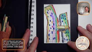
Jason from Inkspired Life sketches the Copper Building in NYC live, working loose and fast with Sharpies, Prismacolor pencils, and an aqua brush. He starts at the silhouette, adds wonky lines and hatching, splashes in chartreuse and neon pink, and explains his tools and process to live chat questions.
Chapters
Hello, I'm Jason with the Inkspired Life. I'm an architect and high school teacher, and I love to do urban sketching. So what fires me up is sketching architecture, going out to different locations, and sketching the buildings that I see in the areas surrounding the buildings. Tomorrow, I'm actually headed into New York City, and. And I'm going to be passing by one of my most favorite buildings in the city. It's called the Copper Building. So I figured I'd sketch the Copper Building tonight, do a real quick sketch of it, and just kind of show you my thought process and how I get buildings onto paper. So if you are afraid to sketch buildings, afraid to sketch architecture in a loose, quick style, join me for the next 10 minutes, 15 minutes, and I'll kind of walk you down the path and the tools and methods that I like to use. So again, I'm Jason with the Inkspired Life. Welcome to tonight's live sketching session. Let's switch to the desktop view. If you have questions, feel free to leave them in the chat, and I'll be checking them as towards the end of the stream tonight. All right, so here is my desktop. Tonight. I have a. I have a watercolor sketchbook with me. We're going to sketch in here. This is a 1264 Fabriano watercolor sketchbook. 7 inches by 10 inches. Really cool size. Another format I really love for the Fabriano sketchbooks is this size here, which I believe is. What is that? Size four. I think it's four by eight. Four inches by eight inches. You can see better there. Really cool format, especially if we're doing buildings that are, you know, very tall and vertical. You might have noticed I have a little watercolor palette under here. I love using this palette. It's easy to bring in the field with me, and you can see it gets a lot of love. Tonight, I'm actually using it just as a prop. I like to have have my sketching paper at an angle. So when I do watercolors, I like when the water runs down. Everything kind of works off of gravity playing. So that's always a lot of fun to use gravity to your advantage. Also, on my desk, of course, I have Sharpie. I love sketching with Sharpies. I'll typically start with the Sharpie, because that way I don't have to worry about making a mistake. Once I put Sharpie down, it's there. I'm gonna live with it. I'm gonna work with it. It's a really great way to get out of the comfort zone. I'm not looking for perfection. I'm just looking to have fun. If for me personally, if I sketched with a pencil, I would want to erase it. Keep changing, keep changing. When I'm quick, when I want to do something quick and fast and just get it onto paper. Sharpie's my go to. And if you think I'm kidding, look what I got here. I have backup Sharpies upon backup of Sharpies, so they're ready to go in case this one, I think this one's almost out of ink. The other tools I have tonight are I have my Lock B Quattros. I love the Lock B Quattro Quick Lock B Plug. I use a lot of their products. I love their stuff. You'll see another one of these tonight. So. So if you're interested in Lock Me in the products, I have a discount code you could use right here at the bottom of the screen. So check that out. But in this Lock B case, I have colored pencils. I have a red pen. I have another pen in here as well. Purple pen. And I usually have a Sharpie in here. So this will come with me tomorrow when I go sketching. And I also have another one that has Creative markers in it. So that's what. That's what I'm going to use tonight. I'm not going to break out any watercolor. This might is going to be just mostly an ink kind of a quick sketch. All right. I'm going to put an image on the screen so you can see what I'm looking at. Let me just go here. Put it on there. Boom. That is the Copper Building, one of the views. This is a view looking from the 34th Street Pier on the Hudson river looking back. No, not the Hudson River. This is the East. The east river on the east river looking back towards the building. So it's a really cool perspective. And what I love about this building is you see how it kind of angles at the top. That's not a trick with the camera. The building literally does that. Kind of looks like the letter H. And there's a bridge that connects the two pieces of the building. So we're going to use this as a reference pick. And my goal is not to duplicate exactly we're seeing. I'm just going to go for my quick, loose, fun style. And lots of times I use whatever colors come into my brain and not trying to replicate what I see. Right. Cool. I'm going to throw some music on while I sketch. I love to listen to music you won't be able to hear because I'm listening to on my iPhone because it's copyrighted and I can't play it. All right, there we go. I'll keep this on the screen for a little bit and let's do some sketching. I just wanted to give you kind of a setup of what I'm using. Typically when I sketch buildings, I like to start at the top. You have the Sharpie on its way up. I like to start at the top because it's easy for me to see where the top of the building, where the silhouette is, where it meets the sky. So it's just a really good starting point for me. You'll see that when I'm really, really loose, I'll go back over lines many, many times. So we got kind of the top building. We're going to come over here and we're going to sketch. This side of the building kind of comes down like this. Notice I'm not worried about drawing straight lines. My loose style is very wonky, so I love wonky, wavy lines that kind of just frees me up. I'm not worried about being perfect by any means. Like, I don't. I don't want to break out a ruler to sketch this. So being an architect, I. I create a lot of technical drawings that have to be precise. They have to be straight, they have to be scaled properly. For me, the urban sketching and just quick style sketching is a way to be loose and fun, and I don't have to worry about being precise. It's about capturing a feeling, a moment in time, and just being really, really loose. So hopefully you can kind of see the shape of the building coming to life there. So that's kind of the copper building. We'll sketch the bridge down in front as well. So feel free to leave comments. Say hello in the chat. I'll pop. I'm going to check the chat in a minute or so and see if it say hello. And if you're watching a replay, I would still love for you to comment and say hello. Or even put leave questions in the chat, whether you're watching on Facebook or YouTube. So I'm just sketching. This is an overpass here. I love the rusty rustiness of it. All right, cool. So I think. I think that's all I'm going to capture on this for right now. And then let me throw down some color. I've sketched the copper building so many times. I just. I love this building. I'm dying to Go inside. I might just work up some nerve and see if I could walk into the lobby. It's a private residential building. Maybe I'll even bring this sketch with me and say, hey, I did a sketch. Do you want it? Unfortunately, all of my other sketches I did I brought to school to show my students as examples. Otherwise, I'd bring one of those. All right, cool. I'm actually going to turn off the reference photo because I don't need to see it anymore. I just wanted to do an outline. Hey, Karen's in the house. Karen, great to see you. Hope all's well. D Ray, hope you're doing well. It's great to see you, too. Wow. I love when you guys pop on here. Hope you guys are doing great on this Friday evening. All right, let's. Let's throw some colors down. I'm gonna get really wacky and crazy with colors. I'm gonna dive right into Sharpie creative markers. I love these Sharpie creative markers. They're definitely coming with me tomorrow when I go into the city to do some sketching. I love them because they dry fast. Great way to throw down color in a short amount of time. I have a bunch more, but these are the colors I like using the most. All right, again, I am not trying to replicate the colors of the copper building. It's called the Copper Building because it's clad in copper. So, yeah, I could do copper if I wanted to. I can mix colors, especially with watercolor, but I'm just putting the color on for fun. Don't be afraid to play around color and just throw things down and make you feel happy and make you feel good. You might notice that a lot of time. A lot of the time, I don't even pick up my marker or my Sharpie. I'm just kind of letting it stay in the paper. And especially if I want to be really fast and loose, I'll just kind of do that. I'm just gonna put the bottom of this bridge in some shadow so we have a perspective, kind of looking up at the buildings. Buildings do continue down past this overpass, but I'm going to stop it right there. I like to leave a lot of my buildings unfinished leaves. That way, it lets the viewer kind of use their imagination to fill in the blanks. It saves me time because I'm not worried about every single detail that's happening. I'm just doing a quick hatching technique here. Let me see if I should zoom in. Maybe it's better. Quick hatching technique here. Create the Idea of some shadow on the side of the building. Right. So just by doing kind of the scribbles, we're getting the idea of shadows is looking. Making it look a little more 3D. My brain is saying to use blue. So I don't know why. We're just going to pick up the blue marker and we're going to just throw some blue here. Maybe where the windows are. We'll just touch some blue here and there to indicate we have windows. Not going to fill every rectangle. This is just to create the illusion or idea that, yeah, we have windows happening here on the building. So really I'm just randomizing this. There's no rhyme or reason to where I'm. As to where I'm putting these windows. So this is what we have so far. See if there's any questions. Wacky with colors. At least he's warning us first. I love that comment. Yes. You were warned. I'm going wacky with colors. Would you expect anything other than that from me? Come on. I love that. Here we go. Yellow and something, something turquoise. Something, something, something. Maybe the word of the night is something. Hey, Karen, thank you for the star on Facebook. I appreciate that so much. So cool. What else do you want to add on this? The man says I'm gonna break out. I think I have my favorite ink color in this pen. Which is. It's apple snail or snail Apple. I haven't been using a while. Which one is it? I'm looking on the shelf. I think we're gonna call it Apple snail, which the company doesn't make anymore. So I still have some in a bottle. But it's very precious to me. It's my favorite favorite in. And I'm just really kind of milking it right now. So I think I do have some in here ready to go. Let's throw down some of that color. This is actually going to have a brownish yellow. Brownish. Think of a apple core that has been oxidized. It has that yellow brownish color. Right. That's what this ink is. And I thought that would be cool. I want to show some shadow or depth on this side. So I thought it would be a good color to throw down in there. I'm just going to bring some of that color into the. This part of the building as well. Just to tie it together a little bit. One things I do like to do is use a color in more than one place to tie things together. If I just had the apple snail here, I think it would draw too much attention. But if I kind of scatter it in some other places, at least in my brain, in my mind's eye. I like that expression, my mind's eye. It's pretty deep in my mind's eye. It balances. There we go. I like. I really love that color. Awesome. Now I think I'm going to dive into. Yeah, I think I'm gonna break out some red. I'm gonna throw some red on here. Maybe I'm getting a little too wacky now. Trying to figure out how to close my pen here. Oh, boy. Oh, I know what I gotta do. Alright. This goes here. This goes on this side and just goes in here. It's a cool pen. It has a. You can see it has two tips on it, two different colors. All right. Yeah, I'm gonna break out the red. My favorite red to use is a sharpie. Not a Sharpie, is a Pilot precise V7 pen. I've used so many different reds, whether it's watercolor, the creative markers, colored pencils. This is my. This is my favorite red to use. I just like the way it bleeds. I like the vibrancy of it. So this, this is my go to red. For any time I want to use red, I will use those other things. I'll use markers and watercolors as well. But this is my first choice and I'm just kind of outlining the building with this red. I like to do continuous lines around, usually around the outside of my building sketches. I think of it as like a red ribbon kind of tying up a package. So if you follow the red line, right, let's go over it again here. Boom, boom. And maybe we'll just kind of bring it down, down that way. It just kind of ties the package together for me a little bit. Hopefully it's showing up on camera. All right, let me see if there's any questions in the chat. I see violent violet. I love that double V. Thanks for joining on YouTube side of things. I love that. What brands of pens do you use? Great question. Let's do that. Let's do a quick pen rundown. Let's start with basic sketching. Black. I. My go to for black sketching is Sharpie extra fine point. There's also an ultra fine point I can't find anymore. I prefer the ultra fine points, but I can't find them. Also my other black go to is. I don't know if I have one in here. I don't think I have any. The other black go to pen is. I know this is red, but it's the same brand. It's a pilot precise V7 just in black. So the Sharpie and the Pilot Precise are my two favorite black pens or markers. I love this precise for my red. Some of the other tools I like using, I love using the Sharpie Creative markers. They dry quick. They're acrylic markers. Acrylic paint. Some other pens I like to use, I like to use Pilot varsity pens. I'll throw some of this down and show you. This is a purple. They come in many different colors and I like this purple. It bleeds really nicely. Let me just grab a water aqua brush. Here we go. I have an aqua brush here. I'm going to show you how this purple pen bleeds. And we'll just throw some and what the heck, we'll just throw some here on the building. So that's a Pilot varsity pen and you can kind of see how nicely that bleeds. Right? So I really love using the Pilot Varsity pens when I want to bleed different color inks. So I would say those are probably my go to pens markers that I'm using right now in my sketching. I also have a Lamy Safari pen. I've kind of gotten away from fountain pens. This is a really cool pen. I love it. It's a fountain pen. It's called the Lamy Safari. I just kind of grew out of it because just having to always refill the ink in it, it's sometimes just a pain in the butt to carry around and worry about running out of ink. But it's a great, great pen. If you're looking for an economical fountain pen to start to sketch with, I recommend the Lamy fountain pen. If you go to my website, I have a section that has all the materials. Not all of them, but a lot of the tools and materials I like to use all on one page on my website. If I get a chance to post a link, I'll do that. Or if anybody out there has a link for it and you want to post it, that would be awesome. Cool. Hopefully that answered your question. Violent Violet. Hey, I just used Violet. What a coincidence. Who would have thunk it? Another thing I did not mention another go to for me are colored pencils. I'll either sketch in black and white or I'll do mixed media sketches. So I like to use watercolor as well. I don't have those out tonight, but I love using colored pencils. And my favorite color pencil brand is Prismacolor. So I love the Prismacolor premier color pencils. They just go on like butter. What the heck? Let's just throw this down. We're having fun tonight. Again. It's just about playing around and throwing color down. Here's. This is chartreuse. I honestly did not know what color chartreuse was until a couple of years ago. It just sounded like an ugly color to me. Just the name of it. Chartreuse. I'm like, what? I never googled it and then I started using it. It is this beautiful green color that I just. I love especially when I'm sketching industrial grungy style architecture. This color comes in handy. And then of course I call it my signature color. Only because I love to add this. A splash of neon pink on a lot of my sketches. If you're interested, I could go through my favorite colored pencil colors. Just let me know in the chat. But I got it. Usually I throw the pink down last, but we'll just throw some on now just for the heck of it. Oh, sorry. I probably cutting off the screen a little bit. There we go. I'll usually throw this neon pink in like three places. Here's something really weird I do. It's going to sound strange. So bear with me. How do I say it? I kind of let my hand and the pencil tell me where to put the color. I know that sounds really, really strange. Have you ever seen someone with a divining rod sticks out trying to find like or where a water source is to put a well? Right. They'll go with this kind, these kind of sticks and it'll point to where the water is. Kind of the same thing here. My hand will. I'll let my hand just kind of roam around the page. It'll tell me where it wants the pink to go. So I'm feeling like I need some here. And then it keeps pointing up here. So I feel like I need some up here a little bit. And you'll see already put some down here. So that's where we're gonna put the pink on this for tonight. Hopefully you guys can see that my lighting might be a little dark on camera. So that's the neon pink color on there. Karen says love my Lamy pens. Yeah, Karen Lamy. I used Lamy for years. I still love, love the Lamies. It's probably just me being lazy and not wanting to fill the ink in them. I have two different ones. I have a black one and then I have this, which I think I bought in 2015. I think it was either lime green or electric green. I forget what they called it. And they had a color that came with this ink. Beautiful, like electric lime green color, which I think I have some somewhere. But yeah, Lamy is a great, great fountain pen, especially at the price point, so highly recommend it. Hey, Lydia, how are you? Good to see you. That's my favorite color. I love those murky ring colors. Oh, are we talking chartreuse? That's so cool. Yeah. Like I said, I didn't even know what this color was until about two years ago. I'm gonna zoom in on this guy so you can just see how the colors are kind of looking. We'll zoom in so you show you some details on it. I love the color combination, especially when neon pink goes over yellow or orange. It, like you could see it here. It makes a beautiful color. Really fun, actually. I'm going to throw some down here and you can see what it does. So I'm just dragging this. Dragging. I'm just dropping some pink on top of that. The apple snail color ink. One thing I did learn over the years is when I'm using the color pencils is I prefer to throw them down towards the end of a sketch and not beforehand. Because if you throw them down first, the colored pencils, you know, it's waxy. Nothing like watercolor will not stick to it. I think the creative markers might go over them, but I just like to add my color pencil touches towards the end. Have you ever, ever used that green for overgrown buildings? Yeah, I've used it for. I call them growies. So growies. I'll just do a quick sketch here. So let me just. We'll just get you real quick basic. I don't know, we'll do like a barn or something. So this pen is dying. That's why I have my Sharpie reserve. I am not sponsored by Sharpie, but if they're ever watching, just saying. All right, let's catch a quick barn and I'll show you my growies. This will be really down and dirty. All right, so we have just a real quick kind of down and dirty barn. We'll give it a metal roof maybe. So these are the ribs for the metal panels on the roof. Our structure there. We'll throw a little bit of shadow. Boom, boom, boom. Let's bleed some red pen and then I'll just show you what I was talking about. Growies. I'll show you what a mean. We're just going to throw down some red just so the building pops a little bit. This is why I like to say if you can scribble, you can sketch architecture. I'm literally just kind of scribbling right now. Or. Or you can call doodling. I'm just throwing down lines, but you can see how that red ink bleeds pretty nice. Let's throw. Yeah, let's add a little more color to this. Going to throw down some. One of my favorite color pencil colors is light aqua. Love to use light aqua when I'm trying to do copper roofs, especially watercolor. I love using watercolor aqua or turquoise for my metal roofs. Let's throw. Where's that chartreuse? Let's throw some of this on top. All right, so that's a down and dirty quick barn. So for me, when I. When I see the word growies, I like to take green. Something green, usually green. And at the base of my buildings, I just like to kind of do something like this. Just to kind of show that maybe it's a little overgrown around the buildings. When you add vegetation or these growies around the base of a building helps anchor the building to the ground. But yeah, so I have used that green colors to do things like that to kind of show an overgrown structures. There's some more shadow on here. I can't stop. I'm having so much fun. This is just a good example of what you can sketch really quickly. And I'll just kind of throw some black here as well. You can see that. So that's just a quick down and dirty barn. Hopefully I answered your question. That was long winded, but I think it was just a great way to demonstrate quick scribbly barn and throwing some colors on it. Cool. All right, let's see if there's any more questions or comments, guys. I love questions and I love helping you the best I can with what I know. And I. All I know is what's in my brain and how I like to make things. So the beautiful thing about art is everybody has their own style, their own personality, their own voice. There's so much freedom we're allowed to do when we're creating. Right. Especially when we're creating for ourselves. We're not creating for a customer or client. So, yeah, I love that. Chartreuse. Yes. If you can scribble. Yeah, I like to say that if you can scribble, you can. You can sketch architecture. Seriously. Right. I don't even know how long that took. And I'm happy to show that I am working on an online course where I'll be going through my sketching techniques and we'll talk about scribbling and line types and just some basics. So be looking for that. A course I'm hoping to release. What are we in March? I'd love to release it at the end of May or sometime in May, so be on the lookout for that. Hey, Leah, great to catch you online. Thank you. Thank you very much. It's good to be online. I'm feeling better. I hope you guys can tell I am getting back to who I. Who I was, but even better than I was. Meaning. Meaning health. Health wise. Yeah. Here's another really cool color I like. It's called process red. I don't know why it's called process red. I should Google that. Just throw some on here. We got a lot of colors on here tonight. It's almost a. I don't know what you call that. Almost like a raspberry color. Maroon. Raspberry. I think it's more raspberry color. All right, guys, I think this one's almost done. I think I'm almost. I think I'm almost done for the night. I think the last thing I want to do is I kind of bold out the buildings a little bit so they pop. And I'm going to be really, really, really brave and use a black creative marker. It's gonna be cray cray if I can find it. Ta da. No. Yeah, there it is. I stuck it in here. Okay, let's throw down some black creative marker on here. I'm gonna lose some of that red, which I really don't want to do. So how are we gonna do this? I'm gonna try to keep the red and go to the outside of it. Notice I'm holding the pen or the marker towards this end, so I have more flexibility. My lines could be looser. If I hold the pen down here, my lines are going to be tighter, but I want to be a little more loose, so. Gives you a little more wrist action and flexibility when you hold it this way. I'm just trying to stay away from the red a little bit just because I like the way it looks. The black marker will definitely cover it. And I can't go back over with that red pen. But you can see just kind of by adding this black around the edges, it's just making the building pop. I could color in the background if I wanted. Typically, I'd like. I would either use a sepia watercolor marker. I like the way they. The way they look. Or a cerulean blue watercolor marker. Or I would just go for some watercolor and do a background on this. But I think I'm gonna. I think I'm gonna leave it at this for tonight. I kind of like where it is. And I'll bring this tomorrow. Maybe I'll. Maybe I'll pop into the lobby of. If it's open, pop into the lobby of the Copper building and be like, hey, I did a sketch of the building. Do you want it? And just give it to whoever's working at the front there. Be kind of cool. Hey, Angel. Great to see you. It's been a while. Hope all's well. Nice. Thank you so much. I appreciate that. D Ray says yes. This note taking is challenging tonight. You're keyed up. And, yes, feeling better. We can tell I am hyper. Yeah, I am feeling my energy levels starting to come back. Thank the Lord. It was. I was. Yeah, it just was not good when I was in the hospital a couple weeks ago. Things are getting better, though. All is well. I'm. Great to hear the Angel. I love seeing you on YouTube. I love seeing all of you guys over on the YouTube side of things. That's always fun. And of course, my Facebook friends, my inklings. You guys. You guys have been with me since the beginning. How could I. What's the word? What am I thinking of? How could I not? Thank you, Hope. You know what I mean. I really appreciate you guys. Hopefully that makes sense. All right, so here we go. Let me zoom in. You can see. Get an appreciation on a different level of the colors, things that are happening on here. So we'll kind of pan around as I wind up for the night. I got an early start tomorrow. Says, I love the pop of red on the center. Oh, cool. Are you talking about this? Are you. Are you talking about this down here? Let me know. That's apple Snell ink. And then I put neon pink color pencil on top of it. But yeah, so let's pan up here. You can kind of see what's going on. Got a lot of different colors on here tonight, which is okay. You know, New York City is a busy, busy place, right? So one way for me to capture the busyness is making the sketches kind of busy with a lot of colors happening. Also, the wavy, wonky lines, for me have energy and an energy that you feel when you're in the city. So you'll see lots of scribbly, frantic things happening. That's me being on location or either there physically or in my brain, trying to capture the vibe, the energy, the feel of the place. I like this. I even like the layers happening here. I think that's kind of fun. Yeah. Throwing the chartreuse on here was. I don't think I've ever used that on this building. This is probably my 15th, 20th sketch of this building. And I'll zoom out. You can kind of see it all, the whole thing. Again, angel says yes. Yeah. I'm glad you like it. That color looks. Hopefully it looks awesome on camera. In person. It's. It's really beautiful. Let me pull out a frame, and we'll wrap it up by putting DeRay's. Like, Jason, you've said you're wrap it up a hundred times. I know. I always do that. It's fun. I just. You. You can tell that I just love this stuff. Sometimes I don't know when to stop. I don't know when to stop. Let's throw a frame around here and see what it looks like. All right. Probably not the right size, but look how cool this looks. Even if I just frame the top of the building. Right. Actually, I kind of like cutting the top off a little bit. So if I just matted and framed that frame, that piece of it, I think it looks pretty cool. Let's look at it with a bigger frame. Here's a bigger frame where we can get, you know, more of it in. I have to be honest with you. I actually like the smaller. The smaller cropping of it. I think this would look really cool with a sepia background, A sepia color background on it. But, yeah, I like the smaller frames better. I think I like this. I think I like this one. Maybe some white space at the top corner. There we go. Oops. Something like that, I think. Looks pretty good. Angel. Love you, Jason. Keep creating and sharing your passion for seeing the beauty in your everyday surroundings. Angel, that is so kind of you. I really, really, really appreciate that. That's really, really nice. And I think that's a really awesome comment to end the night on. So thank you so much for that, guys. I just want to say I really, really appreciate everybody. Whether you're watching this live or a replay. Thanks for watching me and do this stuff and letting me be excited online and be. Just be myself. I appreciate it. Keep using your creativity out there for positivity. We could always use more positivity in the world for sure. And no matter what your creativity is, whether it's cooking, baking, drawing, sketching, painting, dancing, balleting. Is balleting a word musicing? I'm making up words. It doesn't matter. Be creative. Put it out there with positive vibes. Again, I'm Jason with the Inkspired life. You, too, can sketch architecture one line at a time. And I'll see you guys real soon. Thank you again. Have a great, great night. Peace and live inspirationally. I just. I just did that. I just made that one up. Peace and live inspirationally. Have a great night.