Sketchin Sainte Chapelle - Part 2
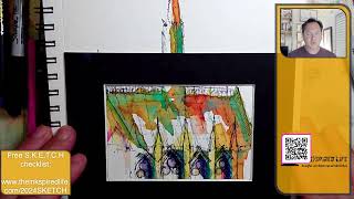
In this live streamed session, artist Jason Nicholas continues his sketch of the Sainte‑Chapelle in Paris, building on a previous outline. He works on cold‑press Fabriano watercolor paper, adding layers of watercolor, hatching, and mixed‑media details with colored pencils and a purple Varsity pen. Throughout the 20‑minute demo he explains his top‑down workflow (steeple, roof, Gothic arches, pilasters, flying buttresses), discusses material choices (paper texture, watercolor palette, signature neon pink), and demonstrates techniques such as hatching for shadow, layering colored pencils after watercolor, and bleeding pen ink for purple shadows. Jason also shares mindset advice—overcoming the “ugly duckling” phase, avoiding perfectionism, and treating sketching as playful experimentation. Viewer interaction (Chip, Crafty Scorpio) influences decisions on cropping, composition, and color use. The session concludes with framing, cropping experiments (vertical vs horizontal), and a reminder to trust one’s gut when a piece feels finished.
Chapters
Hey, hello, hope you're doing well. Happy, um, Sunday, August 4th, 2024. My name is Jason Nicholas. I'm here with the Inkspired Life sketching architecture and urban sketching. Yeah, I'm passionate about sketching buildings in my own kind of quirky, wonky style, and that's what makes it fun for me. I am back. I started working on this sketch earlier today. This is the Sainte-Chapelle church in Paris, courtesy of my friend Chip, who let me, or sent me a photograph I could use. So we're just loosely basing the sketch off the photograph. As you can see, I've already added color. So I'm gonna come back tonight. I wanna add just a little more detail. And maybe throw some more color on it, and we'll see where the next 20 minutes takes us. So thank you for joining. Yeah, so I have my watercolor palette here. I'm gonna make the reference image smaller because I'm not really using it anymore. I only used it to get the outline of the building started. So let's just make some more room up here. Um, I had a question earlier. What, what am I sketching on? What kind of paper? So This is what I'm using. I am using 1264 Fabriano watercolor paper. It's cold press, 140 pounds, and cold press means the paper has a texture to it. It's not smooth. Hot press paper is smooth. This is cold press. I like sketching with texture on my paper and adding color. For me, it just adds a little bit more interest. I to the lines and the colors, leaving some gaps here and there. All right, let's zoom in on this and let's just play around for— like I said, I'm going to be on for 20 minutes or so, and let's, let's, uh, start to add some detail. So if you didn't watch earlier today, the first step I did was to sketch kind of the outline of this church, and I usually start my buildings from the top down. So I started with this steeple, and then I kind of did the roof outline. Then after that, I came and added some details. Um, the video is on my YouTube channel, so feel free to go and watch the video from earlier today. You can see how I started this sketch. All right, let's go in. I want to add some detail, so Awesome. Sorry about that. I am just, uh, closing down the internet because I'm having some streaming issues and I had my internet open, so I'm hoping it'll stream a little bit better now. So there's— I'm going to sketch this, these roof lines here. I'm just— and so what I'm doing now is I'm just going back and pulling out some of these shapes. Sometimes the— they'll get lost when you add some color on top of it. So just going back helps to pull things out a little bit. I'm going to add some hatch lines. Hatch lines are great if you want to show kind of shadows. Let me zoom in a little bit. So let's add some hatch lines. Hatch lines are going to be these diagonal lines, kind of spaces in between, just to help give some depth to the sketch. Let's do the same thing down here as well. I want to pull out these Gothic arches. Gothic arches are, um, one of the main architectural elements of of Gothic architecture, and they're arches but they have a point on top. So that's why I'm kind of just pulling these out a little bit more. They kind of got lost, but we can always come back and add some more lines on top. Let's see, we're going to work on— got some kind of— add some depth on here. Let's add some more in these window areas here. These are vertical pillisters or pilasters, um, to help to kind of reinforce, keep the walls in place. You may have heard the word buttress as well. Notre Dame has these, and lots of cathedrals have these. They're called flying buttresses, which are these vertical elements that are often main walls, and they're braced back to the main wall to keep it from falling and collapsing. They're all— they're structural, yet they also have a lot of ornamentation to them. So I think for me, like, a flying buttress is where beauty and function can come together. It's a great example. There you go. So I think those arches kind of pulled out a little bit more. I'm gonna— I think these are clay tile roofs on here. I'm sorry, a roof. I think it's a clay tile roof. Definitely has some horizontal lines, so let's just sketch some of the horizontality here. I hear fireworks outside. I— someone's doing like a fireworks show tonight. I feel so bad for my pup. She does not like loud, boomy noises. And at the top here, we have kind of looks like some kind of ironwork detail. So let's catch that in— So there you go, that's what it's looking like so far. All right, let's, um, I kind of like where it's going so far. Let me pull out, zoom out a little bit more. There you go. I think I'm going to pull out some colored pencils. All right, so here are my favorite color pencil colors: light aqua, chartreuse, sunburst yellow, neon yellow, and can never forget my kind of my signature color I'm using a lot now is neon pink. You'll probably see on most of my sketches lately. Yeah, let's throw down some colored pencil. I like doing these mixed media sketches. It just, it's more fun for me to throw these different materials down. I like the way they work together. So don't be afraid to try, you know, using different, different mediums. All right, let's throw down. I'm gonna zoom in here. Again, I am not trying to match the colors of what is really there. It's just in— I'm just inspired by the beautiful Gothic architecture of this, uh, this church. So I just want to capture that, that, and the colors are going to be my own. If you are going to use colored pencil, just, just make a note For me, I like to use it later in the process because if I throw it down earlier, the watercolor or the ink will not really stick to it. So I like to come back and add a layer of colored pencil more towards the end. That's just a personal preference. This is all just personal preferences, right? I mean We're creating, sketching, painting, whatever we're doing creatively, it's, it's ours. It's, it's our creation. Just go for it. Do what you want to do. Have fun with it. Don't really worry what anybody else is going to think. I did that for many years and I never did anything because I was afraid. I shouldn't say I never did anything, I just never really showed anything because I was afraid of getting critiques or nasty comments, which is— still do sometimes, but that's okay. You have to learn to just kind of brush it off, but don't let that stop you from showing what you're doing. There is someone out there who's interested in what you're making. Hey, I see, um, Crafty Scorpio online. Hey, Crafty Scorpio, how are you? Thanks for joining the live stream. I give up so easily if something starts off looking bad. I won't continue. Yeah, um, I call that the ugly duckling syndrome. There's always a point for me in every sketch I do where I want to stop because it doesn't look good. It looks ugly, right? Um, we have to get past the ugly duckling phase, keep plugging at it, and it'll have that point where it shifts and turns around. Think of, um, if you know Bob Ross's work— I, I am not comparing myself to him at all— but when you watch Bob Ross, even for me I always watch him in the beginning. I'm like, oh, it's not looking that great. But then there's a point when you're watching where it just, it turns. You're like, wow, it looks really, really cool, really beautiful. So push past the ugly duckling point. Keep plugging at it, even if you need to step away an hour, a day, a week. Step away and come back to it. Um, I get what you're saying, so that makes a lot of sense. So work past the ugly duckling phase. Yeah, perfectionism. Perfectionism equals— for me, perfectionism equals procrastination. When I feel like I need to be— do something perfect, I don't do anything because I'm worried about it being perfect, right? For me, a lot of the sketching creative stuff is mindset. Like, so I call it like an artistic mindset, creative mindset, where, you know, I've tried to adopt a playset— a playset— a mindset that this is playtime. Have fun, experiment. For me, a lot of the, a lot of the enjoyment of what I'm doing is the process of creating, not always the end result. Hey, Chip's in the house! Chip, great to see you. Yes, I'm so sorry I could not make it on Facebook. I was trying to livestream there and something is up with my internet and my settings. It's not letting me stream to Facebook. So I'm so glad you're able to pop in here, and thank you again, Chip, for letting me use that reference photo for this sketch. I'm going to zoom in so you guys can see a little closer. So I'm just throwing down some chartreuse. Love chartreuse, it's one of my new fave colors. Throw down some neon yellow, and I'm gonna— I do want to throw down, um, actually let's leave neon yellow off to the side for a sec. I want to throw down some more watercolor on here. Thank you guys, I always appreciate comments and knowing who's watching. It's fun for me. Grabbing some orange, I just want to intensify some of this orangey color here. I kind of like the way that's popping. I'm not going to get too cray cray with it, but I think I do want to put a little bit of orange. Actually, you know what, I don't like that. Going to blot it off. I like that. I stopped that because I like this hard edge here, so I want to leave that pure. This is a, this is a beautiful, um, piece of Gothic architecture. I said the years earlier today when it was built. I don't have, uh, the facts open, but I think it was— gosh, was it 1294 maybe? When this, when this, uh, church was built. I'm sure it's spectacular inside here. All right, got some orange. I'm going to dip into some turquoise here. I just want to punch some of it up a little bit more. I'm throwing down the paint really thick here. I'm actually not really painting, I'm kind of sketching with it. This will create an edge of where these, uh, pilasters are. The stained glass in this church is 15 floors high. Magnificent. Wow. That's incredible. Made it through World War II without anything broken. I'm speechless. That is, that's incredible. Wow, what amazing history. It's my bucket list. I need, I need to go to Paris. I need to go there. Sooner than later. You know what? Maybe next summer's trip. That's so spectacular. Yeah, I got to get here. I'm going to throw down some lemon yellow. I love using lemon yellow for some zestiness, a pop of freshness. There you go. I'm actually gonna turn off the reference image here. All right, there we go. So you guys can see a little bit more of what I'm doing. I hope you guys are liking this one. I think this one's coming out pretty cool. I'm gonna leave a lot of white space there on the roof. I like it. Um, let's add some— I feel like I want some purpley shadows happening on here. For me, I could mix up purple with my watercolor, but I kind of really— my go-to for purple is using a Varsity pen. I love the purple pen so much. So let's use some of that. Hope you guys don't mind me, I zoom in and out a lot, but I just want to show you some details. Let's just throw some of this Varsity pen on here. I really want kind of these purpley shadows. And I'm going to bleed that a little bit, show you what it looks like. So I'm just dipping my brush in water and you'll see the purple kind of popping out there. So there we go. Let's bleed some of this a little bit. There you go. I think I'm— I don't think I'm going to add any more watercolor. Actually, I lied. I'm going to take some of this orangey yellow. I have this orange yellow, they call it Taxi Cab Yellow color here, or it's almost like a School Bus Yellow. I just like the contrast of the yellow by the purple. All right, I am putting the paintbrush down. I think it's enough color on there. I'm thinking this one's almost done. Let me know what you guys think in the comments. Do you like— do you like this, or do you feel like there's enough color on here? Let me know. I feel like there's enough. I think it's at a really good stopping point, except for, except for my fave color, pencil color. Got to throw some pink on there, right? Kind of got to throw some pink on. It matches, uh, Chip's avatar there. The yellow against the black is striking. Thanks, Chip, that's so cool. I'm glad you, um, glad you noticed. I'm glad you like that. Right, guys, I think this one might be a wrap. Let's do two things. Let's zoom out. Let me grab a frame. Let's kind of frame it and then we'll zoom in. We'll take a look at some of the details and the colors and how things went together. It's going in my magic drawer here to get some frames. Ta-da! Let's see. What's a good size frame? So it's always fun to just throw a frame around here, kind of crop out stuff. Is that big enough? Yeah, let's see, I'm straining the camera out a little bit. It's not going to work that way, so I'm going to do it this way. All right, cool. So maybe this one would miss— this one I might crop somewhere in here even. I don't mind that the top of the spire's cut out. I don't mind when I see the left side. So that's kind of interesting cropping place there. Maybe even a little bit more. Yeah, maybe somewhere in here. So it looks kind of cool. I like, um, we have a big mass down here. I like the blank space up top kind of balancing each other out. I also like that we have a spire here. And kind of another spire, hinting at a spire on the right. They kind of balance each other out, um, you know, diagonally. Just crop. Let's do a horizontal crop. Um, horizontal is interesting but not as interesting. I really, I really think capturing the verticality of this is important for scale. But just for fun, let's look at an even smaller crop of it. I think this I can zoom in on. Yeah, there we go. Let's just move this. Actually, let's, um, there we go. Cool. That's interesting, that composition. Let's look at it this way. That's interesting as well. So don't be afraid to look at your sketches, you know, with, um, different orientations, whether it's a vertical or horizontal. Here we'll get even a tighter kind of crop on it. Now this I don't mind, this really tight crop I think is interesting. Get some texture at the top. Actually, I kind of like this cropping because it really, uh, reinforces the colors that are happening here, right? If I just cut that out, so that could be an interesting way to crop this out as well. Maybe something like this. So there you go. So those are some different ways you can take a look at this, kind of crop it out. I think this one's a wrap, guys. I, I don't want to overwork it. So my gut— always trust your gut, trust your instincts. If your gut is telling you, hey, there's enough, It's enough. If, if I was to add anything else to this, I probably would throw in a background here, and it would be— I'm just thinking a nice, like, a gray, almost like the photograph, like a gray kind of backdrop on here. That could be really nice, but I think we'll save that for another day. All right guys, so this one is a wrap. Um, hope you enjoyed it. Hope you got some takeaways from this. I really appreciate you watching. You guys are awesome for your support and liking this and subscribing to my YouTube channel. Um, Chip and Crafty, I loved your engagement in the comments. Chip says, go vertical first one, you will lose scale of the church the other way. Yeah, Chip, so I agree. So Chip has a good point. I think the end composition should be vertical, and I would go with the— this, this kind of cropping like this. I think— no, I think like this. I think I like it this way. So some kind of vertical cropping would be interesting. So really good point. Guys, thank you so much. You're amazing. Uh, if you want to see the first part of this sketch, it's on my YouTube channel. I did it earlier today, so look for Sainte-Chapelle Part 1 on my YouTube channel. You can see how I started this. This is how we're going to wrap it. I want to give a shout out to Chip for the photograph and the inspiration behind this. Thank you so much, man. I appreciate you. You guys are awesome. Remember, we talked about mindset at the beginning of this tonight with Crafty's comment. Um, mindset's really important. Approach— can't tell you what to do. For me, I approach this with a mindset of being playful. I just want to have fun and be playful with this and wonky, wonky, wonky. When I sketch wonky, crooked wavy. I don't have to worry about perfection. Um, it's a, it's a mindset. It's really hard to shatter, breaking free from wanting to be perfect, especially when you look at these amazing, beautiful architectural buildings. But I kind of tell myself the photograph represents the perfection right? We capture the perfection with a photo. For me, the sketching is my feeling and take and my playfulness about it. So that's kind of one of the things I put up here to allow me to not worry about being perfect. Thank you guys so much. Take care. Have a rest— have a rest. Enjoy the rest of your night. Have a great, great week, and I appreciate you. So again, my name is Jason Nicholas Nicholas with here with the Inkspired Life, sketching the built world around us. One line at a time. Take care, guys. Peace. And live creatively. Use your creativity for positivity. I'll see you guys in the next, uh, video. Take care. Have a great, great night. This is the awkward wave until I find the finish button. Here's the awkward smile. Take care, guys. You're awesome. Thank you for letting me be me, and you guys just keep being you. That's what it's about.