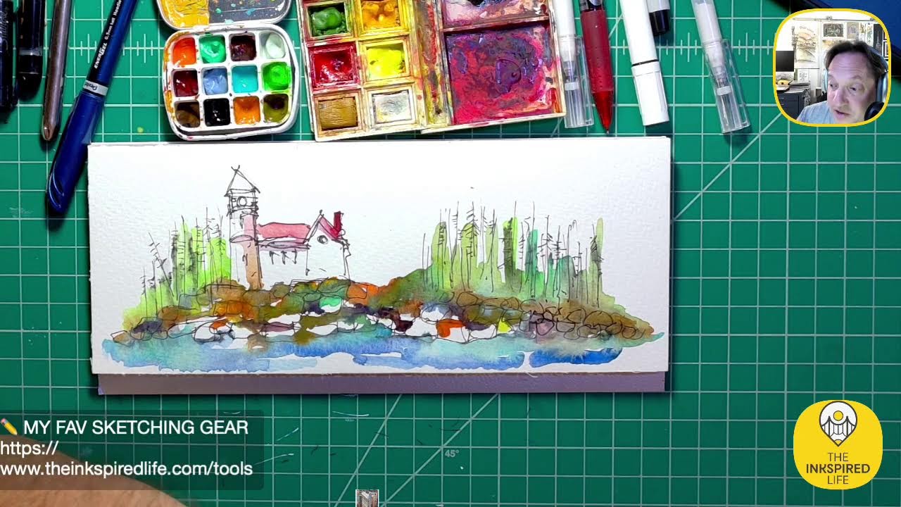
Sketching a Monhegan Island Inkspired Building
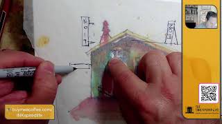
In this live YouTube stream, artist Jason Nicholas sketches a fire department building on Monhegan Island, using a step‑by‑step watercolor and ink process while interacting with viewers. He begins by outlining the roof with a Sharpie, then demonstrates wet‑on‑wet watercolor washes, layering, and color choices (orange, turquoise, lemon yellow, purple shadows) to convey a weathered metal‑panel look. Jason introduces new tools—a Winsor Newton Cotman Round 111 brush, a green pen, and various Pilot/Varsity pens—explaining their performance. He shares practical workflow advice such as rotating paper for comfort, using tracing paper for quick concept trials, and embracing a “grab‑and‑go” creative mindset to stay in flow. Throughout, he answers audience questions about materials, color decisions, and workshop plans, announcing a July “wonky fishing shack” sketching workshop on Zoom. The stream concludes with final touches, discussion of adding a sign, and a friendly sign‑off encouraging viewers to keep creating.
Chapters
Hello, happy Friday on June 14th. Hope you're doing well. I'm just looking at some tech stuff here. Um, gotcha. Love the tech world, it's great when it works. So it's working really well, it just, it's not streaming to Instagram, but that's cool. We're going to keep moving forward. Hope you're having a great, great day. And a good evening. Yeah, let's do some sketching for a short about a short amount of time. I hope you guys are doing well. All right, um, so I think tonight I'm going to sketch— let me bring this image on here. Um, this is a cool little building in on Monhegan Island in Maine. It's actually the fire department building. So I thought it would be fun to give this a quick sketch, make it our own, make it fun, wonky, loose, creative, and just kind of use the shape of this as a starting point. So let's kind of move this to the side. Um, yeah, actually I'm going to take it off screen. There we go. Very cool. Let's do some sketching, guys, and then I'm also gonna break out a couple of new things. I have a new green pen and I have a new paintbrush, so if we have some time, we'll give these a kind of look-see and a trial run and see how they work. So stay tuned. Alright, so I have my Sharpie. Ta-da! Love, love the Sharpies. This is how I'm going to start sketching this. And before I do that, I see some people watching. Who is on the chat? I see Linda on YouTube. Hey, hope you're doing well. It's great to see you over on the YouTube side of the world. So fun, very cool. All right, let's do some sketching. So whenever I sketch buildings, I usually will start with the roof area. Um, gonna hold my pen fairly loose. I have a little bit of lag on my screen. Hopefully that's not translating through on the internet, but we'll see. So we got this kind of roof shape that does something like that. Just kind of comes down a little bit like this. And the idea is I just want to start somewhere, right? So I'm starting at the roof and kind of work my way down a little bit. This building's fairly, um, straightforward with kind of character and shape, but we're going to add some fun color to it. Sometimes I think that We always want to sketch things that are complicated because there's a lot of detail. Start simple, start simple. And when I say simple, I'm thinking just overall shape of it. It's not very overwhelming with a lot of cray-cray details happening. Bring this out. Yeah, there we go. Got some smaller doors on this side, maybe something like this. So summertime's here, one more week of school, my brain is on summer building, summer architecture, wonky fishing shacks. Cool little cottage buildings like this. So I absolutely love summer vibes, uh, anything that's kind of waterfront-related, beach-related buildings, architecture, all that fun stuff, lighthouses. Yeah, so we'll be seeing a lot of those sketches this summer. I'll still be doing some New York City-inspired sketches as well, but, um, yeah, we'll see how it goes. Nothing planned right now other than a workshop. I'm gonna have a wonky fishing shack sketching workshop— that's a mouthful— um, in July. I'll be, I'll be putting out something this weekend for that if anybody is interested in signing up and for a workshop on Zoom. And we'll do some wonky fishing shack sketches. All right, cool, we got a basic shape there. Sorry it's crooked, guys. Um, I see Michael. Michael, great to see you. Hola, hola, cómo estás? Great to see you. Um, so this is actually really cool for you guys to see. I tend to sketch a lot of times with my paper at an angle. Normally I would kind of straighten it out for you guys so it looks straight. But this is kind of reality, is it's just more comfortable for the way my hand is sketching and moving. Um, so don't be afraid to turn your paper, you know, sketch upside down if you want, sideways. Sometimes it's easier to move the paper than to kind of bend your wrists and move your arm around. All right, cool. Again, this is gonna be quick, fun, and loose here. Got some lines started. Let's throw down some color, um, in no particular order. And actually, we're going to break out a new brush I haven't used yet. So this is a Winsor Newton Cotman watercolor brush. Um, it's called Round 111 Round, and it's a size 8. I don't know if you could read that. Never ever used it, so I thought it'd be fun to try it here with you guys if I can get the cap off. Ta-da! So here's what it looks like. Um, typically you'll see me use the nice bamboo brush, but let's dig into this one. All right, colors. When it comes to colors, I'm just using kind of what my gut's telling me, what I feel like is going to be fun. Um, going with just feeling really. I'm not trying to replicate anything that's out there. Let's move this here in frame. Maybe you guys can kind of see the watercolors a little bit better. Awesome, that works. All right, so let's, uh, let's just throw down some water right here. Do a little wet on wet technique. So wet on wet technique is throwing down some water on the paper. We're going to grab a color. Let's, let's do orange. Let's just— I'm feeling orangey, so down some orange. So this, this will be in layers. Um, I just have this handy, but you can see an example, just different layers. Starting off with the Sharpie, the black ink, um, then I added some watercolor on here. There's also watercolor pencils on here as well, so it's just building up different layers. So right now we're just throwing down a quick wash here. I am liking this brush, I'm liking it a lot actually. Let's dip into some yellow orange-yellow color. I call it taxi cab yellow, kind of. I'm actually going to play around with the brush, brush strokes a little bit too, meaning I'm going to do different directions. Um, this brush really is holding the paint really nicely on the water. Here we go, we got some orangies happening. Orangies, yellowies. Why am I adding E to everything? I don't know. So this isn't really a perspective view, this is more just kind of a straight-on elevation view of the building. Gotta add some turquoise, right? As you guys know, turquoise, this is my favorite watercolor color. Maybe my favorite color in in general. I love the color pencils, this color watercolor, this color ink, this color— I don't think I have any clothes this color. Um, so I'm just being kind of quick here with it. Dipping back into the orange, I'm just tapping the brush down here, letting the paint come out. I want to create kind of an old-looking vibe to this. Maybe this building is made out of, um, metal panels that have rusted and weathered over time. So that's kind of where I'm thinking about the material of what this is constructed out of. So let's go with that kind of vibe. And once it dries, I'll be able to come back in and add some ink, some Sharpie on top, and I could pull out some of that, those details, so it looks like metal panels on the side. We're going to give a little wash down here. Maybe this is a Maybe we have a wood dock here somewhere. Uh, what color do I want to use? I'm going to pull out— I'm just going to go brown. I got brown in here. Let's just throw this on here. One thing I want to do is I want to put this at an angle, so I'm just throw this under here. There we go. I need to clean my desk off. All kinds of stuff out here. I'm just mixing some red and blue. I want to make a purplish color. I don't have a lot of blue in here, so I might end up grabbing a purple preppy, perhaps. What's the brand of your watercolor set? Hey, great question. So here is the watercolor set. This is a Winsor Newton Cotman watercolors. I actually have— hold on, I can show you a box here. It's got some I'm trying to think of some graduation gifts for some of my, uh, favorite peeps that are graduating. So I ended up actually buying a couple of these, which is this palette here I'm using. So here, this is actually what the box looks like. I love this set. Here are, I think, the colors in the back. I'll hold it so you can see the colors. I've been using Winsor Newton Cotman watercolors. I think Cotman is their kind of student grade, or grade or a level above student grade. It's not professional grade. It's all I need. They work great for me. I actually started with— where's my palette? Here we are. So I started using Winsor Newton Cotman in this box here. You see, it's really well used. So this was my first go-to. What I love about this, it's— I could fit this in my pocket. This is really awesome. What I love about this palette here is this. I'll show you a little water kind of tray you can put on there. But this is what I really like, is this pops out and I can hold this, so it's really easy for me. I'll just demo, I'll show you. So I can just dip right in. Boom! Oh my God, this is drying really cool. I'm going to zoom in on this, on this in a second. Uh, I don't want to touch it because it looks amazing. We come over here, but it's really convenient and really nice to, um, hold. All right, let me zoom in. I know I am that guy. I'm, I'm that person, that artist, that creative that likes to watch paint dry. I know it sounds nuts, but I'm sure some of you guys get it. Look at this. I don't know how great it looks on camera, this area here. Wow. Let me zoom in even closer. I'll try not to shake the table. Where's my frame? I don't know, where are my little 2-inch frames? Somewhere in my— here we go. All right, you can kind of see I was talking about this area right in here. I'm really loving this, these colors. I'm loving this, the way this is drying looks really cool, especially in person. So love it and love it. If anything, tonight that'll be probably my takeaway of the thing I really liked most about this. But that's— we'll see what else happens. Um, it says, wow, your painting is drying nicely. Great. Hey, thank you. Yeah, it is. It's really cool. Of course. All right, let's throw some lemony zestiness on here, a little bit of freshness. So for a pop of freshness or pop of brightness, it's like cooking when you add some lemon zest, just lifts things up a little bit, right? I love this lemon yellow paint. It does the same thing for me. It just lifts everything up a little bit. So let's just kind of do our— these are called rake boards, R-A-K-E, rake. Or sometimes they're called barge boards, right here that I'm painting. So let's give that pop of freshness on there. And I think I'm going to throw some down here also, just mix it. I actually have a little heater on in here. It's a little chilly, but it's helping to dry the paint quicker. All right, cool. So I am missing— I have— I am running out of the blue. See if I can grab a little bit more out, throw that on. Where do we want to do that? Maybe I'll use this as kind of a You create some shadows or something happening. Still a little too wet here. Yeah, I definitely— I need more blue paint, but since I don't have blue paint, I can find my— I think I have a blue preppy pen here somewhere. Yeah, or There we go. I'm just going to use this blue preppy pen, throw down some blue on there. Very nice blending happening now, totally. This will start taking a little bit more character on once I start adding a little, little bit of details when I start to show the metal panels on there. Being a little too careful. Some— here's a kind of a mindset tip, creative mindset tip. If I find myself thinking too hard about what I want to put down on here next, um, it interrupts my flow, creative flow. And there's nothing wrong with you like to to pre-plan and lay everything out. But these sketches for me are really about just being in a flow, getting things out, kind of grabbing, going, um, and just seeing what my instincts and guts just kind of go for. So right now, my brain— I'm starting to think too much about what I want to put on here next, and I lost my train of thought. Like the flow kind of stopped. And that's just kind of how— it's kind of how I roll. I need to just keep kind of going, go grab, go. I call it grab and go creating, just kind of grabbing and going with what's around me. If I have to stop and think too much, um, yeah. But I can get back into it. So here's, here's how I can get back into it. I'm just gonna focus on the music, grab and go. Music's a great catalyst. Since this is a firehouse building, I want to add some red. All right, let's see. Actually switching up the tunes a little bit. I don't hear any music playing, so I am gonna put something else on. Let's just click— I don't know, what are we gonna click on? I'm gonna put a little peppier. We're gonna pep it up a little. We're peppin' it up. Something's drying pretty nicely here. I feel like I'm at a stage where I want it to dry a little bit more so I can come in and start adding some texture to show, uh, materials that are on the front of this building. I think I'm going to add a sign at some point over in here, maybe. As well. We'll draw some wooden, wooden planks on the door. Actually, it's kind of dry. I think we can start showing some of that. Um, if I didn't want to wait for it to dry— I'm waiting because I wanted to use my Sharpie. Sharpies do not like writing on wet, damp areas. I could have grabbed my Pilot pen on the damp area and that would have worked. Well, we'll show you. Or definitely the Lamy, but the Lamy ink would bleed big time. Excuse me, would bleed big time, and I don't really want that. So let's just use our Pilot and we'll just show, um, let's just do— I'm going to actually turn this because it's wet a little bit here. We'll just draw our planks this way. Oops, that helps. So don't be afraid to Rotate your paper. This goes back to the layers I was talking about earlier, right? We're just layering on a little bit of line work. And the reason I did want to use my Sharpie before is, um, the Pilot comes out— ink comes out really nice and dark. Which is great, but I didn't want these lines to be too, too dark. And I can— it's easier for me to make lighter lines with the Sharpie marker. I could have used other fineliner types of markers or pens, but I try to— trying to keep it simple with what I'm using. All right, flip that around. So you can kind of see we have some planks going on here. Um, let's start to show some metal. Maybe let's try to make this corrugated metal. To do that, I want to do vertical lines, but I think I might do it sideways because my hand— it's gonna be easier for my hand to do this. Movement rather than try to go up and down. So that's why I'm gonna rotate it. So there you go. You can see the vertical lines. Got them fairly light. I like how it's skipping here. They're not really solid black lines like the ones in the door. So that's one of the reasons I wanted to use the Sharpie, is to make the lines look skippy for this metal kind of paneling. Um, this is too, too wet here, so I wasn't able to do it with a Sharpie, but that's okay. Maybe I don't want to show the vertical lines in this section here. You don't always have to add every single detail to— you don't have to feel like you need to complete painting, you can leave a lot of white space. Um, let the viewer use their imagination to fill in the gaps. It's one way to bring people into what you're creating, right? Leave some questions unanswered, like life, right? Life is intriguing because we don't have all the answers. Having a curious state of mind, living in a sense, in a living with a sense of wonder is kind of how I approach not only life, but, you know, these sketches. And it helps that, that created that creative, playful mindset. Cool. And I think I'm going to show— if this is— these are metal panels, maybe we'll see some kind of rivets in here. I'm just going to randomly throw some in, in places. Again, this adds just another level of interest to what we're looking at. Hopefully you can see how this is just starting to kind of take shape. Awesome. Let me grab a drink of water and look at— see if there's any questions or comments in the chat. Hey, Chip's in the house! Chip, great to see you, my friend. Hope all's well. Digging the shadow look under the rack— rafter. Oh, thank you. Yeah, it's kind of cool. Um, Michael, there's— I'm going to actually add something else under there that's going to pop it even more, and it's going to be— it's going to be purple. So I'll get the purple pen out. I was going to mix— lots of times I'll just mix my own purple, red and blue, kind of out of the blue. Um, so we're going to use a purple Varsity pen and we'll add some of that and you'll see how that pops a little bit more. Ah, that is so good. I needed a drink. Perfect. So let's throw down some of that purple. This is a Pilot Varsity pen. I'm just thinking about where I want to add it, so yeah, we'll add it here. I'm gonna bleed this ink and you'll see what it does. Let me zoom in so you can just see it a little bit better. Let's prop this up again. I like to prop it up. I like my— I like when my watercolor runs down the page, so I'm using gravity just to kind of pull things down a little bit. You can see adding that purple And when it dries, you'll see even better what it's doing. Let's throw a little bit here. So a really interesting way to create shadows is using colors. I got a little wonky here, a little messy there, but let's see. I'm going to try to lift some of that off, I think. Let's see, we're going to switch to— let's put some jazzy tunes on. There we go. I also want to throw some of that purplish color down here as well. So let's just bleed some. And I feel like this might just ground this building a little bit. You can see how this is running down because it's wet. It actually looks kind of cool. So I am digging this new paintbrush. I feel like it's the right size for, uh, right size for how I like to create. Cool. So we got that purple. It'll run down, you know, just kind of drag my brush across a little bit, pull it down a little bit more. See how it's kind of running out? I just evened it out a little bit. I mean, I'm gonna dip in and throw some of that purple. I want to give a little bit of recess to these doors, so I'm going to do that purple on here. Another great color to, to use would be the This blue. I think what I'd like to add is a, a siren here, but I actually would need to Google, get some inspo ideas. I mean, some kind of a siren or something that's— I'm imagining either on top, posted on top of this, or off to the side on a pole. So there'd be, uh, let's Let me show you guys. Here's what I'm gonna do. Get some tracing paper. So, tracing paper is a really great tool when you wanna explore different concepts or ideas. An architect always has tracing paper in their arsenal. So, I'm always with tracing paper. So, Let's just lay this on top. Uh, I'm gonna just go look up some images real quick, see if I can find something, and we'll do a couple of options on here and I'll show you. It's just a good way if you're really not confident how you want something to look, feel free to break out the Trace. Um, I only use it for small details I'm not sure of, either it's a sign or lettering We'll do it for the siren here, but I'm not using trace for the entire sketch because, yeah, I would be changing things over and over, and that's not the purpose of this. I'm going to say— say I want to add a dormer. Let's talk architect. Let's be an architect for a sec. Um, let's add a dormer. So maybe we had like a dormer on the side of the roof here. Right, I can see what that would look like. Maybe I want to add a chimney here. So before I committed anything with ink on the painting, I could just explore ideas. This actually looks cool. I like this dormer. Maybe I'll show that because then we could do Just do maybe some cedar shingles or something up in here. Could add another level of interest. All right, let's see, let's see. 11 o'clock. I'm going to wrap up in a few. Let me know if you have any questions or comments in the chat. We'll take a look at it. I'll take a look at it before we wrap up. Yeah, this is the kind of thing I was picturing, something like this. Let's maybe show it So this is a little kind of wonky fire department shack. We have a pole here, and then we have this kind of dealio going here. Right, so maybe we have some kind of siren here on the pole. Or another thought is, let me just trace it and then I'll show you another option. So I'll throw this on here quick. I'm going to tear this off. And we could throw it, you know, maybe I'll— maybe I can throw that right on top in this sketch. Maybe I'll throw that right on top of the building. I kind of, I kind of like it over here, and I think it would be cool to show Maybe some kind of angle brackets or something that are propping it up. So we have like our siren that's on the roof here, and I just like that little detail. It kind of— this is a very asymmetrical building. Nothing is balanced, right? So I think this detail here, there's a little— this big space here, I think would balance, be balanced by the verticality here. If we do that, do this and this, I think they kind of balance each other. All right, or I could even throw it on the roof, but on the top, but I kind of like it off-center. I think we'll show it here. Um, and here's another trick. Let's grab some graphite. It's got a regular pencil here. I am just putting the graphite on the back, and then we're going to put this where I want it, maybe here, and I'm just going to trace over it quick. I just want to transfer that image very loosely there, and then I can come back with my Sharpie. We'll draw it in. And I'm thinking this should be red, so I'm going to use my red Precise Pen for this. This is my favorite go-to for whenever I want to do something red. And I think we'll bleed that a little bit. Cool. And I want this building to have some staining on the siding, so I'm going to grab some of my ink here. Now let's just throw some of this on here as well. I don't want to get too fussy or too planned with it. And I'm just gonna let that gravity do its thing and kind of pull it down a little bit, let it puddle up in some places. And here we go. Alright, I think this one's gonna be a wrap. Let me see if there's any other questions or comments and we'll head out. Um, yeah, after this dries, I'll probably come back and I'll add a little more detail with probably my Sharpie here, maybe pop some colors a little bit more in places. And I think I want a sign on this building, so Maybe, just maybe, right, maybe right in here we'll have a sign. All right. Hey, uh, Chip says, how do you decide on your color combinations? Hey Chip, Great question. Uh, so tonight, a couple of things. This is, this is my color thought process. One is, um, I always kind of just go with my gut and grab and go and paint with how I'm feeling. The second thing for this is I knew this was going to be a fire department kind of shed structure, so so I wanted red somewhere on it, you know, to represent the fire department. Um, the other thing that helped with my colors is I'm imagining this building to be clad in like a corrugated metal panel material, and I wanted to have a weathered rustiness about it. So that really helped to determine the colors on the building. Uh, you guys see me using these colors a lot over and over again. So that was the other kind of— those were the key players of how I came up with the colors on this. Um, the last thing about colors is the shadows. I really like purple, purpley shadows. So, um, you'll see me doing that a lot. So great, great question. I love it. Uh, how about a sign coming off the left of the building? Station 19. Oh, All right, let's do a— let's break out the trace paper. Hopefully you're still out there, Michael. I'm liking your idea. Let's see. Oh, you can see I lifted some of that up. That's all right. Um, so maybe I kind of like the idea of a sign coming out. Maybe I put it up too high, but some kind of metal wire or something kind of there. Whatever, number 19. So we could do like a sign here somewhere on the side, or maybe, um, I can do some kind of— I don't know if I like that. I was gonna do like a vertical sign, right? Something like that. But I think I like the idea of a sign that's kind of cantilevering out. It's a fun idea. It would help balance this out a little bit more. So I think it's a really cool idea because this is kind of busy up here anyway, so putting a sign out here would, would be easier to read, and it also fills this white space nicely on the side. I may throw a background color on this too. I was thinking about that earlier, so you might see, um Um, you might see me do like the sunsets that I like to do with the orange. Oh, I didn't throw pink on here yet. Um, the sunsets with orange, yellows, and pinks in it. So great idea, very, very cool. Try vertical. Yeah, so yeah, so the vertical one, right? And the scale might be off with my sketch here, but just doing it quick. Yeah, I kind of like the cantilevered one. I like the way it's hanging out better. So really cool idea, thank you for that suggestion. I think that's— I think the sign will go over here. Awesome, nice work, thank you so much. Oh, Station 19 was a good TV show. I totally missed that reference. Totally missed that reference. I don't know that, that show. I'll have to Google it. I will definitely Google that. I know the TV show Emergency when I was a kid. I remember that one. Um, cool, nice work. Thank you. Exactly that space. Awesome, fun, good work. Thank you so much. Hey, you guys are awesome. I love the comments and questions on Facebook and YouTube. Love having you guys here. Linda, it's great having you. Have a great, great night. Michael, thank you so much. You have a great night as well. Chip, thank you for popping on. It's always awesome to see you. Appreciate it, guys. You're all amazing. Have an incredible, um, I'll be on this weekend. I don't know when, but enjoy the rest of your day. Enjoy your Saturday and Sunday if I don't see you and keep using your creativity for positivity. Thank you so much. Peace. Live creatively. I'll see you guys real soon. Take care.