Sketching Galaxy's Edge : Episode I
In this live‑recorded YouTube session, artist Jason Nicholas celebrates May the 4th by creating a sketch‑painting of Disney’s Galaxy’s Edge. He begins by introducing the theme, then walks viewers through his chosen materials—Fabriano 1264 cold‑press watercolor paper, Sharpies, Daniel Smith watercolor sticks, Winsor Newton and Cheap Joe’s watercolors, Apple Snail ink, oil pastels, and various pens. Jason explains his workflow: starting with loose, top‑down architectural line work using a single‑stroke approach, deliberately leaving open spaces for later color. He demonstrates how he applies watercolor sticks directly on wet paper, uses a 20 % angle for controlled drips, and employs “bridging” by adding water between hues. Throughout, he mixes media, adds ink washes, and plans future detail work with Sharpies and pens after the paint dries. Jason engages with the live chat, acknowledges viewers, shares tips (e.g., measuring brush angle), and solicits feedback on framing and view preferences. He reflects on his artistic philosophy, emphasizing process over perfection and using sketching to transport his imagination to a Star Wars‑inspired world. The session ends with a preview of a second part, noting the piece must dry before further detailing.
Chapters
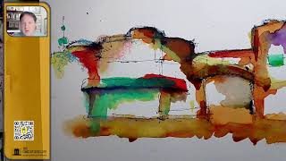
Hey there, happy, um, Saturday. Hope you're doing well today. It is May the 4th, so if you're a Star Wars fan, uh Yeah, you know what that is. May the 4th be with you. So I thought tonight I would do some architectural sketching inspired by Galaxy's Edge, which is located at Disney's Hollywood Studios. Um, been there a couple times, and last time I was there I took a lot of pictures, so I figured I'd bring up some images and do some sketches that are inspired by Galaxy's Edge. So if you're watching, let me know where you're watching from. It would be great to say hello in the chat. Um, yeah, so let's do some sketching inspired by Disney's Galaxy's Edge. Let's put some music on here. I wish I could play Star Wars music, but I can't. It's copyrighted. So we're just gonna go with my playlist I usually listen to, which is also fun. Hope you guys are having a great Saturday. Tonight I am sketching on Fabriano 1264 watercolor paper. Let me see if I can open this here and show you the COVID Here's the COVID I love using this Fabriano 1264 watercolor paper. It's cold press. You kind of see the description, which means it has some texture to it. And I really like the way the watercolor dries on this paper. Let me show you. Um, let me just pull up maybe the last thing I did. You can kind of see here, get a little bit close. So I just really love the texture, and I love that it comes in different formats. You can see I have a 4x8 format here, which is great for sketching landscape, uh, or or you can do vertical as well, right? I just love the size of that. And then this one I think is 8 by— no, 7 by 10. 7 by 10. All right, cool. So let's flip it over. Um, another thing I do like about this watercolor sketchbook, I like this spiral binding because I can flip it over lay pages flat. I also like the fact that it has perforations here so I can easily use that to tear sheets off. Um, one thing I don't like, if I can be honest, is— there's a solution— but I don't like how high these rings come up on the side, and that's only because I'm left-handed, and when I'm sketching, they kind of get in my way. You can hear it, but a solution would be to either sketch this way or I can even have the rings on the right. So it's not a biggie. All right, cool. I'm going to bring an image on. So this isn't— this is Galaxy's Edge, Disney Hollywood Studios. I forget when this was taken. 2021. 2021. So I thought this would be fun. Let's do some Star Wars inspired sketching. Let's give this one a shot. What I like about this image is I like the shapes of the buildings. And you guys know I love bridges, right? So you can see that kind of bridge and underpass there as well in the photograph. So, yeah, let's just sketch this thing. I'll keep the image on screen. I'm going to make it smaller and I'll just stick it over here. It's gonna pop out of my orange rectangle, but that's okay. So if you're watching, let me know where you're watching from. Also, if you have any questions, please put them in the chat. I'd love to talk to you guys. Um, I am sketching, so I do have my sketchbook at an angle. It's not flat on the table. I'm propping it up with this, and that's for when I go to add color, watercolor or ink. I like the way drips down the sheet. So I intentionally am sketching and, um, we'll be adding color at an angle. Hey, Patty's in the house! Patty, great to see you. Hope all's well. May the 4th be with you also. Cool. All right, let's do this. So I'm going to try to, uh, go through my thought process as I'm sketching. So bear with me because I'd like to usually sketch very fast. So I might try slowing down intentionally a little bit just to explain what I'm doing. So it's kind of a new process for me to slow down and talk about my thoughts. So I'm practicing. Here we go. So when I'm looking at the photograph, I'm actually going to be starting with— I kind of want to start with the building on the right and then that bridge. And then work my way to the left. So we're going to do that. You guys can see that okay on screen. When I'm sketching architecture, I'm not trying to be detailed. I'm not replicating the photograph. I'm really using the photograph as inspiration, a starting point, a guide. The— grab another Sharpie. That one is dried out. I have mega Sharpies here. Me just going to Binding and get it to start. That one works. Cool. All right, so I'm holding the pen towards the end. I want it to be loose and sketchy, so I'm not gripping it really tight. So I kind of holding at the end and I might even try a— maybe we'll try a single line continuous sketch. There's that bridge. This is that kind of round piece at the top. It's okay if I don't fit the entire image on here. I'm fine with that. I just want to capture some of this. Let's come back up here. Let's do this dome thing looking here as well. So we'll just kind of start with that. So I'm looking at the— where the building meets the sky. I usually start my architectural sketches from the top and work my way down. And one of the reasons I do that is when a building is against the sky, it's easier for me to see these kind of these edges, right? Because they're kind of— they're kind of well-defined against that blue sky in this picture. Hopefully that makes sense. And I'm just going to start coming in and filling some of the pieces. So I have not sketched this one before. This is the first time sketching it. And I'm going to come back and we'll throw down some color. So I'm not going to be sketching a lot of lines we see now because I want to leave big open spaces, blocky areas to throw some color down. If I were to sketch a lot of detail at this point, I'd want to come back and then fill each section of each detail with some kind of color. But that's not what I'm trying to do here. Here, I just want to capture an overall kind of feeling. Now the proportions are off a little bit. And again, I'm cool with that. I am very cool with that. This is just a fun, fun sketch. We kind of have like this awning thing that wraps around here, kind of bends here, a little curve to it. So you may have noticed I am kind of working from the top down. Um, it's not always true. I don't always hold to that rule. I will jump around sometimes, things that pop out to me. For example, I kind of want to finish this up here a little bit more. I see this dome here. I see this kind of funky looking radar antenna-ish thing here. If you haven't been to Disney's Galaxy's Edge, oh my God, the detail there is— if you're a Star Wars fan, even if you're not, the detail that they put into This part of Hollywood Studios is— it's astounding. I literally spent a few hours there one morning just walking around when it was early, less crowded, and I was looking at the way the sun was hitting the buildings and the light and the shadows. And if you stick around, I'll, uh, you could go through some of those other pictures I took while I was there. I'm gonna pull this down a little bit because it looks a little taller. So notice I'm not afraid to throw the Sharpie down, come back, and just kind of correct it. I wanted to make this taller. I know I have the line there, and I'm okay with that. Um, I'm also going to cut the people out of here for now. So I love the line work on drawings because it kind of shows the history, the thinking process, because this isn't a piece about perfection. It's a sketch. About a journey, and I'd rather have you guys— and for myself, I'd rather just see the process and the line work of how this was created instead of trying to hide it. For me, all the lines help to add to that kind of story. I hope that makes sense. All right, I think this might be enough line work for now. Me will come Come back here and throw some colors in a little bit. Let's see if there's any, anything in the chat going on. Patty says you paint with watercolor at a 20% angle. I measure the angle with your iPhone level app. That is really cool. That's a really, um, awesome tip out there. So if you want to check the angle, you could do that. So I honestly don't even I haven't— I don't measure the angle. I just kind of whatever's around, I throw underneath. I don't want to be too steep, obviously, like this. I don't want to be too flat, so I grab and go with whatever's around. I could make like some kind of wedge, or I could design a 3D— I can design and 3D print a prop or a wedge. All right, cool. All right, let's throw down some color. So step 1 for me is throwing down some overall outlines using the Sharpie. And why the Sharpie? Actually, you know what, we're going to do something a little different tonight. Um, the Sharpie— I use the Sharpie first because I know I'm going to be adding ink and/or watercolor, and the Sharpie is not going to bleed and run. It's going to stay. Um, I just saw this, so I pulled this out. Let me show this to you. I haven't used this in a while. We're gonna go— we're gonna take a trip back to my college days. I've had this ArtBin container since college. Love it, love it. And here are some things in it. It's not well organized. I have some, uh, oil pastels, it looks like, some lead refills. I was looking for some of my pink— I have Lamy ink in here. Um, this part's cool. If I flip this open, and that's where I just pulled this watercolor stick out that we're going to use now. Watercolor stick. These are oil pastels, some pens and a dip pen. It's all kinds of stuff in here. But yeah, I haven't used this in a while. Let's break this out. 20% angle. I mean, my watercolor instructor paints at that angle, so as you say, the paint blends and it flows down the page. Cool, that's awesome. All right, watercolor stick, Daniel Smith. This will be fun. So Galaxy's Edge is kind of an old grungy place. Let me look— let me zoom in on this photograph. Look at the architecture. It's— there's nothing pristine about this. It's old, it's rusty, it's grungy, it's industrial. Right up my alley. I— that's my— I love that aesthetic. It is my most favorite aesthetic to, to, uh, sketch. So let's throw down some of this watercolor stick. One of the ways I like to use it is I'll actually dip it right in my water. And yes, I do have my dirty water on hand. As usual, usual. Um, I'm just going to dip the watercolor stick in here and we're going to sketch. I like to call it sketch painting. We're going to sketch paint with it. I'm just going to go over some of the lines and I'm actually going to turn off the reference photo because I don't want to look at it anymore. I just want my imagination to be playful and if the photo's on, I'm going to feel like I need to replicate colors and I don't I don't want to do that. I just want this to be mine now. Look at the way the watercolor stick goes down. I love how it skips across the rough texture of the paper. That looks really cool. And for me, that's actually the aesthetic is kind of the roughness. I really like back here what happened. So this is just one way you can use it. Um, you could put it down dry, kind of like here, and then take a watercolor brush— not a watercolor brush, I'm sorry, any kind of brush— just throw some water on it like I did here. You can kind of throw down more water here. You can kind of go on top of it this way, or you can throw water down on paper and come back and kind of sketch on top of it. So there's multiple ways to use it, and those are just a few of the ways I like to use it. Let me know if you have any questions or comments. I'd love to know where you're watching from. What are you doing on this May the 4th? Be with you day. All right, cool. I'm going to move this over a little bit. I'm going to dip into my watercolors, which are right here next to me. So you can kind of see that as I'm dipping in a paper towel. I do a paper towel. That's so cool, Patty. I will definitely check out that 20% angle thing. Be fun to measure what this is at. I have no idea. I'm gonna mute you guys for one second because allergy season is here, so hold on a second. I am back. I lost my cursor. I could put this— the volume back on, but I'm back. Hey Sheila, great to see you. Bainbridge Island. Oh, awesome. I would love to visit Bainbridge Island. It is on my place— on my place— on my list of places to go visit. So cool. I'm gonna throw down some Apple Snail Ink. I love the caramelly color. Again, we're going for this— this is Galaxy's Edge. We're gonna grunge-ify this building. So let's just slap down— not really slap down, let's throw down some of this ink. Again, I am not— I am just painting by kind of feeling here, adding these colors, grungifying things a little bit. I almost dipped this into my drinking water. I'm literally just tapping this down because I want to I want it to pool up in here and be nice and dark. This is, this is one of my favorite, favorite ink colors. I know I say this all the time when I talk about it, it's no longer available, so I treat this like gold. Um, cool. All right, let's dip in here. I got some We're going to throw down some turquoise watercolor. I'm going to mix in some of that turquoise with the apple snail ink again. I'm trying to create this grungy kind of vibe here. Maybe rusty metal happening. I think I went to college with someone named Rusty Metal. No, I am just kidding. Be a cool name, wouldn't it? Rusty Metal. And here you can see what I was talking about, the angle, how everything's just kind of running down and pooling. I love the pooling effect, and I'm going to let it dry that way. I may have noticed I put turquoise here, here, and here, at least for now, just to kind of bring your eye across and tie it together with the turquoise. I like the way this is mixing in here. Looking cool. Super cool color. Yeah, it is, right? You guys are enjoying this. This is so much fun for me. All right, I'm now going to— let's throw down, let's throw down some orange. I'm going to dip into the watercolor. These are mostly Winsor Newton watercolors in here. I do have some Cheap Joe's. The red and the turquoise, I believe, are Cheap Joe's. Everything else is Winsor Newton. I just dipped into orange. Oh yeah, look at that pop of orange. Love it, love it. I really threw it on thick. Here's the brush. One of the fun things about watercoloring is, for me, is just playing about, playing around with the amount of paint that I put on the brush. You know, you could really make it thin, you can make it thick. I'm actually gonna— I'm just adding water now. There's no paint. I dipped it. I'm gonna add water in here because I want it just to run down a little bit. I like to call this bridging. Bridging is where I'll do— let me see, I'll do it somewhere. I'm sure there's a technical term for it. For me, I call bridging where I just add water between two colors and they kind of connect. So let's do it right, right in this area. So I'm just going to put some water here and just connect those colors together. So I like, I like to call that bridging because I love bridges. I have a question for you guys watching. Let me know, um, do you like— is it better for you to see, or do you prefer to see the watercolor palettes and the sketch, or would you prefer to see the sketch up close? I'd love your feedback on that. All right. I'm going to dip in and grab some yellow. There's a couple of different yellows I like to use. There's a lemon yellow, and then I have kind of an orange yellow. I don't know the technical color name, but we'll go with lemon. So the lemon yellow is whenever I want to add a pop of freshness or brightness to the painting. I go for lemon yellow. It's like cooking, right? You throw lemon zest in there to get that kind of freshness, that brightness. Same thing with adding color. Lemon yellow does that for me. Well, I actually like how it has some greenish— the greenish going on there. So I like, I like where this is headed so far. It's looking cool. Let's throw some on the ground. We do have ground down here. I don't know how I'm going to handle that quite yet, but we'll just kind of let the water, let the colors run down. I'm just throwing water here to create some kind of a base maybe. All right, so we have the lemon yellow. It's not the first time you'll see— I'll come back towards the end and I'll really add thick pops of that lemon yellow on here. Uh, we're going to dip into this orangey yellow color. Uh, let's see. I kind of— I really kind of like all the white space happening here. I don't want to throw this. So you see my hand kind of moving around, dancing around. This is my brain. This is my hand and brain and eyes kind of deciding where it wants to throw that down. So it's kind of weird. It's almost like— what do they call that? What do they call them? Dowsers? I think— isn't a dowser someone that goes out with those sticks and they try to locate water? Divining stick? I don't know the exact words, but this almost— it's almost like I'm a dowser. This is almost like a divining rod, divining stick, trying to find water, but In this case, it's just moving around kind of on its own-ish. And it'll tell me where it wants to go. I know it sounds a little weird, but it's true. I am not thinking in my brain, OK, A, B, C, D, plot it here, put it here, do this. I'm just kind of letting it happen. All right, cool. I love where this is heading. I'm loving the colors. You can see how the graphite— I'm sorry, the watercolor stick is drying. I should break out some graphite. Where is my graphite stick? Hmm, where is it? I don't know where my graphite stick is. I usually have everything right here, so I don't see it right now, so that's okay. We don't need it. I kind of wanted to play with these. I had these oil pastels in here, which I know are really incredibly messy, but let's see what happens. I kind of— I like these colors. So let's just throw some oil pastel on here. I love mixed media sketches. Pei says, while you are sketching and painting, I like to see everything— your palette, your paper, and your workbench. But once in a while when you pause, the close-up is great too. I want both. All right, cool, we can do that. Love that. Thank you for the feedback. I don't— I don't really use oil pastels. Nothing against them, I just don't really use them. I think these were samples I got. Let's throw them down and see what happens. I really do like this blue color. Actually, these might be better to throw down after the paint and ink are dried. I— so I'm going to wait on these. I'll come back towards the end and throw these two on somewhere. So let's put that aside for now. I don't think they're going to dissolve. They're oil-based, they're not going to dissolve. Or mix well with the wet areas. What else? Um, I have some ink here as well. I have some Rusted Rivet. It's called Rusted Rivet. Let's throw some— let's throw down some Rusted Rivet. And I just got some new inks actually. Maybe I'll break one out. We'll test it together. Rusted Rivet is close to the Apple Snail color. It's more— I feel like it's more brown than caramelly. This is really going to pull together nicely when I come back and add some more, um, Sharpie or Pilot Precise Ink on top to pull out a little more detail, some hatch lines for shadows. You know what, let's make the ground this color. This is interesting because this is looking through to something. I'm not sure how I want to treat this yet, but I'm really just watering down this. So this reminds me of a building, maybe if you know the Star Wars universe, this could be some kind of a building located in on the planet of Tatooine. Or is it Tatooine? I'm going to say Tatooine. Tatooine is a desert planet. So this kind of has an Adobe feeling to it. Even some of the colors have Adobe colors, and I think this pink would be really nice later to add a little bit on to get some Adobe-ish colors. You guys are enjoying this? Let me know if any questions or comments. Probably going to wrap up at 9 tonight. We'll see how far we get. Just want to check something here on my settings, so just bear with me. Let's see. Cool. Let's go to a couple settings here. I had, uh, updated software recently and sometimes it throws things off a little bit. Let's see if it's working. Hope you guys are enjoying this. Let's see, edit settings. I'm just trying to reconnect. I have a setting here that's not connected. I'm just trying to reconnect a little bit. It's not reconnecting, but that's Okay, we'll figure it out another time. Are you still live on YouTube too? I hope so. I should be on YouTube. If anybody out there is on YouTube, let me know. As I dip my brush in the wrong thing, um, I'm going back in here now. It's dried a little bit more. I'm going to grab some more of the aqua. We're going to intense a little bit. Maybe this awning here, we'll just throw some on. Wrap the corner a little bit. This will all— this will— we will pull this out more with ink after it dries. Yeah, great question. I should be on the YouTubes— on the YouTubes. I should be on YouTube. I'm hoping I am. Um, who knows with this technology, right? Yeah, I like the way this is looking. Let me come back, put my cap on here so I don't spill it. Pro tip: make sure you put the caps back on your bottles. I have been known to spill them during live streams. Um, let's break out some ink. I have some— I want to break out some purple. Let's bring— use a purple Varsity pen and bleed some ink on there. So I'm just throwing down purple. I'm going to bleed that actually. So I'm just dipping my brush in water, and I like the color of the Varsity Purple, and I love just tapping it into the wet areas and letting it— the ink come out and just spread. This will add some interesting texture. I'll zoom in here. You can see I like the texture that's happening up here, and I'm just literally tapping this down. I'm going to just throw some purple on this, the underside of this bridge area here. I'm just tapping it again. Actually, you know what we'll do? I'm going to add this purple underneath this overhang. And let's see, let me try something. I'm gonna, I'm gonna kind of make a purple shadow under here. We'll see how it looks. I probably will still come back in at some point and do hatch, hatch lines to help create a shadow. But let's see, I'm just going to kind of bleed this a little bit. So just creating a little bit of a shadow. I'll be able to clean it up or neat— neaten it up a little bit when I come back with ink— with, um, a Sharpie. I like the way these colors are looking down here. It's kind of cool. I'm really loving the pops of orange there. I have to— I definitely need to go back over this when it after it dries and pull out some of those shapes. And that's okay. I want it to be loose, so I'm fine with going back and just redefining a little some things if I need to. You know, I'm not trying to paint within little areas. I'm letting it spread out and kind of bloom out a little bit. There we go. Just pull this down a little bit. Here we go. And we need some of that purple. I want to anchor these buildings to the ground a little bit. Maybe this purple can help just kind of create an edge there. I like the way it's looking. I feel like I want some kind of, uh, gray. I feel like I might need gray on here. What could I use? I'll mix it. I'm just looking around my desk here. I have some gray markers I could use, but you know what I'm going to do? I'm actually just going to take my watercolor. I'm going to make my own gray. And I like to take brown and we'll just throw it— we'll throw it in here. Throw some brown in here. And I usually like to throw some blue in there as well. As you can see, my blue is— the blue is— there's a little bit of blue in there. We'll see what I can pull out. I need to replace that pan, but we'll just dig in there. We'll see. Yeah, you can kind of see it coming together, right? A little bit of grayish happening there. I wish I had some kind of sci-fi or Star Wars music going now. That would be so cool. So in your brains, well, in my brain, I'm gonna be humming some Star Wars music. Feel free to listen to some Star Wars music on your side of things. Yeah, I like where this is headed. I'm intentionally just kind of mixing some things and swirling around a little bit in here. Yeah, this will be fun when it dries. I'll, I'll throw on some little bit— some windows, some other fun little details on here. All right, I want to play around with this oil pastel. Let's do it. Zoom in. I like the texture. I like how the pastel skips on the page and leaves some texture there. Let's try this blue color. We'll do over here in a white spot so we can see what it looks like. Oof, this stuff really comes off. I actually— I like the blue on top of the orange here. It's kind of leaving like a speckled pattern, which is interesting. Um, I don't have the I had a blending stump. I probably blend this in a little bit here. I want like a blue dome on top, but I can do that later. I'll get a Q-tip or something, just blend this in a little bit, almost like the domes you would see, uh, in— oh my gosh, what's that island? Santorini. The Santorini that has all the beautiful whitewashed architecture and the beautiful blue roofs. I believe it's Santorini. Um, you are live on YouTube, but I don't see anyone watching. No comments. Hey, thanks, Patty. I know I got to get the viewers up. I'm trying really hard to put it out there. Um, yeah, if you guys— I love that you guys are watching, so thank you so much. Yeah, I'm just putting it out there. Hopefully people find me and will— what, more people will start watching? That would be amazing. Thank you for checking. Finished color theory class. We made gray with any primary and its complement: blue and orange, green and red, yellow and purple, for example. Oh, that is so cool! Thank you, thank you for the, um The color theory lesson. That's awesome. Yeah, it's cool texture because yes, the paper is cold press. I'll zoom in. You can see it's cold press, so hopefully the camera's picking it up, but it is rough. Let's do something fun. I want to frame out some of this. I think I got enough colors on there, so I'm done adding color for now. Um, the next step will be after it dries, I'll come back with Sharpie or my Lamy or my Pilot Precise here, one of these three, or a combination of all them. I'll add some details on top of the color. Remember to recap your Sharpies so they don't dry out. I was gonna do— I want to grab some frames. Let's kind of frame some of this and take a look at it. Uh, let's see, got a bigger frame here somewhere. All right, so I just like doing this, throwing a black frame, taking a look at it, pieces of it. I like this format. I think— what size is 3— is this 3x5? Yeah, 3x5. So this is a 3x5 opening, which I really like this size. So we'll zoom in. Let's zoom in and just kind of frame some of this out, see what it looks like. No, I'm not digging that yet. I think, I think a vertical sliver could be cool. Mm, not digging that yet. This could be interesting when I add detail. I mean, this right here could be just a— the building, a little bit of ground maybe. I do like the colors happening in this frame. And for extra, for even more fun, let's go to our 2x2 square. I just love taking this 2x2 square, holding it over, just looking at the colors. That looks pretty awesome. I actually— I really like the colors happening here. There's some really fun patches of color in here. These are cool little 2x2 abstracts. I actually like this. I really like this abstract here. That's interesting. Yeah, yeah, I think I'm really gravitating towards this here. Maybe somewhere in here. Very cool. So that's fun. I never thought of mixing pastels with watercolor ink. Fun idea. Hey, you're welcome. Yeah. Yeah, I think it'd be more fun to— for me to come back and add the pastels after the colors are dry. Um, so interesting to crop it with your frame. The vertical on the right side ends up looking like a dog. Oh, I will go back and check that out. That's so funny. Love that crop with a blue pastel and the turquoise circles upper left. Oh, up in here. Yeah, right. Very cool. Yeah, it looks, it looks fun. All right, so guys, I think I'm gonna, um, wrap on this one for tonight because it needs to dry before I come back and add any more ink details on top of it. So this is fun. So this is kind of, uh my contribution to May the 4th Be With You Day. Just a little inspiration from Star Wars Galaxy's Edge. So this is part 1. I will have to come back and finish. Let me know if there's any last questions or comments or thoughts before I wrap up. Um, yeah, you guys are awesome. Thank you so much for watching. You know, I love doing this. I love sketching architecture. A lot of different reasons. Today, Tsketch was able to transport my brain to a galaxy far, far, far away. I don't know if I said the right amount of fars, but sketching for me, especially buildings, architecture, is a way of transporting my brain, my imagination, to another place. So, uh, I was able to— as I was sketching tonight, I am visualizing Star Wars stuff in my brain, different scenes, different movies. So, uh, yeah, sketching for me is a way of unlocking my imagination to take me to different places. Thank you guys so much. Keep paying it forward. Use your creativity for positivity and, uh, join me next time. I love sketching architecture one line at a time. See you guys real soon. Peace and live creatively.