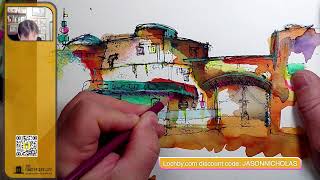
In this tutorial‑style video, artist Jason Nicholas continues his mixed‑media sketch of a Disney Galaxy’s Edge building. He explains his step‑by‑step workflow, beginning with a dried ink and watercolor base, then adding details using a Lamy pen for bold outlines and a Sharpie for lighter, textured lines. He demonstrates hatching to create shadows while preserving underlying watercolor, and uses stippling (described as “Morse code”) for texture. The artist discusses his color‑pencil layer—light aqua, chartreuse, neon pink, sunburst yellow, neon yellow, and a sky‑blue stripe—explaining each hue’s emotional purpose and the order of application (color pencils last because they cannot be overdrawn). He references the architectural inspiration from Disney’s Galaxy’s Edge, likening its design to a Tatooine‑style pueblo, and shares personal reflections on the building’s aesthetic. Throughout, he promotes the Lochbie Quattro pen case with a discount code, encourages viewer interaction, and concludes with a motivational call to use creativity for positivity. The video serves both as a practical demonstration of mixed‑media techniques and a personal narrative about artistic process and inspiration.
Chapters
Hello, happy Sunday. I'm wrapping up this sketch I started yesterday. I'm just coming back in with my Sharpie and Lamy pens and just throwing out some details on top of the colors, just add a little more character to the scene. I had to wait for the ink and the watercolor to dry before I could come back and start adding these details on here. So you might notice I'm interchanging between the Sharpie and Lamy. Uh, I'm using the Lamy where I want to get some really dark, bold lines. So the Lamy pen is good here for doing some outlines like I'm showing right now. And then I'm tending to use the Sharpie just for these smaller details. I want them to be a little bit lighter, and I like the way the Sharpie skips across the texture of the cold press watercolor paper. So that's kind of where my brain is at as I'm coming on here adding some details. Um, for shadows, I'm just hatching kind of these angled lines here, or hatch lines, just to create the idea that this is an overhang. And you'll see me add those hatch lines in other places. I'll do some under this bridge here. Right now. Just kind of pull this arch across there. Now underneath, it's fairly dark, so I'm going to use hatch lines. Let me zoom in so you can see it closer. I love the colors that are happening here. I don't want to totally, um, wash them out— or wash them out— or cover them up with like solid black. So that's why I like hatch lines. It keeps it loose and sketchy looking, but you can also see through, um, the lines. You can see the color underneath a little bit. And I'll just do it and you can kind of see what I'm talking about. So I just did it there so the spacing between the black angled lines allows you to see through to the color underneath, and I like that look. Um, yeah, you could totally take a Sharpie or black mark— black marker, or even have a watercolor stick and color that in all black if you wanted to. But just to keep my style going, I like that loose look of the hatch lines. And you could also— if I want to darken some of it a little more, I could just come back and add more lines on top of the original lines. So this is about layering. So we're layering. The first layer I threw down yesterday was kind of the outline of the buildings, really, really loose and rough. Then I came and added some ink and watercolor on top of that. And actually, I did— I used some other stuff as well. I was messing around with some oil pastels just for fun. Today's layer is adding the details with a Sharpie and a Lamy pen. And I will also be adding some color pencil. You can see I have some here. My Lochbie Quattro. Love this thing. Love putting pens and colored pencils in here. It's a great, great product. Um, yeah. So I love Lochbie. I also have a discount code if you go to lochbie.com Jason Nicholas, all caps, you get a 10% discount. I'll flash that up on the screen. Anyway, so let me grab some color pencils here. Let's throw some of that on. I like to do the color pencils towards the end because once the color pencil's down, I can't do any ink or watercolor on top of the colored pencil. I got 3 of my favorite colors. We have light aqua, chartreuse, and neon pink. So these will be popping on here. I'm also going to grab— I'm going to grab this color here, which I don't remember the name. I have to look it up. Sunburst Yellow. Sunburst Yellow, I think, would be cool on here as well. And maybe we'll pop in some neon yellow. I just love mixed media sketches. I think it adds another layer, another dimension, some more texture, and just more fun to play around with. Let's do it. Make sure you guys can see that on screen. I think you can see most of it. So this sketch is inspired by or inspired by one of the buildings at Disney's Galaxy's Edge. If you haven't been there, it's an amazing environment. The detail is incredible. If you're a Star Wars fan, you gotta check it out sometime. It's, it's astounding. I, I could spend hours and hours just looking around. And sketching. And I have, I have actually done not hours and hours and hours, but I've spent an hour or so sketching the architecture there. Really cool place. So I'm just popping down some colored pencil. I want to keep this really rough looking. I think the architecture of these buildings was inspired by the planet Tatooine. Or is it Tatooine? I'm not sure how to say it. I say Tatooine. Tatooine, which is the desert planet. So these, uh, these buildings almost have a pueblo kind of architectural style to them, which I find interesting. I'm loving this sunburst yellow on here. It's really fun color. I do want to leave a lot of white space on here just to leave some breathing room between all the colors happening. So we'll have that. We'll keep the breathing room on there. Add some light aqua. Light aqua is my absolute favorite, number one favorite color for color pencil. Love it, love it. I love the Prismacolor Premier color pencils. I love the way they just go down on the paper. It's— they kind of almost melt, quote unquote, they melt onto the page. It's so smooth, they just glide on there. So Prismacolor, if you're out there, thank you for making these cool pencils. You can see right here how it just popped out, especially against the darkness underneath. I'm going to add some more. I'm going to tie that in. Maybe we'll do like a little band on the arch. These are not the actual colors you'll see if you go there and look at these buildings. They're really more white beige color. This is just my take on my vibe, what I feel. It's looking kind of cool. Let's see, uh, one of my signature, signature colors I love throwing down on a lot of my sketches is neon pink. I don't remember how it started, but I just love throwing some pops of this pink on here. It— for me, it adds a sense of whimsy, just playfulness. And I don't do it so it's overwhelming. I just kind of will pop it down in usually 3 places. So let's kind of put one there. Let's Pop this little panel thing out here, and then let's just do, uh, maybe in here. Let's see, I think somewhere up in here we'll just kind of throw some on. And I think that's all we'll do with the pink, just a few places. Let's up a little bit. There we go. Chartreuse. Um, actually, let's do some chartreuse. I'm not sure where should we do it. This is a color that I never really started using until a couple years ago, and I honestly can tell you I didn't know what color it was, but I love it. It's, it's a greenish color. I've come to really, really like this color. I'm just popping it in a few places. This is neon yellow. It's like using a highlighter. I also use highlighters as well. Go with the neon color pencil. I like the yellow, ah, the pops of yellow add that— talk about freshness or brightness. I'll do that with lemon yellow watercolor paint. I also like to pop that freshness out with, uh, the neon yellow color pencil. So it's getting close, I think. I do want to try to figure out what to do with the base to anchor the building a little bit more, so I got to figure out what to do there. And there's kind of a blue stripe. Let's see what color I'm going to use for that. I have a light— what color is this? It's a sky blue light. I'm going to use that for this band that goes across there, but I need to sharpen it. So that's that light blue kind of stripe that goes across the building. Um, you have some doors back here. I think I'm just going to hatch them, throw some hatch lines on this. I'm going to give an edge to this building. I don't want to be really highly defined, so I'm just kind of stippling or Morse code lines. Dash, dot. You'll see me down here, I'll do it. Just to create a kind of a softer edge. You, you don't always need solid lines. You can kind of stipple them, or I like to call it Morse code, right? Dash Dosh, I'm sorry, dash dot dash dot, or dosh, however you want to say it. All right, cool. And let's add a little bit of texture, a little bit of grit on here. We'll throw some stipples. Stippling is just dotting this. It's going to add some texture to this facade. So I'm randomly just adding this stippling here. Creates a stucco kind of texture. You know, if these were built— if these buildings were created out of sand mud, you know, we might have some of these kind of stipples going on here to show that grip. Stippling can be very meditative. I remember I had a teacher, a substitute teacher, back when I was in middle school. Um, this guy was an incredible artist, and he would do portraits, if I remember, just by stippling. Everything on his drawings were dots. That was so cool to see. But idea here is just throw them on randomly. You don't want to really— I don't want to create like a uniform pattern anywhere. I think it's looking good. I feel like it needs just a little bit of— I think I need either, um, a dark blue or a purple on here somewhere. Let's see, what do I want to do? Excuse me, this isn't purple, it's Process Red, another color I like. It's called Process Red, so You have these sort of recessed panels on that bridge. Just want to pull those out a little bit. And I'm just— so I'm going to darken this back here a little bit, lightly. Dragging my Sharpie across the paper. All right, I think I'm liking this where it is. Yeah, I think this one's done. So I hope you enjoyed this. Let me know if you have any questions or comments as you're watching the replay. Um, watching this on YouTube, I'd love for you to like and subscribe if you enjoyed this, uh, sketch. This is part 2. I posted part 1 this morning or last night, I don't remember. This will be part 2. Um, thank you guys so much. Keep using your creativity for positivity. And yeah, you too can sketch architecture one line at a time. This is Jason Nicholas Nicholas of the Inkspired Life, and I'll see you real soon. Enjoy the rest of your day. Take care.