Sketching Ink-spired by Lady Liberty and Monmouth University
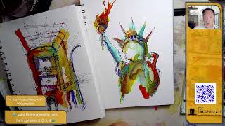
In this hour‑long YouTube livestream, architect‑teacher and urban sketcher Jason Nicholas (the Inkspired Life) shares a loose, fast‑paced tour of sketches he made during a recent Disney vacation, demonstrates live sketching of a Statue of Liberty study and an interior view of a Monmouth University building, and discusses his creative workflow, materials, and mindset. He showcases his Lockbie field journal, Pilot Metropolitan pen, Sharpie, a range of inks (Inferno Orange, Clementine, Apple Snail), watercolor pencils, and Fabriano watercolor paper, explaining how he uses a "grab‑and‑go" approach, dilutes ink with water, and layers media for texture. Throughout the stream he interacts with viewers, answers questions about tools, promotes an upcoming July 20 workshop on sketching "wonky" fishing shacks, and reflects on the purpose of art – aiming to create a positive ripple effect for his high‑school students and the broader creative community. He also shares personal inspirations (Disney Imagineering, Jim Henson, Bob Ross), offers self‑awareness advice about presenting unfinished work without apologizing, and highlights the emotional and sensory experience of Disney (sound, smell, storytelling). The session ends with a wrap‑up, gratitude to the audience, and reminders to follow his social links and workshop sign‑up.
Chapters
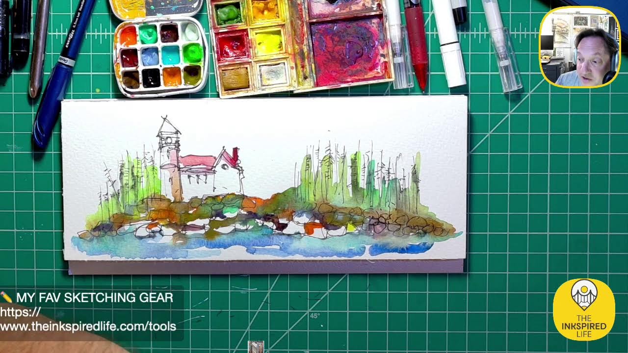
Hello, happy Wednesday. I almost said Saturday. Yeah, happy Wednesday, July 3rd. Hope you're having a great day. Thanks for tuning in and watching and joining along. I'm gonna be all over the place, I think, for the next hour or so. Got a lot of things in my brain. It's been a while since I've been here live. So, um, yeah, let's just kind of start with what we're looking at here on screen. So this was a sketch I did, um, about 2 weeks ago, inspired by the castle at Disney's Magic Kingdom, Cinderella's Castle. It's not the colors of the castle that are there, but these are just the colors I was feeling kind of when I did this quick loose sketch of it. So I'm gonna— I'm gonna go through some sketches I did while I was away, and then we'll do some sketching tonight. I have a couple of different ideas or things I'd like to sketch. So, uh, yeah, make yourself comfortable. Grab a pen, pencil, paper if you want to follow along or doodle along or just chill out. That would be so, so cool. If you don't know me, my name is Jason Nicholas here with the Inkspired Life. Um, I am a passionate architectural sketcher and urban sketcher, architect by trade, and a high school teacher. I teach architecture, so What I'm talking about here is stuff I just love doing. I love capturing buildings and locations and places for a lot of different reasons, and we'll be talking about some of those maybe tonight as we kind of go along on our short journey. Uh, let's see, let's put some music on here. We'll just play some in the background. And there you go. All right. So let me take out my sketching journals, the journal that I brought with me. Um, this past week I was actually in Disney with a family, with a family on a trip. It was awesome, loved it, loved it. Um, brought my Lockbie field journal. I talk about this thing all the time. Um, I practice what I preach, and I'll show you guys just some sketches I did while I was away. Um, so these sketches are meant to be quick, loose, fast, fun, and just trying to capture an idea of the places I was at. So we'll just do a quick little sketch journal visitation, then I'm going to jump in and we'll do some sketching tonight. Let me zoom in. Um, one of the cool things about this journal, you can see it's well loved and well used. I actually used it to carry along some colored pencils Course, I have a Sharpie in there. I had some other pens. I think I lost a pencil while I was there. So someone in Disney now owns a Sunburst Yellow colored pencil. So if you're watching, enjoy and get something cool with it. Couple of pens back here. This is my— the Pilot Metropolitan pen, which I'm starting to use more and more. I really like it. And the Sharpie. All right, let's take a quick little sketchbook tour. Hope you guys are doing well out there. I do see Becky in the house. Becky, great to see you. Nifty Castle. Hey, thank you, Becky. So this is from, uh, before I went away. I did this sketch. What I liked about this, I like the blocks of color, and I also like that there's very, very little detail. I think it's really cool. And I was trying to pop this kind of tower out in front so it's a little bolder in the outlines. So awesome, Becky's in the house and Michael over on YouTube. Hey Michael, great to see you, hope all's well. All right, let me know guys, let me know if you can hear me okay. Is the music okay? Is it too loud? Do you want it on or off? Does it not matter? Um, all right, so here's a— here's some sketches I did while I was away. Uh, this was— always have to do an airport sketch. So this was a bagel place in the airport terminal A, and I called it Holy Bagel or Holy Gate 23, sorry. And a holy because of the bagels. But quick, quick kind of loose sketch there. Um, that's a Sharpie sketch. This is part of the Disney Contemporary. So my per— my goal was to capture just some vignettes or small scenes of some of the places I was at. Um, this is, this is a building located along the Boardwalk Inn Resort at Disney. Um, I really like this building. I like the kind of sign at the top. Pretty cool. You're going to see a lot of sketches of this building. This is, um, the Walt Disney World Dolphin Resort. There's also the Swan Resort. They're across from each other. I can do an hour, 2 hours, 3 hours, 4 hours just about this— these two buildings by one of my most favorite architects ever, Michael Graves. And I will put together actually a show we'll dedicate to that because I have a lot of photographs I can show you guys as well. So if you're interested, let me know in the comments. Say yes dolphin or yes swan, and I'll do a separate kind of livestream and we'll talk just about that building and those buildings, and I'll show you some pictures. This is a detail, kind of a— this is a seashell fountain actually on top of part of the building. And these are just small sections of the building. This was the entry of the Dolphin. An amazing fountain here. You got these kind of cartoonish dolphins as well, and this triangle in the back. The building is meant to represent a mountain rising out of the Everglades. Interesting concept. This was a real— oh, this is a super quick sketch, um, part of the front of the Boardwalk Inn. I would love to be playing Disney music now, but it's copyrighted, so I can only use the music I've paid for to play. Um, this is— where is this? This is the entrance to Epcot. Epcot is an amazing place. Um, this is the entrance near France, the France Pavilion. Cool bridge. I had to sketch a couple bridges. I love bridges. I love their beauty, um, the structure of them. I love what they represent, right? Bridges can mean connections, um, crossing, a lot of different things. This I was trying to capture. I was trying to do really minimalistic type sketching on this, so I think I captured some people, a little bit of the ironwork on the bridge here. I actually like that one. Another view. This is actually a building of, um, the Moroccan— the Morocco section of Epcot Pavilion. Morocco Pavilion. This is, um, inside the Morocco Pavilion. If you ever go to Epcot, walk around Morocco. It is beautiful inside there. I had no idea I took a lot of pictures. I didn't do many sketches, but this was a real quick vignette inside the Moroccan Pavilion. Beautiful courtyard spaces. Um, I didn't capture it really well here, but there's a— I think it's a bougainvillea. Bougainvillea. Bougainvillea. Who are my plant people out there? Bougainvillea. I'm not sure how to say it. Uh, vine climbing up the side of the building. Um, I'll show you guys pictures of that on a different stream. Here's Epcot as well. I was fascinated by the geometry, the modern part of Epcot. This was actually a restroom back here. I like the geometry here, so here I was just going for geometry. Hey, Karen's in the house! Karen, great to see you, hope all's well. This is part of the entry lobby of the Dolphin Hotel or Resort. Barrel ceiling. And this is actually— there's a sketch I'm going to do later based on a photograph from Monmouth University that one of my friends said I could use her, her picture as a reference. So we'll be sketching that a little bit later. I mentioned that because they're both very kind of has some classical elements inside of the architecture. Quick sketch inside the Swan. There's a little fountain inside and a little vaulted space. Here's a little vignette of the exterior of the Dolphin. So my brain is all over the place, and how did I decide what to sketch when I was there? Um, I just kind of carried this around with me and I took it out when I had time or I made some time, and I just grabbed little things that really caught my interest. I was kind of looking at geometry a lot and shapes on this trip. This is part of the, um, Galaxy's Edge at Hollywood Studios, and I've done some sketches of this, uh, park— part of Hollywood Studios before. I just like the geometry, the arches, the curves, the circles. Let's see, um, here this is from Hollywood Studios, also part of the, the Chinese theater they have there. I really like— and someone commented on this, um— the simplicity of this sketch and the pop of red. I think makes it really fun sketch. This was, um, sketched on location. It was raining, so we were sitting under an umbrella. I did add the color later, but the ink— most of the ink was done on location, as most of these sketches are. They were mostly done on location. This is the Hollywood Tower, um, at the Tower of Terror ride, Hollywood Studios. I really like the way this came out too. All right, we have a couple more, then we'll, uh, do some sketching. Let me know if you have questions, comments. Where are you watching from? What are you working on? What is going on in your neck of the woods? So here's a— this is on watercolor paper. This is part of the— there's a court, there are a couple courtyards inside the Swan Resort. This is a small pavilion inside the um, Swan Resort. So I just added some color on here, couple of lines. Really cool. The Chinese Theater is my fave. Hey, that's cool, Michael. I'm glad you like that. Here's some more of Galaxy's Edge. This is a Disney Springs. If you don't know what Disney Springs is, it's a let's just call it a huge outdoor mall. It's like a huge outdoor strip mall, but it's, it's beautiful. It's not like a New Jersey strip mall. It's really incredible. Um, this was just part of one of the buildings I sketched. This was arts and crafts style here. I think the store here was Unique Glow. Unique Glow, am I saying it right? It's a cool store. Uh, Starbucks. I started to sketch a Starbucks when I sat down. It was hot, the heat, it was really, really hot. The humidity was killer, so there was a lot of sitting on this trip, but I loved, I loved every second of it. Hanging out with my peeps was so cool. So that is a part of a Starbucks, kind of a modern looking Starbucks. And then we have more from the Dolphin Hotel. Uh, this— if you caught my YouTube livestream where I was sketching and it was pouring and thundering out, I was standing under the roof of a courtyard area and I got wet. You could sell my— you can see my paper got wet also. But this is the sketch of what it ended up being. This was sketched with the Metropolitan pen. So Metropolitan pen, the ink in here is, is not waterproof, so you could see it was bleeding from the raindrops. Lots of times I will start with a Sharpie first in case I want to come back and add color. This is a Sharpie here, but in this case I was, um, the paper was damp and the Sharpie wasn't really working, so I switched to the Pilot Metropolitan pen. Sharpies do not like to write on damp paper. Uh, here's one of the hallways inside the Dolphin— Swan— nope, this is the Swan Hotel. A little perspective. I wanted to play around with perspective on this, and you'll see the next sketch is also based in that same area. I threw on some color here, kind of a curved section of the This is a really long corridor. I like the looseness of this and the bold lines, and I tried to capture kind of the curved feeling of that hallway area. So again, I'll be doing a separate live stream where I just kind of focus on the Dolphin and Swan Resorts. I'll show you photographs I took. We'll look at these sketches again. When we'll do a sketch together live as well. Um, these are based on— so in the Swan Hotel, I stumbled upon a little kind of entry vestibule that went to some meeting rooms, and in this vestibule were 4— I don't know how big they are, 8 by 8 feet maybe— paintings. I don't know if they were paintings or um, applications, but they were done by or inspired by Michael Graves, the architect of the building. This is just a really small piece of it. I did post pictures. If you look on my Instagram and Facebook and YouTube, I think you'll see some pictures of that space. But I was just kind of looking at his artwork and just doing sketches based off of it. And then here's a round area with kind of piano I didn't finish. So that is a quick sketchbook tour of some of the sketches I did while I was away. Hope you enjoyed that. Let me know if you have any questions or comments. Hey, Chip's in the house! Chip, great to see you. Karen says we are having 103°F weather this week. Oh, Karen, keep cool, please. Keep cool. Yeah, the humidity in Orlando last week was outrageous. It was— I couldn't handle it. I had to sit down a lot. Um, I did go to school in Miami for 5 years, you know, to college, so I did experience the humidity back then. But wow, yeah, it was crazy. So stay cool. All right, let's do, uh, let's do some sketching, guys. So a couple things. Fourth of July is tomorrow. I thought maybe we would do a Lady Liberty inspired sketch. I love the Statue of Liberty. I've sketched it a few times. Um, so let's do a Lady Liberty inspired sketch. We'll do a quick kind of loose and fun, and I'm gonna grab a drink of water, so give me a sec. Becky would love to go to Galaxy's Edge. Yeah, Becky, Galaxy's Edge is incredible. And let's— I'm gonna do a little side, um, a sidestep. That's— is that dancing? A little sidetracking maybe? I don't know what the expression is, but let me pull out a quick book here. Let me show you something. Hopefully it's in here. Yeah, it is. Um, Galaxy's Edge is located in Disney's Hollywood Studios. I think there's also one in California. The one I went to was in Orlando. Um, I have a whole book here. I'll show you some images, um, that I got a couple years ago on Galaxy's Edge. If you like Star Wars, it's an incredible place. The atmosphere you feel like you're in Star Wars. They do shows, um, Kylo Ren's there running around, and we had Rey, and you see Chewbacca. Um, the sounds— what I love about Disney is their storytelling is not just visual, it goes beyond that. It, it goes to the characters, it goes to the sounds you hear that they're pumping everywhere you go. You could hear, you know, TIE fighters zipping by and spaceships zipping by and lightsabers going on. And so they pipe a lot of sound in there to go with the story. Um, also smells. Disney, it has— it's really interesting. This time I really never noticed it, but Disney will use different smells in different locations. I really noticed it at the resorts So if you go to the Polynesian Resort, it smells very different than the Boardwalk Inn Resort. So the Polynesian has almost a— I'm going to say it's almost like a sun, uh, suntan lotion kind of smell. It's— I love the smell. The Boardwalk Inn is different. I don't know how to explain it. Boardwalk Inn almost smells like laundry fabric sheets. Not in a bad way, I love that smell. Anyway, so Disney's really, you know, the king, the king company. They're awesome at storytelling. Here are just some images or concept sketches that were done for Galaxy's Edge. I love the artwork here, you know, everything from environments like this to— if you look below, there's some really kind of quick sketches. So my dream career that I did not pursue was Disney Imagineering. I would love to have been a Disney Imagineer and helped to design and develop, um, these theme parks. Here's some really cool sketches. Like, I could sit and look at this book for hours and hours. There you go. I'm hoping my stream is still going because I think my internet's wonky, but here are just some other images. So Becky, um, this actually— so these concept images are really what the place feels like. So those are, those are just some images from Galaxy's Edge. Very, very cool book. All right, let's do some sketching. We're going to start with Statue of Liberty, and then we're going to end tonight with a, um, a building that's located, I think, at Monmouth University here in New Jersey. Wicked cool book. Yeah, it is really cool. Statue of Liberty. A couple examples here. Let me pull this out, actually. I have this sketch convenient. I don't know. Oh, I gave my other one away. Yeah, so here's a Statue of Liberty sketch. Notice I did the back on this one. That way I didn't have to show the face. Little, little trick there. And then I had another one with the, um, torch being held up that I gave away to someone that really liked it and someone I feel like really deserved it. So yeah, let's just sketch something now. I keep zooming in and out, but we'll see what happens. This is a hard one to sketch, guys. That Statue of Liberty is not easy. I am looking at a reference picture. I think we're going to keep this one. We'll see how it goes. I think we're going to throw some ink down on this one. One of the things I've noticed I've been doing more when I'm sketching— I especially noticed this at Disney— is that when I'm looking at a building, um, and I'm sketching, I'm tending to look a lot more at the actual building than the piece of paper. When I'm sketching. I don't know if that makes sense. I'm actually— I'm finding myself doing that a little bit here with the Statue of Liberty. And one of the things I like about that is it's making my sketching looser, I think, by not focusing on the paper so much. Um, it's, it's interesting. It's an interesting feeling. I sometimes, um, you just got to let go and let it happen. So if you want to sketch loose, that might be a good tip. Just try looking at your subject more than the actual paper. You know, this is, this is a hard, um, sketch. The proportions and everything. I know the head's going to come out wonky, but that's okay. Again, I'm just doing it loose and fast. I posted today on my Instagram and Facebook, all my socials, I posted a picture of an acrylic painting I did of the Statue of Liberty, kind of abstract. I really like the way that one came out. And I have to sneeze, so excuse me. Excuse me. Um, I see Dawn's in the house. Holy moly, Dawn, it's been so long! How are you? Wow, Dawn, I hope all's good. Yeah, we miss you, Dawn. It was, uh, Dawn is one of the original Inklings from way back. How many years ago was that, guys? Have I been doing this 3 years? 4. I don't even remember, it's been a while. Yeah, you could tell my head— this is way off in here, so the proportions are really wonky. It's almost like the Miss Piggy version of the Statue of Liberty. If you guys at Disney— they have, um, Hollywood Studios, they have a Muppet 3D Movie, and I remember one of the scenes Miss Piggy is dressed like the Statue of Liberty. Ah, got some kind of curves or arches going on there, and the man is holding off on any of the face stuff right now. See, I can kind of maybe pull this back, peel it back in here a little bit. Alright, let's throw some color on this and just have fun with it. What do I want to do? I'm gonna put down some watercolor. And I'm just going to use some turquoise. You know, I like turquoise. The Statue of Liberty has that patina kind of going on to it. I should do this. I think I'm blocking. There we go. Let me tilt this up a little bit here. Let's do that. And I'm going to grab some orange. So this is my own take on the colors right now. I'm not looking at any pictures. But I do have this really cool ink. This is awesome. This is Inferno Orange. It has gold, like gold flecks in it. I don't know if it's real gold, it's probably not, but it has some kind of gold flecks in here. We'll just kind of throw it here. I'm actually being too tight right now, so I'm thinking too much. I just want to let it go and be playful. So another way I like to stay loose really is not to think too much, just kind of put things down. But this Inferno color is really cool. I gotta change the tunes up, guys. I, I want some high-energy music. Um. Let's see, what do I have here on my— so I use a service called Epidemic Sound that I pay to use their music so I'm not copyright, copyrighted anywhere. Let's put this on, just a little more peppier. So I did take this, this palette with me on my trip. Got some good use out of it. I would like to have done more sketching when I was away, um, and that's on me because I didn't get up earlier. I meant to get up earlier. Some days, but I kind of slept in a couple days. But I'm sure I'll be going back again sometime. So I kind of like the way this ink is running down here. I'm going to move it around a little bit, just turning the paper. We're going to do a kind of blow it up there a little bit. There we go. Just kind of randomize it at the top. And I may let this dry and come back to it in a little bit. Let me just throw down a little more deeper turquoise here. So that's kind of a really quick take. I'll come back, we'll add more to it. Let me read the comments, see what's going on. Dawn, we miss you too. Dawn says, miss, miss my Inkling friends. Yeah, it's so great to see you. Chip says, if you enjoyed Imagineers, you might like to watch Jim Henson's Story. Yes, The Jim Henson Story on Disney Plus. Awesome, awesome stuff. Really, really well done. The style it was done in was just— it's fun. It's a fun, imaginative Jim Henson style, the way the documentary is done. If you haven't seen it and you watch it, you'll know what I mean. Or if you have seen it you'll know what I mean too. Um, really, really cool stuff. I know there's a workshop back in May of 2021. Wow, so I guess that's when I maybe started live streaming, was probably— may have been 2021 or 2020, somewhere in there. Cool. I want to blot this. I want to blot this area out a little bit here. Don't be afraid to blot out some of your watercolor ink if you want to pull things back a little. See, I like that better. It was too dark. We'll zoom in. I don't know if you can see the gold flecks in that Orange Inferno or Inferno Orange color. Uh, after it dries, you'll be able to see it better. But cool. But what I like about this, you know, you could tell— I think you can tell it's a Statue of Liberty. Um, I'll come back and add more to it. I have to remove this one because I just got paint on it. Oops. All right, let's put this to the side. Yeah, Disney Plus. Yeah, good recommendation, Chip. I'm assuming that you watched it. Um, really, really good show. He— I do have Jim Henson in studio with me. He's right here. All right, we have a couple of my, uh creative— let me grab these guys here. All right, a couple of my creative and just personal mentors of mine. So we'll start with Mr. Henson here. Ta-da! Got Mr. Henson and Kermit, of course, hanging out in the studio. Then of course we have another personal inspo right here, Mr. Bob Ross. I believe there was a Bob Ross documentary on Netflix, um, very sad documentary, and how he was really taken advantage of. Um, very interesting story, so I'm not gonna get into it, but Bob Ross. And then another personal mentor and childhood hero right here, won't you be my neighbor? You guys are all my creative neighbors tonight. I appreciate you all so, so much. So these guys are always hanging out in my studio watching me and encouraging me. Told you I'd be all over the place tonight. All right, we're going to let this one dry. We're going to switch gears a little bit. Let me see if I can find this photo. Let me know if you have any questions or comments. I think when this dries a little bit, we're going to come back in and we're going to play around with some of these color these watercolor pencils. I am loving these watercolor pencils the more I use them. They're really cool.
I actually—
you know what, I'm not gonna wait. We're gonna stick on this one here. So this is how my brain works. I jump all over the place. It's the creative mind going. Um, let's break out some of these watercolor pencils. I'm thinking too much, but that's okay. Actually, I want to bring out some of this purple. A couple of ways I like to use these, uh, my favorite ways to— I literally just dip this in water and I kind of— I'll sketch paint with it. Sketch paint. You can use them dry on the paper, you can throw the color on the paper first and then come back with water on top of it, um, but I like this method the best for me. So let's just throw some of this on. When I dip it in the water, it just kind of melts the tip and it comes out really powerfully strong on here, and I like that. So I guess it depends on the look you want. So you can see I just dipped in water, it's dissolving. I also like to use it dry. I like the textures here as it picks up the paper. Maybe I'll help create some kind of shadows under here where the robe is, just to give some more character to that robe area. This is fun music. Yeah, this is drying and I could see, I could see it sparkling here. Mixed media sketching is a real favorite thing of mine. So, um, ink, watercolor, color pencils. Now I'm using watercolor pencils more. Um, I just like all the different textures and effects you can get with these, and the layers are really cool and fun. Look how this is drying. This is really awesome. These colors right here, check out how beautiful that is. I see Linda H over on YouTube. Hey Linda H, great to see you. Michael says the good choice of colors, the orange really represents the copper of the statue substance. Hey, thank you so much, Michael, I appreciate that. Linda has 3 pins from the Henson Museum in Georgia. Oh, that is so cool! Where is it? In New York City. Oh my gosh, I think it's the Museum of the Moving Image. Has permanent Jim Henson exhibit there. I have not been to it yet.
I definitely need to get there.
All those people have invested in others at a very high level and still going. Yeah, right? Jim Henson. Um, Chip, that's— I'm glad you said that. So There's been a thought. We're jumping off a little bit here. Feel like if you need to reel me back in, let me know in the comments. I've been thinking lately. It's interesting music to go with my thoughts here, but we'll go with it. I wanna make an impact, a positive impact, right? I'm trying to think of the way that I can have the greatest impact, or the greatest impact on the greatest number of people, by doing the simplest thing. I don't know if that makes sense. I've been kind of thinking in my brain, like, almost like a domino effect, right? Start here, you hit the domino, it knocks over all the other dominoes, or they're a ripple. Like, I just want to somehow create a legacy of— I'm not talking about fame or being a superstar or anything like that. Kind of like I'm doing— I feel like I'm doing in high school a little bit, is I feel like I'm having a positive impact on some of the students, and I just want that ripple to keep going. So, you know, if I could touch, you know, touch one student's soul or heart or inspire them somehow, one or two a year, that would be huge. I think that's a way— kind of thinking back to Jim Henson, right, or Bob Ross or Fred Rogers— how they were able to impact so many people kind of just really by being themselves. Really interesting thought. All right, I know it's way off topic, but hey, Welcome to the Inkspired Life. It's not always just sketching and colors and shapes and geometry. Sometimes we got to talk about mindset, right? Creative mindset, creative growth, stuff like that. All right, I'm back. He's back. Mixed media is very freeing. Yes, it is. Um, it is very, very freeing. That's— I like to call it grab-and-go design. Let me see if I can show you guys what is here on my desk. I'm going to zoom out a little bit. I just grab and go. I got my watercolors, I have pencils there. If I swing back, you can see I have a bunch of things there, markers and stuff. So for me, grabbing and going is important if I want to be loose and creative and not think about what to use next. So That is also another way to be very loose and free, is not to spend so much time thinking about what you're going to use. Um, I try to set up and grab and go. Very cool. All right, let's keep working this a little bit more. I'm having fun with this one. Let's grab a— let's throw some yellow. I want a pop of freshness or brightness. I'll either use like lemon yellow watercolor Or I'm going to use this yellow watercolor stick. I know this tune. I think it's— I think it's some Pirates thing it's called. Let's throw some yellow in the flame, maybe up here. I don't know how well it's going to show, but we'll try it. If that doesn't show, I'll come back with probably a neon yellow, um, regular color pencil and add some yellow into that flame after this dries. Definitely have some interesting music going on tonight, guys. Hope you like it. I have not used this color yet. It's called Fired Brick. First time for everything, right? Let's do it. Yep, got some red on here now. Alright, cool. I really like the way this piece is coming out. We'll, we'll finagle and play around with this head area at some point. Michael says, uh, maybe sometime you could share your whole setup, how you record, how you get your little scannable bar. That would be inspiring. Hey Michael, I will— we'll do that sometime. Well, we'll do a kind of a tech, tech episode. Hope you guys are enjoying this Statue of Liberty inspired sketch here. Actually, I'm going to blot some of this back right here. There we go.
All right, cool, cool.
I'm liking it. Hey Karen, thank you for, um, sending stars over there on Facebook. I appreciate that. I really appreciate it. Thank you so, so much. To Be Better Human. I love this. They certainly did. Yeah, right, Chip? All right, guys, let's put this aside. We're going to switch gears. We're going to switch gears. There's a building. I just want to try sketching this here. Let's, let's just— I have a different book I can grab. Yeah, let's do it in here. I could tear the page out of here, but I don't want to mess anything up, so I'm going to let this dry. We're going to put it to the side. I'll show you guys how it dries, so I'll probably be on till 10:30-ish. All right, so I'm using 1264 Fabriano watercolor Uh, it's made in Italy, so I guess in Italy, Italian, you would say Aquarelle. Aquarella. Aquarella. Aquarella. Um, very cool. I love this paper. This is 7 inches by 10 inches. I also have a 4 by 8 here, which is another great size as well. Um, this I like. I took a bunch of sheets of 4 by 8 with me. On my trip. They fit really, really nice, and it's right in here. I'll show you. Ta-da! You can see them. So the 4x8 sheets fit really nice inside, um, the Lockbie Field Journal. All right, cool. Let me see. I will put it— I'll put the image on screen of what I'm going to be sketching. And we got our Sharpie here. I have my Pilot Precise. We also have a Lamy here. You guys can probably guess which pen marker, which one I will be starting with first. And let me find that image and I'll pull it on screen, so just give me a sec. Hey, D-Ray's in the house! D-Ray, great to see you. Hmm, I thought I added it to my photos. Let me click here. You guys are awesome, I appreciate y'all. Thank you so much for watching and sticking around, asking questions, commenting. Loving on each other. This is so cool. This is what it's about. Using your creativity for positivity gets my juices going. Thank you so much. Um, I'm looking for the photograph. Michael Nicholas says, hey Jason, how do I buy you a coffee on YouTube? Oh, that is so cool. So That's a great question. Uh, if you go to where it says more on my YouTube page, I actually have a link I could post for buymeacoffee.com. I don't know if that helps. Um, I have this link here. Thank you for asking. I'll post it. So if you go to buymeacoffee.com/inkspiredlife, you could do it there. On YouTube, I don't think I have it where I can earn income yet, so I don't think I have enough subscribers for what you might want to do. I may have a PayPal link in my YouTube description. So I'm not on the page now, but I can take a look. Thank you for asking and offering. That's really, really kind of you to do that. I— that means a lot. So let's give a thumbs up out there to Karen, who sent some stars, and Michael, who's gonna— who said send it. Thank you guys so much. I, I do really appreciate it. It helps me just buy more ink and paper, so it's all good. So there you go. Anybody's interested, I'll just leave it to the side. Um, underneath this you will actually see another link to a workshop I'm having on July 20th. Where we're going to be sketching wonky fishing shacks. So I'm just going to do a quick little plug here for it because I would love to get more people to sign up. I have a couple right now. We're going to be sketching fishy wonky fishing shacks. Here's some— here's some study examples I did. Here's an example. We'll do some black and white sketching. And any of these are actually available for purchase as well. If anybody's interested, let me know. Um, I just mailed one out today. I'm more than happy to send one of these original sketches out. Here we just added some ink in the background for the sky. So these are just ideas or examples of things we might No, we'll be, uh, sketching things like this in the workshop on July 20th. It's on Zoom. It'll be a Zoom meeting from 8 o'clock to 10 o'clock PM. Um, there is a fee, so if you want to check that out, visit the link, uh, over there for more information. I really love this one. This is fun. The colors are really whimsical. So that's just some, uh, some examples. Sorry, just want to do a quick little plug there because the 20th is coming up before we know it. I'd love to have you guys there sketching with us. It's always a positive environment, a lot of feedback, a lot of camaraderie. Is that the word, camaraderie? And, uh, it's— they're usually fun, and somehow we always end up talking about food. Yes, I said food. All right, I'm looking for that picture. I got totally off topic. I'm back. Don't hide who you are, guys. I'm just going into my texts here where I know I have the picture. Okay, here, let me see. Let me, let me download it. Let me see if it's in my library. Thanks for your patience. I do have something else I kind of wanted to talk about that ran across my brain today. Um, I notice— if I can't pull up the image here, guys, I'll have to— I could post it later, um, that reference image. I think I'm gonna have to do that because I can't find it in my photo— photos. Anyway, um, something I noticed occurred to me today on like Instagram posts with artists posting things. I'm gonna put on some more music here. Let's just put on this. Is I notice a— and I do this too, I'm guilty of it— I'll put things down like, here's a very quick sketch of the Brooklyn Bridge, or, um, or I'll apologize like, oh, this doesn't really look great, this is 'Uh, this is the Eiffel Tower, sorry it doesn't look great.' I feel like we shouldn't have to apologize for the art we're showing. Like, let other people— if they want to think it's bad, let them think it's bad. But if you're gonna post it, just put it out there. Um, I guess put it out there without any qualifiers, like this is done really quick, so it's not that great. It's kind of already putting in the viewer's mind like, oh, why do I want to look at this? The artist doesn't even really like it. And I've noticed I've done that in the past as well. So something is just kind of being more self-aware about. Sometimes, yeah, there are quick sketches, but I'm not going to say it's a quick sketch and it really looks horrible. And, oh, this isn't what I meant it to be, unless you're going to put it out there as a learning lesson, maybe. So just kind of think about the language you're using or the words you're using when you're posting your art and people are looking at it, whether it's written or even verbally, right? So, uh, just something that's in my brain, want to put that out there. All right, we're going to sketch this. This next sketch is an interior perspective. Let me see if I can drag it on. Is it gonna work? Come on, show it. Hey, there it is. It worked. Ta-da! Really cool interior. This is a photograph, I believe it's at Monmouth University in New Jersey. Um, my friend, um, Chiara took it and sent it to me. She said I could use it, so thank you so much for letting me use this to sketch tonight. We're gonna do just a really quick interpretation of this just for fun. Haven't drawn it yet. I just did it really quick, but it's gonna be quick. I didn't say bad. We're gonna do, uh, just to draw my take on it, and we'll just sketch this for fun. Let's do it. See, I caught myself. Self-awareness is— when you can become self-aware and know what you're saying and stop yourself, that's good. That's a good thing. All right, yeah, I love motivational and self, personal development and self-growth, personal growth stuff. That stuff fires me up. I'm all over the place, guys. All right, got my Sharpie. Let's just sketch this bad boy. Here's what it's looking like. I'm actually gonna look at a bigger image because I cannot see the one that you guys see. So, really small. I see it bigger. So it's an interior perspective. It's really cool. The roof on here is amazing. It looks like stained glass. Awesome, awesome. Here's how I'm going to start with this. Um, I'm looking at the angles of the top of the roof and how they're kind of coming down, right? So perspective, sometimes I'll start with the back. So let's just kind of sketch this back here a little bit. Talking about the back wall that's happening. I didn't draw my frame like I usually do. That's okay. There's several ways we can do this. Kind of have that. I'm gonna keep quiet and sketch, I think.
If that's possible.
I think my students are right. I talk too much. I think I hear thunder outside. I'm not sure what this building is, what, what its function is. Definitely will look it up. It's a— it's very beautiful. I love these archways that are happening here on the sides. The first time I sketch a building or a space, um, I usually just kind of sketching it for feel, just to get— make a hand eye-brain connection. And my hand, I'm just kind of traveling around, and what's popping out to me kind of in the moment is what I'm sketching. Alright, cool. Let's, uh, throw down some color on this now as well. I'm gonna grab some Apple Snail ink. So I'm going to dip into some Apple Snail ink. I want to put my paper at an angle because I like using this watercolor palette here. There we go. And I am not adding color to match the picture. I'm actually going to turn the picture off, guys. I'm just now throwing color down because what I, what I feel like I want to color here. And some of you guys are really awesome at doing detailed paintings, detailed drawings, detailed sketches of architecture and capturing everything precisely. Or not even just architecture, people, animals. And you're— you do realism, which is fantastic. I don't have the patience for realism. I'm just trying to capture kind of a feeling. Again, I'm just grabbing and going. I have an ink here called Clementine, so let's use some Clementine. I'm guessing it's orangey like Clementine. Oh wow, this actually looks a lot like the Inferno Orange color. Wow. They could be related. Dang, I had no idea. Now we know. That was interesting. Let's kind of move that. We'll hold it like this.
There we go.
It's almost time to replace the turquoise. It's getting low in here. You know, I feel like doing a little bit of splatter on here. Splatter some, um, pink, pink, pink. Where See, I'm grabbing— grab and go. I don't have my pink out, but I did see earlier, so I got it. Hopefully there's ink in here. I don't know, let's see. There is some. Purple. Let's see, let's go back to the watercolor stick. I want to throw some purple on here. Alright, so there you go. Um, that was fun throwing down some colors. I'll zoom in so you can see it a little bit closer. We'll check in with the comments. Let's see how it goes. Pretty cool. That was fun, quick and loose. Um, after it dries, I do want to come back in with my Sharpie or my Pilot, and we'll add some more detail on this. So let's let this dry. Let's We're going to jump back to Lady Liberty and see how that's looking, and then we'll come back to this and we'll add a little bit more detail, pull some of the elements out of it. Um, I like it though. I like this perspective idea coming back here, kind of these little balcony spaces over here as well. We have some arches. I definitely want to add some cross-hatching with my Sharpie to add a little bit of shadows and depth to it. Um, fun space. And maybe, maybe I'll even sketch in the stairs kind of in here. We've got stairs coming down somewhere in this area. So we'll let this dry. Let's pull out this Statue of Liberty. See how this is kind of drying here.
I'll zoom in so you guys can see, and we'll pan around a little bit.
All right, look at the comments, get a drink of water. Becky says, if a workshop title has wonky in it, I gotta sign up. Thanks, Becky. I love that word wonky. You know me. Um, so that's so cool. Becky, uh, Becky did sign up, so thank you, Becky. I'm so glad you're going to be part of that workshop on the 20th. Love it, love it. D-Ray says, teach yourself to appreciate yourself and your talent. Yeah, I love that. And don't be afraid to put it out there. You're gonna have people that don't care for you, don't like what you're doing. And that's okay. That's life, right? No way to avoid it. Put it out there and be proud. Be proud of yourself. Andy Warhol documentary, I see mentioned down here. Michael says, boom, sent. Thanks for your inspiration. Thank you so much, Michael. Oh, you're so nice. Thank you. Andy Warhol said something very similar. Let others decide whether art is good or bad, and while they're debating, make more art. I love that. Yeah, we're just wired. I think creatives are wired. We're just wired. We want to make stuff, whether it's painting, sewing, cooking, dancing. We just want to— it doesn't matter, we just want to make stuff. And put it out there. I love that. There's a Warhol— Warhol— oh God, why can't I say that? Warhol documentary on Netflix. I'll have to check that out. Chip says, what is your painting ratio from watercolor to ink? Big difference. Which do you like better? Oh, Chip, I love Chip. You always have great questions. Let's, let's think about that. Um, what is your painting ratio from watercolor to ink? Which do you like better? Um, so, uh, when I use ink, it's less— it's a really good, great question. I'm going to say I use less water for ink and more water for watercolor. Um, let's just do here and we'll— now that that's in my brain, let me do this and just see what happens so I can figure it out because I never thought about it. It's a great question. We're gonna pull out a totally random color. I saw one here that said Boxcar Kiwi. What? Yeah, Boxcar Kiwi. We're gonna put some Boxcar Kiwi on this. I think I've used this once. Before. It's gonna be a green, I'm imagining. Um, so when I'm using this ink, I'm just dipping in the bottle and I'm just gonna throw it down. Let's just throw some down here.
I don't know where, maybe here.
So that was the ink straight out of the bottle, no water. I just dipped my brush in water. So I guess it depends, right? I'll add water when I want to thin it out and dilute it more. Um, same principle with watercolor. Let me do the same thing. Let's just grab another— I have some green here. Let's just grab a green out of here. Chip, I love your question because I never thought about what makes me go for ink versus watercolor. I think ink for me is more intense, so when I want something that has more intensity to it, I'll grab the ink. I can get richer colors. Um, my friend I mentioned before, Chiara, who just started watercoloring, she She has a way of using watercolors and making them so vibrant. I don't know how she does it. So I'm thinking that she just uses very little water and just a lot of— a little bit of water, a lot of paint on here. She did these really cool design sketches in architecture class, watercolor concept sketches. Great, great question. Which— and which do I like better? I know I'm not probably answering your question. I'm trying to.
Let's see. Hmm.
I'm gonna probably say that I don't know, I can't pick a favorite. I feel like I go to ink more than watercolor. The watercolor is also great for mixing, um, coming back and doing things with. I find the ink sometimes hard to rework. But I don't really rework things a lot, so that doesn't matter. Like, for example, so I really want to— I want to darken this turquoise up here. So I do have right here Ink Varsity Pen. I can just throw some of that on here. I can bleed it. Chip, I'm going to give you a much better answer. I got to maybe process that one at some point. That's a great question. Sometimes it has to do with grab and go with the color I want because I know I love Apple Snail as kind of a base to my grungy sketches. So I'll throw this down lots of times first on my industrial grungy vibe architecture stuff. Um, yeah, gone to pink already. Yeah, D-Ray, you notice I went to pink on that one early. We're gonna throw our pink on here though. We're gonna use a colored pencil here. Usually the pink goes on kind of, kind of as a last step, not all the time. So I'm glad you noticed that. Why did I go to pink? I just felt like I needed a really vibrant fluorescent color somewhere on here when I was working on it. Sometimes adding that vibrant color kicks up my energy a little bit or stimulates my creativity in a different way. So by throwing that pink on there, it kind of awakened some of my creative brain cells and said, all right, we got this really cool bright color, let's go for it. So sometimes just to give yourself a creative jump start, for me, I like to throw down the kind of a vibrant color. There might be some kind of scientific or chemical neurological, um, reason for it. I am Definitely, guys, it is art. It's not art unless you wear it. I am definitely wearing it tonight. Uh, let's see. Loving the bleeds on the statue. This is looking pretty cool. I'm loving the colors on here. Yeah, maybe we'll leave the face invisible-ish.
Um, we'll see.
Wonky is an awesome word. Yeah, wonky is awesome, Linda H. Dear Ace, you're funny. Yes, yeah, Linda, I think she loves the kiwi color. So you dilute ink all the time with water or sometimes? Um, sometimes, sometimes I'll dilute the ink with water. What, what I'll do is I'll just dip it in the— I'll show you, we'll dip it in the bottle first. Actually, let's throw down— let's throw down some more orange on here. It's a great question, Chip. I do both. Sometimes I dilute it, sometimes I don't. So let's just kind of throw this in here. Zoom in. Like, I like how intense this is right here. But what I'll typically do is after I throw it down, I will come back with a brush, and I like to sometimes soften the edges. So that's when I'll take my brush to soften the edges of the ink. Or let's throw some of this down here. Let's see, can you guys see this? Let's just put some Uh, let's just throw some here, like, for fun, right? So that was kind of out of the bottle. Now I'm dipping my brush in the water and I'm going to dilute it just to soften it a little bit. So it's a great way to create softer edges just by diluting it. Hopefully that helps. But if I want it super intense, I'll dip it in the bottle and I'll just kind of plop it down like that. Just let it bleed in the wet water so it really mixes, mixes up. You get a variety of dark and light, which is kind of fun. I'm liking the colors on this one a lot. Turquoise varsity, go wild Jason Nicholas Nicholas! The crowd goes wild. Um, plus you mix on table. Oh yeah, you guys have seen me do that, right? So when I mix on my table over here, this is just an art board here underneath. Yeah, what I mix on the table is my, um, are my watercolor I don't know if they're in this one or not. My watercolor markers. Yep. So let's just, let's just grab this one here. Let's throw some of this down. So yeah, to use my Winsor Newton markers, I will mix this on the board, throw it down here, and that I'll just dip in the water, mix it a little bit, and I'll just lift and we'll paint with it. And the reason I mixed this on the board is that if I put it right on the paper, it's really hard for me to move it around. It kind of stains the paper. So I like to put it here most of the time, and I'll just kind of come here and lift it, and then I can add it on top. Let's just say we want a pop of yellow maybe here on the flames. Deary, I'm glad you said that because This yellow is going to be perfect for these flames here. See, guys, it's a group effort here. I couldn't do without you. So yes, that's when you see me putting or mixing stuff right on the table. It's usually the art, these, um, sorry, these watercolor markers. This is so much fun, guys. I'm having a blast. Hope you guys are enjoying this. Hopefully there's some great tips going out there and some creative vibes you're picking up here and some insights where you're just chilling out and relaxing. That's cool too. Whatever this is we're doing to help you and encourage you and— yeah, you know what I'm saying— lift you up. That's my goal. All right, this is cool. I think this one has enough color. This— I'll come back and add some more ink details with my Sharpie. Let's take one more look at this one and we'll wrap with this one tonight. We'll see how it's drying. So this is that Monmouth-inspired, really quick, loose, fun mixed media sketch. I'd like to add some some hatching, some details, and you'll see it come together even, even more. Let's see, we'll use a Sharpie. If it's too wet for the Sharpie, we'll break out the Pilot Precise Pen pal. The Pilot Precise Pen pal, perhaps. So some of this was kind of dark and shadowy. Dark and shadowy. So let's do some hatching. So we got the Pilot Precise Pen here and let's see, we're going to do some hatch lines here. Let me zoom in so you can see it better. I'd love for you guys to put in the comments maybe a takeaway or a highlight something you got out of watching tonight and hanging out here. It doesn't have to be anything I did or said. It could be something that you— that was in the chat or you thought about while you were here. I'm just curious, what takeaways or insights do you have from tonight's Inkspired Life livestream? So I'm hatching, kind of actually scribbling, just to create some depth on this arch here. I could color it all black, but I'm leaving it white space in there because I want to keep that loose look, so it's kind of scribbly. If I was to fill it in black, for me it would take away from the looseness. Let's add some This is kind of make these two kind of square panels happening here. And this is, this is just a fun take on what I'm looking at. We got these columns. I got to show these columns here, right? Of course I do. I guess I'm going to— columns happening. Mr. Architect Man, show those columns, dang it. One thing that annoys me about this— I love the ring binding, I love that you can turn pages flat, it's awesome. I could tear it out, I probably should. These stick up and my hand is— I'm trying to sketch and my hand is just scraping on them. I could flip the book, right? I could do it this way, I could do rip it out as well. Um, I didn't, but it's one of those things I have to get in the habit of doing, or just using the sketchbook this way. That would be a smart thing to do, just draw everything this way from now on so the binding is on the right. So basically would make it a left-handed, um, sketchbook. All right, we've got these cool columns here. What order is the column? Order is the style of the column based on the capital and the motif on it. There's Ionic, Doric. Oh my gosh. Corinthian, Tuscan. Those are the 4 that are coming to my brain. Corinthian. I think this is a Corinthian. It looks like it has leaves and things on the very top. I'd have to look at the bigger picture. Almost has like these kind of curly Q leaf things happening. So I'm going to say it's a Corinthian column. I should do an episode, we'll talk about some architecture, more detail. And then we have the base here, kind of a column thing happening in there. And we'll draw one here on the other side. I believe Corinthian is the one that has the leaves. I'm gonna have to Google when we're done. It's been a while since I had to talk about the classical orders of columns. What else do I want to show over here? We have this— let's kind of show these here. Let's add a little bit of detail. I keep putting my palm in the wet ink, which is happening right here. I'm just going to blot it. There we go. All right, that worked. This arch has depth to it, has more than I sketched here, but we'll just do this to indicate some— a little bit of depth to it. So you can see, just kind of doing those scribbles, you can create a sense of depth and shadow. I like to say, if you can scribble, you can sketch architecture. And I think that's true. Let's do— let's do some fun hatching down in here. Let's see, it's kind of a doorway back in here. Light coming through. So we're going to just kind of make this really dark, and we'll keep that rectangle shape light. So these are just some diagonal hatch lines here. So this is a, this is a fun part. I love coming back and adding just some layers on top of the color. Got a light fixture. Let's make a light fixture somewhere here. Kind of just has some globes there for lights, kind of a chain kind of thing there. So there's some kind of fixture happening in there. I think there's a clock here. I'm looking at a really small picture, but I think there's some kind of clock here actually.
I don't know.
And let's add some shadow. These are actually balconies that protrude out a little bit, so we're going to add some contour lines to make them look curved. And then down here, we're going to do the same thing. There's another balcony that protrudes, it curves out, so we're going to do some contour or curved lines here. To make it look curvy. Yeah, this is— I love— I just love adding this layer on top of the color. It, for me, this is— it's all exciting, but this is really exciting. This is like you could pull things out and really kind of bring it home, which is so fun. All right, what else? What else? There's a really intricate pattern in the ceiling itself. I'm just going to draw these kind of circles, sketch these circles here. I do want to learn more about this structure. This, this building looks really beautiful. Cool, right? Let me know if you guys are digging this one. And let's just kind of add some depth to this opening, and I'm gonna— I like the purple underneath. I don't want to cover that purple. So we're gonna hatch it, but we're gonna do really kind of wide lines so that color really shows through. See, the same thing here.
Alright, let's zoom out.
So you can see where my hand was hitting the ink. Ta-da! But that's okay. You know why? Because we can cut that off. Let's bring out our Magic Frames. Let's frame some sections of this, take a look at it, and we'll wrap up. Let me know in the comments if you have any last questions or thoughts. Um, so we got different size frames. Obviously it's not the exact right size, but you get an idea what it would look like if we were to crop it out a little bit. I really like this space, um, and I really like the colors on here as well. There's a small frame, but let's just crop out some small sections and see what it looks like. This is something I like to do with a lot of these sketches, is just crop out certain areas. Let's see. Take a look at that Barbie pink. Linda H says, yep, we got to always add the Barbie pink somewhere. It's become like a trademark of my stuff. Love the lines, the thin lines you do. Thank you. Oh, it's loose, Jason, just the way we like it. Thanks, D-Ray. Very cool building, kind of reminds me of Museum of Fine Arts Boston. Oh, interesting. That's so cool. I have to Google that one too, Becky. Let's just move it a different section. Crop it out. I mean, even this is kind of just a cool cropped out area. Maybe a little bit of pink at the bottom. Yeah, look at this. This is really cool if you just crop this section. I actually like the busyness of it. It has some white which balances out the colors a little bit. But I'm liking all the fiddly kind of scribbly stuff happening in here. So cool. We can get even more fun. Let's break out the— let me know what I'm going to take out. Aha, the 1-inch square and the 2-inch square. Areas. This I like to do just to look at different colors and patterns going on. I love these, just these little snippets or vignettes. Vignette sketches are my favorite types of sketches to do in these 2x2 squares, or we could even go 1x1. Those are one of my absolute favorite in college, um, I still love doing little thumbnail sketches. Let's find a really interesting color area, maybe up in here. Really cool. And we'll do the same thing with Statue of Liberty and wrap it up. Thea is probably counting how many times I said I'm gonna wrap it up because you know me, I get excited and I keep going on and on. Um, this came out really cool. So, um, thank you again to, uh, to my friend for letting me use her picture. I'll definitely be doing more sketches of the same building. This was just a fun, loose, uh, first interpretation. I really like it. And the Statue of Liberty is here. You know, we can add quick— some quick hatch lines on here as well. And we're just going to use our Pilot pen. I am hesitating on the facial part for now, and I might even just keep it blank, to be honest with you. It's not— it's not really bothering me, but let's just add some contour lines here just to make this look a little curvy. Um, we'll do the same thing up here, darken some of this area, make the robe look more curvy as well. Let's pull out some of these details we kind of lost here a little bit with the color. Looking really cool. And, uh, let's see, my music stopped. That's okay because we're gonna wrap. I'm just gonna switch gears here. I want to have my phone. I just want to, um, do I play something in my ear as I'm wrapping up here? Very cool. Maybe I'll get some black in some of these kind of arch areas, and under here we'll do— I'll probably look at a picture at some point and I'll pull out some more detail in there, but Um, I'll save that. You know what this does need? It needs some neon yellow. Let's use a highlighter. I'm surprised my pup hasn't come to get me yet, tell me it's bedtime. Um, that's actually a cool, uh, frame right there. Like that. He's wrapping it up. Uh, we love watching as long as you're on here. We've done it before. You inspire us. Oh, thank you, D-Ray, you're so kind. Love that, thank you, I appreciate that. What color pencils do you prefer? Hey Michael, great question. I am a huge fan of the Prismacolor Premier. So these are regular color pencils. Hopefully— I don't know if you can read that clear, but these are Prismacolor Premier. These are my favorite go-to color pencils. I don't know if I have a link to these on my— if you go to my website, theinkspiredlife.com, on my first page, scroll down to, um, tools, materials. It'll bring you to a page. I don't know if I have these on there or not. Yeah, so hopefully that answers your question. The Prismacolor Premier color pencils. Um, I'll take it one step further. Here are my favorite colors: light aqua, neon pink, neon yellow. Um, this one's starting to grow on me. I fairly new, so I'm going to say it's one of my favorites. Sky Blue Light and Chartreuse. And the one I lost in Disney that I hope someone is using, um, was Sunburst Yellow. Sunburst Yellow. Those are my go-to colors. Sometimes I use cream as well. Oh, and here's another color here. Let me see if I can get it out of the— oh my gosh, it's stuck. Hold on a sec. Um, Process Red. Oh, this is Magenta. Magenta is a cool color, but there's one called Process Red. I don't know what the heck it is. I like Process Red. All right, Process Red is another one. It's in my— I know where it is, my other case. So there you go. Um, looks great, cool frame, guys. You like the frame like this? Awesome, very nice. Thank you, Linda H. The last pencil light Aqua made the metal pop on the statue. Hey, yeah, right? I love the way it looks against the orange. So the light aqua and orange, c'est magnifique. Is that French? I don't know why, I guess I was thinking French because didn't France give us the Statue of Liberty? Um, yeah, great, great, amazing color combo. I love the rusty colors, industrial, um, metal, rusting metal. Patinaed metal. So great observation, Michael. Or D-Ray, who said that? D-Ray said that you lost Sunburst. Yeah, I did lose Sunburst Yellow. It wasn't— it was in my case right here that was carrying all around Disney with me last week. And silly me, I told myself like 10 times that I was going to take a rubber band put it around all these pencils and then put it in here, and I never put the rubber band on, so one of these bad boys escaped. It's probably riding It's a Small World or the Pirates of the Caribbean ride as we speak, although I think the park's closed, and that would be kind of odd to see a colored pencil on a ride. Yeah, that means it's time for me to get ready for bed because my brain's gone totally cuckoo. All right, guys, um, I appreciate you all so, so much. Hope you had fun tonight. I know we were all over the place, but what else is new? So it keeps you coming back, I hope. Um, here's what we did tonight: a little take on the Statue of Liberty and a little take on this, this beautiful building at Monmouth University. Same color palettes, two different subjects. Um, yeah, there you go, guys. Have an incredible night. Enjoy your Fourth. Have a happy and safe Fourth of July. I appreciate you all so, so much. Keep using your creativity for positivity. Thank you from the bottom of my heart. I am blessed to have you guys watching and commenting, so thank you. Peace. Live creatively. I'll see you guys real soon. Take care. I think I'm waving. I can't see my face, but yeah. Karen, Linda, you're welcome. Chip, great seeing you. And Becky was in the house. And Michael, thank you again. I appreciate the cop buying me a cup of coffee. So cool. Uh, did I miss anybody? Becky, I think I said your name, but if I didn't Becky, thank you again. I appreciate, appreciate you. And Karen, I think I'm just repeating myself now. Thank you guys, everybody watching live or incognito, which I hear it's a cool state to be in, incognito. I'd like to go to Cognito. All right guys, take care. Have a great, great night. I have to move this window to hit the finish button. Here it is. Got it. Uh, now the school's out, I will be on more often, so stay tuned. And also feel free to check out the link to the workshop on July 20th. I'd love to have you guys there. It'd be so cool. And I think I'm changing the size of windows on my screen because I'm hitting the wrong button. Take care, guys. I'm out.