The INKspired Life
Artist Jason Nicholas sketches the Spokane County Courthouse live, using Sharpie, Lamy pen, and watercolors in a deliberately loose style. He prioritizes expressive detail over symmetry, lets gravity move wet ink, and skips exact color matching for intuition. Upcoming workshops include a New York City architecture series and an April sketching session.
Chapters
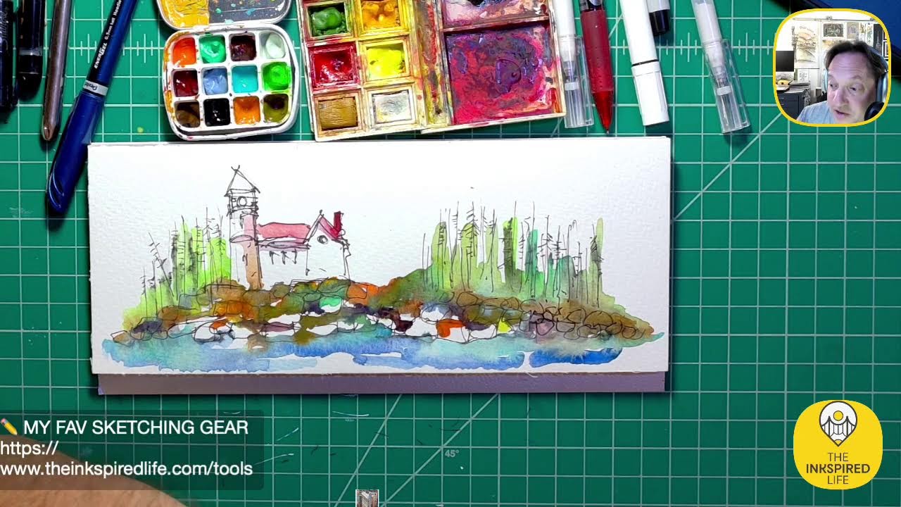
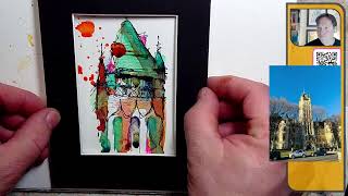
Hey everybody, happy Wednesday, March 20th. Hope you're doing well. I'm on for a few minutes tonight. I want to do some sketching and I'm looking for my Sharpie, which— tada!— is behind my ear. Hope you're doing great. Thanks for tuning in. I was just wrapping up— this is a sketch I did last week or the week before before, inspired by the High Line, a part of the High Line in New York City. There's an overpass here. Really fun sketch. I added something in here I've never really added before. I was trying to do a— give the hint of a taxi or something down in the lower left. You may have noticed I didn't bold it out with my Sharpie. I didn't outline it, and I did that for a reason. Um, I kind of don't want to stick out too much, so I didn't want to draw too much attention. But I think it works. You look at the overall scene, the main focus really is kind of up in this area here, right? So there you go. So that is a scene inspired by the, um, High Line in New York City. Love the High Line. So here's what I want to sketch tonight. I want to do a quick sketch of a really cool building in Spokane, Washington. It's the Spokane, Washington County Courthouse. Here's kind of an image of it. It's, uh, it was built in 1875, I remember. It's kind of in the French Revival and château-esque style. Château-esque. Don't ask me how to spell that. I think there's an X, A-U-X somewhere. Um, so I thought it'd be fun just to do a quick sketch and see what happens. So let me know where you're watching from. It's always great to have people tuning in. We're gonna Close that. Hey, Dawn is in the house! Dawn, great to see you. Hope all's well. It's been a while. Yeah, I'm going to zoom in and pan around so you guys can just see some of the details close up before I start sketching. So you can see the tower here. I believe it's 9 stories tall. Um, it has a castle-like kind of look to it with all these turrets in the corner, these little mini towers on the corner. I bet you there's an incredible view up in the top. I think there's a balcony up there. I wasn't actually inside the building. I was only outside. And this, if you were to stand up at the top and look out, you'd be looking out towards the city of Spokane, over the Spokane River. So it's probably an incredible view from up there. So amazing, right? Let's pan down a little bit and see more of it. And it has these— it's a symmetrical building, at least from the photograph here, it looks symmetrical. It has these towers, these turrets kind of here on each side of the main tower. Really cool. So it's very detailed, very complicated building. And here's what I'm going to do. I'm just going to focus on part of it. Sometimes I think when we go to sketch architecture and we look at buildings, they're— they can be very, very overwhelming, especially this— buildings like this. Um, a couple reasons it's overwhelming: one, it has a lot of details; two, it's big, it's massive, right? Large scale. And 3, and this is kind of a mental challenge for me when I'm sketching buildings, is the building is symmetrical, right? So when you're looking at it, it's the same on the left and the right-hand side. I don't like sketching symmetrical buildings. I shouldn't say I don't like it. It's challenging for me because symmetrical means the left and right sides have to balance. But we're gonna shatter that. I'm not gonna try to mirror the left and right exactly. If I wanted to do that, I could do a technical drawing on a computer, or I could do old-school ruler and triangle and all that. So loose style, quick, fast. It's okay for me if it's wonky. I don't care if the left and right don't match. So let's see what happens. I'm talking a lot, but I just want to set it up and let you guys get kind of in my, my brain when I'm sketching architecture. I think it's important to talk about the mindset, not the how-tos all the time, but how do we think about what we want to sketch and how do we think about how we're going to approach the drawings, um, or sketches, right? Hopefully that makes sense. Let me know if I'm rambling, just put in the chat, rambling. Um, all right, I'm going to turn the image off. Let's just start sketching this thing. I forgot to turn off my notifications. If you hear any beeping sounds, I'm going to zoom in here. Uh, I am going to start off. I have my Sharpie here and I'm sketching on this paper right here, Fabriano watercolor. Uh, it's cold press, 140 lb. I like the texture of it. And go back to the thing I was looking at at the beginning, this, this kind of sketch, same paper. And I like adding ink and watercolor along with my Sharpie, and you can just see the textures that are created from the paper, and you can see the hard edges that happen as the watercolor dries. So that's why I like kind of the cold press paper with a texture. I think you get really interesting things happen rather than smooth paper. Don says, "Wonk it up." You don't appreciate that. All right, let's sketch. Um, do I want to do this way or do I want to do it vertical? I think we'll do it horizontally. I think this whole thing will fit on, so make sure I stay within frame. I'm gonna put a little mark here just so I know that the camera is like in frame there and my big head's there. So if I come here, boom, I'll try to stay within those dots. Um, so here's what I'm thinking. I'm seeing the big tower first. I'm gonna start with that. And I usually like to work from the top of a building down. So the roof area down, not all the time, but typically that's where my kind of eye and brain want to start is where the building meets the sky. I'm going to hold my pen kind of far away. I'm going to be really loose with this. This is one of those turrets here on the side. I saw— so already I can tell you I'm not going to fit the entire building, the entire tower, and that's cool. Maybe I'll just focus on the tower or the top piece of it. Again, don't always feel like you need to sketch the entire building. Sketch maybe part of it that interests you. Even if it's a window or a door. I mean, windows and doors can be really quite beautiful. And have fun with it. So we got kind of this piece here. There's a horizontal piece that comes across. I wonder if I should— actually, you know what I'm going to do? I'm going to bring this on screen and I'm going to shrink it down and just leave it, uh, where should we put I'm just going to kind of put the image over here off to the side a little bit. It might be very small on your end. If it is, I'm sorry. I don't care if it goes over the yellow, that's fine. Let's keep it there for now. All right, so we have the one turret, we have a piece— it looks like a roof line that comes across here. Actually, this could either— I think this might be a roof. With the balcony happening kind of down here. It looks like there's an opening going on. So we have another turret on the other side. This is where I was talking about symmetry, right? We have a turret here, a turret on this side. Boom, this comes down. And then it has a perspective to it. So to make the perspective happen, you There's kind of a piece that comes down here at a steep angle. So I'm just capturing— I'm just capturing lines, really. I see angles, I'll try to capture the angles a little bit. I'm not caring if this perspective is off. This isn't an exercise in pure perfection in perspective. I'm really digging alliterations lately. I don't know why. Um, it's kind of fun. You have kind of these squares happening here. I'm not counting how many squares are across. I'm just sketching. I'm not worried about counting every single window pane. If I look— welcome back to the windows. I'm going to continue this tower down a little bit. Here we have these three kind of arch things happening. So, the arch kind of happening here and it swoops up to another one. So, it comes down, it swoops up here and it kind of curve, kind of curve it and go down. We've got a couple other swoops within this swoops. And then we have arches. We have an arch here, kind of comes down. These are windows in this section here. Got another one and we got another one. Cool, right? So it's wonky. Are these towers the same height? No. The same width? Not exactly. But it's just capturing the feel of what's going on, um, with the building. It's all I'm trying to do. Got some lines coming down here, flagpole up here, these kind of decorations, these finials on top. You do have grouping of windows. They're so small in my photo, but it looks like we have some kind of here in the middle, maybe another one there. Um, yeah. What else do I want to sketch with the pen before I throw some color on it? That might be good for now. I think I might just add some color. All right, so we have kind of just the top of the tower happening. Um, color. Let's talk color for a second. I am not going to try to match the color that's there in the photo. It's like a cream kind of color we see. I'm just gonna have fun and go with my gut and grab and go. And yeah, I know it sounds kind of weird, but I don't want to match. I'm gonna grab— I have some watercolor. We'll throw some of that down and we'll just see where it takes us. The reason I don't want to match color, if I sit here now and I want to try to match colors exactly, it's gonna stop my, my thought, my flow, my creative flow, because then I gotta try to color match. I could do it, but I don't want to spend the time. This is fast, loose, get it out, have fun. So it's kind of an energy thing. So I'm just dipping in my— there, we'll dip in here. I do want to, I do want to actually prop this up at an angle a little bit. So I'm going to prop this up just so the water runs down a little. If you're watching, let me know. Thank you for watching. I see some people over there in the Facebook land. That's so cool. There were some people over on, uh, Insta I saw too. So I always appreciate everybody watching and tuning in and saying hello from wherever you're watching from. It's so cool. All right, let's just throw some color down, have fun. I'm actually gonna start with the roof. So this building is very, very similar in style to the Biltmore in North Carolina, Biltmore Estate, which I've sketched and painted. I love that building. The real building has— here in Spokane, the courthouse has a It looks like a black shingle roof on it, but we're not— we're not going to make it black. Digging right into some turquoise. I wanted this to be kind of really— I'm adding water. I want this to be loose and let colors just run together. It's kind of dabbing them down a little bit here and there. We'll throw some down here as well. Let's connect it, let it flow down. Alright, uh, I'm gonna grab some of this yellow color. I don't know the name. I don't know what exactly yellow it is. To me it's like a taxi cab yellow. So we'll go with that. We'll call it taxi cab yellow. Huh. Alright, so we got some of that yellow down. I'm gonna pop on some orange. If you've watched me sketch me paint before, you'll do— you'll notice I do kind of gravitate towards some of the same colors a lot. I just like the palette, and there's nothing wrong with using what you like, right? But there's also nothing wrong with trying something totally different. It's really an attitude. It's about just being playful. Grab some blue, kind of running out of the blue in here. Hey, Sherry Laporte, great to see you. Sherry's on over there on YouTube. It says anxious to see the colors you use. Oh, thanks, me too. I'm just grabbing and going, having fun. Hey, D-Ray is in the house. D-Ray, great to see you. Love that you're in the house. Chip, Chip, it's great to see you too, man. Chip, we need to catch up soon. I hope all's well. Linda S says nice building. Yeah, for you guys just joining, what I'm gonna do, I'll zoom in, I'll bring the picture on screen again. Well, I'll zoom out in— take 3, this is unpracticed, unrehearsed. I'm so excited, I'm talking fast. I will bring the picture of the building up bigger so you can see the details. Oof! You could tell I really love something when I start stuttering and stammering and talking super, super fast. But when I do instruction on this, I need to slow it down. So if you guys are ever in a workshop with me, just slow me down because I sometimes go way too fast. All right, cool. All right, so let me zoom in so you guys can see kind of closer what I'm trying to work on here. Let this dry for a second. I actually love that. I love how it's running down the page. That's so cool. All right, let's zoom in on the building so you can see it. Ta-da! So, uh, if you're just joining me, thank you guys so, so much. Feel free to comment, say hello. Love to know who's watching. This is the Spokane— Spokane, Washington County courthouse building. Um, I believe it was built 1875. It's in the French Provincial and Châteauesque style. Really, really cool. I love the tower here. We— I was talking about turrets, those round towers in the corners. Really cool. A lot of detail and I'm just focused— focusing on part of it, a part that I really like. If I could— if I had turned my paper vertically, I could fit more of the tower, but I don't want to. It's symmetrical, so it's balanced on the left and right. My symmetry is going to be off. It's going to be wonky and that gives my brain permission to just be even crazier and have more fun. Because I'm not trying to be tight and make the left and right a mirror image. I'm shutting that down in my brain. I'm like, no, because for me that's going to slow me down, make me focus. And for— this is not focus time for me. This is get my creative energy out, boom, time. And you can call it, um, and then you can see the turrets on either side as well. As well. So it's a really, really beautiful building. Wasn't inside, I only saw it from the outside, which was so cool. I love how this is drying. Let me just zoom in so you guys can see how the colors are drying. This is probably the most exciting part for me, is seeing how things are drying, how they're mixing, how we're getting some hard edges. You can see that happening really nicely here with the orange. I actually love this color. I don't know if it's coming out on camera for you guys. This actually ended up being a lime, almost like a lime green color on here. That was just stuff blending together, so it's really cool. Ta-da! All right, um, one thing I didn't throw down I like to usually use— I, I have this Inferno Orange that Linda S. was kind enough to send to me a while or probably last year, maybe, or even 2 years ago. It's sitting on my desk. I used it— I think you can see it here a little bit on this one, and I used it on my Statue of Liberty. This is probably one of my favorite sketches to date right here. But this Inferno Orange is right there in the torch, still on my desk. So we're going to throw it down on this Again, it's about attitude, playfulness. Gotta shake it up because it's got gold flecky things in there, little fleck. D-Ray says hello. Cherry says nice to see you too. Hey, thank you so much. All right, so we're all, we're all shook up, shook up, shook up. Shook Up. Isn't it Elvis song? I won't sing it. I want to be copyright— well, it's not really copyrighted. I don't want to do, do it injustice by singing a classic. All right, I am dipping in. Does anybody want to see me dipping in here? Zoom out. I am dipping in. I think I'm gonna set up another camera at some point in time so you could— like a camera on the palette area so you can see that part as well as the painting. Let me know in the comments, is that a cool idea? Do you think it'd be helpful if you could see the palettes and inks and stuff and also the image on screen? Because I can, I can rig that up. All right, here's that orange, uh, Inferno Orange. Love this color. It's— we're gonna throw some on the roof. I know, now I'm getting really insane. It's good. It's good insane. Don't worry, it's gonna— it'll look good. Actually looks kind of like a shadow on screen. Um, just let it run down a little bit. Don't be afraid, like, if you're not digging something, don't be afraid to take a paper towel or washcloth or something, dab it, lift colors off. I don't have one of those right now, so I'm just gonna go like this. Go with it. I really want— here you can see the orange really popping. I hope it's vibrant for you guys on your screen. I'm leaving a lot of white space here, so I'm not even going to add color in some of these areas. I am feeling like I need some yellow. I like to call it lemon yellow. Maybe that's the actual name. Could add a little bit of zestiness to this. Um, D-Race says he's going wild. I, I've lost— I've gone cuckoo. Chip says if you show us the colors you're using, also informs us as to how your creativity is clicking to eventually get it to the paper. Chip, I love that. Excellent. So I will, I will rig this up at some point so you guys can see the colors where I'm going with my— like, if I zoom out, you can kind of see my setup here, right? So I think that's a great idea. I will do that. Also, let me know if I talk too much. I'm just trying to get out what's in my head. Um, just to get so you guys can see what my process is. It's— and it's my process, meaning everybody has their own way of going about things and thinking about it and creating. But I just want you like— let's try and let you guys get inside my creative brain a little bit. Maybe somewhere in there is a nugget you could use. Um, So I'm adding this yellow, just dipping into the yellow because I need a pop of freshness. And lemon— lemons do that, right? They have that zesty freshness about them. For me, the lemon color does the same thing in a sketch. Dip in. I kind of want— I feel like my hands tell me to go up here. Oh, you can't see it. There we go. I kind of like this. It's looking very shadowy on this side, so maybe this is where the shadows will happen. Um, I'm going to come back with turquoise, intensify it, and throw it on top of this. I may even end up doing it with with a color pencil. We'll see. I think that's enough pop of yellow for now, though part of me just wants this to run down a little bit, just to kind of let the edge drip down so it's not so clean at the bottom. At least letting it bleed down so your brain, your imagination says, hey, this building is actually continuing down. And I think by letting the kind of drip its way down the page. It helps to convey that idea. Um, DB, is DB in the house? DB, what's up? DB, I'm gonna make some gray for you. We're gonna mix some gray up. Welcome. Um, splatter tonight, okay? Hey, D-Ray, I will splatter for you. Yeah. Chip says, talk again. We need to have a past to understand your thought process. That's why I asked you at Princeton, what are you thinking, from the very start. Thanks, Chip, you're awesome. I appreciate you guys so much. Yeah, we'll splatter, D-Ray. We'll splatter, we'll splatter it up. Um, not sure what color is splatter yet. We'll get there. So I don't want to think. Another thing that goes through my brain, um, is when I start thinking too much about what I want to do here, it just bottlenecks me. And now I'm sitting here thinking, okay, do I want to use pink, purple? Should I use ink? Should I use paint? Um, it's just— it's slowing me down. And there's a time and place. I do like like times when I'm quiet and I want to be slower, more methodical, more precise. I definitely do do that, but this forum I'm on, and usually when I'm online, it's like zip, boom, bang. I just want to go, go, go. So I don't know what color to splatter yet, so we'll just come back to it. When it happens, it happens. Although I do now know what color, so We're gonna break out our Preppy Yellow. Literally gonna just take the cartridge out. This is where you got to be a little brave. You kind of take a deep breath, just go for it. So let's do it. Yep, he's doing it. I did it. But what I'm going to do is lift some of that off and we're going to splatter it with the brush. So I'm just kind of dip in, I'll just kind of do this. Cool. And it'll look cool when it's dry. I'm not, I'm not worried about it. Here's the secret, guys. I'm going to let you in on one of my secrets about sketching architecture. You might want to write this down. I'm building up suspense. I hope it's working. All right, here's one of my secrets before I forget it. Here's one of the reasons I love sketching in the wonky, loose style. Because it allows for the freedom of anythingness. Anything can go. Nothing is expected to look beautiful or amazing or pre— precise is probably the better word. Wonky equals, for me, creative freedom and looseness. That's one of the reasons I love wonky style. It's right there in the name. So if you kind of go at your buildings, if you like that loose kind of style and you want to give yourself permission, think wonky, think fun. Cool. Um, I love the way this is drawing. Let's zoom in. Look at this. This is so cool. I love the top. Really, really fun. This is actually drying really interestingly also right along here, and I'll zoom in before I'm done. Right now it's too wet. I don't want to lift the paper up. Let me see if I can do it this way, slide it back. Um, I don't know if you can see it really well. There's some amazing, amazing blue popping through this orange turquoise. I'm really digging it. Now I'm going to go back to use gravity as our friend. Gravity could be our friend. So I'm going to actually tilt this back up, just kind of let this run up, and we'll let it come back down again. It's a cool way just to kind of mix some colors together. Ta-da! Uh, D-Ray says watch out front row, he's taking apart his pens. Yes, feel free to go to my, um, my website and purchase your Inkspired Life poncho. Protect you from getting splattered. It's like the Shamu Splash Zone, except this is the Inkspired Splatter Zone. All right, what I want to do is I want to pop out some turquoise really intense, so I'm just going to dig right in or dip right in, spin my brush. I like to, I like to add paint on my paintbrush by spinning it and twirling it. You could actually see a really good example here of how it just wears away at the paint pen, the hole in the middle. It's because I do this a lot. I put it in, spin it around. Um, this is drying really nicely actually, and I love this hard edge. Ta-da! But I want to pop some vibrant turquoise. I'm gonna do with paint, and then eventually I'll come back and I'll even add some of my favorite— one of my favorite color pencils, the light aqua. You want to do this, let my hand dance around. It'll kind of tell me where it wants to put more, more intense. There we go. I'm thinking maybe just kind of on the edge here a little bit. So I'm literally just kind of drawing right now with the brush. I'm not painting, sketching, sketching. Um, I feel like I need some turquoise down in here, maybe against that yellow a little bit, so that way I have some tur— lot up here and a little bit down here just to tie it together. I think that's enough. The lighting is really wonky tonight. I wonder what's going on. And going to soften it a little bit, just a little bit of water. I think there's enough colors on here other than some gray, so I'm going to make some gray and just kind of create a little bit of depth in some of this. Zoom in because we're gonna work in this area. Let's see if there's any cues. If you guys have any cues, please put them in the old chats. I'd love to answer questions. Um, let me know if you guys are liking this. It's looking cool. So, D-Ray, thank you for the splatter. I love splattering. Splattering adds a whole nother energy level, especially in my New York City sketches. I love splattering. QQQ, which ink doesn't bleed? Which ink doesn't bleed on this particular sketch I'm doing? It's the Sharpie. I'm using a Sharpie for all the black lines, so that's why like 90% of the time, 95% of the time, I'll use a Sharpie to start my sketches, because then if I want to add water— I'm sorry, ink or color on top, I don't have to worry about the black bleeding too much. So I'm using a Sharpie for the black. I hope that makes sense. Yeah. Oh, what was I just gonna do? Oh, I'm making gray. Sorry. Um, here's how I'm gonna make some gray. I like to use blue So I'm dipping into my blue. You can actually see some in the pan up here. You can kind of see the grayish colors. So I'm going to take some blue. You could zoom out. Is this better? That's better. I got some blue. I'm going to throw it in the pan up here, or the— they call this divider thingy, compartment, excuse me. And then I'm going to dip into some brown over on this side. I like this kind of like spy music, like a secret agent. So you can see just by mixing the blue and brown, that's just one of the ways I like to get kind of gray happening. Zoom in so you can See where I'm gonna add it. I'm just trying to darken these window areas a little bit. I like this gray kind of color for that. So you can see I have this really tilted at quite an angle and all the water is running down, and I like, I like that. Let it dry. Uh, Poncho available, blah blah blah, on his blah blah blah. Thank you, D-Ray. D-Ray's quoting my blahs, love it. Hey DB, you're so kind. I love all of your stuff too. You are— DB is the detail master. Your detail is amazing. I love what you do. One of these days I'm going to slow down. I'll try it online, on here live. I'll slow down and I'll see what kind of detail I can make because of your inspiration. You guys want to see that sometime? Let me know in the in the comments. You want to see if I could actually slow down and see how a thing turns out, or sketch turns out. Um, I like the colors. I know what color I'm going to add next because I'm looking at it. Ta-da! We're going to throw on some— 8:51, so I'm going to wrap up at 9. So I've got 9 more minutes. Again, let me know if you guys have questions, comments, thoughts, conundrums. Let me know if you want a secret brownie recipe, like peanut butter brownie. Actually, I never made peanut butter brownies. Uh, I make some wicked chocolate chip cookies though. You can ask my peeps at school. All right, cool. I'm gonna zoom out for a sec. I do want to come back with Well, instead of just talking about it, I'm going to do it. I want to pull out this edge a little bit. Sharpies do not like to work in wet areas. I could come back with my black Lamy pen, which I have right here, so I could use my Lamy to outline it. The only thing with the Lamy ink is it will bleed. Um, but that's okay. Let's just throw it down. I'll show you guys. I like this black Lamy ink. You can see how I'm just kind of pulling out the edges. So don't be afraid to go back over and pull out shapes you want people to see. Again, right, so that really just helping to pull the roof line out. Do I have to do the entire roof? No, I'm gonna actually leave this kind of soft back in here. Why? There's another secret. Um, loose, wonky, and this perspective is really off on this roof. I'm not going to draw attention to it. I'm going to leave, leave it faded out. Done. I see a lot of people feel like they need to darken the entire entire edge around the building, which is cool. You can do that, but you don't need to. You can be very selective. I do want to pull this tower out here a little bit. I want to pull this edge out a little bit as well. I do want to come in and add some hatch lines. Let's try it with— I usually use my Sharpie for that. Let's use the Lamy. Zoom in even closer. So there's a roof overhang happening in here. It's really flat looking now. Here's a great way to get that kind of depth look. If this is a roof coming across, we're gonna have some shadow underneath, and I'm just literally doing some, some angled hatch lines across there. And it's the Lamy ink, it's going to bleed wherever it hits anything wet. But just that angle line is helping to create a sense of an overhang, right? There's kind of shadow happening. Maybe, um, you can see actually it is officially artwork, guys. It, you know, it's art when you're wearing it. I'm wearing that orange, the Inferno Orange. Curse, being lefty and wet ink. All right, it's all good. Um, let's pull this out. Here's kind of a little recessed area happening. I'm gonna pull these windows out a little bit too. Usually I'll do this after it's dry. I'll come back with a Sharpie or my my Pilot Precise. I have one right here. Let me just grab my whole— If you guys haven't seen this yet, I love, love, love this. This is time for a product announcement. This is my Lockbee tool roll. This thing is amazing. Look at all the stuff I can fit in here. Holy moly, this is so cool for traveling with. They even have a little watercolor painting in here. Um, really, really love it. The reason I pulled it out is because I do have a Precise Pen here. Thank you, Lochbie, for all you create. I love your tools, as you guys know. All right, cool. So we got the Pilot in I can come in with the Pilot. Pilot ink will bleed. I'm just creating little window kind of panes happening here and I actually drew them where there are no window panes. Aha! This— these are actually solid panels that do this. They have like these geometric patterns on them. That's okay. You really have these geometric patterns. Good catch. I want to round the turrets a little bit, so to make the turrets look rounder, I'm doing some contour lines. For me, contour lines are these curved kind of lines happening. They're not straight, they have a curve. And I'm going to add a little bit of this. And it has— it's starting to look kind of round now. You can do the same thing on the roof. Uh, actually, you know what, there are shingles on the roof. Let's show some shingles. I could do that with my Pilot, but I would prefer to do it with my Sharpie. But my Sharpie Ultra Point— this is a Sharpie. Oh, this is Ultra Fine. I'd rather use my Sharpie if I can find one here. Hold on. Extra Fine Point. They're different. They're very different. I don't know if one's discontinued, one's newer, but my preference is for the Extra Fine. I'll show you why. Extra fine's on top, but if you look at the tip here, they're different. The ultra fine is what it says, ultra fine, very, very fine tip. I like the width of the extra fine, and the extra fine, I find I need to push harder to make the marker, the ink come out. I like that because it it's easy for me to create skippy lines or Morse code lines, lines that look like this. I'm going to exaggerate here to kind of dot, dash, dot, dash, blah, blah, blah. Right? This pen, because it's harder to push down, will pick up the texture. It'll skip more. So I like that. Whereas the fine is more precise. You can see when I go quick how it looks. It's really picking up the texture, and the harder I push down, you know, the darker it's going to come out. So I can control how we— how broken I want it to look by how hard I push the pen down. So for my roof shingles, I like to keep it fairly light because I want that Skippy Morse code look. You'll see the first couple times it's not coming out, and I'm adjusting two things: the pressure I'm putting down and the angle I'm holding the pen or the marker. So that's why you might see my hand dancing around a lot, because I'm trying to find a position, an angle, and a pressure that's going to get what I want to do. Look at that, I picked up some of the ink— I mean, the Yeah, the color, that's cool. Um, but you can see how the lines are skipping right here. So that's a really quick way to create kind of a shingle look. Oh my gosh, I am getting my hand all over this thing. Watch it. We're having some issues down here. I just stuck my hand, my palm all over this. That's okay, I probably would crop this anyway. Um, so that's a really fast fast way to create shingles, even bricks on buildings. You can have that same look. There are bricks. This building is a brick building, so we— let's try the same thing with bricks. Ah, yes, 10:10, looking through the questions. Lock me, you got it. Thank you, D-Ray. Got the black Lambie. Yep. You're hoping to take a hyper-realistic watercolor workshop in June. Ooh, awesome. Shows. DB, that sounds amazing. I especially like the hyper part. Definitely like the hyper part. Uh, keep me posted. Keep me posted. Um, speaking of workshops, I am having a workshop in April, end of April. And yeah, I'm sorry, this is a plug. Plug, but, uh, it's called the, uh, what do I have it called? Don't Panic— a Don't Panic Survival Guide to Sketching Architecture of New York City. So we're gonna pick a couple of iconic New York City things, maybe the— probably the Brooklyn Bridge for sure, and maybe the Empire State Building. And we're just gonna sketch and kind of do what we're doing tonight. I'm gonna go a little bit slower so you could follow along in the workshop. And I'm gonna just talk my process, so you might want to take notes. Um, I will plan on having a recording available of the workshop as well. So if you attend the workshop, we'll give you a recording, and I'll probably even offer the recording separate, as a separate purchase for those that can't make the workshop. We'll see. I'm doing bricks. Bricks, I'm doing kind of the same as the roof, but I'm going to do one thing a little different after. Lines are really close, and then I'm intentionally going to come back and pull out some horizontal lines. This is just a quick way to indicate maybe some kind of brickwork happening on a building. No, you may notice I'm playing around the angle of the Sharpie, and I am holding it a little bit closer to the end, to the point, because I am controlling the lines. The further away, the looser. The closer, the more you can control. So I'm controlling this a little bit. You guys getting a good playbook tonight? Let me know. Let me know one thing maybe you've gotten out of tonight. If you've been watching, do you have a takeaway? I'm curious. I'm curious, like the monkey, what was his name? George? And also, here's another pro tip: try to put the right cap on the right writing instrument. This cap does not go on here. This cap goes on here. And this cap goes here. Isn't that satisfying, by the way? Wait, we gotta do this. I'm turning off the sound. I just love this sound here, just the click of a cap on the pen. Holding it right in front of the microphone. Let's see, that was not— that was not super clicky. There's this one. That was not super clicky. All right, so what's as satisfying as this sound? I'm just doing here. So creating isn't only about what we're seeing, it's about what we're hearing, right? It's about using all of our senses. So when I'm here sketching, I have music on. It's really impacting how I'm creating. Um, but I love other sounds. I love the sounds of clicking pens or you know, things dragging across paper. Curious George. Yes, that is the monkey. I thought so. All right, one last thing I'm gonna do, guys. I'm wrapping up. It's 9:04. I'm going to come in and throw down some of one of my favorite colors I usually like to end with is— ta-da— pink. And we'll pull out some frames. We'll kind of look at this cropped a little bit. I do appreciate you guys so, so much. I, I've been wanting to do this pink here. My brain actually pre-planned this pink here a while ago, kind of as a little dormer that sticks off the roof. Throw some on here. Um, I usually like to do it in 3, either 3 or 5. 5 places, usually it's 3. My eyes kind of go in here with it, you can see my pencil, it's kind of doing its thing. So, I'm ending up down in here somewhere. So, let's throw some pink down here. And then I do want to throw in some of this light aqua on here as well. I hear my pup outside my door. She's like, "Where are you?" So I'm gonna go visit my family. I feel like this is missing purple. Azumura-san is purple. All right, cool. All right guys, I think that's it for this one. I'm going to put a frame on top. We'll see what it looks like. I mean, if you have any last questions or thoughts before we leave, uh, DB says, I like how you did the roof and the brickwork, very easy but very effective. Thank you so much. I see Pro144 on YouTube. Hey Pro144, hello, thanks for joining, good to see you. Yeah, so let's take a little frame here. They're going to be bigger than I want them to but this is all I have right now. Actually, it'll work, you know. So I love framing these. I mean, look how cool this looks, kind of cropped out, right? Let's use this one, it's cleaner looking. There we go. I like it. I like that splatter in the upper left. It almost has a, uh, like a sun quality to it. Maybe when I crop it, I— maybe I would even crop it here in the corner. I think I actually like it with a little space around it. Right? It looks so cool. Like I said, I know I— this was kind of messy. My hand was dragging down here, but I'm not worried because we can crop it out if we need to. Ta-da! And that ends up being a cool little sketch. This has dried really nicely. I always like to zoom in so you can see how it's drying. I like these colors down here. I like the way the light aqua pencil looks on top of the Inferno Orange. This is actually cool. I like the purple. It's creating some nice depth there. This game's a little funky, it's really busy, happy here. It's a busy little turret, as Bob Ross would say. We have a busy turret. Turret is that corner tower piece. Oh, I heard that capped. Time. Thank you, enjoyed it. Wrapping it up. Hey, thank you, D-Ray. D-Ray says framing looks great. Thank you so much, I appreciate you. I think this is one of the songs I made in GarageBand. No, I could be wrong with that. I think I'm wrong with that. All right, you guys go. Thank you very much, I appreciate you all watching. Have an amazing rest of your day. Have a great Thursday. Um, yeah, appreciate your time. Keep paying it forward with, uh, positivity. And my pup's barking, so I'm gonna go say hello to her. Take care, guys. Peace. Live creatively. I'll see you guys soon. Camera's there. Good night, guys. Take care. Thanks again. I appreciate you all. Dear Ray, I am clicking that finish button, I swear. I am clicking it. I got it right here. Right down there. Peace out.