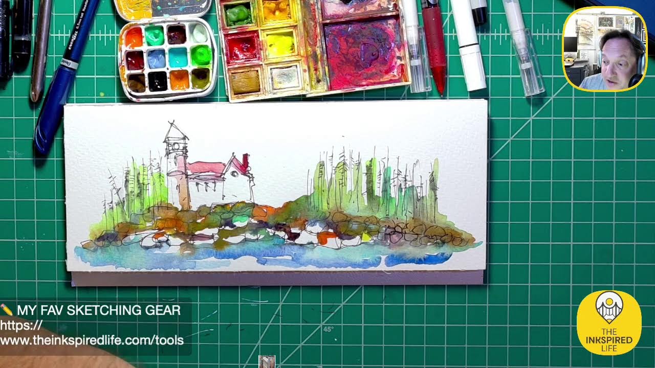
The Inkspired Life - Architectural Sketching
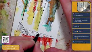
Artist Jason Nicholas sketches a New York City street scene with Junior's Cheesecake in the background, using watercolor, ink, and Yupo paper. He works loose and energetic, prioritizing the city's vibrancy over photorealism, while chatting with regular viewers about upcoming shows and a potential sketch-athon for Habitat for Humanity.
Chapters
Hey everybody, happy Thursday evening, 8:37 PM. I see Linda's out there. Linda, awesome to see you. Hope you're doing well. Sorry, I'm off camera. I shifted some things around, but I hope you guys are doing well. Just on really kind of quickly here, maybe 10 minutes, uh, to do some sketching. Let me know how you're doing. So we are visiting New York City with the sketch tonight, and, um, I'll do some sketching and then I'll kind of show you the reference image I'm using. Let's do it. Hey, the NCI walking show is on. Hey, Sifat, great to see you. Thank you so much for tuning in. Sifat, you inspire me with your walks, and I'm actually doing a New York City sketch right now. Guys, I urge you to check out the NYC Walking Show with my friend Sifat. He does amazing livestreams from New York City. Um, he's an amazing, amazing person and incredibly inspiring. So thank you, Sifat. Great to see you, man. So I'm gonna pull on screen. Let me show you guys an example of what I'm sketching here. Put it on screen to see if I can do that. But here's a sketch I did. I'm really intrigued by New York City and kind of the views you get looking up at the buildings. So this was a sketch I did here, um, of actually the top of the theater right here where the Harry Potter and the Cursed Child show is playing right now. And what I liked about it was the sign here It's very abstract, right? I'm not creating a photograph, but my feeling of the city. So, I did that sketch and then I also did a bigger version of it here. Let me zoom out. So, really cool. This artwork is actually on called Yupo paper, which is like a plastic. I love working with this. You get really cool colors. Textures and patterns with watercolor and ink. Um, and this was pretty much watercolor and ink on watercolor paper. So I'm taking that same idea and I'm doing a new scene tonight, and I'll see if I can get the photograph and show you guys what I'm looking at. Let's see if I can drag it on screen. Sometimes it works. I move this.
Boom.
So this is, uh, the view I'm looking at right now. If you see the kind of the canopy at the bottom, it has like orange and white stripes, kind of reddish. That is actually Junior's Cheesecake or Junior's— I guess, what is it, a restaurant? Junior's Restaurant in Broadway. And that's their iconic color scheme. So, I'm going to kind of capture that with my sketch here at the bottom. And then I love the view just looking up at the buildings. So New York City is filled with incredible architecture and amazing shapes, and whenever you're there, I recommend you look up. And I know Sifu also says that as well. Always look up because there's some amazing views, really incredible. So right now I'm just outlining some of the shapes and buildings with a little bit of color on tonight. And again, this is just my kind of interpretation of what we're looking at. I love the lines. I love the angles happening. If you look at this building here, there's a lot of kind of lines doing this kind of movement. I try to capture the energy and the feeling of New York City with my sketches. For me, New York City is very vibrant, a lot of things happening, a lot of energy. And that's why my lines and my drawings and sketches are really kind of loose, they're fast, wavy, and I just love that so, so much. Let's see who's watching tonight. So Linda's in the house. Linda, great to see you. See you, thank you so much. Love that you're tuning in. Linda's been sick but getting better now. Ah, thank you, Linda, for tuning in, and I'm glad you're feeling better. Hey Jody, great to see you! I haven't seen you in a while. Thanks for tuning in. Hope you're doing well. Love when you guys talk to each other. It's so fun. You guys are so positive. Tonight's music, I just have some kind of fun holiday music playing. Um, this building here has a kind of these stone slabs happening here. Just want to capture them lightly. And then on the canopy, we have stripes happening. Let's do some of that. All right, cool. All right, let's throw down some color on this. So I'm actually going to turn off the photo and let's just have fun and play around with some color for a couple minutes. Um, what should we do? I have some watercolor here, so we'll break out this, my well-loved watercolor palette. You can see it gets a lot of good use, all the fun funky colors. And just have some, some dirty water here, and I just dropped my brush. There it is. So I'm actually headed into New York City on Saturday. I'm super, super excited. I'm going to be going to a place called the Chelsea Factory. So it was an old factory that they've actually just converted into a theater, like a performing arts theater. So that's going to be a lot of fun just to go check out. And then I'm going to stay and watch a flamenco show after, a Christmas flamenco show. I love flamenco music. I think it's going to be a lot of fun. So it'll be interesting to see how did they take this factory and convert it into a theater. So I'm kind of super excited about that. And then I'm going to, after the show, I'm going to go, um, take a walk on the High Line. You guys know I talk about that a lot. I love, love the High Line. And my goal is to be in Hudson Yards when the sun goes down and the lights are up, because I haven't seen— I've never seen it all lit up at night, especially during the holidays. So that's going to be a lot of fun. So I'm just dipping into some watercolors, playing around. I just used some turquoise. I'm going to grab some of this kind of lemon yellow. I like the lemon and the turquoise here. It's a nice contrast. So am I actually painting the colors that the buildings are in real life? No, I'm, I'm definitely not doing that. The idea is to keep this loose and fun. And just, just use colors that kind of make me happy. I may try to replicate kind of the colors of the, the canopy or the awning here at Junior's. Let's see, what else do we want to throw on here? Let's throw in some orange. So if you guys have not heard of Junior's, um, Junior's is an amazing restaurant. They're really known for their cheesecakes, iconic cheesecakes. Um, I believe it— they started in Brooklyn and now they have a bunch of locations. So I, I try to go to Junior's whenever I'm in the city. Gonna mix up some gray, so I'm gonna take some brown And then I'm actually going to throw in some blue as well. Let me know if you guys have any questions or comments in the chat. I'll be checking it out. Let me know what you want from, uh, Santa this year. Do you have anything on your Christmas list, anything you're wishing for? Love to know. So I'm throwing kind of this gray color here to balance with the blue on the other side, and this is only layer 1. I'm gonna have to come back to this a couple times. This sketch here, I probably have an hour into it, um, so I'm just right now throwing down the base layer of colors, and after it dries, next day or so, I'll come back and add to it. I like to throw these splatters of color on here just to get some extra energy kind of into the scene. It's just, it's so much fun to just throw splatter paint on here. Hey, Karen's in the house! Karen, how are you? Great to see you. Long time. Hope you're doing well. I love cheesecake. You know what, I used to actually be afraid to try it. Like cheese and desserts really for me don't go well. But I have to say, I really actually love cheesecake. Um, so it just goes to show, sometimes you've got to just try things. You never know, even if they don't sound good. Hey, Chip is in the house! Chip, how the heck are you? Good to see you. Chip is in the house! Chip, um, we'll, we'll connect. I'm hoping I get to see I hope to see you when you're up and when I have my school break. That would be awesome. We can meet up in New York City. How fun would that be? Might be— bring your sketchbook. It may be warm enough to do some sketching, do some urban sketching in the city. That would be fun. I'm just kind of letting the music take over now, guys, as I throw colors down here. See, I'm going to break out a Sharpie. Let's try this Sharpie roller pen here. I'm going to sketch See if it works. That's too wet, so it's not going to work. No worries, we can wait for it to dry and I'll add some more detail. Have some kind of railing back here, metal work happening. What's fun for me is just seeing things come together as I add more layers of information. Karen's just chilling after work. Awesome. Good for you. I'm chill. I'm just chilling before bedtime. I know, Karen, you're out there on the West Coast. I'm gonna zoom in so you guys can see a little bit closer. It's probably better. Um, you can see how this is drying. I love kind of the granulation that's happening with the paint. The texture of the paper showing through there is really cool. Chip says, coming up next Tuesday, I'll bring my stuff. All right, man, definitely bring it. Bring some of that sketch gear. We'll, we'll talk. I'm actually going to be in New York City, um, I want to see the Rockettes, the Radio City Christmas Show. Not this weekend. I think the following weekend we'll be headed to see that show. Maybe we can coordinate a time when I'm, um, we're out there. We'll figure it out, man. All right, so I like, I like where this is headed. I do want to throw down some, and I'm going to break out— I have this really cool color ink, it's called Railroad Worm. How cool is that? It's kind of this yellowy color. Um, so let's throw some of that on here, guys. Thank you so much for watching. I I would love for you to like this or share it. If you're watching and you're liking this, it would be so cool. Let's get the word out. I'd love to hit like 600 subscribers before the end of the year. I'm at 540 on YouTube, which is actually really cool. I never even thought I'd get past 2, and I was the first 2 subscribers. So I appreciate you guys and your support on Facebook and YouTube. So I'm dipping into that ink. It's really— it's, it's a fun— I'll put some here— almost like a highlighter yellow color. I don't know if the camera's picking up the color. It is fun in person. Here, I'll zoom in so you can see a little closer. See, look how bright that is.
Pretty cool, right?
I'm just— I'm actually have— I have, um, not too much water on my brush, and I'm just kind of dipping right here into this orange. I want it nice and thick. And you can see when I go here, I'm just going to pop it down, and I just want to kind of punch it a little bit. This is what I love. I just love seeing these colors kind of just come together, do their own thing. I'm not really trying to force anything, just kind of letting go with the flow here. Notice I just used that Rail— Railroad Worm color just right in here and a little splash up there. Let's do some more. I just want your eye to kind of travel I feel like I should put a— just a pop of it down here as well, kind of bring your eye down. And let's just do— we'll do some splatter with it too.
Cool.
Just gotta be careful to not overdo it. Linda says those colors are really coming together tonight. Hey, thank you so much. Yeah, I'll zoom in. I'll let you guys just take a look. I'm gonna get this at a better distance. See if that's a little bit better. Yeah, I have to say my favorite part of this right now is this part in here. I, I love what's happening right here at the top. It's just really magical the way things are— it's just coming together, it's just doing its own thing. That's why I love doing this mixed media, ink, watercolor, these types of sketches. You do have to be careful to not add too many different colors, although I want to— I'm gonna use some of this. This is actually my favorite ink color, Apple Snail. I'm being very, very greedy with this because there's no more to be found. The company, um, they've been out of stock on it for a long time, so I don't know if they're going to remake this color. So I try to use it sparingly because I just love it so much. It has a really cool, like, caramel type of color to it. So we're trying to create the idea of— these are, um, kind of— they're called ribbon windows, basically stripes of windows happening here. I'm just trying to create the idea and the movement with these kind of lines and perspective. After this dries, I'll come back with some— I'll use Sharpie and I'll be darkening in some areas, indicate some windows. And that's— that'll be fun to see that taking shape. Cool. Let me know if you guys are liking this way this is coming out. I have a bunch of— I'm trying to separate and organize all of my NYC artwork. I just want to pull some things out of here. You can see I kind of like to use the same color palette. This is the, um, Copper Building here. There's another version of the Copper Building. I'm obsessed with it. Chip says, QQQ, I feel you prefer fall bold colors in your art. Agree? I do agree. So when I add colors, Chip, I agree with you. So for me, those colors equal, um, kind of an industrial vibe, kind of grungy. I always imagine metal that's kind of rusting and deteriorating. Those are the colors that are in my brain when I'm doing, um, city scenes especially, or pretty much any scene actually. I just love the vibe of buildings, metal that's aging, wet buildings that are weathering. So it's a great observation. You could really see, I think, pretty clearly in this one right now, especially here. I was trying to capture the idea of just kind of gritty industrial grunginess. So I love the grungy vibe. Great, great call. And if I don't do color, black and white. Black and white is also— I love just the power of black and white lines like this Empire State Building sketch or Here's some other examples. If you guys don't mind some show and tell, it's kind of fun to look through these. Here's another black and white example. This is a sketch from Little Island, New York, and I just, I just love this sketch. I love the hatch lines here to give some shadow, so I kept that black and white. Here's a view of the Met. Metropolitan Museum, black and white. This is, uh, doesn't have industrial vibe, but it has really bright pops of color. Here I just added some pops of pink at the Guggenheim. Here's another version of the copper building. Again, we're back to kind kind of the— my favorite color. If you put these next to each other, you can see the similarities in color. So awesome observation. Here's one from, um, Domino Park in Brooklyn. This is a cool one. This is in NYC, another view looking up towards the buildings. I really love the marquee signs in the city. Something I'm going to really start focusing on more when I go into the city, taking pictures of that. This is a sketch of the Starbucks Reserve down near Chelsea. Again, we have that industrial kind of vibe going on. So yeah, that's just some of the pieces I have in here. I have so many more things. St. Patrick's Cathedral. Love sketching this building. I kind of— I really like the black and white. Um, I love the spires on here. Here's my attempt at sketching catching the Atlas statue. Rockefeller Center, right across from St. Patrick's Cathedral. I am obsessed with this sculpture, the statue. I think it's beautiful. Here, this is New York City, but it has more of a Miami vibe. So I guess I was thinking back to my college days, right? I went to the University of Miami. It has that kind of tropical feel to it. I guess my point is don't be afraid to just throw down different colors and have fun. Love the Met. That's so cool. Yeah, the Met sketches was a fun one. That was actually done there. So where's that— where'd the Met sketch go? I've done a few Met sketches. Hey, I never met a sketch I didn't like. Get it? Never met a sketch. Yeah, so here's just a quick view. This was done on location, um, sitting outside the Met on the steps. Pretty quick sketch. This is probably, I don't know, 10, 12 minutes maybe. So thank you. The colors are coming together. Thank you so much. Uh, love the matte, crazy great. Same, Pat's amazing. Oh, thank you. I'm so glad you like this stuff. All right guys, we're gonna wrap up in about 2 minutes or so. Let's come back to this and see how it's drying. So I really like the hard edges that are here. You can see a good example here. Actually, I should get my frame out. Hold on a sec. Just found it the other day. Well, actually, since we're talking about colors, here's a— here's a totally different color palette. So this color palette here, these are sketches of the Biltmore. The Biltmore Estate. And notice the color palette is really different than this one, right? So for me, the Biltmore, I guess I don't have— it's not really— it's a, it's a stone building. It's amazing, amazing stone architecture. For me, it didn't have the same gritty ness of being in New York City, different environment. So my brain, my gut went with a different color palette. Um, it's— this is not the color of the building, it's not this yellow color, but it's just— it was kind of just my feeling at the time when I was creating it. So I guess I never thought about it. So Chip, thank you for making me think about this. Yeah, I guess I go to different color palettes based on the subject I'm painting. And I never actually realized that, so thank you so much for the insight. But I digress. I was trying to get this frame out here. Here we go. I'm going to do this so you guys can see this a little better what I'm talking about. There you go. So you can kind of see the hard edge happening in there, the way it's drying, that crisp edge. I like hard edges and I sketches. Um, let's zoom in on here. This is fun. I just love the way everything came together there. I know I geek out. I geek out about this stuff. This is what gets me excited. Zoom in here. Maybe we'll kind of zoom in on this piece. You know, it's not a solid color here, it's a mixture. For me, that mixture creates energy and movement. If it was all a solid color, it would feel, um, stationary, stagnant. It would feel like it's just sitting there, and there's nothing wrong with that. But when you're— when I'm trying to capture movement, this really helps. And then here, I actually do like this as well. I like the pop of the orange there against the kind of the— that yellowish background. So that's a really fun pop that's happening. And notice, you know, these are really, really rough sketches of windows, but I have one here and one here, right? I didn't feel like I wanted to make them both really bold and orange, so I left one just, just open. And for me, that again creates interest. If I made all these boxes that orange it would kind of lose a little bit of character, right? So I have kind of the boldness, left it empty, I got the bold happening there again. So it just kind of pops, right? Just pops a color. Awesome. Hey, Jody says it feels alive to me. Awesome, I'm so glad that you said that. Maybe I can throw down some ink before you head off. It's kind of dry here. Um, Biltmore built in 1896. Stone was so different then as well. Absolutely. Biltmore is an incredible, incredible place. I got a chance to visit it back in April. Um, didn't have enough time. I was there maybe 3 hours. Did not see nearly enough. I'll have to go back again, but Just an astounding architectural masterpiece. The whole estate is, is just mind-boggling. And we could thank our friend Roo for the suggestion of going there. So he tipped me off about an amazing place to visit. Thanks, Roo. Thank you guys. Thank you for watching and commenting. It's so much more fun for me to have you guys out there while I'm sketching. Sometimes I come on and no one's on, and I get it because I don't have a schedule, but when you guys are out there, it just takes my energy level up another notch. I'm just gonna pull some of these lines a little darker. I kind of have to wait for this to really dry before I break out my Sharpie and bold up some of the lines. Kind of hatching this in. I want to push this building a little bit more into the background. So I'm just bringing these lines down here just a little bit to push it in the distance. When this is dry, I'll take my Sharpie and I'll pull out this edge a little bit darker. I'll pull this edge out darker. This building's really the closest. Actually, let me try to see if it— See if I can do it. Yeah, actually it's working. You can see, right? You can see how I just kind of pulled that out a little bit more. I just— I'm just going over this edge with my Sharpie because I want the building to look a little closer. And then I'm going to do the same with this edge here. So darkening that edge, that edge is kind of framing what's happening in the background. Awesome. Hey, thank you guys for the thumbs up. I appreciate that. Um, I really, really do. What else do I want to do on this? Oh yeah, let's just do a little more. I can honestly sketch 24/7. I was thinking about doing that this year for, uh, New Year's Eve, doing like a sketchathon where I'm just on sketching. Maybe not 24 hours, but I don't know how long, which to just sketch, sketch, sketch. Um, it'd be great if people tuned in, we chatted, and it'd be really cool if I could somehow do that and raise some money. I'd love to donate money to a charity that I really like, which is Habitat for Humanity. You know, being an architect, I really connect with that organization. So let me know if you guys have any, or I could even do like an online auction. I don't know, I'm not sure what to do, but it'd be just a cool way to kind of end the year and start the new year with, um, a little bit of, a little bit of giving. All right guys, I'm going to zoom out. I think we're going to wrap. Let me know if you have any last questions. So here's what it looks like, and the idea eventually is I'm going to be doing just like I did with these pieces. I kind of did the small one, and then I went on to this Yupo paper, Y-U-P-O, which is really— it's polypropylene, so it's plastic. You can hear it. Really fun to work with, really tricky too. But I'll do a small one and a big one. Cool. Enjoy your weekend, NYC Jason. Thank you so much. Enjoy your weekend, Jody. See you all next time. Thank you, Linda H., for watching tonight. I really appreciate you being out there. Feel better and just get, get some rest. I appreciate that. So thank you guys so much for watching. Jody was in the house, so Linda H was here. Chip, man, we'll get together. I'll— maybe I'll give you a shout, um, over the weekend or early next week. We'll see when we can get together. Uh, Karen, awesome to see you as always. Thank you for tuning in. And, um, Karen goes way back to being an original Inkling, so following me when I first started, so thanks, Karen. I appreciate you tuning in as always. Plus, we had the NYC Walking Show. Guys, check my friend Sifat out if you love— if you want to learn about New York City, get some pro tips. Sifat at the NYC Walking Show is an amazing person. Had the chance to run into him in the city one day, and it was fun. Love to catch up with him again. Hey guys, you're awesome! If you're watching the rerun, thank you so much. Have a great, great day. Keep paying it forward with positivity, using your creativity, and peace, and live creatively. See you guys real soon. Take care. Enjoy the rest of your week and your weekend that's coming up. See you soon. And if D-Ray was on, she'd be like— I love when D-Ray comments because because I can never find the finish button. I gotta look on screen, move my mouse. D-Ray, this is for you. I am searching for the finish button. I do know where it is. I'm just creating drama. It's like a cliffhanger ending. Tune in next time where we take this to the next level. See you guys.