The Inkspired Life - Architectural Sketching
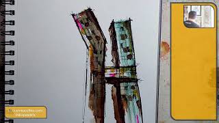
Artist Jason Nicholas sketches New York City's Copper Building live, using walnut ink and watercolor markers to capture the city's energy rather than precision. He chats with viewers about his loose, wonky line style, his teaching philosophy, and upcoming workshops and an online auction of his NYC sketches.
Chapters
Hey everybody, hope you're having an awesome, um, Thursday, November 9th, 1:50 PM here in Northern New Jersey. I see Linda's in the house. Linda, hope you're doing well. Uh, I'm popping on just for a few minutes during a little quick break here. I'm actually off of school today, which is cool. I love teaching, but it's good to have breaks sometimes. Let me know how you guys are doing and what you're up to.
Um, let's just do a quick sketch.
Let's see, so I'm just going to do a quick sketch of one of my favorite buildings, NYC. The copper building, which I love so much. I actually want to do this really, really fast. I'm thinking too much here. Boom. Sketch some lines on here. I love how this building kind of bends. This is good here, thank you. Hope you are well. Yeah, all is well. Thank you for, uh, asking. Everything's awesome, no complaints. You are, um, I don't know, I think it's all of New Jersey, um, teachers are off today and tomorrow for called, which is called Teachers Convention, I guess. There's a convention, I think, in Atlantic City or something that teachers can go to. It's optional. Um, it's been happening for years. I, uh, I'm home today. Just got to sleep in, which was awesome. Trying to catch up on some other work, all kinds of fun stuff. I'm going to throw down some— I haven't used a walnut ink in a while, so let's break some of that out. Just throw some walnut ink on here. Just purpose of being on today is just to get to do some sketching, change my mindset. I was doing some studying before and it's good for my brain to take a break sometimes and get into creativity mode. And this is one of the ways I do it is by just sketching and drawing.
Cool.
So we have walnut ink. I haven't used it in a while. It's Daniel Smith walnut ink. I don't want to turn it over too much. Yeah, let's just mess around with it and see how it goes. We do need some kind of—
I don't have any more tissue.
Paper towel or something. Alright, I got a cloth here. I can wipe stuff off. And I need some water. As you can tell, I came on unprepared. That is not my water. That's an empty container. Oh my gosh. Thank you guys for bearing with me as I drop things, find things. That's what makes this fun, being spur of the moment. All right, I got some water here. Awesome. Let's just throw down some of this Walnut Ink. It's really dark. I'm actually just going to take some out of the lid and move this back here so I don't knock it over by mistake. Actually, my keyboard, um I just want to turn a window on here on screen and see if it's working. It's turned off. It is my—
oh, it's on the other screen.
Okay, all right, never mind, it's all good. I also want to put this at an angle, so I'm just going to prop it up with my watercolor palette. Perfect. Now we're good to go. Is the copper building walnut ink colored? Nope. And that's okay. Oftentimes my architectural sketching, the colors I add aren't really what's there. It's kind of— I either use colors I have that are close by Or I'll just go with what I'm feeling at the moment. And the Walnut Ink was right here on the desk, and I said, let's go for it. It's how we roll sometimes, just kind of go, go with the flow, right? Now, if I spent time looking for the perfect colors to match this exactly, I probably would lose my motivation and interest. Rather than just going with the flow. Kind of my brain just wants to go, great, go, go, go. Sometimes I don't have the patience. Lots of times I don't have the patience to, uh, color match anything. But I love this Brown Walnut ink. It is so rich and brown, and I've been diluting it a little bit with water. But a color that goes really, really well with this is turquoise. So let's, uh, actually, is it in here? I don't think I've used my—
let's see.
I don't— there we go. What do we got? So this might be cerulean blue. Yeah, we're just going to use some cerulean blue on here. This is a watercolor marker, Winsor Newton. I really like these. I'm going to scoot this over a little bit because I just want to put some of this marker on my palette and I'm going to lift it off and add it on the paper. Just cleaning this off. Brush is kind of dry here, kind of clean. All right, let's just throw some of this blue. And these colors work really well together. Zoom in so you can see it better. It's creating some vertical lines here to indicate we have some windows going on here. Yeah, this is cool. I like it. There's some more, some more walnut on here as well. Hey Barbara A, hi from Germany! Good to see you, welcome. Germany. So cool that you're tuning in. Love it, love it, love it. Linda says, that's good. Kids are in school today here in NYS but off tomorrow for the holiday. Yeah, tomorrow is Veterans Day, so we are off for Veterans Day tomorrow. Um, that's awesome. I love that Linda and Barbara are saying hello to each other.
That is so cool.
Across the sea. Linda is so great that we both are watching the same live stream. Isn't technology amazing? It's like connecting people from all over the world. It is amazing. So cool. So, yeah, so this is the, the copper building in New York City. I want to do kind of a darker outline around it. This is just a quick, fun ink wash sketch. And if you're just joining me, I I don't really sketch realistic architecture. I mean, it's based on realistic buildings, but I just add my own kind of loose, wonky style to it. It's not about precision. It's not about detail. But sometimes just capturing the feel of the building. That's for me. Photographs are the way I capture the details of buildings, preciseness. Sketching is just kind of fun for me. Lets me be kind of loose and wonky. So I'm just adding some Sharpie. I just want to pull the outline of the building out a little bit more. Um, yeah, you guys are enjoying this. That's some dramatic music happening there. And let's indicate windows. I'm going to take— this is a Sharpie. Roller pen, and I'm going to just do some vertical lines here just to create the idea of window grids happening. And then I'm going to just, like, darken some of these in a little bit. Just to give some interest, indicate there's some openings here, some glass happening. My favorite part of this building were two things. One, the building really does bend like this. They're also called the Dancing Towers because it looks like these buildings are dancing. And then my second Favorite part here is the sky bridge we have that goes across and connects the two buildings. One of my, uh, one of my New York City bucket list items is to go in the Copper Building. I would love to get inside. It's a private residential building. I would love to get get inside here and just check out the architecture and the interior spaces. It would be so awesome. So if anybody knows anybody, just saying, at the Copper Building, let me know. It's my, my architecture brain just I just always want to explore buildings. It drives me, it keeps me going, it's my imagination tick, my creativity go. It's just so fun for me, and that's why I have fun teaching architecture, um, to my high school kids. I just, I just love teaching something that's fun for me, something I've I do as a profession as well, and I hope that comes across in my classes. Just the enthusiasm I have. I might be a little too enthusiastic about it sometimes, but I think it's— I'm really lucky to be teaching something that I love and that I do.
Cool.
So you can see I'm just by adding some little details on here, it's starting to pull together a little bit more cleanly. Barbara says, "It is amazing. I am happy to catch you live. Most time your streams are in the middle of the night." Yeah, Barbara, that is so true. I'm glad that you're here live. That is awesome. Yeah, so most times I, I do go on at night and I'm very inconsistent. I don't have a regular schedule. Which is probably a bad thing for people that want to watch. Sometimes it's good for me. I like to just be able to come on whenever I want to and not be held to a schedule because if I had a regular schedule, I would feel like I'd be having to plan lessons and it would be much more formal. And that's something I would do when I teach my online workshops. That's stuff that's scheduled, and we have particular lessons, which I'd love to do a workshop this winter. I haven't done one in a while. Due to get a sketching workshop going, I'm adding some more of this walnut ink. I'm actually dipping right into the jar here. And I just, I want to darken, like there's a shadow underneath the bridge here. I just want to kind of make that really dark. And let's just say that I guess light is coming this way. So the building would be a little darker on the side if you were to add some shadows. Shadow ish shadowy stuff. And I'm also just going to kind of fill in some of these window squares with this walnut ink. I'm just randomly doing this to give it randomness. It's a good word. It's a good way to— good reason to do randomness because I want it to look random. For me, when I just add random touches of like these colors, it for me, it adds an energy or a movement to the building. It's not so static. And I like New York City for its energy, its vibe. So I try to— I do try to capture that in a lot of my sketches of the city, just that energy, the loose wavy lines, colors. All right, cool. I think that's enough on that one. And then zoom in a little bit. I do know one other color I want to add, actually two other colors I want to add on here. Barbara says, "Never give up on the spontaneity." Love that.
Yeah, right?
Sometimes that just helps feed my creativity a little bit more when I can be spontaneous. But it is cool when I have other people joining the live streams that normally don't, so I appreciate you. Joining. Oh, this is looking fun. I have two more colors I want to add. I love using— since we're using the watercolor markers, I'm going to grab— I love using this color right here, Gamboge. I think that works well with this palette. And then if anybody has watched before, you might be able to guess the other color I want to add to this. It's kind of a signature color and I haven't used it probably the past— let me— 4 or 5 sketches because they've all been black and white.
Let's throw down some of this gamboge here.
And I'm just throwing down this yellow just to give a little pop of brightness. If it was watercolor, I probably would be adding like a lemon yellow color. Um, whenever I want to add like a touch of freshness or a pop of, um, brightness, I like to use lemon yellow watercolor or this Gamboge Yellow. So I'm gonna throw some right here on the palette and we'll lift it off. 208. I'm gonna wrap in a couple of minutes. More stuff I had to get done. All right, let's see. Apparently they have some kind of red on here on the board where my finger is, and it's mixing with the yellow, which is cool. So I don't mind that bit of randomness. Cool. Actually, I really like the color that's happening here.
It's pretty interesting.
Pink! Barbara says pink, you got it! Ding ding ding ding! 10 points for Barbara. Yeah, we're gonna break out some pink. That's so awesome that you got it. Yes, um, and I think we're gonna use just my One of my favorite color pencils here, neon pink. This is a Prismacolor, not a watercolor pencil, just a regular color pencil. And I love their neon pink here. And I think pink really plays well. If I'm just gonna put the pencil here, I just think pink plays well with the colors we're looking at. We're not going to go too crazy.
Easy.
So we're just going to pop it in. All right, part of me is telling me to pop some of it here, little pop of pink. So you might notice my hand kind of like dancing around. It's kind of weird. So my— I'm kind of letting go a little bit, letting my hand kind of tell me where it thinks I should add pink. I know that sounds weird, but so my hand keeps pointing. I'm somewhere in here, I need some pink. I'm just going with it. And then the other place it keeps kind of pointing to is down here somewhere. Which makes sense. So I'm connecting the pink kind of diagonally, so it's bringing your eye across. If I just did a pink thing in the middle, your eye would go right there, but if I have it in 3 places, it helps to bring your eye across, I think, a little bit better. Uh, so we'll do it right in here somewhere. I'm just gonna change the playlist for a sec. Let's go holiday music.
We'll be happening soon.
Super cute Barbie pink. It is like Barbie pink. Absolutely. Isn't that funny? I never thought of it that way, but yeah. But I just, I love kind of the touch of pinks happening. And that's it for the different colors I'm going to use on this one. I'm going to come in with my ink, with my Sharpie I mean, and, um, just add a few more lines onto it. We'll call this one a wrap. Sharpies do not like to write on wet areas, um, Sharpie markers, but the Sharpie roller is actually pretty good going on top of wet areas. I'm going to pull this out and I'm adding hatch lines underneath this bridge just to make it a little darker.
Move the lights a little bit.
So I'm just doing hatch lines here. If I was to color this, I could color it black totally, but I kind of want some of that walnut ink to, to, um, show through. So I'm doing hatch lines that leave space for the walnut ink to come through. A little bit closer, maybe. You can kind of see there are hatch lines there. Also, by holding it close, can you see how wonky and wavy those lines are? So, that's my style, but it really lends itself well for my New York City sketches because I love those lines and how they kind of capture a sense of movement and energy. So for me, wonky, wavy lines equal energy. Now, these might even be a little too clean in here, too straight. But if I have wonky lines, crazy lines everywhere, it might be too much. So it's okay to have some cleaner lines and some wonkier lines to break things up a little bit. Hope that makes sense. I hope it makes sense. Let's just kind of hatch some of this into— give a little more shadow kind of on this side. I am— I'm actually digging the sketch a lot. I probably sketched the copper building maybe 10 to 12 times. It's never the same sketch twice. Which is for sure. So it keeps me interested in it. So inspiring to see the use of these different media. Yeah, thank you. And add that to the broadcast. There we go. Oh, I just realized my neon pink matches the pink of behind your B there, your icon. Your avatar. So funny. I do see and I love your style. Oh, thank you so much, really do. All right guys, I think that's a wrap. Let me just go through and show you a close-up. I'll pan around, see some of the detail on here. Ta-da! There we go, the Copper Building, guys. I appreciate y'all so much. Linda H says, thank you for a little extra live chat video for the rest of your week. Thank you so much, Linda, for tuning in. I appreciate that. Always thank you for your positivity and your kind comments. And Barbara, thank you so much for joining live. It was great that you were able to to catch me. And thank you also for your positive comments. I appreciate you so much. Says gorgeous. It is. It came out cool. Thank you so much. Actually, wait, before I go, let me see if I want to put a frame around it, if I can find it quickly.
Let's see, where's my black frames?
That's not my black one. I need a black one. Dang nabbit. Where is my black frame? I want to see what it looks like.
All right.
I have a black one that's way too small, way too small to frame, but that's okay. We'll go with it. Zoom in. Actually, it looks very cool, even if it's just this piece of the building framed. That's actually kind of— oh, that's nice. I just want to measure it. Was that 5 by 3? So 3 by 5 opening. Looks pretty cool framed. Hey Dirk G! Dirk, good to see you! That's awesome. Dirk is also over in Germany. Good to see you, man. Um, so I'm liking— I'm I'm liking this building, the— it framed. So Dirk, you might recognize this from CFOT's streams. This is the copper building I just sketched today. Gorgeous indeed, thank you so much. Yeah, really cool. I really like the way it came out. So I think I'm gonna be having, um, online auction bit soon on all of my NYC pieces I've been sketching. So, I'll have more information about that but if anybody's interested in picking up or owning a little New York City sketch, I'd love for you guys to join the live auction. I think it'll be a lot of fun. I probably have about 10, 12, 15 sketches. I think I'm going to leave the background white on this also, just because I want the building to really pop. So I think I'm going to leave it just like you see it here.
Pretty cool.
All right, so we have this one. Let me just grab a couple other ones here. Right, so we have that copper building, we have Hudson Yard sketch. I really love this one. Uh, Brooklyn Bridge. I have a bunch of Brooklyn Bridge sketches as well, but you can kind of see sort of the black and white next to the color, and I actually like the black and white, so I'm not going to add colors. Cool. Looks great, the frame. Thank you. Yeah, I really— I like this framed, and I don't mind that I can't fit the entire image in. I'm happy with just framing. You know, I'm thinking the frame would go something like this. Yeah, maybe something like this. I like how the building actually gets cut out at the top, so that could look really cool. All right guys, thank you so much for watching while I took this quick break. Um, I do appreciate you all so, so much. Dirk, it was great seeing you here live as well. Um, I do appreciate when you tune in. Thanks guys, take care, have a great, great day. Keep paying it forward with positivity. Yeah, guys, peace and live creatively. I will see you soon again on the Inkspired Life. See you guys, take care. Gotta switch hands because I need this one to turn off the, uh, livestream. See you guys.