The INKspired Life - architecture + urban sketching
Artist Jason Nicholas sketches the Eiffel Tower and Pont Alexandre III bridge live, experimenting with Sharpies, Posca pens, and distress-ink sprays on watercolor paper. He demonstrates matting and framing decisions, shows off a 3D-printed sketch stand he designed, and takes feedback from regular viewers on composition and color choices.
Chapters
Hey, how are you doing tonight? Happy Sunday. Hope you're having a great, great day. I, uh, I'm going to pop on for a little bit here, and I'm not starting off with a sketch, but I'm just looking at matting, um, a sketch I did. So I thought it'd be cool just to take a look at a different couple sizes Maybe we'll cut it out and then we'll try to get to, uh, maybe doing a quick sketch. So I hope you're having a great day. Let me know, how is it going? What are you up to? So let me zoom in on this. Here's a, here's a sketch I did, um, inspired by the 2024 Summer Olympics and Paris, right? So I have the iconic Eiffel Tower here. This was a quick sketch I did using a Sharpie on— this is watercolor paper, 140-pound cold press. You can see there's some texture on it. And what I did before I actually sketched the Eiffel Tower is I, for the first time, I used these inks. Um, I'll show you— show them to you here. I guess they're called Distress Inks. It's a spray stain. So I sprayed this on the paper. I have a couple different ones, and I just wanted to mess around and get kind of a cool looking background, um, maybe something that looks aged, an aged piece of parchment paper. My ultimate goal one day is I really want to do sketches that kind of emulate or kind of look like Leonardo da Vinci sketches from his notebooks, his iconic notebooks. I'll spend another show and we'll just talk about Leonardo da Vinci. I could talk about Leonardo da Vinci forever. Very inspirational person to me. But so here's a quick Eiffel Tower sketch. It looks kind of cool with this kind of stained background. What I really like on the background, I like the white specks, right? That's just the paper showing through. So when you spray something on, you know, here's the spray bottle, um, you can get an uneven texture, which is really fun. So I thought this came out pretty neat. So I'm playing around now looking at different sketches— not sketches, but different size frames on it, because I'm going to put this out there for sale. So if anybody is interested in this original sketch, let me know. That'd be so cool. So originally, after I did this, I took this frame out, and I think it's a 4x6. Hold on, let me, uh, sorry, I'm zooming in and out like crazy. Let me just zoom in this way. I think that's good. So the opening on this is actually— the actual opening is about 3.5 by almost 5¾. So I, I liked this at first, but then I was looking at it, you know, I have some words I wrote here. It says, "I fell in love with you." It's a pun on the word Eiffel for Eiffel Tower. I fell in love. Um, yeah, so, um, actually that's a cute pun. So it's kind of tight with the text and the tower, so I just broke out this, this mat here. Let's see if this one looks a little bit better. So this is a larger size mat. I got to zoom out. There's a larger size opening on this. The actual cutout here, or opening, is about 4.5 by 6.5. I think this is better. I like it because you can fit— I can fit the text and there's space on the side. There's definitely breathing room on this side of the Eiffel Tower before it was cramped. And I just like— I like the white space around here. I think it's a really interesting composition, so I'm probably going to end up cutting it so it fits in this size mat. So let me do that. Actually, let's just do it, uh, live here. I'm going to cut this, I'm going to mark it, and I have an X-Acto knife here. We'll just kind of cut this. So I could take my knife— let me grab it.
So I have an X-Acto knife.
I could just kind of score down here, but I don't want to mess the mat up, so I'm literally, literally going to take a pencil. Was that a good use of the word literally? I'm literally not sure. Um, and I'm really just eyeing this up, you know. That's— you could tell be really crooked if I did that. So let's see, I kind of— I'm kind of liking it here. So I'm placing the bottom of the tower closer to the bottom here. I mean, I could center it. I can't center it because it would go off the paper. So let's go back to here. Yeah, all right, I think that's good. So I'm literally just going to do that. I love metal rulers for cutting things. Make a little space here. Just kind of line this up. I think I have a paper trimmer, a little paper trimmer thing here somewhere. My studio is a mess. I have to spend time cleaning it this week and do a reorganization, so I might document the behind the scenes of that. But anyway, all right, so there we go. So I cut it out and I can just kind of tape it on here to where we need it and call it a day. Boom. All right, awesome. So I thought I would do is use this scrap and let's just do a sketch on here tonight, a scrap piece of paper, and, um, maybe we'll sketch another Eiffel Tower. It doesn't hurt to practice, right? So I'm going to keep this here. We'll sketch another Eiffel Tower. And I don't have my comments on, so let me put the comments on, see if anybody is watching out there. I've been inspired by the Olympics. I've— I thought the opening ceremonies were incredible. Extremely dramatic. The music was amazing, the performances. It was really, really just a cool show. So here's a bridge I was sketching during the opening ceremonies. This is the Pont Alexandre III, crosses the Seine River. It was built in between 1896 and 1900, 353 feet long. So this was a fun sketch, just watching the beginning. Um, had a sketchbook there. This is a Sharpie on watercolor paper. I think I'm going to keep it black and white. I like it this way. So really fun. All right, so we got this scrap piece of paper. Let's do another Eiffel Tower. Let's do it this way, and we're just going to hold the paper, position it vertically, right? Because the tower is vertical. Kind of makes sense. All right, I'm going to turn on the comments window. If you're watching, hello out there in watching land. I'm turning the comment window on right now because I haven't— I did not have it on. Nice to say hello. Comments, reactions, it is on now. Very cool. I see, uh, DB. DB's in the house. Great to see you, DB. And D-Ray, great to see you as well. Always appreciate seeing you guys. Hope everybody's doing well out there. All right, Eiffel Tower. When I look at this, I, I'm seeing the letter A. Right, so think of a big letter A that has kind of curves. It curves. It's not— they're not straight lines on the side. They definitely have an arc to them. So let's arc them up a little bit. Um, yeah, let's just check my pen, make sure it's working. There we go. Look at my Sharpie out here. And when I sketch architecture, I like to sketch from the— usually the top down. So let's do that here. And I'm going to just kind of keep it in shapes. You know what, let's do something different. I just had a change of heart. I don't think I'm going to add any color to it, so let's do red. Why not? So I'm gonna break out a red Precise pen. Hopefully it's zoomed in close enough. And of course we have the iconic arch at the bottom here. If I remember history correctly, I think there was a point in time where, uh, I think the Eiffel Tower was built just for an exposition, a World's Fair exposition, and they were going to take it down, and I believe there was a, there was a fight to keep it up, and I'm so glad they did. Imagine if the Eiffel Tower was gone. It's so iconic, right? I'm just doing some diagonal lines here just to indicate some of the metal work, the cross bracing. And then we also have some more kind of cross bracing down here, these kind of X shapes. Cross bracing helps to keep— prevent the building from racking or twisting this way. So the cross bracing stiffens it up. So that's just really just a kind of a quick Eiffel Tower. And I think just for fun, I'm actually going to— let's maybe bleed some of this red ink. Hey, Karen's in the house! Karen, great to see you. Hope all's well. All right, let's do this. Let's bleed some of this ink. I have a little bit of show and tell here I'll break out in a sec if you guys are— want some show and tell time. I think I've shown it before, but I'll show it again. So I'm just dipping my brush in some water and I'm just going to bleed some of this. I'll zoom in closer. And you know what, I'm actually going to break out something else here. So let's bleed a little bit of that. Not going to get too crazy. There we go. So for my, my favorite red color for sketching is actually the red of the Pilot Precise Pens. I love this red. I love bleeding it. I actually like using this more than red watercolor paint. I'm gonna play with these. I I bought these, um, these are Sharpie paint markers. This one's extra fine, water-based. I know my friend Patty was using Sharpie markers the other day. I don't know if— I don't think it was these, but I was out looking and I saw these in one of our— one of those big box stores, and I figured I'd give it a try. So since France colors are red, white, and blue, right, let's just maybe throw some blue on here. So I'm going to shake this up. I've only used these pens— they even use this color yet? Yeah, I'll use it once before. I'd like to splatter some of that blue. I'm going to zoom in close so you can kind of see how this goes down here. There we go. I think scrap piece of paper, you have to push, kind of get the flow going. You have to push the pen down a little bit. Do it here so you can see it. So we just got to push it down and then the paint will start coming out. So there you can see some of that blue ink going down, or it's actually, I guess, paint. This is cool. I think I'm going to throw some white on here. What am I going to use for white? Um, what do I have handy? I have some white gel pens. Let's see if— I don't know if there's really any ink left in here. Let's actually try this. This is a Tombow, Tombow brush pen. Fude— I don't know how to say this— Fudenosuke. Fudenosuke Tombow writes on dark paper, so it's white ink. So let's give this a try on here just to add some white and see what happens. Um, do those pens come in a set? Yeah, so I'll show you the colors I got in the set in a sec. Great question. All right, let's just see if some of this white comes out. Maybe we'll do on a— maybe in here. I remember last time I used these, these were interesting pens. You don't see the white until it dries. I'm trying to see if I have a black piece of paper. I don't think it's really working on there. I think it has to be in black, darker paper. So we'll put that one aside. Hmm, I don't think there's much ink in my gel pen. Let's see. No, no, no luck with that. That's trash. No, I have a— all right, here we go. I do have a white Posca paint pen. Um, it has a really— let's shake it up. I've learned to shake up the Posca pens with the caps on, so pro tip: shake, shake these with the caps on unless you want to do a splatter effect, and then you do the cap off. Alright, let's get this started. There you go. Yeah, you can definitely see the white. So this was the way to do it. We'll just throw in a little bit here.
Alright, cool.
During the opening ceremonies, they had some amazing, uh, light shows right on the Eiffel Tower. It was spectacular. If you haven't had a chance to watch the opening ceremonies, you can go on YouTube. I know there's some clips on there, just beautiful. breathtaking displays of, um, light shows. All right, cool. So that was a Posca paint pen. So DB, to answer your question, these are the colors that came in the set. If you want, maybe we'll just play around these for a few minutes. We'll just kind of do some scribbling. But these are the colors that came in this set. So it was 5 So maybe we'll just do a couple of something really quick and fun with those. What else do we want to do on this? I kind of want to pull this out a little bit more.
All right, let's do this.
I'm just gonna go over the edge here a little bit. Alright, there you go. So that's a quick Eiffel Tower. Tower. Take 2. That's a quick Eiffel Tower sketch. That was funny. All right, just adjusting my camera a little bit. I just realized the wire was in my screen there. All right, cool. There you go. So let's hold that next to the one we did the other day. You can see we have a couple of Eiffel Towers going on. I, I fell in love with this building. Eiffel in love with this building every time I see it. I fell in love with this building every time I see it. All right, so yeah, I'm trying to be silly. All right, cool. So there we go, a couple of Eiffel Tower sketches, really fun, on that splattered background. So, uh, sometimes, you know, we always think we need to start on a white sheet of paper. Well, I I mean, I started on a white sheet of paper, but the sketch I started after I added the background ink. So don't be afraid to add some background colors and sketch on top of the background and get some really cool effects. All righty. All right, let's mess around with these paint markers. Let's see, do I have something? I might have something here we can just mess around. Yeah, here. Let's just mess around on this scrap piece of paper. All right, so we're going to take this— this, uh, was something— you see, I was messing around some inks on here. Let's mess around these paint markers and just see how they flow on here. Yeah, they're pastel, pastel colors. Exactly. All right, so let's break out some of these. Some of them, some of them have not even opened yet, like this one. So let's just kind of break this open. They come wrapped in little plastic baggies. Um, again, if you want to hold it closer, it's called a Sharpie paint. Shake it. Hold this up here. You can see the tip of the pen is white, so we have to depress it to get the— to get the paint start to— I get the paint flowing, and you can see it's starting to come out. Alright, let's kind of zoom in. And I'm using this on watercolor paper, cold press. I'm sure it would go down differently on hot press, smoother, you know, smoother paper. It really just kind of glides out, which I like. I can keep my scribbly kind of look happening. Just kind of intense it here a little bit. Let's throw some under here, maybe. So there you go, it's kind of cool. Let's break out another color. So this is a— I don't think they have the name of the color on here, do they? I don't see a color name. All right, let's break out this orangey color. So this is Orange again. It's brand new, so we're gonna have to get the paint started. So I'm shaking it, I'm gonna depress the tip on here just to get it started. This one's not coming out as quickly as the other one did. I might have to give it a— maybe I'll just let it sit here for a minute and see if the ink gets absorbed. I keep saying ink, it's actually, it's a water-based paint in here, it's not ink. There we go. Now you can see it's starting to come out. Let's see, um. I'm just changing up the music. All right, let's see how this orange looks like. Let's throw on top of this brown. I like it. It's a fine point, which I'm liking on here because I can get really fine lines and you can see texture in between. So the brown, uh, ink underneath is showing through a little bit between the spaces. So if I'm trying to do maybe like a siding or wood siding. Awesome. That's so cool. All right, so that's the orange color. Let's try pink. So I'll get this one started like the other one here. Let's just kind of throw that there. This one's brand new, so we're going to do— make sure you put your caps back on these so they stay fresh. Don't want them to dry out. Yes, one's coming up pretty quick.
All right, cool.
I see how the pink looks. Let's Let's throw it down. We'll throw some down here. I feel like the pink isn't really flowing and covering as much as the other colors did, but maybe that's because it just has to get warmed up and, you know, let the flow start. The pink does not seem to be as opaque as the other colors. It's more— has— it's, uh, has more transparency to it. I'm liking it though. I'm liking the effects. So these are some wood, wood piers here on the dock. All right, we have two more colors, purple and blue. All right, so here's, um, this is purple. So let's zoom in and see how these— how this looks on here. Let's do it in a white spot so we can see it better. So hi, if you're just joining us, welcome. Tonight, um, I did a statue— I'm sorry, I did an Eiffel Tower sketch before, and now we're just playing around with these new Sharpie paint pens. So I had a scrap sketch here that I just took out, and we're just throwing down some of these paint pens on here to see how it looks. Actually, let's do— let's do hatching under here for an overhang. So when I want to add depth to a roof overhang, I'll do some hatch lines. I think these would look really cool on darker paper, and I'll have to try them on hot press as well, something that's a little slicker. This is the cold press paper, so it has the texture on it. Let's do some here.
Maybe I kind of wish I had a yellow, a yellow one.
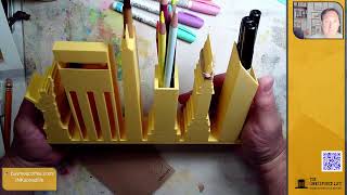
All right, the last color here is this blue. Uh, looks very weathered. Nice. Yeah, I think I'm really digging the roof on this. I think this spray— so I used a combination of these Distress spray stains underneath This is called Vintage Photo Color. I used some of that, and I think I combined some of the Walnut, and then I have another one, it's called Linen. I think that kind of really helped set the stage for getting a weathered effect. All right, let's throw down this blue. I'm going to zoom in on this window. Let's Let's just throw some blue in here. Oh yeah, I like the thickness and, um, opaqueness of this blue a lot. And then let's even throw some— let's throw some of this down on the paint we did before that's dried. So I'm loving this blue, blue color. You can kind of see an overview. So always keep, keep scraps around. If you draw something, paint something you don't like keep it around because you can come back and mess around on top of it, experiment, right? Kind of like we're doing here, experimenting on this scrap piece I had before. Let's show, uh, some planking. Maybe this is kind of a— this is a dock area, right? So we'll use this blue to pull out some of the boards for some of the planking here. If I can get it over here, that's kind of what it looks like. It's kind of cool looking. So those were the Sharpie paint pens, these pastel colors. Make sure the lids or the caps are on tight. I'm going to make sure they're on, and I think we're going to wrap in a minute or two. Let me see if you guys have any, uh, questions before I leave. Make sure you put them in the chat so I can answer them. You know what, I'm going to break out— I have some Posca paint pens here. I have a yellow. Let's throw some yellow on here. Let me see who's in the chat. Hey, I see Becky joined us. Becky, great to see you. Nico, I see Nico is in the house. What's up, Nico? Great to see you. Awesome. I love, I love when you guys all pop in here. All right, so we got the yellow paint pen. I don't use these enough. I'm going to start really playing around with these paint pens. A lot more. It's just that I never think of grabbing them. It's, um, and using them. So here's some of that yellow. I just, I felt like I needed a bit of brightness, pop of freshness on here. For me, yellow is that zesty color. It has that lemony zest. Yeah, I'm hungry. Um, yellow has that lemony zest. There you go. So I kind of pulled out those piers with the outline there. I wanted to pop— I wanted to add some yellow there, and I wanted some on this roof before. You know, let's pull out these door frames here with this yellow. I know this was a scrap, but I think it's looking kind of cool. There we go. So we got some yellow happening. There is a color on here I did not add yet. Can anybody guess what color did I not add that I usually add? Oh, fun new toys. Yeah, exactly. Becky, we're just breaking out some fun things. For me, the sketch time is playtime. I'm just looking at these materials, these new pens, and exploring them, playing around with them. Not worried about making mistakes because, you know, I'm approaching this as just experimenting and seeing what happens. And what do I like? What do I— what don't I like? And we don't know that unless we try it. So don't be afraid, guys. It's just paper. Just paper. We can always start over if you want. I'm really digging this, actually. Um, sorry, my lighting's kind of wonky. I'm not sure why. Pink. You guys got it. Yeah, so we're gonna throw some pink here. Karen, thank you so much for, um, sharing some stars on Facebook. I appreciate that so, so much. They're always helpful and, um, it allows me to try different things like paint pens, so I appreciate that. Yeah, of course, signature color. Right here. And I'm also happy to report— well, I'm happy to report, you guys know I was kind of sad— not sad, but somewhere in Disney I had lost my sunburst yellow colored pencil. Ta-da! Thank you, Michaels, for the coupons. Or the voucher, so I was able to get a new Sunburst Yellow colored pencil. Uh, it's a color I've come to really love using. So let's throw down some of that pink. I want to pop out the edge of this wonky fishing shack, so I think that pink really looks great against the brown. Pretty cool, right? I want to pull out the front edge of this dock a little bit more. I think I'm just going to do it with black, do it with my Sharpie. Actually, I want it to be a little bolder, so I'm going to— I'm stepping up my Sharpie game. I'm going to go for, um, one of these bad boys right here. Oh, sorry. So I just wanted to pull that out, and then we're gonna throw some color in between those lines. What do I want to use? Let's see, actually, let's use some of this. Uh, where's my brush? Just going to dip my brush in some water and I'm just going to, uh, Uh, dried too quick. I was going to try to thin this out a little bit, but it dried. No problem. All right, I think this one would be done, guys. So, uh, that was kind of fun playtime. Here's what it looks like overall. Let me zoom in. We can look at some of the textures and how the paint pens are drying and all that fun stuff. So let's zoom in a little bit. Actually, before we zoom in Before we zoom in, let me get out a mat. Let's put a mat around this thing. Um, let's see, where did I put that nice big mat I was using before? Oh boy.
Ta-da!
Here it is. So let's just see what this would look like framed. I can't fit the whole image in, and I don't mind that because it allows us to do some selective cropping, which is always fun. I kind of like— I kind of like this cropping of it here. Mm, maybe more like something like this. Hey guys, let me know what you think. Do you guys like the way that looks cropped inside the mat? I like it. Karen says me too. DB says awesome. That is one wonky shack. It is, it is definitely wonky. We wonked out on it. I'm gonna wonk out even more. I want to pull this edge out. I'm going to try it with a purple pencil. We did totally wonk out. Cool, this is pretty— this actually is pretty cool. Selective cropping, that's right. Nico says looks so good. Thank you, Nico. Are you talking about me or the, or the actual, uh, sketch? Just kidding. Uh, you guys know I like to joke around. The sketch does look good. I'm so glad you're watching, buddy. It's so cool to see you. Um, yeah, it looks cool. We can do a little vertical crop as well. I don't think the vertical works. I'm not digging the vertical on it. I really think this is a horizontal crop on this one. Pretty cool. All right, let's do a quick recap and wrap up, guys, for the night. Oh, I was going to zoom in so we can see some texture here. I'll zoom in, you guys can see some of the texture happening. Hey, Chip's in the house! Great to see you, Chip. Great to see you, man. So you can see we got a lot of texture happening on this bad boy. So this is a great example tonight, guys, of just playing around. Let sketching be your creative playground. You know, we tried out these new Sharpie paint pens. Boom. Yeah, pretty cool. So I really like the textures on this. This came out pretty fun. You know what, I— these— so these are actually stamps. These are Distress Ink stamps here. I was just messing around with— they're pretty dry. But now that I see these, I could actually somehow have used these to make, um, what do you call those things that like lobster cages, right? These could almost be abstract lobster cages on a fishing Doc. Look at the pattern and texture. So that, that was kind of interesting. I just thought about that. Um, I do want to play around a lot more with these kinds of inks. So in upcoming shows, we'll be kind of playing around with these a lot more. Pretty cool. Guys like it. Thank you so much. Yes, Chip, I'm so glad. That is such great news. That's such great news. Awesome. Love it, love it. Yeah, lobster traps, right? Pretty cool, guys. I want to show you— I've, I've showed this before, but here's a project I'm actually going to be working on now that summertime's here. I want to refine this, but here's what I'm actually using. Over here, and then we'll take a look at the Eiffel Towers. I know I've showed this before, but let's, let's do it again. I don't know which version you guys have seen. So I'm using this, this cool stand that I designed and 3D printed. Um, you can see right now I have some Sharpies in there, I have some colored pencils, I got a paintbrush in here which comes out like this. Right, boom. This is a prototype, so it's not, you know, it's a work in progress. And it's one of the things I love about design is taking sketches, ideas, concepts, and making prototypes like these quick 3D prints, testing them out, going back, redesigning, refining them, printing another one, testing it, getting feedback. I love the whole design process. It lights me up. It's crazy. So, um, this actually had some really great feedback from one of my former students. She just graduated, so, um, Maddie had some really great feedback for me on this, how to improve it. So I'm going to be adding some of those suggestions this summer. And this is actually something I'm working on. I'm going to be selling— I'll be selling these. Um, so yeah, but this is really, really cool. I have some slots here that could fit like your— if you have field journals, fit those in there. You can put sketchbooks in here, paper folders, all kinds of uses. So just a really cool thing I want to show you guys that because I broke it out here tonight and wanted to test it and mess around with it. A little compartment here you can put paper clips in or thumbtacks or binder clips in here. Statue of Liberty is really cool. Um, you can use this to put Post-it notes on and stuff. Anyway, so I just wanted to show you that real quick, and, uh, I'll be making some more. All right, here are the Eiffel Towers. And so here's the sketch we did the other day. Here's what it looks like framed. We cut it— beginning of the show, we cut it to show you what it looks like Looks like matted here. I think it looks really cool matted up. And this was a fun one we just did on the scrap tonight with our red pen. We added some blue paint and white, uh, paint markers or paint pens. Hey, you guys are awesome! I appreciate you guys watching so much. Here's the first thing I showed you was this cool bridge. Hey, you guys are amazing. Thank you for watching. I appreciate you all so, so much. Keep using your creativity for positivity. And creativity means something different to everybody. For me, it's sketching. For someone else, it might be cooking or dancing or sewing or gardening or baking or making music. It doesn't matter. We all can express ourselves creatively in so many, so many different ways. Um, just be— just use your gifts for positive, uh, vibes out there. Okay, you guys are amazing. Happy Sunday night. No school, so I'm gonna try to commit to 2 nights a week regularly. Um, yeah, let me know if you have any suggestions what nights work for you guys. I'm thinking it's going to be Tuesdays and maybe Thursday, or Tuesday and Fridays. Um, thank you guys. Take care. Have a great, great rest of your day. I appreciate you, and I love you all so, so much. Peace and live creatively. See you guys real soon. Take care. I'm looking for the finish button, D-Ray, I swear. And positive vibes out to all of you guys out there as well, if I did not say that. Take care, guys. Thank you so much for watching. Peace out.