The Inkspired Life - Sketching & Painting : Inking Out Loud

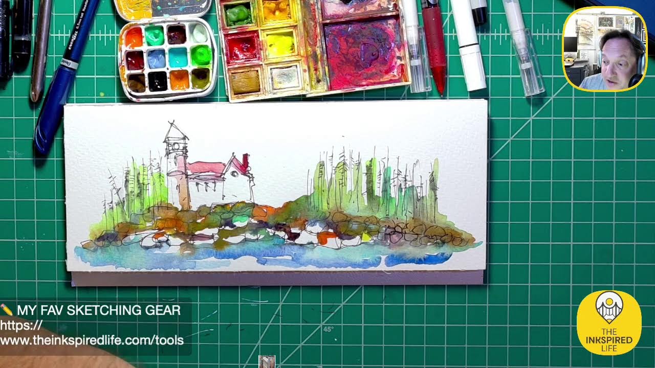
In this livestream, artist Jason Nicholas sketches and paints a view of Seattle’s Public Market while narrating his process and interacting with the chat. He explains his choice to use non‑realistic colors—red for the sign, blue for glass, a custom gray made from blue‑brown, and yellow for freshness—demonstrating techniques such as bleeding red ink with water, blotting, and layering washes. Jason discusses his intent to practice lettering on architectural sketches this summer and outlines his plan to sketch in Central Park the next day. He describes his materials in detail: Fabriano 1260 24 cold‑press watercolor paper (4×8 in), a Winsor Newton thumb palette, Winsor Newton paints, Pilot Precise Red ink, and various brushes. Throughout, he engages viewers (D‑Ray, Deborah, Heather), asks for feedback on perspective and depth, and shares personal anecdotes about fatigue and creative routine. The stream ends with a preview of future ink detailing and colored‑pencil accents.
Chapters
Hey everybody, happy Friday! Hope— I hope you can hear me. I'm having some mic issues. Let me know, chat, if you can hear me. If not, then you can't hear me and you— I won't know you can't hear me. I don't know what I'm saying. Anyway, I hope you guys are doing good. I'm on really, really briefly here. I'm exhausted. But I wanted to do my sketching tonight, so I figured I'd pop on and add some color to this one. Hope you guys are doing well. I see D-Ray and I see Deborah in the house. Great to see you guys. Hope you're doing well. So this is a sketch that's inspired by the Public Market in, uh, Seattle. In Seattle. I thought it'd be fun to just change it up a little bit, just get a different location. And these aren't the real colors of the place, I'm just kind of having fun with colors like, like I like to do. Anyway, hope you guys are all doing well. I do want to use red though, the letters are red in the sign, and I'm going to bleed bleed some, uh, I'm gonna bleed some Pilot Precise Red right here. I like this, this red color. Hey, D-Ray says, I hear you. Awesome, that's good to hear. Let's throw down some red on here. I'm just going to blot this back a little bit. There we go. So one of the things I'd like to start working on and practicing is lettering on these architectural sketches. You know, I like to— I like to sketch, um, signs. So in order to do that, I have to start kind of practicing my lettering. So that's something I'm going to be trying to work on this summer as I'm sketching. So you might see me doing more sketches with some letters on them. Cool, there we go. Am I gonna bleed? I don't know if I'm gonna bleed the red ink. Let me just see what it looks like. I'll try it. Yeah, I hope you guys are doing great out there. Let's try bleeding some of this. Yeah, I think I'll bleed it, just soften it a little bit. So I'm just, just lightly touching the red ink with some water here. Tomorrow I will be heading, um, I'll be out in Central Park doing some sketching. That's the plan unless I wake up and I'm super, super exhausted. But right now the plan is to be in Central Park doing some sketching in a workshop I signed up for, but we'll see what my body, my body, my might say sleep in, but we'll see how it goes. I'm excited to go, but sometimes you got to listen to your body and sometimes it just needs a rest. But we'll see. Anyway, yeah, I like the way this is bleeding. I actually like what's happening right here. Let me zoom in. Boom! I like how the red is kind of bleeding down. I have some gray happening. I like what's going on right in there. It's looking pretty cool. I'm gonna leave the red at that for now. Uh, let's see, what other color do I want to throw in here for right now? Let me move this. Boom, there you can see it. I am not sure. I think I'm gonna throw some blue on here. What the heck, why not? Just feeling it. Let's just throw some blue on. Maybe we'll do some blue in these glassy areas here. There we go, a little bit of blue happening. There's other colors in here, that's fine. I don't care if they mix. Cool. All right, so we have some blue for glass. I'm actually used to throwing in some of that blue for shadows. I'm going to mix the blue with some brown, uh, which one's brown? This one. There we go. And I'm going to make my own gray, and I want to just do some like shadowy type areas with this blue-brown mix. I like to mix my own gray color. Sometimes I'll throw other things in there too, but typically it's blue and brown. And sometimes I'll, you know, I can always add more blue if I want. And I kind of want to darken this under here a little bit more. There we go. I think that's going to be a nice color for now. There we go. Just kind of make some shadows happening here. There's actually a staircase going down. Cool. I'm liking— I'm liking the sketch, actually. Let's see, that might be the only colors for now. I'll let it dry. It's looking cool. DJ DeRace, essential part of cool, but rest is important. I am right. Hey, Heather's in the house! Heather, good to see you. I recognize that place. That is so cool, Heather. Have you been here? I have not been here. One day I'd like to go check it out. So if you recognize it, that's a good sign for me. I'm doing something right, um, but you— especially since I'm kind of putting my own colors and spin on it. So it's really cool that you were able to recognize it. I'm glad you said that. I want— all right, I feel like I need some freshness on here. So when I want to add freshness, I go to yellow. Got an itchy nose. So I'm gonna dip into my yellow that's disappearing from my palette. And for me, yellow adds just a little touch of freshness. Think of cooking and lemon. When you add lemon, it adds freshness, a bit of brightness to whatever you're putting it in. I think of the same thing as the lemon color here, adding a bit of brightness and freshness to to the painting. So let's pop in some yellow. And the reason I'm wearing it out this way is I take my brush and I tend to spin it to load it up with paint. That's why I wear out these kind of circles here in the middle. You'll see, you'll see it on pretty much all the colors here, here, here. So I'll have to replace this pan soon, but Let's get some paint on now and we'll, uh, throw it on here. Heather says, been there many, many times. Oh, so cool. Yeah, it looks like a really cool place. Um, I've seen it on YouTube, uh, some streamers have been there and I've watched them kind of go around this area. That's what inspired me to do this. But it looks like a really interesting place for sure. Cool vibes. And I think this is actually— Heather, you might know— I think this is located near the original Starbucks. I forget what year that was, that 1930-something. I could be way off. I think the original Starbucks is near this public marketplace. There you go. So you can see that yellow just kind of pops a little bit. I threw it in here as well with the glassy areas that I just now turned green. It's okay. I actually want to blot some of this back, I think. There we go. I'm gonna blot some of this back too. There we go. I just want a little hint of yellow. I think one of the iconic things at this location is this sign. There's actually a clock here as well. Again, I'm not looking at a photograph. I don't know the colors. I do know the letters are red. I think there is some red on the clock. Um, I'm gonna make the hands right here red. There's a hand here, maybe, maybe a hand coming down. It's only— you can only see half the clock in this perspective right here, so I'll just throw some red on there as well. Pretty cool. I should put this down here so— there we go— my arm's not getting in the way of the picture. Hmm. That's cool. I think that's gonna be it for yellow. That might be all I'm gonna do for tonight, guys. Um, I'll let it dry and then probably tomorrow I'll come back in with my— I'm probably gonna end up using my Pilot pens, um, and adding some ink details on top of this. So here's the paper I'm using tonight. It's Fabriano 1260 24 watercolor paper. I love this format. The size is 4 inches by 8 inches. I'm loving the proportions. I like that it's horizontal. It's kind of panoramic, so it's a really cool, um, scale or size to the paper. And it's— I guess it's a block because it is glued on the top edge here and the rest is loose, so it's not glued all the way around. And I don't— yeah, it's cold press. I don't know if I said that, but it is cold press. So I'm liking the Fabriano paper better than the Strathmore I used to— no, it was a Strathmore, so I can't remember the name. Was it Strathmore? Canson. The Canson. I think that's Strathmore. The Canson paper I was— had always used for many, many, many years. I'm starting to like the the Fabriano better. I'm liking the texture of the paper here on this cold press, so I've been using Fabriano lately. Cool. So we're going to close shop here. Let's close. Here's my palette if you want to take a look at it. Very messy. But I love it. I'm not one to be fussy and clean this out a lot. Maybe once or twice a year I'll clean it out. But I like the colors that mix here. Really fun. Zoom in, you can see them closer. And really cool. And actually this piece comes out. You can put it on here if you wanted to, or the other side to put water in there. And then you can use it like this as a thumb palette. So it's a really pretty cool, um, palette. It's Winsor Newton, so I really like this palette a lot. All right, cool. All right guys, I think that's gonna be a wrap. I am beat. I hope you had a great, great day. D-Ray says that might be it for tonight and work on it tomorrow. I think that's it for tonight. We'll take one last look I'm gonna zoom in so you can see it nice and close. And let me know what you think. Do you like these colors? Is it making sense? Are you getting a sense of the perspective? That's what I really would like to know. Are you getting a sense of the perspective and depth? Can you tell that it's going back this way to kind of the focal point back here? I hope so, because that's what I'm really trying to accomplish, is just get a little perspective view. Focusing back in this area. I think I'm going to leave the sky white. I'm going to leave a lot of white on here. I'm just looking at— if I throw down any more color, I do have— I'm going to have to bring in my signature pink. I love using it. So you'll end up seeing this somewhere. Don't know where yet. And maybe some neon yellow too. And light aqua. So I'll definitely be adding some colored pencil to it. Cool, guys, thank you so much. Heather says, yeah, yes, right when you walk down into the market. Oh, awesome. So, uh, Heather, I'm glad you can tell that's— that is what I'm trying to paint here. Or are you talking about Starbucks? Maybe you're talking about the Starbucks. So the Starbucks is around here. How cool is that? I'd love to see it. I bet you there are huge lines to get in, get in there. It's a bit of history, right? Speaking of history, guys, I think it's history for me tonight. Thank you so much for watching, um, and tuning in, and I hope you have an amazing, amazing rest of your day and an amazing Saturday. So hopefully I'll be headed to Central Park and sketching tomorrow. Um, that'd be great. And maybe I'll try to livestream a little bit while I'm out and about. Have a great, great night, guys. Thank you. Great night, guys. You can tell I'm tired. Appreciate you all so much. Peace and live creatively. See you guys soon. Take care. Thank you. Oh, right across the street is the flagship Starbucks. Thank you, Heather, and thank you for letting me know the geography. That's awesome, I appreciate it. Uh, and yes, this is the entrance where you walk down into the market, so I'm glad you picked up on that. And I got a piece of fuzz or hair or something in my face. How did that happen? I'm shedding, I'm shedding like a dog. All right guys, take care, have a great, great night. Peace and live creatively.