The Inkspired Life - Sketching & Painting : Inking Out Loud
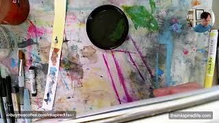
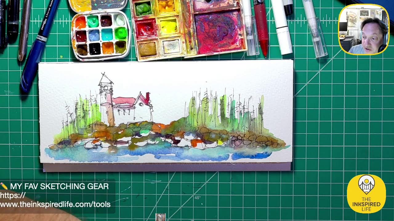
In this 2021-05-06 YouTube livestream, artist Jason Nicholas breaks from his usual schedule to sketch and paint a clock‑tower illustration live for his audience. He walks viewers through his step‑by‑step workflow, emphasizing a layered, weathered aesthetic. Jason demonstrates the use of sepia watercolor, chartreuse watercolor brush, cerulean blue, copper acrylic ink, metallic acrylic ink, black watercolor crayon, and an Aqua Brush, explaining brush‑size choices (3/4‑inch vs medium tip) and wet‑on‑wet techniques. He shares discoveries about color perception (e.g., chartreuse vs label), the effect of adding warm yellows, and the interplay of metallic copper with blue to create gray tones. Throughout, he engages with chat, encourages viewers to comment, and reflects on his introverted nature, the therapeutic value of painting, the importance of patience, and trusting gut feelings about when to stop. He also experiments with framing ideas, testing black and rusted‑metal mattes, and plans a final detail pass with a Sharpie or Pilot Precise Pen. The stream ends with a call to action for likes, comments, and sharing, reinforcing community building.
Chapters
Hey everybody, happy Wednesday! It's 3:37 PM here in New Jersey. Hope you're having a great day. This is a very unusual time for me to be popping on. I am rarely on before 7:30 at night, but tonight I've I felt like sketching. It's been a crazy busy day in a good way and I just want to change my gears from— take a break from school stuff and do something a little fun and creative. So I figured I'd log on for a little bit and work on this sketch or this painting. Hope you're all having a great day. Let me know if you're watching. Say hello in the comments. Give me some thumbs up. It's always nice to know who's out there. In virtual land. Just looking for some scrap paper. There we go. Make sure you can see that okay. Looks good. Hopefully I'm not talking too loud. I feel like I might be shouting, but I have my music on, so if I'm talking too loud, let me know. So I've been working on this. I started this last night, kind of a clock tower. Piece here, and I'm just adding layers on top of layers. I'm trying to create a kind of a weathered, rusted kind of look to it. It's an aesthetic I really, really love and something I've been practicing and practicing. So that's kind of what my intention is right now, is just to, you know, practice the layering technique. It's not meant to look realistic, it's just a loose kind of fun piece. I'm just— I'm brushing on some sepia watercolor right now just to darken up some areas. Cool. I was just checking. I'm trying to log in on Facebook here on the screen. It's not even letting me— here we go. Trying to open up the live stream. Sometimes I like to see what's going on in the computer. I know there's a time delay, so just trying to figure out how much of a time delay we have going. There we go, cool. Now I can see it. Awesome. So if you're having a good day, let me know. How's your Wednesday going? I think I wanna pop in, I wanna add maybe a background color. I'm thinking maybe some kind of a yellow in the background. So let's, let's give that a try. Actually, you know what I'm gonna use? If I could find it here, I have it here somewhere. Where is it? I'm trying to find— I have a watercolor brush, uh, watercolor marker I want to use as Chartreuse color somewhere in my stuff of stuff. Where did I put it? I should have it ready to grab and go. Got it! I think I got it. I got it right here. Yes! He scores! Scores a chartreuse! So feel free if you have any questions or comments. I'm checking out the chat as I'm talking here. Feel free to put them in the comments. Don't be shy. I am very shy. I am like so introverted. It's crazy. So doing this live is challenging, but it's fun. I'm just trying to step out of my comfort zone a little bit and get better and better at it. So this is a Chartreuse watercolor brush, and I'm gonna add— I want to add some yellow just around the outside here. I feel like I want to brighten this up maybe a little bit. What I'd like to do is put it down on the canvas— or not canvas, like on a palette or scrap piece of paper— and then lift it off of there, brush it onto here. That way it's not so intense on this, this painting. So I'm gonna use a 3/4-inch brush. I like to use a wider brush sometimes. This is 3/4 versus this, and I like to use a wider brush when I'm doing backgrounds or I don't want to do any detail cut type of work. Sometimes I'll even pre-wet the background a little bit. Again, I don't want to be incredibly vibrant yellow. Maybe not right to start with. I can always add to it and make it more vibrant. But just by adding this yellow, I think it creates a little more, kind of a little bit of warmth to what's going on. So this is actually a brush pen, it's called. It's watercolor-based, so it's water-soluble, so I can paint with it. And honestly, I really didn't even know what chartreuse was until like a couple months ago when I got this pen. I never even considered— I always thought it was like a pink color. Obviously I was way off with that. And then on here it looks kind of green, but I like the way it looks when you put it on paper. So sometimes you don't know until you try it. You can't always go by the labels. Like the color of this here looks very different when you put it on the page, so you can't, can't always trust the color that the label is. You have to actually play around with it and experiment with it. This is kind of just a happy little, uh, discovery. So let me know if this adding this yellow made it— if you can see a difference with this painting. Did it change kind of the way it looks or the character of it? This is a brush pen, or, I'm sorry, it's an Aqua Brush. So I love these because you can put water in here Very convenient to travel with and carry around with you. Basically, the only two size brushes I use are a 3/4-inch brush and this medium tip Aqua brush. I do have so many other ones, but these are the ones I always tend to gravitate to. Unless I'm doing a big— if I'm doing a big piece, I'll use a— sometimes I'll go with like a 1-inch brush. I think I want to put some of that yellow on this, kind of where the clock face is here. I like how the yellow is mixing with— there's some graphite on here, there's some sepia. I like the way it's mixing with it, so it's not just straight up— I call it yellow, I mean it's chartreuse, but we call it yellow. I like how it's kind of mixing up a little bit. And I don't want to color all of this. And I want to leave some of that white. White almost has like reflections happening. So I don't think I'll add any more on there for now. Move that over a little bit. There we go. Cool. So if you're having a great, great day out there So I think that's good for the chartreuse. We'll put this aside and I'll add some other— I think I'm going to add some more blue. So I'm using cerulean blue. This is one of my standard go-to colors. I love it. Actually, I'm going to change my mind. I'm going to put that aside. I have some copper acrylic paint here, acrylic ink. I'm going to use some of this copper. I think that would look kind of cool on here. It is metallic, which will look kind of cool in the light. Excuse me, I need a drink of water. Alright, so let's put some metallic, some copper on here. Again, I'm just gonna use this piece of paper as a kind of a palette. I'll hold this up in a second so you can get a closer view of what I'm doing. Maybe we can see some of the metallic-y stuff happening. So it's okay to turn your paintings and sketches around, make it easier. I just turned it around because I don't want to get paint on— trying to avoid getting paint on my hand. It always happens though. And for you guys that have been watching these, you always know what I say, right? It's not art. It's not art unless what? Unless you wear it. And I typically end up wearing it somehow. But that's part of the fun of creating, right? It's the process. You've been getting into your work. If it means you get some paint on you, it's all good. It's kind of fun. Sort of. Alright, let me hold this up so you can get a closer look at it. So there's some metallic, some copper in here. You can get a good glimpse of it over here as it's drying. Kind of hard to see on camera. You can see it kind of shimmering a little bit. So a piece of artwork like this is about adding layers and layers, just to keep building it. It's definitely something you need to have patience for, and I just love the process. For me, it's rewarding. It's kind of therapeutic. You know, sometimes it's a good lesson to learn, right? Sometimes we just have to be patient in life. I don't know how much more I want to add on here. I don't want to put too much of this copper on here. I'll just touch it in some spots. Add on top of where it is, kind of dab it on some places. I could use some over here, I think. Yeah, I think it looks pretty cool. Make sure the cap's on so I don't spill it. Let's break out some more of the blue, throw some blue on there as well. I'm just adding water to thin it out in some places. Some areas I want the blue to be kind of pop out, and some places I want it to be a little more blended in. So to blend in, I just add some more water to thin out the paint. I'm mixing some of the blue and the copper over here on this piece of paper. It has a really cool kind of gray look to it that I want to add to this here. Here we go. Cool. Let me hold it up a little bit closer so you can see. You can see where I added some of the copper color on here as well. Down here is where I added some of that gray, copper and blue mixed together. I have some gray on here. There's some on here as well. So just adding some more layers. Hey, Patty, how are you? Good to see you. Yeah, so I am just kind of Wrapping up, taking a break from school today. I know I'm not usually on this early, but I just wanted to take a little break. Sometimes it's good to give our minds— it was either napping or painting, so I decided to paint instead of napping. I've been wanting to work on this today, having fun with it. Hope you're having a great day. There are a lot of layers going on. I'm just trying to get this blue to drip down a little bit on there. There we go. I just want to prop it up a little bit so it stays at an angle. Just throw that under here. Cool. There we go. Yeah, I like the way it's looking. I'm gonna let it dry, I think. Hope you're having a great day. Hey, Dolores, good to see you. Checking in for a few minutes. Time flies when you're painting. No pun intended, right, Dolores? I love that. Yes, time does fly, or it gets rusty. Either way. Thanks for that comment. Actually painting some cast iron roosters to hang on the door of my shed. That's awesome, Patty. Very, very cool. Love that. Make sure you take some pictures and post them. Be awesome to see that. Sunny, sunny day over there by you. It's, it is cloudy and rainy here in northern New Jersey, which I like. We need the flowers, the grass needs the rain. When it's cloudy and rainy, I thrive on rainy days. I love rainy days. I can't explain why. So maybe I should move to Seattle, right? I just love rainy days. I get a— it just brings really cool feelings to me. I don't know what it is. I'm looking out there now. So I love sunny days too, but I love rainy days. This is actually, I want to show a close-up here. The way it's drying has a kind of a mottled white kind of look going on here, which is pretty interesting. I wasn't expecting that, but I like the way that's looking up there. It's kind of cool. I like the addition of the yellow on here as it's drying. I like that it's drying kind of light. I didn't want it to be very vibrant and bright. So I think it has a nice contrast in the background, brightens it up a little bit. So that brightness kind of counteracts or balances with the dark, rusty kind of colors happening. So I think that was working out okay. I wasn't sure how it would look. But you know, when you're creating things, don't be afraid to try. Just play around, have fun with it. It's the only way you're gonna figure it out. I mean, if you're worried about it, you can always do it on scrap paper. Or you can just go for it and see what happens. It's the best way to learn what you like to do, what you don't like to do, or maybe what you want to learn to do. This looks good. I keep saying I'm not going to add anymore, right? I think I'm going to leave it at this for now. On here. Cool. Hey, Dolores, I like the yellow. Thank you. I'm glad you like it. That's so cool. Hey, thank you, Patty. I'm glad you think this looks nice. I appreciate that. Yeah, this has been a fun piece to do. I might even add one more layer after it dries. Come back later and doctor it up. Actually, I think I will. I think I'll add some just pull out some black on some areas. I'll use my black watercolor crayon here. Actually, we'll do that. I can do that now. Let's put some black watercolor on here. And I just take the crayon and I'm just dipping it in water. So it has— it's wet on top there, so— and I just like the way it kind of bleeds when I put it to the paper. And I'm just dragging it across the page. I'm not pushing it down hard at all. I want it to be light and look imperfect, imperfect, if that makes sense. The texture underneath will show through if I drag it lightly across. If I want it darker, I can push down in certain areas or just move it slower, let it, let it kind of melt onto the page. I don't wanna get too crazy with the black on here, so I'm not gonna put too much more. I think that's enough on there. Put down the stuff. Walk away. Put it down. Cool, there we go. Hey, um, so you— oh, so you need to paint a mat for it that's rustic. Hey, Patty, you know, that's a cool idea. Doing a rusty color matte, that would be fun. I have, I just got a couple of small mattes, let me see if I can find them. Here we go. I haven't even opened them yet. These are really small, they're not going to fit the whole painting, but I do have a black matte here. Let's see what it looks like if I just pulled it over part of the painting. Just gotta open it up. There we go. I like that. Or even maybe find like an old metal frame or something that I could maybe distress it or something. That would look neat. How about a frame made out of, like a steampunk frame made out of maybe old parts? That'd be kind of neat. So I just want to see what, you know, just get an idea what the colors would look like if it had a black mat around it. Yeah, Dolores, it's so hard to know when to step away. You're right. Typically I just go with my gut. If it says stop, stop. I know it's kind of a weird answer, but it's true. It's kind of a gut feeling, right? There's really no right or wrong answer when to stop. So I'm just looking at different sections in the black mat. Yeah, rusted frame, I like that idea. You know, the black's looking cool. Let's see if I had a white frame, what that would look like. Nah, this definitely isn't a white— for me, this is not a white frame matte. I think it would have to be a dark color. Even just this section is kind of cool. If this was like a little painting. If you notice how I'm holding the mat, I'm purposely offsetting that clock face. It's not centered like this. I think it adds more interest if it's slightly shifted. I could shift it either way. But I like, I'm liking it better shifted so the clock is more towards the left of the frame. Oops, sorry. There we go. Yeah, that would be cool. So I like the idea about the rusty frame. Yeah, no white, Doris is like, "No white." Yeah, this is definitely not meant for a white frame, for sure. I totally agree. You need the darkness to make the image pop out. Cool. I wish I had bigger frames. I don't have any other ones to look at right now. Why am I picturing some kind of rusty frame or something? Do I have— well, this isn't a frame. This is a sketchbook I have. Ooh, I just Kermit just fell down. Kermit on my shelf there. So this is just a metal sketchbook I have, cover. But I'm just curious what it would look like. I even maybe thinking maybe it's kind of aluminum kind of frame or something. Actually, I'll flip it this way. There we go. No, I like maybe a metallic look. It could be kind of cool there. So that's a possibility also. Cool guys, so I think that's a wrap. I just wanted to come on for a little bit and play around with this piece for a little bit more. It's very close to being done, so I'll step away from it for a little bit and take another look. And at that point, you know, I'll decide if I want to add more or just kind of leave it. I'm thinking I'm going to add a little bit more, and I think I'm actually going to come back and add some some pen on top of it. Just pull out some kind of detail lines or like scratches or something on the surface. So I'll either use my Sharpie or the Pilot Precise Pen. So that'll probably be the last step I do to this. Cool. Hey, yeah, Pam, glad you caught me. Yeah, thank you. So yeah, this is totally, I'm usually on randomly, but this is even more random because I'm not usually on before 7:30. You guys are awesome. Thank you for watching. Make sure you say hello in the comments wherever you are. Leave me a thumbs up so I know you visited. Say hello so I can say thank you to you. Feel free to share this. I would love that. Let's spread the word. I'd love to get more people tuning in and joining along. That would be so cool. Thanks guys. I'll be back. I might not be on tonight. I might not be on tonight. I have some stuff I gotta do. So you guys are awesome. Thank you so much. Take care. See you real soon. Possibly tonight. I'm not gonna promise. Yes, I know, it's a mystery. Peace and live creatively. Keep being awesome. Keep paying it forward with your creativity. See you guys. Take care.